Displaying symbols on a map
1. Overview
A symbol is a type of element that is used to represent location points on a map visualization. These can be added to your map from map resources, or from coordinates in your data source.
Using size rules, the sizes of symbols can be varied according their data values like bubbles, known sometimes as a proportional symbol map. For example, each symbol can indicate the location of a city, and its size indicate its population. Using color rules, the color of each symbol can be varied according to data values such as sales figures.
The following walkthrough shows you how to create a proportional symbol map in which the symbols and their locations are loaded from your data and where both their size and color vary according to metric values.
2. Add data to the map
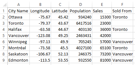
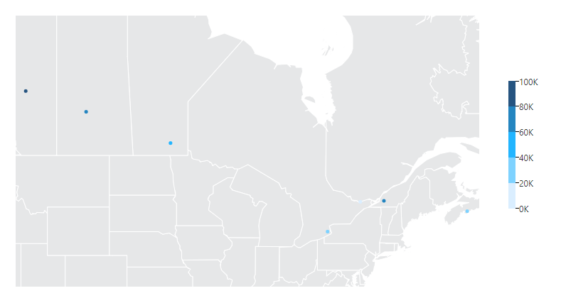
Consider the following example, which specifies the decimal longitude and latitude for various cities in Canada. These values will be used to create and position symbols on the map. There is also some measure data, such as population and sales figures for each city.
In our example, we have imported our Excel data by dragging and dropping it on the Explore window while editing a dashboard. After adding a new map visualization from the toolbar, we drag City Name and Sales from the Excel data connector in the Explore window onto the map.
The city names in our example happen to match with the cities included in the map resources included with Dundas BI, which are automatically loaded since we have selected only the city names. They include many more symbols in this case than the ones we have data for, which display various shades of blue to indicate measure values.
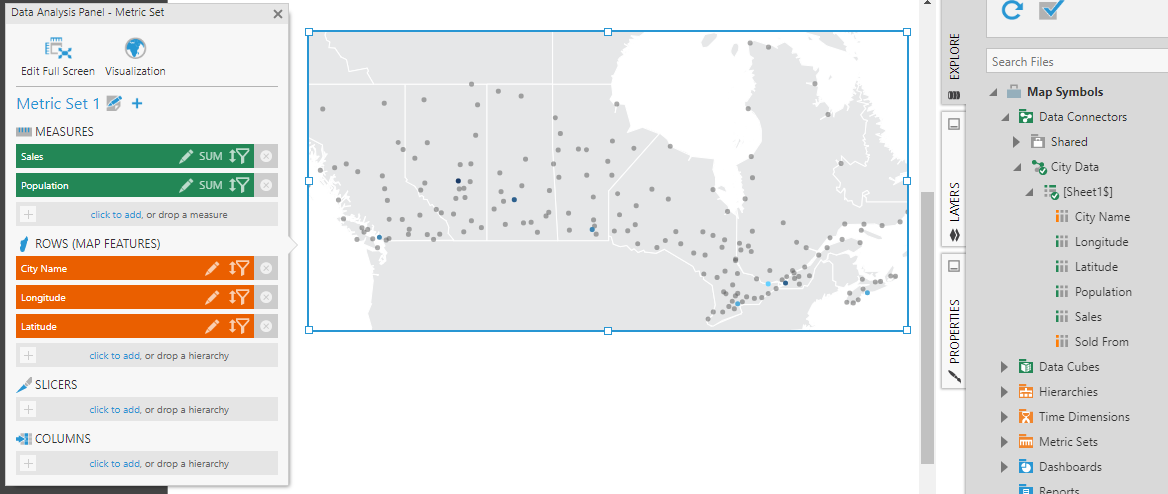
In the figure above, we have also changed the Map Projection property in the Layout tab to Mercator, and dragged the map resource Canada (States and Provinces) from the Explore window onto the map to display as additional context.
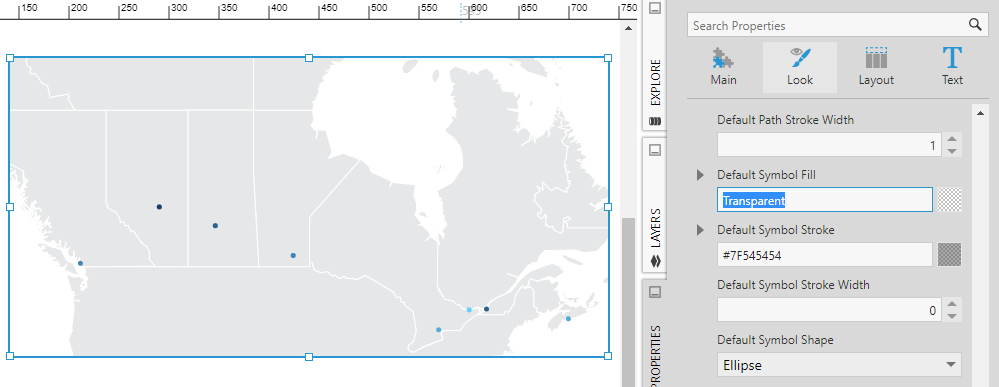
In the Properties window, in the Look tab, the various Default Symbol properties determine the appearance of the symbols whose appearance is not being changed by data. For example, we could decide to change the other symbols to be fully transparent. Or, when using data to change symbol sizes, you could assign a default symbol size of zero.
3. Connect symbol location to data
In our example, our data includes the coordinates of the cities, so we don't need to use map resources and can display symbols directly from the data.
Click Visualization in the Data Analysis Panel, expand Symbols, and scroll down to Longitude (X) and Latitude (Y).
Drag from the Explore window or click to add the corresponding longitude and latitude coordinates from the data source.
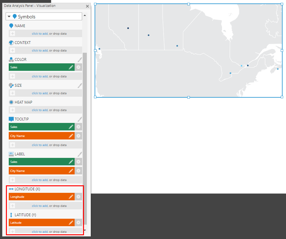
Symbols for each city are now displayed, and the map will automatically zoom into them.
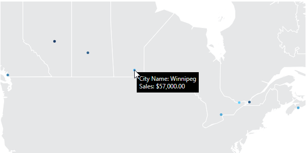
If you switch to View mode, you can access a tooltip on each city that shows its name, sales figure, and other information assigned under the symbol's Tooltip in the Data Analysis Panel.
If your symbols are very close together, for example within the same city, you may want to make use of street-level maps displayed in the background to better understand their context.
4. Connect symbol color to data
The symbols on the map have different colors based on the values of the measure because it was automatically assigned under Color in the Data Analysis Panel's Visualization tab under Symbols. You can go there to remove or change this measure.
The colors that are assigned to each symbol based on these values are determined by the Symbol Color Rules property, found in the Look tab of the Properties window.
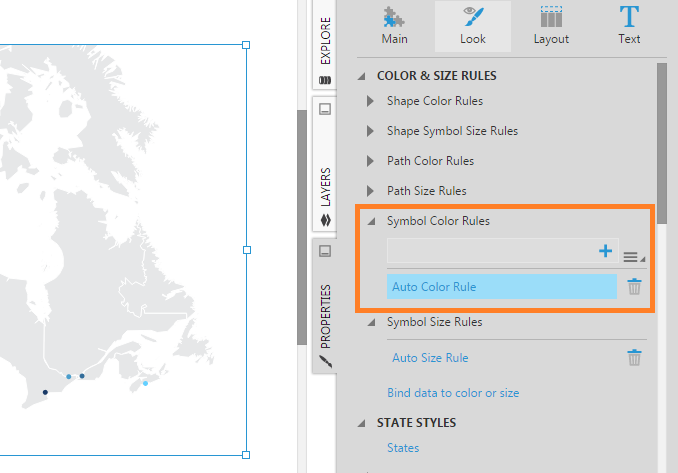
Click Auto Color Rule to make adjustments to the default color rule. You can also click the paintbrush icon next to Color in the Data Analysis Panel's Visualization tab as a shortcut.
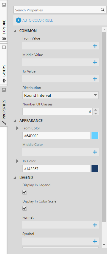
Colors are automatically produced between the From Color and To Color set here. You can specify a Middle Color if needed. You can also change the Number of Classes (number of data ranges assigned a color) and the Distribution method used to determine their ranges.
4.1. Distribution methods
The Round Interval divides the entire data range into equal-sized ranges defined between rounded values, and represents each range with a particular color. When a legend is added and connected to the map, these ranges and their corresponding colors are displayed.
This is useful when identifying what the measure values are based on the colors of the data points, because unnecessary precision shown in the legend can be more difficult to follow.
The Continuous distribution method maps the entire data range to a continuous range of colours, so that different quantities from your measure are each represented by distinct shades of color (values are not 'binned' into classes or ranges assigned a single color). This can allow you to identify even small differences in measure values between neighboring data points, which will be represented by slight differences in color, although it can be more difficult to judge for yourself which value corresponds with that color (you can use tooltips to find out the exact measure values).
The other distribution methods you might choose to use are:
- The Round Continuous distribution method assigns a continuous range of colors like the Continuous method, but rounds the numbers marking the start and end of the data range, which will be identified on your legend if you have one.
- The Equal Interval distribution method divides the entire data range into equal-sized intervals like Round Interval, but does not round the values marking the start & end of each range.
- The Equal Distribution method determines ranges that assign each color approximately the same number of times, making equal use of each distinct color, whereas Equal or Round Interval may leave out some colors entirely from the data points if there are no corresponding values within those ranges. The result is that the shades of color don't necessarily change to accurately represent the quantities of the measure values, and a legend should be included to clarify this.
5. Connect symbol size to data
In the Data Analysis Panel's Visualization tab, under Symbols, you can assign data under Size. This changes the size of each symbol to represent its value.
The figure below shows the result of assigning Population from our example data source under Size.
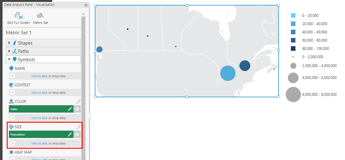
The sizes of the symbols now vary according to population of each city. Similar to color rules, the Symbol Size Rules determine these sizes, which by default correspond to rounded intervals. You can modify this rule in the Properties window the same way as for color rules, described in the previous section, except that each range or class is represented by a particular symbol size.
6. Add paths between the symbols
If your data contains pairs of symbol names each defining some connection between two symbols, you can assign these to the map to display these links, similar to a relationship diagram. Links between pairs of cities can be shown to indicate shipments, for example.
Open the Visualization tab of the Data Analysis Panel for the map.
The symbols should have data assigned under Name for the map to be able to match up your links with the existing symbols on the map. For the example shown in this article:
- First expand Symbols and re-add City Name under Name.
- Map resources containing matching city names may now re-appear. You can remove these by selecting Show Only Requested Maps in the Properties window. For additional context other than the provinces map resource, search for and drag the map resource United States from the Explore window onto the map.
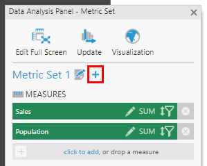
- Disable totals on the metric set to exclude the grand total from the color and size ranges: click the metric set Edit button in the Metric Set tab and set Shown Totals to None.
If your symbol link data does not correspond with data already being displayed for individual symbols, you may need to first add a separate metric set for the map in the Metric Set tab. For example, the symbol data should contain a single row corresponding with each symbol, while the path data might contain multiple rows defining multiple links in or out of every symbol. (The example data used in this article contains no more than one link ending at each city.)
In the Visualization tab, expand the Paths section, and add the two hierarchies with names matching symbols: one under Symbol Link Start Name and one under Symbol Link End Name (e.g., Sold From and City Name).
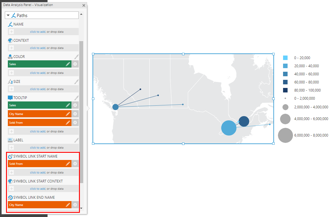
Like for symbols as shown earlier, a path color rule is automatically generated for the data assigned under Color (e.g., Sales), and a size rule can be used to determine the path widths by assigning data under Size.
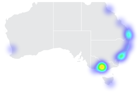
7. Show heat maps
To display symbol data as a heat map rather than individual symbols, add a measure (e.g., Sales) under Heat Map in the Data Analysis Panel in the Visualization tab.
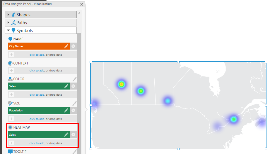
The heat map settings are now used to determine the colors and sizes of the plotted symbol data. If you want to customize these, go to the Properties window in the Look tab and click Heat Map Style.
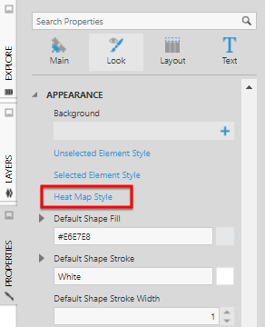
You can change the Gradient property to display different shades of a single color, for example.
Heat maps are useful for large datasets containing data for many symbol locations, such as in the example shown below.
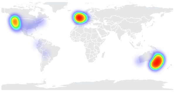
Locations that are nearby can merge and change color to indicate their total value. You can zoom into an area and the heatmap will update in real time to break down the data at the changing zoom level.