In the spirit of celebrating 25 years of data visualization innovation, we took on the daunting task of picking 25 unique and smart visualizations you can easily create in our most modern BI and Analytics platform – Dundas BI. Some of the visuals are unique and won’t be found in other tools, and some of the visuals are smart and automatically created for you by Dundas BI without any data prep required. Plus, we’ll show you some cool techniques and concepts you may have not considered before.
While the list is lengthy, we hope it gives you just the right amount of information to understand the “What” and the “Why” of each visualization and sparks your inspiration to take your visual delivery to the next level.
Click on the visuals you’re interested in and enjoy!
1. Pie Gauge
2. Sunburst Chart
3. Relationship Diagram
4. Sankey Diagram
5. Treemap with Hierarchies Grouping
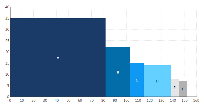
6. Pareto Chart
7. Waterfall Chart
8. Data Transitions
9. Maps with Custom Symbols
10. Correlation Matrix
11. Parallel Coordinates Chart
12. Custom Diagram
13. Range Bar Chart
14. Mekko Chart
15. Strip Plots and Automatic Box Plots
16. Histograms
17. Data Image
18. Bullet graphs
19. Funnel Chart
20. Total Value on Chart
21. Harvey Balls
22. Visual Scorecards
23. Stock Chart and Candlestick Chart
24. Venn Diagram
25. Any Other Visualization You Can Imagine
Pie Gauge
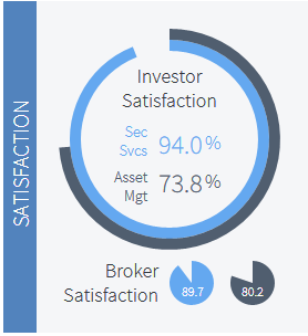
What:
The Pie Gauge, also known as the Orbis Indicator, is the evolution of the Radial Gauge, which shows a percentage value in a circular form. The value can be easily perceived as we know that 100% is the equivalent of a full circle.
Why:
This is a highly intuitive presentation visual for illustrating completion. No outlines, marks, or labels are needed as we naturally understand where the 25% and 50% points are because we perceive the indicator as 100% when the circle is complete.
Learn more: http://www.dundas.com/support/blog/a-gamer-s-guide-to-the-orbis-indicator
Sunburst Chart
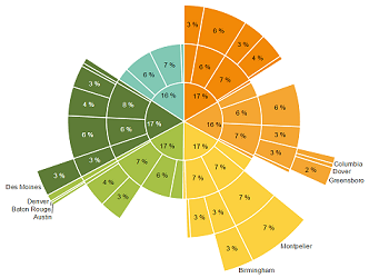
What:
Otherwise known as a Radial Treemap or Multi-level Pie Chart, Sunburst Charts show hierarchy through a series of concentric circles.
Why:
Beyond being an eye catching visualization, Sunburst Charts deliver an intuitive way of representing hierarchical data structures and increasing engagement of users.
Learn more: http://www.dundas.com/support/blog/sunburst-charts-homerun-or-groundout
Relationship Diagram
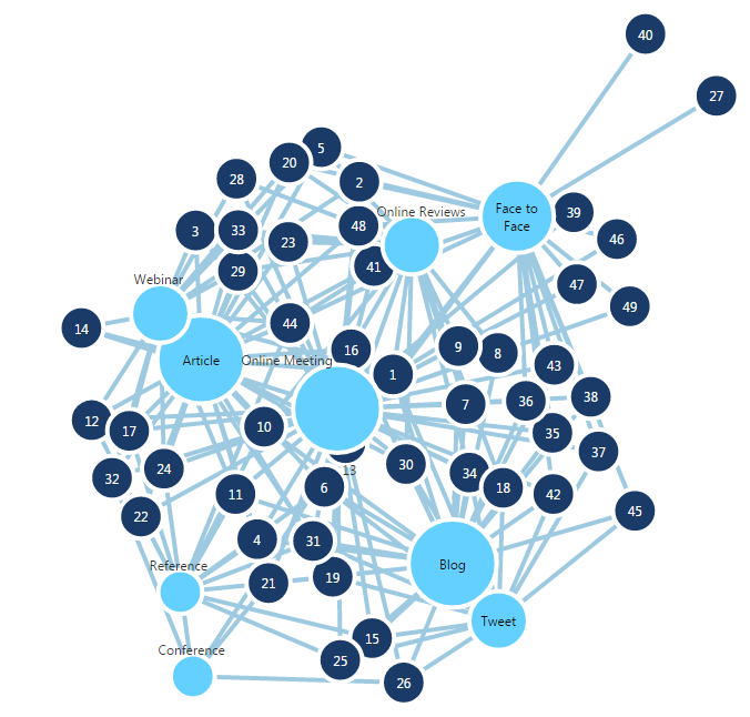
What:
Also known as a Network Diagram or as Force Directed Graphs, the Relationship Diagram shows a collection of nodes (i.e. circles) and links (i.e. straight or curved lines) to connect the different nodes together.
Why:
This provides a great visual to help you uncover hidden relationships within your data that would be easily missed with other visualizations. While other visualizations show many of the relationships implicitly within the visualization, the Relationship Diagram displays it explicitly. Use this when you want to analyze social media connections and impact, customer engagement experience, directions of connections or other forms of hierarchy relationships.
Sankey Diagram
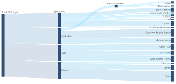
What:
This is considered a sister visual to the Relationship Diagram, but is designed to show the relationships in a flow (defined breakdown) rather than by connections without any specific structure.
Why:
This diagram is suited to visualize distribution and loss of values such as energy/money/material across a flow (typically from left to right).
Learn more: http://www.dundas.com/support/support-center/support-articles/data-visualizations/using-a-sankey-diagram
Treemap with Hierarchies Grouping
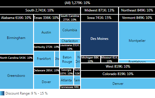
What:
The Treemap is a visualization that shows a distribution of values using differently sized and colored rectangles.
Why:
While the Treemap is now more popular and available in different tools, the Treemap can become even more valuable when it is able to display parts of a whole in a way that handles hierarchies grouping. This allows us to compare different rectangles with other rectangles in the group (i.e. city) they belong too and against other rectangles of other groups (i.e. state).
Learn more: http://www.dundas.com/support/learning/documentation/data-visualizations/using-a-treemap
Pareto Chart
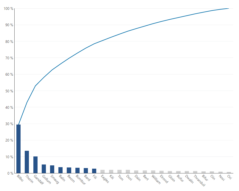
What:
The Pareto Chart contains both bars and a line graph, where individual values are represented in descending order by bars, and the cumulative total of those values is represented by the line from left to right.
Why:
This is a great visual in order to focus on the Pareto principle, which states that, for many events, roughly 80% of the effects come from 20% of the causes. This is also a great alternative to Pie Charts when there are many categories (slices) in your data.
Learn more: http://www.dundas.com/support/blog/pareto-charts-the-vital-few-vs.-the-trivial-many
Waterfall Chart
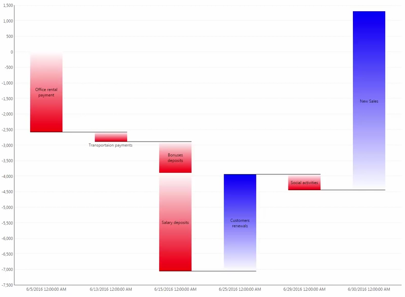
What:
The Waterfall Chart displays changes in the aggregate as an abrupt increase or decrease from its prior value, which is more akin to the nature of this shift.
Why:
While not a new type of visualization – not many tools provide an easy way to create this type of visualization that can be very useful when it comes to illustrating the cumulative effect of a sequence of events such as representations of balance sheets, income statements, cash flows and other sequences, which ebb and flow quantitatively.
Learn more: http://www.dundas.com/support/blog/120-reasons-to-love-waterfall-charts
Data Transitions
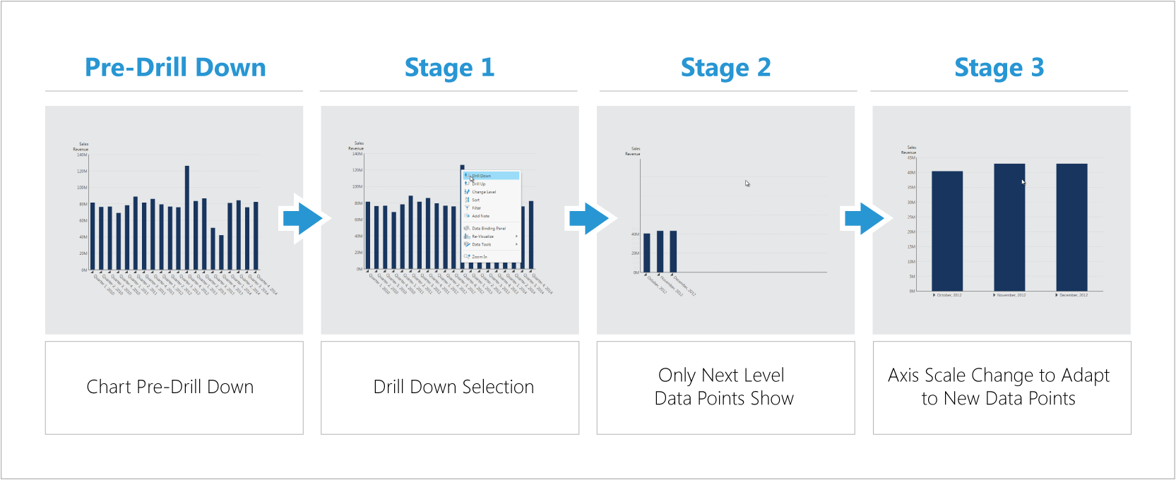
What:
Data Transitions are the ways by which the visual changes upon a user interaction before showing the next visual. For example, when a user clicks to drill-down, this defines how the chart transitions to show the values after the drill-down.
Why:
Many tools offer data animation but not many do so using best practices that can really help the user better understand data. Data animations, or better named “Data Transitions”, can readily support your data discovery by helping you better understand the effect of the interaction you applied to your data.
Learn more: http://www.dundas.com/learning/articles/23-02-2016-easy-data-discovery-with-smart-data-transitions
Maps with Custom Symbols
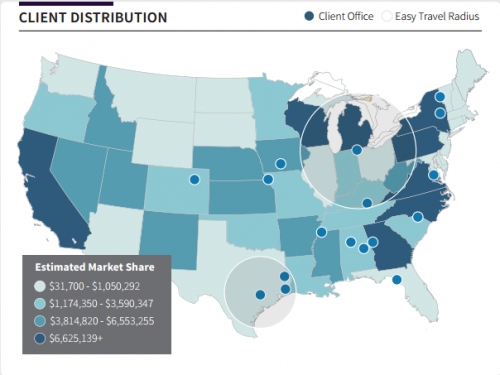
What:
This provides you with the ability to combine color-coded shapes (choropleth) with customizable symbols.
Why:
While plotting geo-data is now common to many visualization tools, not many offer a combined option that can reveal an additional layer of insights. Such insights include the relationship between the measure shown in the shape color, and the one shown using the symbol (color or size), which can be easily missed in separate visuals. This eliminates the need for the user to travel back and forth between different visuals, no longer requiring them to remember the values of one visual when looking at the other.
Learn more: http://www.dundas.com/dundas-bi/features#maps
Correlation Matrix
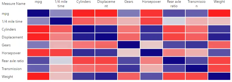
What:
A Correlation Matrix (table) shows the same variables across the rows and the columns and its correlation value, ranging from -1 (Red - negative) to 0 (Light - no correlation) to 1 (Blue - positive). The values situated diagonally from top-left to bottom-right will always be dark blue (value of 1) as that is where the variable is correlated to itself (always 100% correlation).
Why:
This is a great visualization to highlight the positive and negative dependencies between multiple variables within your data in a single visual, rather than having to analyze and look for a hidden dependency one variable at a time.
Learn more: https://www.dundas.com/support/learning/documentation/data-visualizations/using-dundas-bi-recommendations
Parallel Coordinates Chart
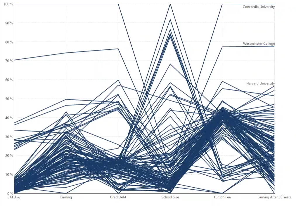
What:
With a Parallel Coordinates Chart, overlapping lines represent many series of values, each associated with a different variable.
Why:
Analysts can easily access meaningful multivariate patterns and bring comparisons to light by looking at a large amount of series overlapping each other.
Custom Diagram
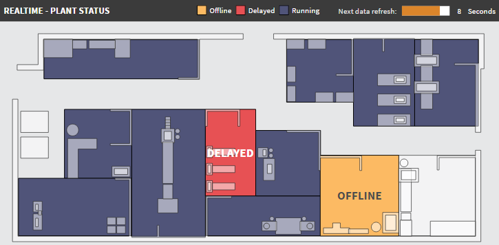
What:
Custom Diagrams allows you to visualize the latest status of workflow processes, manufacturing floors and any other conceptual display via SVG files easily generated in Visio or other tools.
Why:
Seeing performance in a conceptual display that relates to the real environment you deal with (i.e. in oppose to chart or gauges) can be extremely powerful when it comes to the speed in which one can understand data and thus take action on it.
Learn more: http://www.dundas.com/support/learning/documentation/data-visualizations/add-a-diagram-and-bind-it-to-data
Range Bar Chart
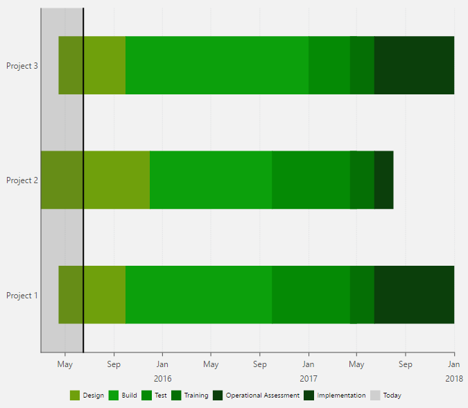
What:
The Range Bar Chart is a Bar Chart that displays bars for each dimension (category), ranging between a start value and an end value. For example, Range Bar Charts can be used to represent the beginning and end of operations/tasks along a time axis, similar to a Gantt chart.
Why:
Range Bar Charts are a great tool to track measurement ranges, tasks and project schedules adherence.
Mekko Chart
What:
The Mekko Chart is a Bar/Column Chart whose column widths are scaled such that the total width matches the desired chart width and there are no gaps between columns.
Why:
This is a good visual to use when tracking growth against actual size for categorical data. For example, sales growth for a certain product line will be represented as the column height and the total sales value for that product line will be represented as the column width, allowing us to easily spot which products lines are growing and what is their impact on our total sales activity.
Strip Plots and Automatic Box Plots
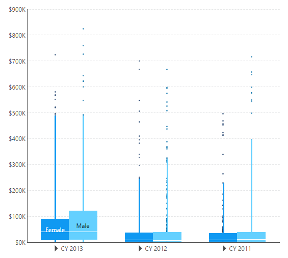
What:
Strip and Box Plots are used to summarize the distribution of data in a compact format.
Why:
Without any custom data prep often needed for this visualization, analysts can quickly identify outliers and concentrations of value within their dataset.
Learn more: http://www.dundas.com/support/support-center/support-articles/data-visualizations/chart/creating-a-box-plot
Histograms
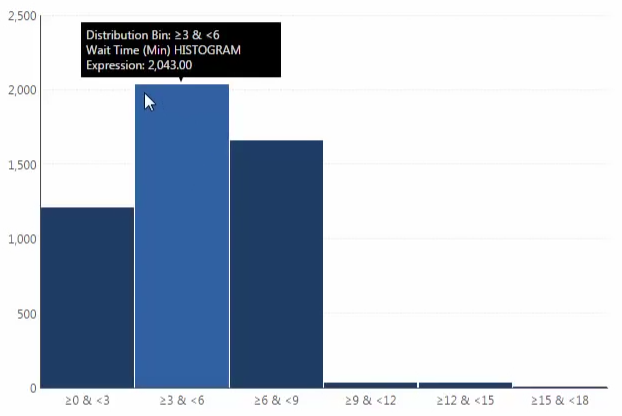
What:
The Histogram is a graphical representation of the distribution of numerical data, which groups each value into a "bin" of values close together, and displays the bin counts across a range of values.
Why:
Use this chart when you have a single set of numeric values and are interested in which numeric values occur the most or least, and want to uncover patterns in how the values occur across the total range (think of product reviews ratings when you want to buy on Amazon). Similar to the Box Plot, this visual often requires data prep, but Dundas BI already takes cares of that for you.
Learn more: http://www.dundas.com/support/support-center/support-articles/data-visualizations/chart/calculate-histogram
Data Image

What:
A Data Image is an image control connected to data, which you can add to your dashboard, report, or scorecard.
Why:
Use Data Images to show different images depending on data values, rather than being forced to use static images.
Learn more: http://www.dundas.com/support/learning/documentation/data-visualizations/adding-a-data-image
Bullet graphs
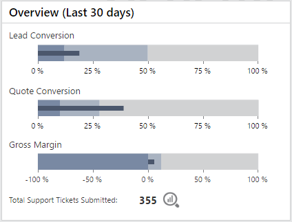
What:
Bullet Graphs, developed by data visualization guru, Stephen Few, are variations of the Bar Chart. It displays an actual value and a target value. It may also show ranges that identify whether the actual or current value is good or bad.
Why:
Bullet Graphs convey meaningful information in a compact space, making them ideal for dashboards that need to display a number of single-valued metrics, such as the current year-to-date sales revenue.
Learn more: http://www.dundas.com/support/blog/the-darlings-of-dashboards
Funnel Chart
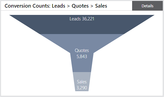
What:
A Funnel Chart helps you visualize a linear process that has sequential connected stages.
Why:
While not always the best way to represent your data when thinking of data visualization best practices, many organizations are used to this type of visualization and users' familiarity should be a factor in your design considerations.
Learn more: http://www.dundas.com/support/support-center/support-articles/data-visualizations/creating-a-funnel-chart
Total Value on Chart
What:
Users visualize not only the breakdown value, but also the total value across all categories in a single chart.
Why:
The ability to display the total values across all the categories is often needed when trying to get a good sense of values, not only against other individual categories but against all other categories at once (especially when looking at average measurements). While this is not necessarily a unique visualization, the ability to combine the total value and the individual values breakdown on a single chart is often not easy or possible to do with many visualizations tools.
Harvey Balls
What:
Harvey Balls are a type of state indicator (also known as a Booz Ball or FAIZ ball), which conveys a score such as a quality or safety rating using 25%, 50%, 75% and 100% filled circles.
Why:
With Harvey Balls, you get a quick status update (i.e. when reading row by row within a table/report) without diving into the exact value.
Learn more: http://www.dundas.com/support/learning/videos-tutorials/data-visualizations/introduction-to-state-indicators
Visual Scorecards
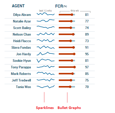
What:
Visual Scorecards are repeating sets of controls allowing the user to have a dense summary of key measures across a repeating category. Some of the common visuals better suited for scorecards are Sparklines and Bullet Graphs.
Why:
Visual Scorecards provide the ability to convey a lot of data in a small dense space. By repeating dynamically across the relevant categories, you are able to assess not just with text but with visuals as well. Specifically, Visual Scorecards are ideal in order to identify trend changes among different categories and trigger the need to dive deeper on a specific category.
Learn more: http://www.dundas.com/support/support-center/support-articles/reports-scorecards/building-a-scorecard
Stock Chart and Candlestick Chart
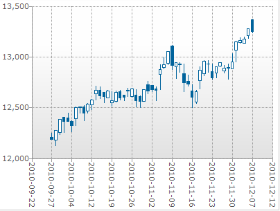
What:
Both charts are used mostly for financial reporting. The Stock Chart describes price movements over time, using bars with ticks to represent a stock's open, close, high and low values. The Candlestick Chart is a variation of the Stock Chart used to describe price movements over time, and is most often used to plot fluctuations in securities and currencies.
Why:
These charts are key for financial analysis as they allow the user to perform price and volatility analysis in one view.
Learn more: http://www.dundas.com/support/learning/documentation/data-visualizations/using-chart-properties
Venn Diagram
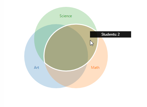
What:
Venn Diagrams show areas where different categories are overlapping. They are mostly good for 3 different categories and their use is limited when starting to overlap more categories together.
Why:
Users can see (in a familiar design) all possible logical relations between finite (ideally 3) numbers of collections of different sets.
Learn more: http://www.dundas.com/support/developer/samples/integration/creating-a-venn-diagram
Any Other Visualization You Can Imagine
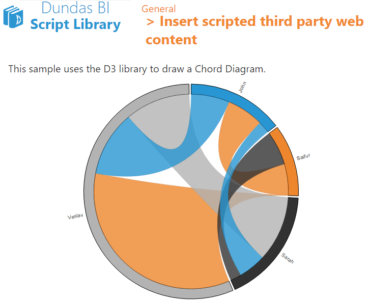
What:
Dundas BI is designed to be 100% customizable. This means it is very easy to use the API and enrich or extend your views with any visualization you wish to create. For example, you can easily include D3.js or any other 3rd party content into your views (like a Chord Diagram), or extended the application and create a completely new type of visualization that is going to be available for all the views (like a sticky note control).
Why:
Get the power to support any business request without being limited to a tool’s out-of-the-box capabilities. Go beyond even the richest set of built-in visualizations to create whatever works best to represent your data.
Follow Us
Support