Easy Data Discovery with Smart Data Transitions - Articles
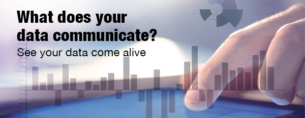
See Your Data Come Alive
What does your data communicate?
Can you see the correlations and insights hiding in your data?
Visual analytics tools that let you explore data, rather than simply view it, result in a better understanding of the underlying data as well as providing opportunities for deeper insights.
Smooth, animated data transitions makes interactive data analysis and visualization even easier, allowing users to easily follow data changes and quickly see data correlations and trends.
The fact is well-designed dashboards get heavily used - and badly-designed ones don't. By avoiding these Seven Deadly Sins, you can end up with a heavenly dashboard design - one that will communicate quickly and efficiently the data points you want communicated, so that those involved can do their jobs better.
Follow Us
Support