Dundas BI 4 - Visualization
Welcome to the third and final installment of our Dundas BI 4 – Feature Series Webinars blogs. These blogs are dedicated to providing more detail in preparation of their respective webinars, which are hosted by Dundas’ R&D teams. Each individual webinar in the series focuses on a different area of the product, giving you valuable insight into how specific segments of the product have been enhanced in Dundas BI 4. If you haven’t had the opportunity to watch the first 2 webinars, or if you missed one of them, be sure to check them out:
- Dundas BI 4 – Feature Series: Operational Reporting blog
- Dundas BI 4 – Feature Series: Operational Reporting webinar
- Dundas BI 4 – Feature Series: Integration blog
- Dundas BI 4 – Feature Series: Integration webinar
Feature Series 3 – Visualizations
This webinar will focus on the new and enhanced visualization options in Dundas BI 4. We’ll walk you through automatic visualization recommendations, new smart visualization options and a variety of new customization options that are now available.
Date – Thursday, May 18, 2017
Time – 11:00 AM ET
Presenter – Jamie Cherwonka, R&D Director, Data Visualizations
Register now: www.dundas.com/learning/webinars/18-05-2017-new-and-enhanced-data-visualization-features
Visualizations Recommendations Engine
Gone are the days where you depend on a graph selection matrix or worse, your own judgment (gasp!). To assist you in designing views, in Dundas BI 4 we now provide guidance and recommendations to help you select the most fitting visualization according to industry best practices. Based on the measures and hierarchies you place on the metric set, Dundas BI will recommend certain data visualizations. Automatic recommendations will not only save you time, but will also help you visualize your data in ways you didn’t consider before to reveal additional insights you may not have seen with traditional visualization selections.
Sankey Diagrams
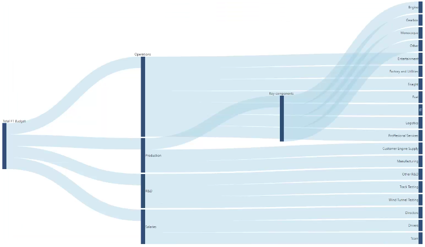
With the release of Dundas BI 4 comes new visualizations, one of which is the Sankey Diagram. This diagram, often considered a sister visual to the Relationship Diagram, is designed to show the relationships in a flow (defined breakdown), rather than by connections without any specific structure. The diagram is made up of ‘links’, where the width of a link is proportional to the magnitude of the flow. The most typical use case for the Sankey Diagram is to visualize distribution and loss of values such as energy, money, and/or materials across a flow (typically from left to right).
Enhancements to the Relationship Diagram and Other Visualizations
While on the topic of relationships, let’s transition back to the Relationship Diagram, and briefly mention the enhancements that have been done to this specific visualization. Going beyond the improvements made to the Relationship Diagram’s link color, length and width, you’ll now be able to change the appearance of the nodes when related data is selected, and change the appearance of links when data related to the Source Name is selected. More importantly, the style for each of these (nodes & links) can be adjusted separately.
In addition to enhancing the Relationship Diagram, Dundas BI 4 has enriched many of the existing visualizations, of which Jamie, our R&D Director of Data Visualizations, will go into much greater depth in his feature webinar.
For more information on Dundas BI’s new and enhanced data visualization features, you can learn more here: http://www.dundas.com/support/learning/documentation/release-notes/what-s-new-in-dundas-bi?v=4.0#h2-data-visualizations

