Dashboard design plays a crucial role in structuring and communicating information. Too often are dashboard designers focused on either style or substance, failing to blend the two to deliver a dashboard that simplifies data, tells a clear and concise story, and ultimately conveys useful information and insights in a beautiful, digestible manner.
The importance of dashboard design should never be understated. When designed well, dashboards become experiences, highly visual hubs of data that present precisely the right amounts of data at the right times to guide people to make better, more impactful decisions. When designed poorly, dashboards have a tendency to make data even more incomprehensible than in their raw states.
Earlier this year, I wrote an article showcasing four unique tips for designing better dashboards in Dundas BI. In it, I offered a few non-traditional suggestions on how features specific to Dundas BI could be used to evoke emotion from your users and keep them coming back for more. We discussed how to use color more effectively, how to create customizable templates to give your solution a more uniform and ergonomic look and feel, how to save appearance settings (for components, data visualizations, filters, etc.) with themes and styles, and how custom menu navigation settings can enhance the user experience.
And while that article is comprehensive, it barely scratches the surface on dashboard design in Dundas BI, and the role design plays in engaging users and imparting critical information in a timely fashion. That’s why we reached out to our customers to ask them – based on their experiences with Dundas BI – if they had any tips on designing better dashboards. While there were many responses, each which could have commanded its own blog, here’s one response that stood out:
“… I never design anything that doesn’t have a baseline, threshold, comparison, or goal. Basically, never put out a number without having context for that number. Whether it’s an internal goal or a year-over-year comparison or anything else you can dream up, [a threshold] tells consumers what [your numbers mean] in real business operation terms. My personal favorite Dundas BI tool for this is States…”
The simplicity of this is staggering, yet so important. Too often do we see information displayed without the context of business goals and strategy. There is immense value in context in analysis. Data without context is simply data. Data visualizations without context are simply data arranged visually. And dashboards without context are misleading, unrepresentative, subjective views that impose false senses of security, and deter users from participating in data-driven decision making. Maybe that’s a bit hyperbolic, but you get the message. Without context surrounding your output, there’s no story to tell; there’s nothing that resonates with your audience; there’s no change in behavior.
So, what role does design play in contextualizing your analysis? Outside of attributing KPIs to frame our data, how can we leverage design – and by extension, design features – in Dundas BI to communicate more accurately and drive change? Well, how about we take a page out of our customer’s notebook and take full advantage of states!
What are states?
States are used to check for conditions in your data that you define. They can be used to indicate whether or not data is within a certain range, call attention to specific data points, or to otherwise customize visualization settings for certain data. Even better, states can be compared against other measures, values or period-over-period comparisons, or used to compare the values of a hierarchy against a pre-specified value.
A common use case for states, is for displaying good and bad conditions, or for highlighting outliers in the data.
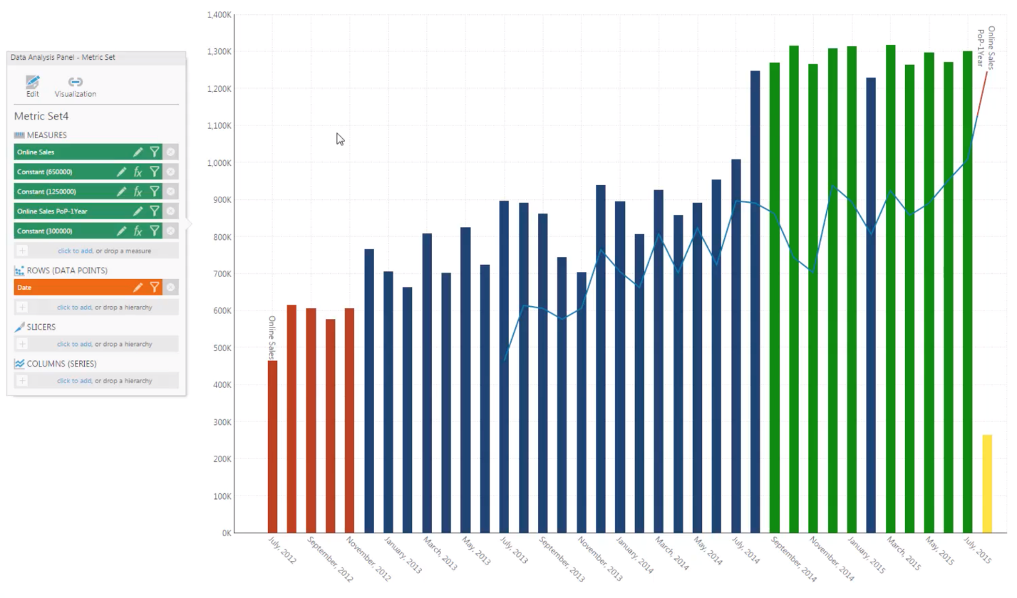
If we refer to the above image, you can clearly see which values are good (those in green), which are bad (those in red), and which are outliers (those in yellow). This is an incredibly powerful design tool as it allows users to immediately contextualize the data in front of them. Remember, businesses use dashboards and data visualizations because they don’t want to sift through or frequently analyze data to arrive at some conclusion. States negate the need for additional analysis by contextualizing and communicating to the user what is happening with their data. By using states to change the visual properties on data points, end users will be more likely to notice patterns and trends, and spot issues while performing analysis.
Setting up states
In Dundas BI, states are applied to metric sets, which are groups of measures and dimensions that can be created and later used to power data visualizations. A metric set can have multiple groupings of states – what we refer to as state groups – where each group is associated with one measure. In turn, state groups can have one or multiple states within them. By setting up states on a metric set we can alter the visual properties of a data point to make it easier to spot and ultimately do a better job of conveying important information about special values to the end user.
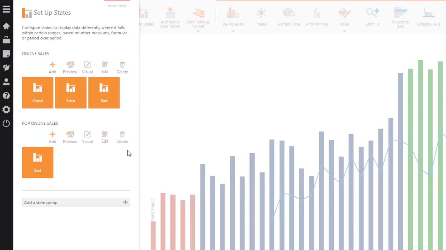
Take the following image for reference. Using the same data visualization as above as our example, you can now see how we’ve set up our states. We’ve created a state group based on the measure online sales and included within it states that dictate how data points should appear depending on their values. To demonstrate how multiple state groups can exist on a metric set, we’ve also included a second state group, period-over-period online sales. States are set up this way to provide a more structured and organized experience.
For more details on how specifically to set up states, I encourage you to watch this video. To access this video, you must create a free account on Dundas’ Support Site.
Visualizing states
Every data visualization has a state style property, which is available via an easy-to-use properties panel in Dundas BI. A state style dictates how a data point that belongs to that state will appear on the visualization. The list of properties that can be styled varies depending on the type of data visualization (i.e., on a Bar Chart, properties such as fill color, stroke, stroke width, and markers can be styled). What this means, is that there are many different ways to style your dashboards and data visualizations using states.
Here are some of our favorite examples of dashboards and data visualizations using states to boost their design, legibility, and story-telling capability.
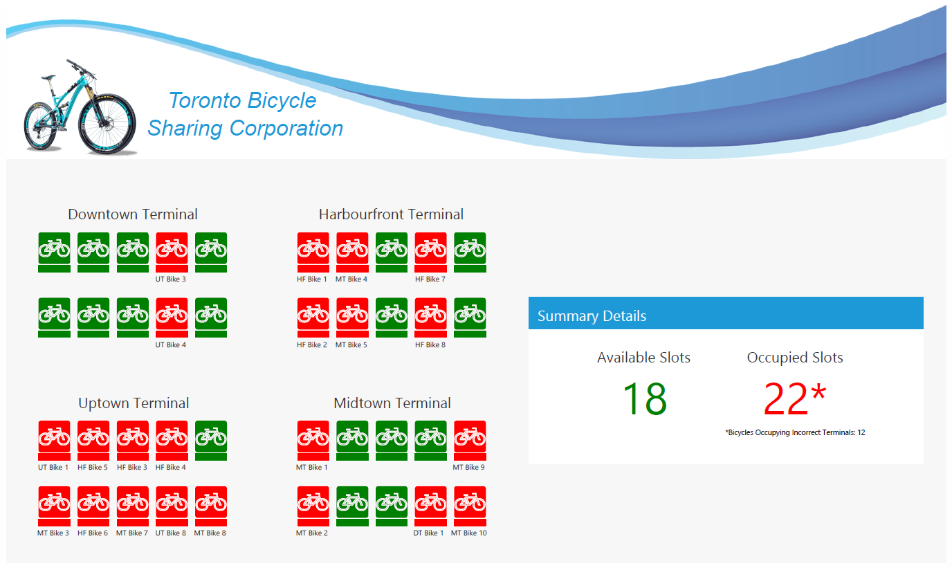
1) Custom Bicycle Sharing Diagram & Dashboard >>>
In this example, we’ve defined shapes in Visio and connected each to data (in this instance, each individual bicycle image). Each shape has been assigned a color that corresponds with its data value (1 for available, 0 for occupied).
2) Production Dashboard >>>
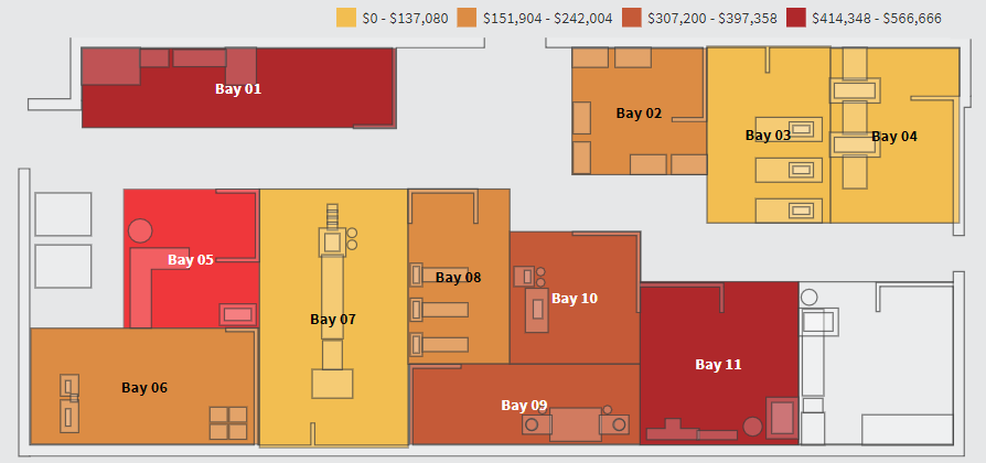
This dashboard displays a multi-bay production facility that has been linked to a dataset. There’s a legend at the top of the dashboard that uses color to denote range. In this specific example, the darker the color of the bay, the higher the loss as a result of defects. By using states, we’re able to immediately visualize which bays require intervention/are suffering and which might be at risk.
3) Data-Driven Notifications >>>
State usage extends beyond simply changing colors as well. For example, Dundas BI can be set up to send automatic notifications when target data enters, or exits a specified state (i.e., receive notifications depending on whether a specific value has decreased by greater than 20% compared to the same value one month prior). States allow for practically any aspect of your data to be monitored, meaning notifications can be sent for any use case!
The state of dashboard design
Good dashboard design helps to contextualize data and give it meaning. It aids in the transformation of data from something raw and incomprehensible, to something visual, substantial, and highly informative. By leveraging easy-to-implement (yet incredibly powerful) states, dashboard designers can change user’s behaviors, impart critical information quickly, and enhance the user experience.
--
*Update* - With the release of Dundas BI Version 8, you’re now able to display values from data in state indicators in addition to the current state in its text or its tooltip popup