There’s something rather therapeutic about a well-designed dashboard – especially one that combines style with substance. How often do you see dashboards that are filled to the brim with data? Ones that’ve thrown caution to the wind and have included every KPI under the sun? Conversely, how often do you see dashboards that are so minimal they’d bring Marie Kondo to tears? You know the ones I’m talking about. Sure they look amazing, but what value is there in showing data without context?
These days, dashboard design is as important as the data itself. It’s no longer enough to simply present the data. Now, businesses and end users are clamoring for dashboards that present them with precisely the right amount of information they need to do their jobs better, to alert them when to take timely action, and to guide them into brighter futures.
Designing good, easy-to-read, enticing dashboards is no walk-in-the-park. It can be a daunting challenge for the most seasoned designers and developers. But, lucky for you, I’ve got 4 unique tips to designing better dashboards in Dundas BI.
These tips go beyond traditional design tips. After all, we want you to not only create dashboards… but dashboard experiences.
These tips are specific to Dundas BI and are intended to help make sure your next dashboard is your best one yet. These are suggestions you won’t find anywhere else. Think about the experience you want your users to have when they consume your dashboards. If you want to evoke emotion and keep them coming back for more, you’ll want to incorporate one – or all – of these tips into your next dashboard.
TIP 1 – Learn to use color more effectively
A bad or mediocre meal is more than the result of poorly sourced ingredients and shoddy chef-work. It’s the culmination of a host of factors, from ambience to service levels to drink prices. And it all begins with the first impression – which is what the restaurant looks like from the outside.
And while the appearance of a restaurant may have no direct correlation with the quality of food it serves, the stats prove otherwise. Perception is – unfortunately – everything, and the appearance of a restaurant will impact how the food is perceived. The same goes for dashboards. If your dashboard is half-baked and poorly designed, it’s not a stretch for the end user to question whether the data is equally as cobbled together, or if the formulas in use are incorrect. The simple truth of the matter is, a better design equals a better dashboard. But where do you start? Well – we think color’s as good a place as any!
But we’re not talking color in general. We’re talking about one, very specific way in which color can be used to design better dashboards in Dundas BI. The key is to use one color, and one color only. Figure out what your users are interested in, draw attention to that using a strong color, and either get rid of all other colors, or use muted colors if necessary.
This gives you less variables to worry about. Take the following image for example. How will you determine which individuals are receiving a score of less than 95?
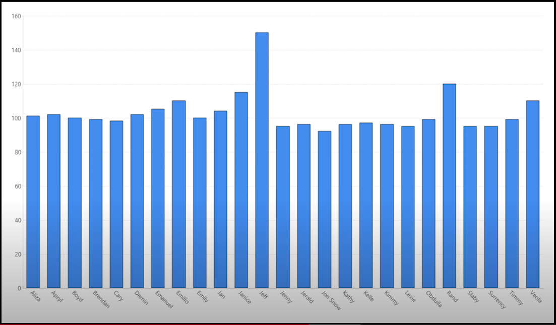
At-a-glance, this isn’t terribly easy to conclude. However, since you know exactly what you need to show, you can leverage – and by extension, omit – color to structure your visualization so that it’s displaying precisely what your users need to see.
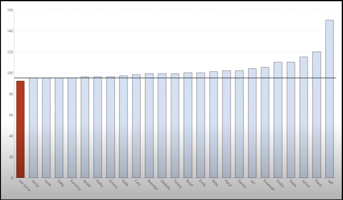
The red not only helps users identify more quickly what it is they’re looking for, but it also improves the readability and overall design of the dashboard. For a more detailed view on how to use color effectively, I encourage you to watch our video – How to Effectively Use Color in Dashboards. Beyond what I’ve covered, it touches on how to select color palettes, the importance of hues and intensity, and much more.
TIP 2 – Up your dashboard game with templates
If you’ve built a dashboard in Dundas BI, then you’re likely familiar with templates. Most people think of dashboard templates as a common place for adding graphics and styling elements – such as banners, logos and other repeating elements – which other dashboards can then inherit. Templates are well liked due to how well they lend themselves to dashboard maintainability, as changes made to template elements in turn are made to the dashboards they’ve been applied to.
What people aren’t necessarily aware of, however, is that templates can be used to design better dashboards, by giving your entire Dundas BI solution a more uniform and ergonomic look and feel – beyond the additions of styles, colors and graphics.
Dundas BI offers complete control over your visual design, and templates are no exception. Just about any aspect of them can be modified to fit your own custom dashboard designs. You can actually make your dashboard templates interactive; you can apply scripts; you can even have multiple applications running as part of an individual template – there are endless styling options.
For example, did you know that you can use templates in Dundas BI to create sliding menus like this? Talk about a great way to better your dashboards and enhance the user experience:
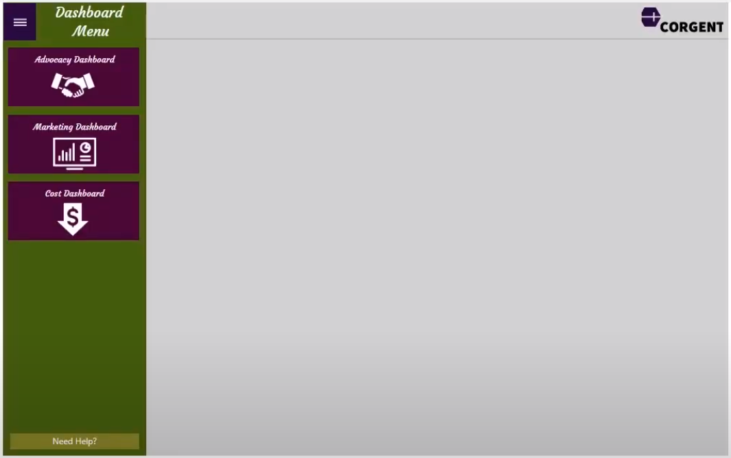
To learn more about how to up your dashboard game with templates, and to create customizable templates like the one above, watch our video – Up Your Dashboard Game with Templates. Your users will thank you.
TIP 3 – Save time on design with themes and styles
The purpose of brand guidelines, is to give your brand consistency; they set the tone for everything from brand identity to typeface usage and educate everyone internally on how to best represent the brand. Odds are your company maintains a set of brand guidelines that are published and available for you to use.
While these guidelines often contain a fair volume of marketing lingo – synergy, anyone? – they also contain massive amounts of valuable assets dashboard designers and developers can leverage, such as brand logos, color palettes, photography, illustrations, icons, and typefaces. Dashboard design can be time-intensive and costly. Why not save some time – and in the process design better dashboards that align more closely with your brand – by building dashboards and reports that match the styling of what’s already available, rather than reinvent the wheel?
Your Dundas BI dashboard is built using a variety of controls – charts, tables, buttons, labels, etc. Each of these controls has properties that can be modified to style your visualizations in any manner imaginable. As Dundas BI is an incredibly flexible and customizable platform, it’s highly possible your dashboards contain several controls, each with an assortment of properties.
With that in mind, let’s imagine you had a lot of similar elements on the screen that you wanted to all look the same. It’d become quite tiresome and tedious having to style every single element, one at a time. Fret not, as Dundas BI leverages the concept of Styles and Themes as an easy way to save the appearance settings for components, data visualizations, filters, and a host of other controls and properties.
Rather than style every element on every dashboard you’re able to style one element once – one bar chart, one button, one label, etc. – save it as a Style, and apply those designs to other common elements. Themes work very similar to styles; in that they are simply collections of styles. They can be made up of any number of styles and applied all at once to a dashboard for faster, better designing.
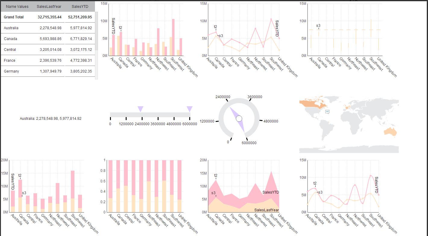
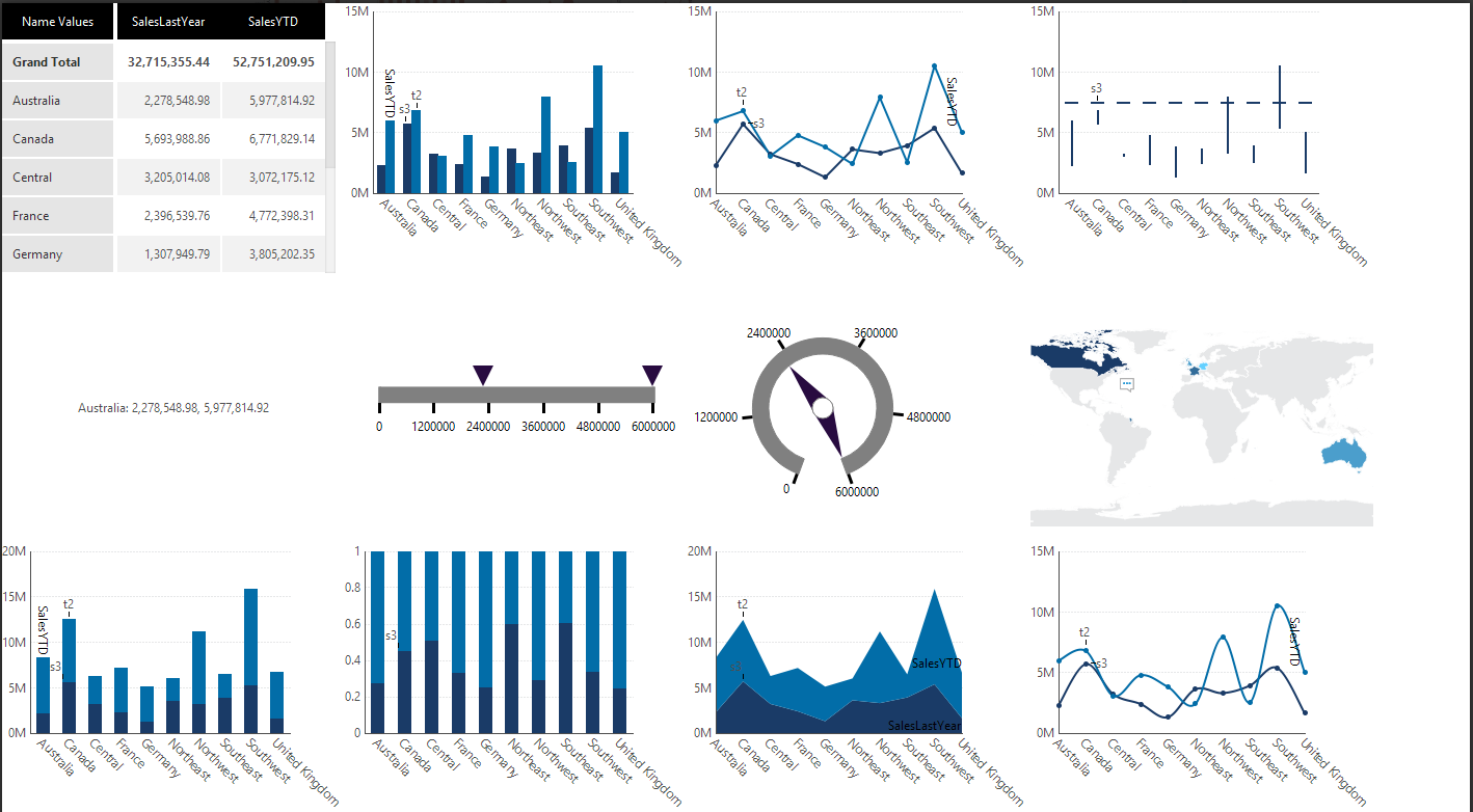
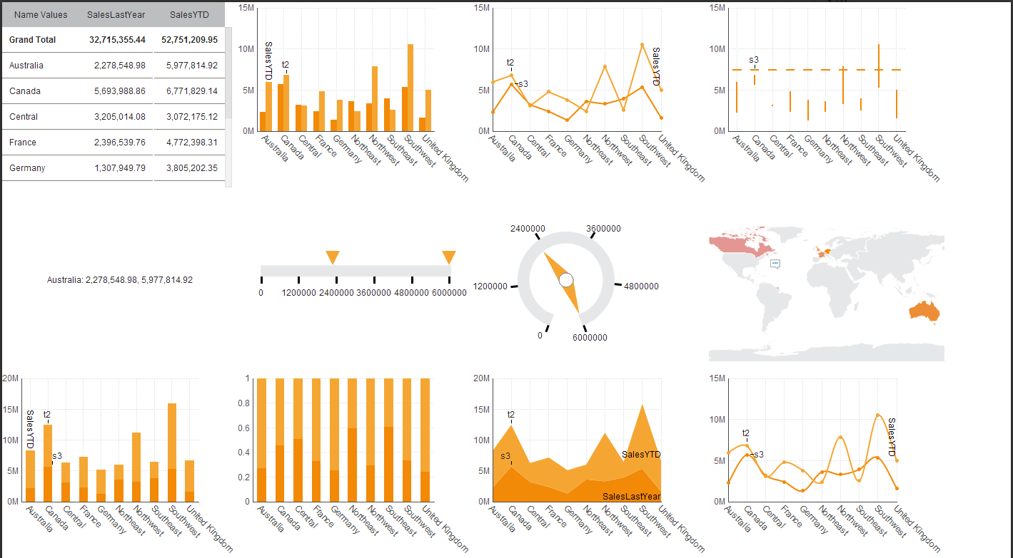
Here’s what a few different controls look like under different built-in themes in Dundas BI. Hopefully these images inspire you to create your own themes!
CANDY
DUNDAS
BRIGHT
Let your users focus on their data and not worry about design. Build better dashboards in Dundas BI that match corporate brand guidelines using Styles and Themes. For more details on how to save time by applying pre-built – or custom made – Styles and Themes, watch our video – How to Save Time on Design with Themes and Styles.
TIP 4 – Enhance your user experience with custom menu navigation controls
Humans are emotional creatures, and subsequently, most user experiences are predicated on triggering pleasurable, emotional responses. Dashboards – for the most part – do this well. Especially if you’ve followed tips one through three! However, what happens if your users aren’t even able to even navigate to their dashboards? What if that navigation experience – while it may be functional – is severely lacking in the pleasurable experience department?
Before you say, ‘Jordan, hold up – what does finding my dashboards have to do with designing a better dashboard?’ let me explain myself. Dashboard design extends far beyond the dashboard itself. Much like the quality of a meal is dependent on much more than the ingredients themselves. The more exciting you make your navigation experience – the more applicable you make it to each user – the better your dashboard adoption and engagement rates will be. Adoption is vital to the success of a business intelligence project, and a superior navigation experience can act as a catalyst for retaining a higher volume of standard users.
The default Home Screen provided by Dundas BI is no slouch. It contains everything one needs – and then some – to navigate the business intelligence application. That said, navigating the application to find the exact dashboard you’re looking for can be a daunting task if you – or more likely, your end users, as they’ve not authored the content – are unfamiliar with the application.
Would you rather your users access your dashboards via the default Home Screen – whose branding is not reflective of your own company’s, by the way…

… or would you rather have them land directly on the dashboards most relevant to them – with simple-to-follow navigation tools baked in?
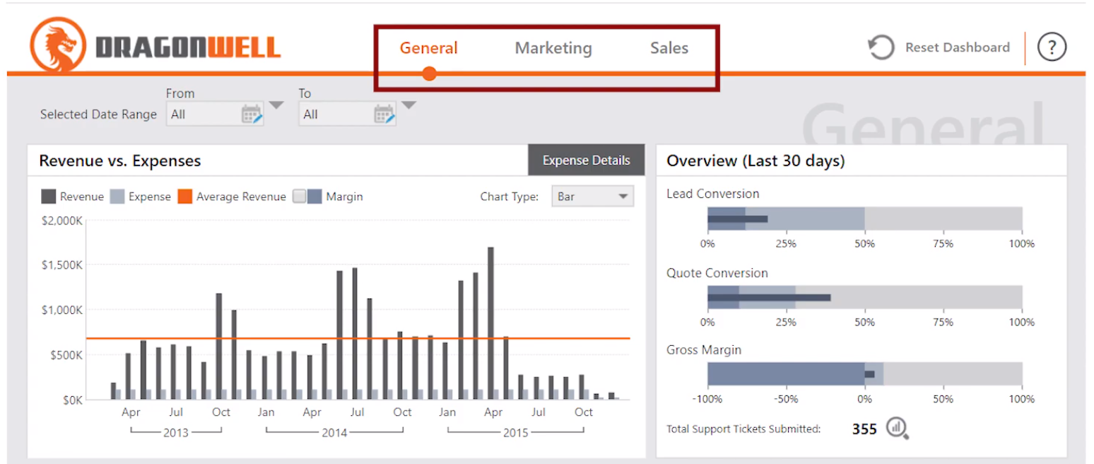
How about giving your users the ability to easily select which dashboard they’d like to view, without having the fuss of extra menus and options to cope with?
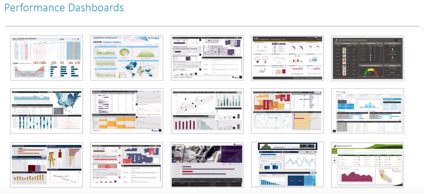
With Dundas BI, you’re able to enhance the user experience with custom menu navigation controls, ensuring your users reach the dashboards that are relevant to them, faster. For more details on ways to customize the navigation experience why you should build a custom navigation experience as part of your approach to designing better dashboards, I highly recommend reading our blog – Tackling Your Business Intelligence User Navigation – or watching our video – Enhance Your BI User Experience Using Custom Menu Navigation Controls.
Regardless of how your navigation is composed, the fact that you’ve built it with your users in mind will resonate deeply with them. They will appreciate the effort and in turn have a better experience.
These are just a few unique tips to designing better dashboards in Dundas BI. Do you have any others to add? We’re always looking for ways to improve the dashboarding experience. Let us know at This email address is being protected from spambots. You need JavaScript enabled to view it.!


Follow Us
Support