
1. Overview
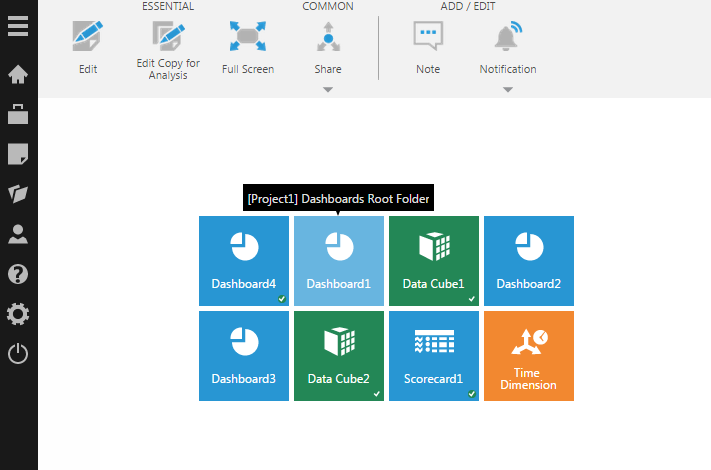
Tile Navigation is a component which you can add to the canvas of your dashboard or other view. You can use it to create a dashboard solely for navigation, or simply add a navigation bar next to your other content.
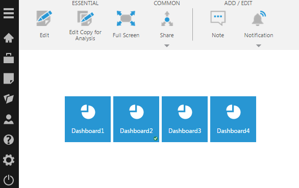
Users navigate with this component by clicking tiles like the ones on the home screen, which can similarly display thumbnail previews of views such as dashboards that have been checked in.
2. Add a Tile Navigation component
Go to the toolbar, click Components, and then click Tile Navigation.
You'll see a block of tiles like the ones on the home screen. By default, the tiles correspond to your recently viewed items.
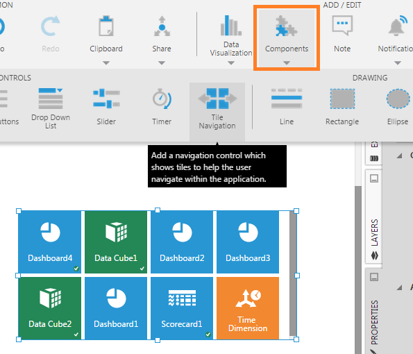
Switch to View mode to use the component. Click on a tile to navigate to another dashboard, for example.
3. Properties
By default, the Tile Navigation component is configured to show recently viewed items. You can change this as well as customize the appearance of the tiles from the Properties window for the component.
3.1. Open
Use the Open property to specify what happens (or where to navigate to) when a tile is clicked. In recent versions, find this in the Design tab under Animation & Interaction.
The available options are:
- Open the clicked item in the same window (selected by default)
- Open the clicked item in a new window
- Open the clicked item in an embedded view (i.e., a view container elsewhere on the canvas)
- Invoke a Tile Clicked script action (Nowhere option)
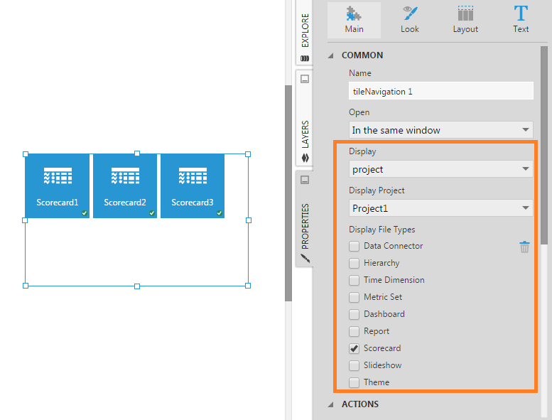
3.2. Display
Use the Display property to specify what tiles to display. The available options are:
- Display tiles corresponding to the list of recently viewed items
- Display tiles corresponding to the child items of a selected folder
- Display tiles corresponding to items in a selected project with a certain file type
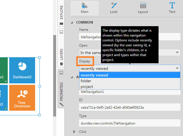
3.2.1. Displaying recently viewed items
When the Recently Viewed option is selected, the Tile Navigation component displays items that the current user has recently viewed, which is different for each user.
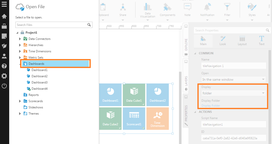
3.2.2. Displaying a folder
When the Folder option is selected, click to Select the Display Folder and choose a folder in the active project. Tiles will be displayed for each immediate child item in the folder.
3.2.3. Displaying a project
Choose the Project option in order to display tiles corresponding to items in the project selected as the Display Project.
You can set Display File Types property to limit the types of files that are displayed.
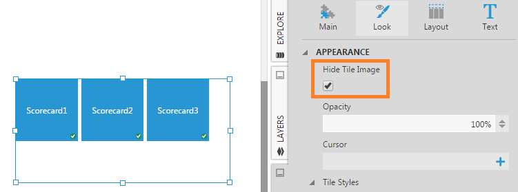
3.3. Hide Tile Image
In the Design tab under Lines & Fills (previously the Look tab), select the Hide Tile Image option if you want to display only text in the tiles.
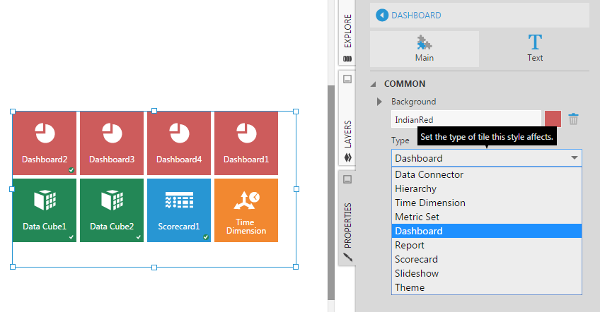
3.4. Tile Styles
Tiles for dashboards have a different background color than tiles for data cubes. You can customize the background color of tiles on a per-file type basis by adding one or more tile styles.
In the Design (or Look) tab under Tile Styles, click the plus sign to add a tile style. A tile style for dashboards is added by default (named Dashboard).
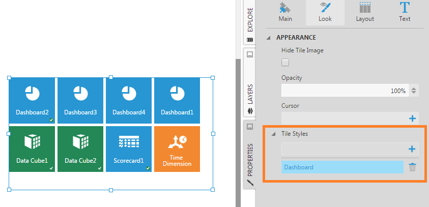
Click the tile style to edit it. You can now set the background color or change the file type it applies to.
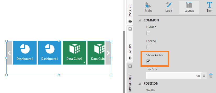
3.5. Show As Bar
By default, tiles are displayed in a rectangular grid that wraps depending on the size of the component. You can change the component to display the tiles as a horizontal bar with left and right arrow buttons as needed (similar to the toolbar).
In the Design tab under Layout & Spacing (or Layout tab), select the Show As Bar option.
3.6. Tile Size
Use the Tile Size property in the Design tab under Layout & Spacing (or Layout tab) to change the size of the tiles in pixels.
4. See also