Using a range bar chart and visualizing a project schedule (Gantt like chart)
1. Overview
A Range Bar chart displays bars ranging between a start value and an end value. When those values are dates/times, Range Bars can represent the beginning and end of operations/tasks along a time axis, similar to a Gantt chart, for tracking project schedules.
This article demonstrates a few Range Bar chart configurations that can be used to visualize this type of data.
2. Range bar charts
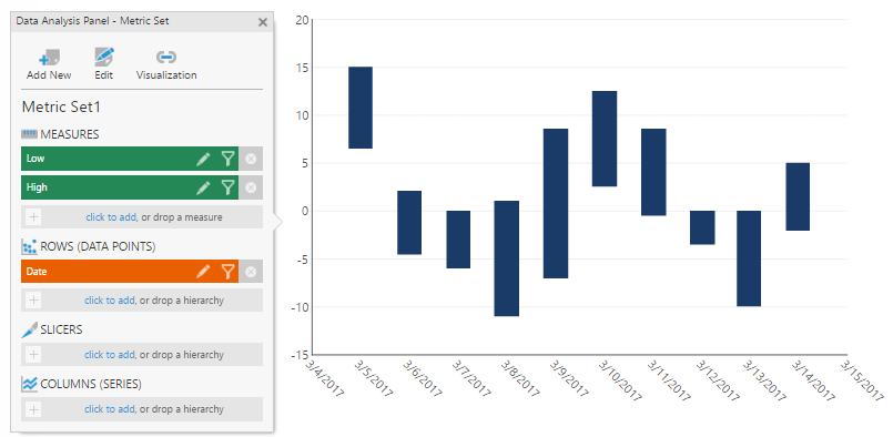
A basic range bar chart configuration looks like a typical bar chart, but with two measures instead of just one: one for the start and one for the end of each bar.
For example, in the following chart, the measures represent the ranges of daily temperatures:
There are also other ways to configure a range bar chart:
- You can switch the bars to be horizontal instead of vertical.
- You can use dates or other types of values to determine each bar's range, along a different type of axis besides numeric.
3. Showing task schedules and dependencies
A project can have multiple phases, such as Planning, Design, Implementation, etc. Each phase can have milestones and dependencies.
You can use a Range Bar chart to show these milestones and their dependencies within a project phase.
3.1. Data preparation
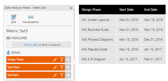
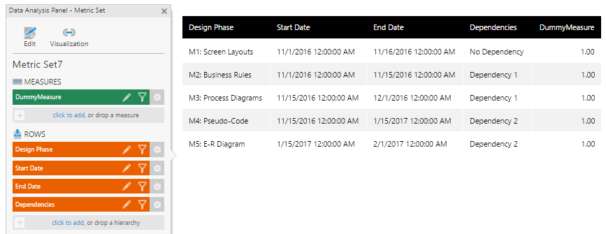
The following table is used to create the chart. It has five milestones (M1, M2, etc.) and their timelines from the Design phase of a project. M3 is dependent on M2 and M5 is dependent on M4.
3.2. Creating the chart
Re-Visualize your data into a Range Bar chart.

In the toolbar under Chart Properties, click to display Horizontal Bars.
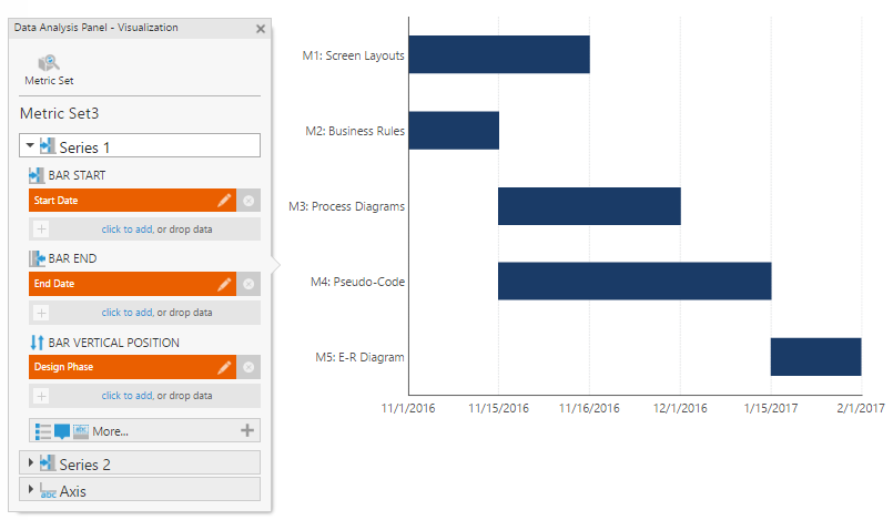
Since the range bar series will be created using start and end dates instead of two measures, you may need to configure the Data Analysis Panel Visualization settings accordingly:
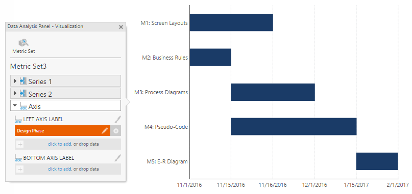
Also, make sure that you have the appropriate hierarchy as your axis.
In the Properties window for the chart, click to select the bottom axis, and set the Scale Type to Date/Time.
For this chart example, the Skip Missing Data option is selected under Bottom Axis 1 > Intervals in order to show only the dates available in the series.
3.3. Indicating task dependencies
There are multiple ways to indicate dependencies among tasks. One option is to make use of states and creating state styles to indicate dependencies.
We have added a Dependencies column to our example data for this purpose:
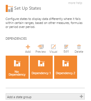
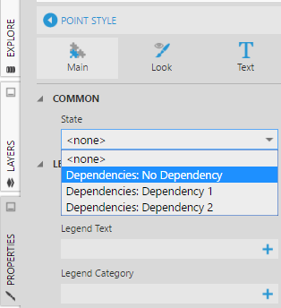
Create a state group named Dependencies and add states like the following:
You can add conditions in the Configure State dialog to compare hierarchy values, creating a state for each type of dependency. See the article setting up states on a metric set for the details on how to do so.
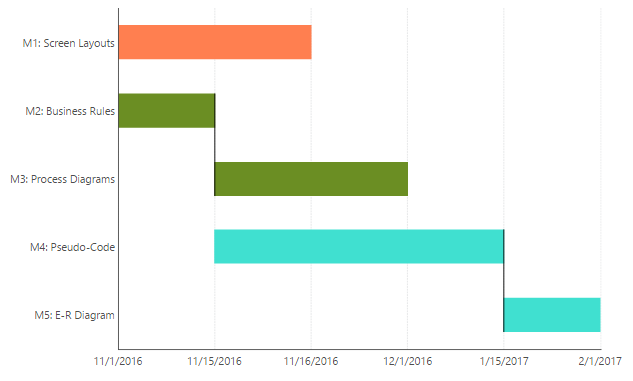
In the Properties window for the chart, select your data point series, and click + to add three State Styles. For each style, set the corresponding State and Fill color.
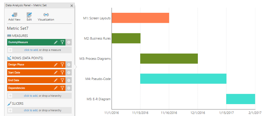
As an additional step, you can show connecting lines between tasks to indicate the tasks that are supposed to run in sequence, e.g. connecting M2 to M3 and M4 to M5.
In the Properties window for the chart, select your data point series, open Lines & Fills (or the Look tab), and set Connecting Line to Bridge.
4. Showing the project schedule for multiple projects
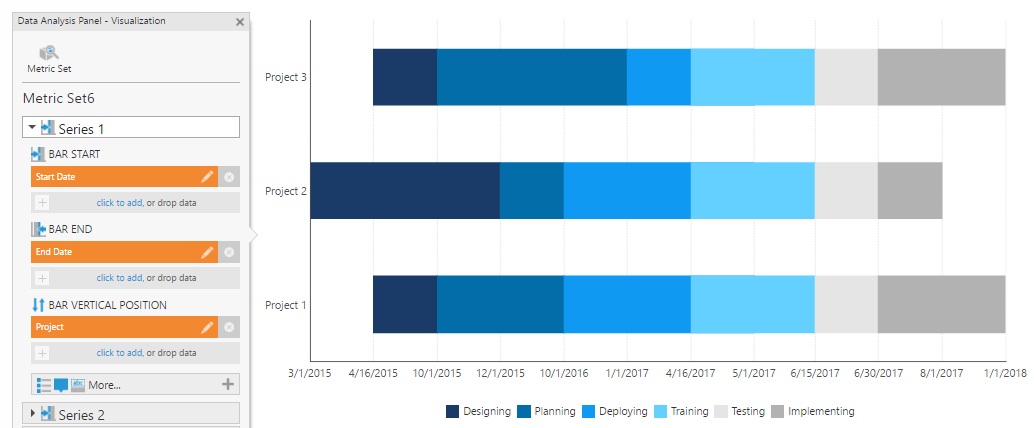
You can use a Range Bar chart to display a schedule with multiple projects, along with their phases.
4.1. Data preparation
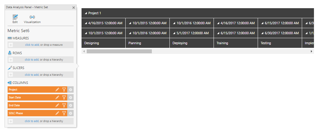
The following data is used to create the chart. It shows several project phases along with the start date and end date for each project.
4.2. Creating the chart
With your data added as shown above to a metric set or dashboard, Re-Visualize into a Range Bar chart. Under Chart Properties in the toolbar, click to display Horizontal Bars.
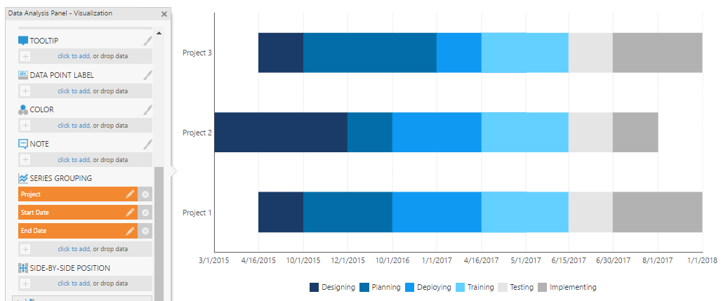
Make sure that the Visualization tab of the Data Analysis Panel has the following settings:
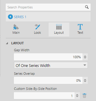
In the Properties window for the chart, select your data point series, and under Layout & Spacing (or the Layout tab) set the value of Custom Side-By-Side Position to 1.
In the properties for the bottom axis, set the Scale Type to Date/Time.
(In this example chart, Skip Missing Data is selected, and Interval Method is set to Show Data Point Values to include only the dates available in the series.)
5. Miscellaneous
5.1. Adding a line to indicate the current date
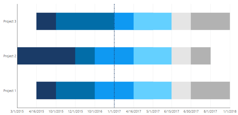
Often there is a requirement to show a vertical line in the chart to indicate the current date. This is useful to highlight where the project schedule stands. For the example shown above, you can add another metric set to the same chart using the Data Analysis Panel.
In the following example, the hierarchy Now has the current date.
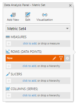
Adding this metric set will create a new data point series to the chart: in its properties, set Series Chart Type to Line.
In the Visualization tab of the Data Analysis Panel, add this hierarchy under Horizontal Position.
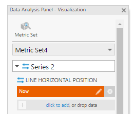
This will show the current date as a vertical line.
5.2. Adding milestone dates
You may want to show the milestone dates of each phase within a project timeline. Assume that you have the following chart:
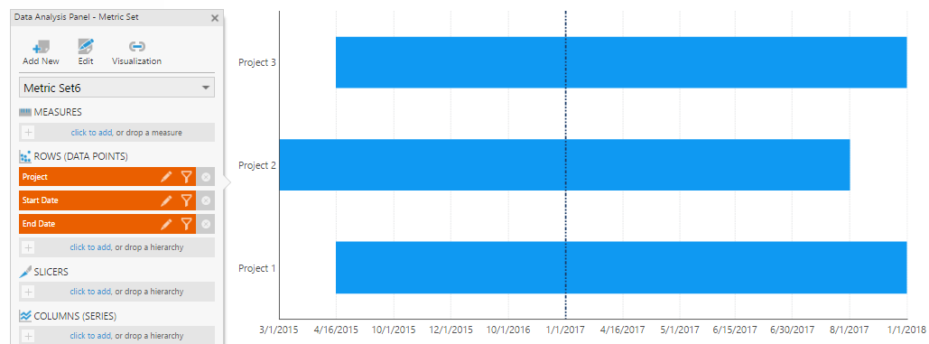
You can add another metric set using the Data Analysis Panel to create a new data point series, and in the Properties window set its Series Chart Type to Point.
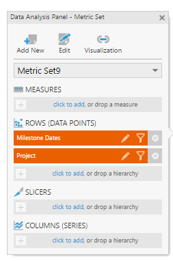
The Data Analysis Panel's Visualization tab should have the following settings:
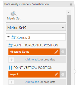
In the series properties, we have set the Fill for the markers to White and the marker Shape to Diamond.
Now you can see the milestone dates along the project timeline for each project. You can use states and state styles for the point series to illustrate the status of the milestones (i.e., In-progress, Delayed, Completed, etc.).
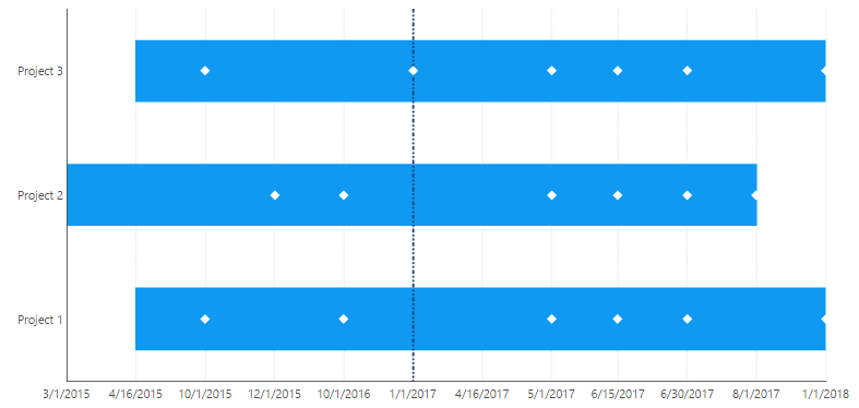
You can also make use of notes to record and show further details about the project milestones.

