
1. Overview
Color-based properties of visualizations, components, and other design elements often are actually 'brushes' which can be any of the following brush types:
- Solid Color
- Linear Gradient
- Radial Gradient
- Image
- Hatching
The image brush type in particular allows a button, for example, to be displayed as an image that you can specify instead of a solid color. You can also use this option to create customized state indicator states based on images.
2. Using an image brush
For this example, create a new dashboard and add a Button component from the toolbar.
Go to the Properties for the button, expand Lines & Fills (or the Look tab), and then open the additional Rest Background property options.
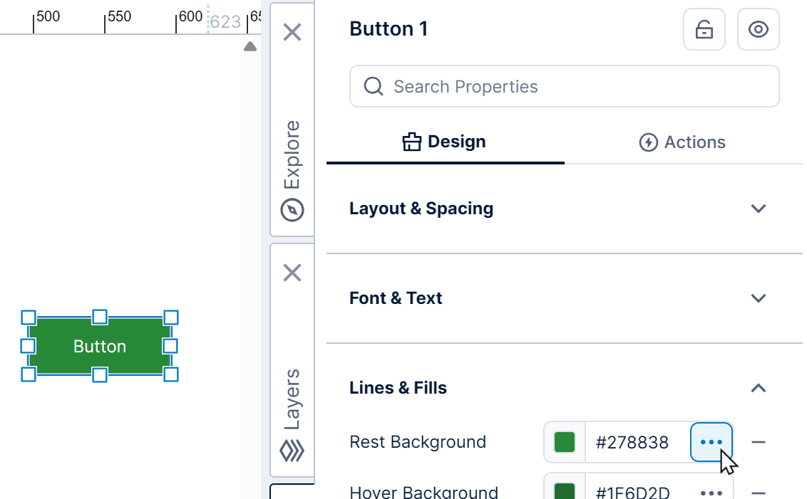
This property determines the background color of the button when at rest (no user interaction).
Click the Brush dropdown and set it to Image, which loads a placeholder image by default and updates the button accordingly.
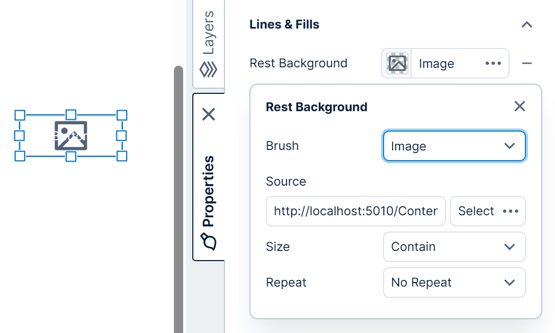
Next, customize the image brush as described in the following sections.
2.1. Source
There are two options for specifying the image source: you can set Source to a URL that points to an image (e.g., https://www.example.com/images/image1.png), or you can select an image resource uploaded to the application.
To use an image resource, click the Select button.
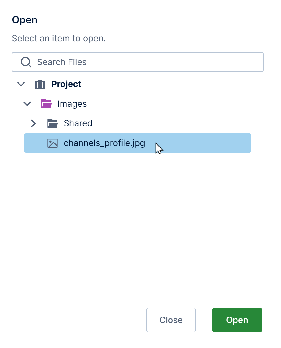
In the Open dialog, you can right-click the Images folder to upload a new one. Select one of the listed image resources and click Open to continue.
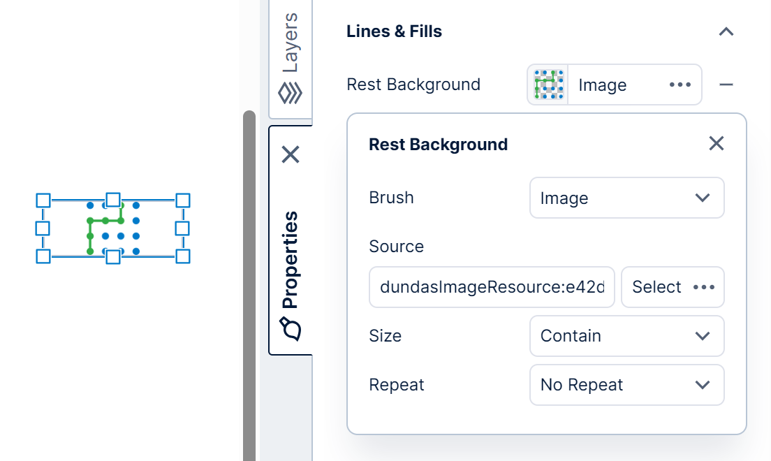
The button is now displayed as an image on the canvas. In the Properties window, you can see a small preview of the loaded image as well. You can now clear the text displayed by the button if you want to display only the image, and optionally set an ARIA Label instead.
In the case of an image resource, the Source setting looks like this:
dundasImageResource:e0011d1d-62ac-4d81-b532-287287741f14
The portion of the above text after the colon is the ID of the image resource (which you can also get from the image resource's properties).
2.2. Size
The Size setting offers the following options:
- Auto - The image size is automatically determined.
- Cover - The image is sized so that it covers the available content area.
- Contain - The image is sized so that it is contained within the available content area.
- Fill - The image is stretched to fill the content area without taking the aspect ratio into consideration.
2.3. Repeat
The Repeat setting specifies how the image will be repeated within the content area. There are two options:
- Repeat
- No Repeat
3. See also