
Using a template grid for resizing
1. Overview
This article shows you how dashboards can adapt to different screen sizes, such as monitors, widescreen TVs, and tablets.
A template grid can be added to any dashboard for an easy drag-and-drop grid layout, but you can also use it in a resizable or responsive dashboard to resize its contents.
Related videos:
2. Set the view size
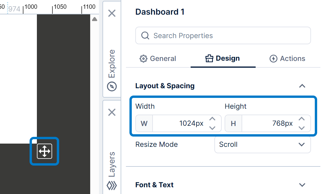
The size set up for a dashboard when editing is often used to determine its size and layout when viewing.
When editing, you can drag the resize icon in the bottom right corner.
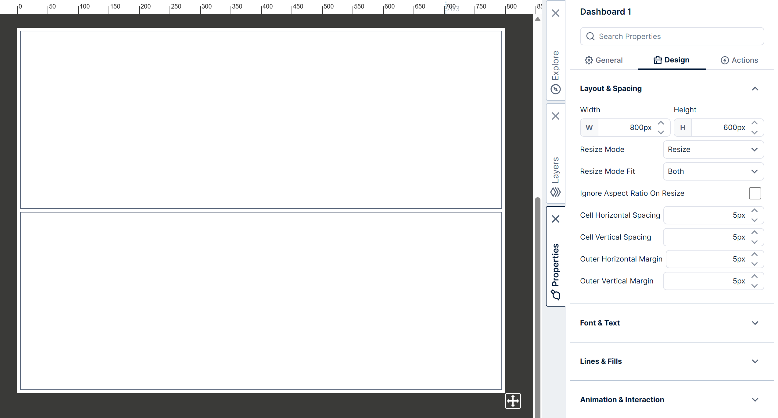
This updates the dashboard's Width and Height properties accordingly, found in the Properties window under Layout & Spacing, or you can also set these properties directly.
3. The Resize Mode property
When viewing the dashboard, its size can change according to the dashboard's Resize Mode property, which has four options: Scroll, Scale, Resize, and Responsive.
This property is found in the Properties window for the dashboard under Layout & Spacing. (If an element on the dashboard is selected, click an empty part of the dashboard to access its properties.)
3.1. Scroll
When you create a new dashboard, its Resize Mode property is initially set to scroll. In this mode:
- The dashboard does not change size (width or height) when you resize your browser window.
- The elements on the dashboard (e.g., charts, filters, and components) do not change size or position relative to the dashboard when the browser window is resized.
- If the browser window is resized large enough, the dashboard will be centered horizontally and positioned at the top of the viewing area.
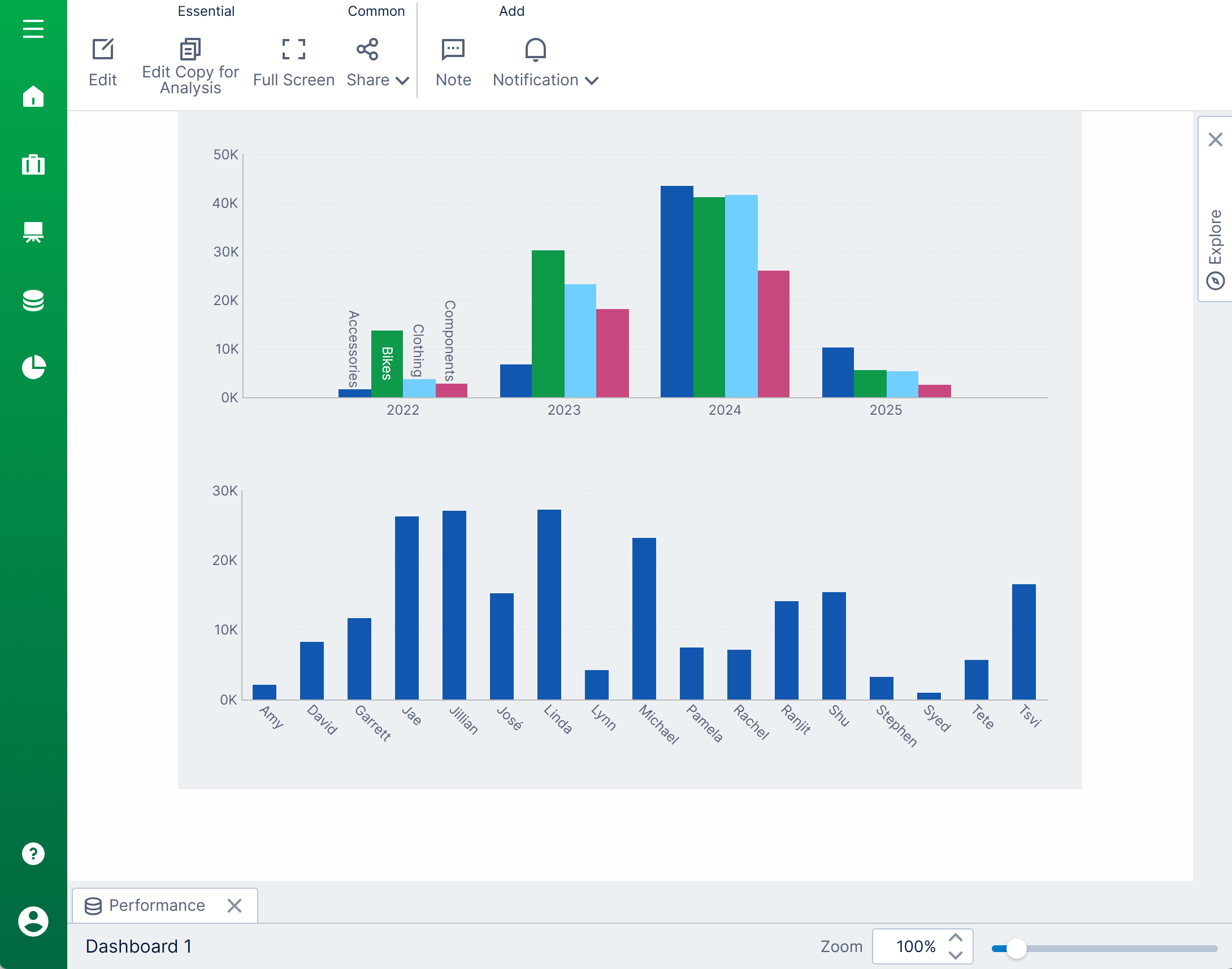
- As the browser window is resized smaller, scrollbars will appear, allowing you to scroll the parts of the dashboard you want to see into view.
- You can use the zoom slider and the view panel in the status bar to zoom in, zoom out, or pan the dashboard.
- 'Pinch-to-zoom' will also work in scroll mode on touch devices.
- No further design work is necessary other than deciding on the width and height of the dashboard. The dashboard contents will look more or less the same using different monitors, devices, and resolutions.
- If your dashboard is very large, important information may be scrolled out of view initially and potentially missed by a viewer.
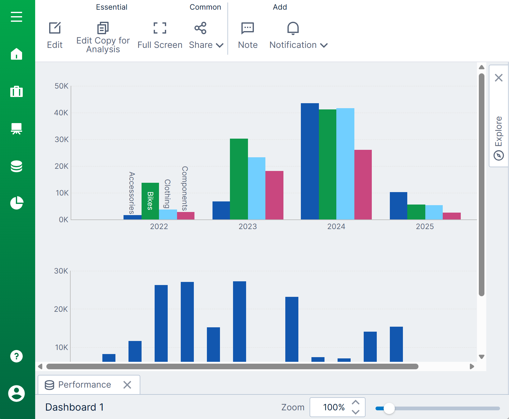
3.2. Scale
When the Resize Mode property of a dashboard is set to scale, the dashboard and its contents will be scaled to fit the available viewing area. In this mode:
- The entire dashboard will be initially visible without any scrollbars present. This is also the behavior whenever the browser window is resized.
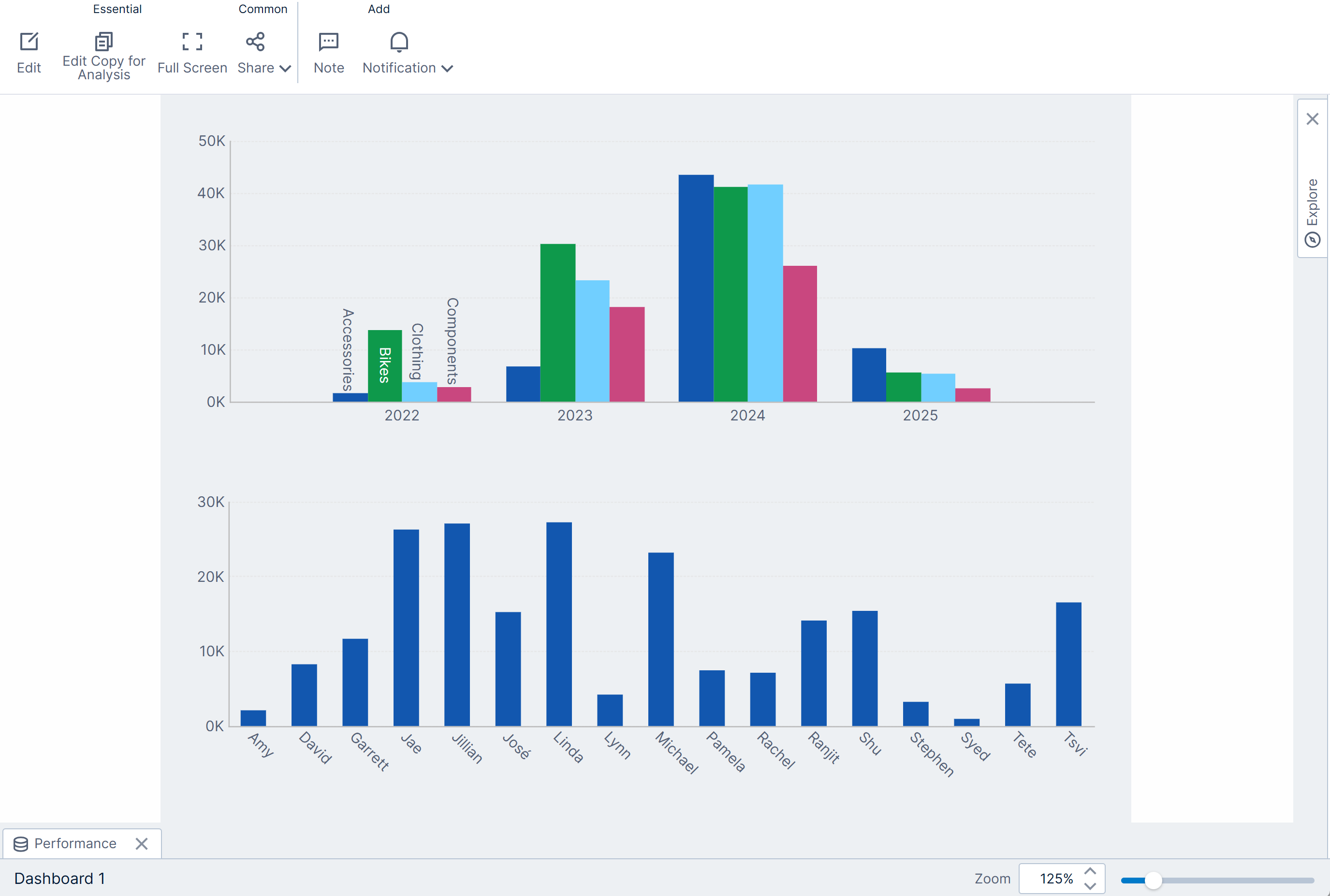
- By default, the aspect ratio of the dashboard is maintained for different screen and window sizes. If you don't want the aspect ratio to be maintained, select the dashboard's property option Ignore Aspect Ratio On Resize.
- You can use the zoom slider and the view panel in the status bar to zoom in, zoom out, or pan the dashboard. Scrollbars will appear as needed when zooming in.
- 'Pinch-to-zoom' will also work in scale mode on touch devices.
- The downside of using the scale mode is that content may initially be too small to see when the screen or window is too small.
3.3. Resize
The resize mode is a smart resizing option that is designed to be used in conjunction with a template grid, which allows you to set up the elements of your dashboard for resizing within a grid-like layout. In this mode:
- The dashboard canvas is resized to fit the available viewing area without scrollbars.
- The zoom slider and view panel are not available in this mode.
- The Resize Mode Fit property determines if the dashboard should be resized to fit the width of the screen, the height of the screen, or both.
- By default, the aspect ratio of the dashboard is maintained when resizing. If you always want content to be resized to fill all available screen space, enable the Ignore Aspect Ratio On Resize property option.
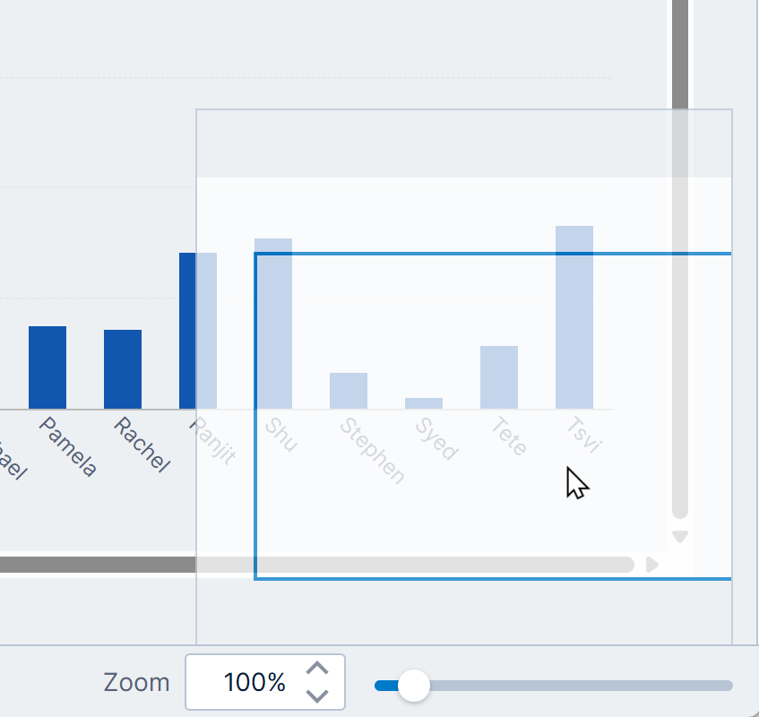
- Elements on the dashboard will resize along with the dashboard and the screen or window provided they have been attached to the template grid's cells (see below). This lets you take advantage of any smart layout or labeling logic that may be built into visualizations. For example, when a chart is resized smaller, the chart axes adjust the label text size and layout to avoid overlap and maintain readability.
3.4. Responsive
The responsive mode is also designed to be used in conjunction with a template grid, but takes smart resizing a step further. This mode reflows and wraps the individual cells from left to right and then from top to bottom according to the available space on the screen, allowing the same dashboard to fit both the largest screens and the smallest screens automatically. In this mode:
- The width of the dashboard canvas is resized to fit the available width of the viewing area.
- The cells in the template grid may be rearranged into additional rows if there is less width, or to fit additional cells in each row if there is more width.
- Vertical scrolling is used to see additional content if it does not all fit on the screen or in the window.
- The layout of the cells on the canvas is computed based on the page size and is recomputed when resizing. For example, the layout will change when a mobile device changes from portrait to landscape mode.
- You can use cell groups to keep cells together when the layout is computed.
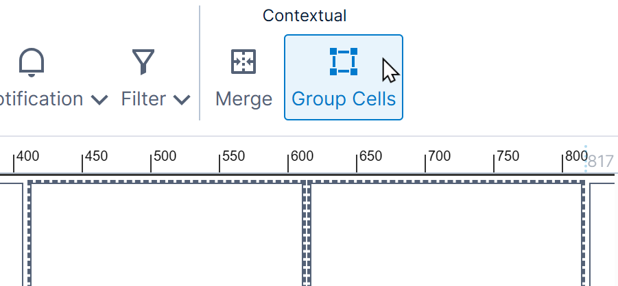
Group template cells - You can turn a cell or cell group into a header row if it spans the entire row to preserve it and ensure cells are not added or removed when viewing. You can also designate a header row inside a cell group.
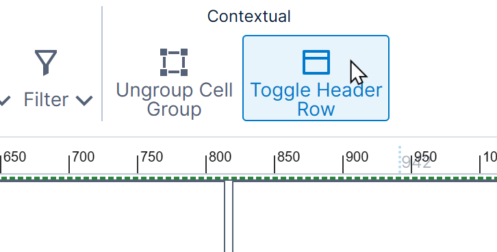
Toggle headers
For additional information on Responsive mode, see the article Responsive layout dashboard mode.
4. Define a template grid
This section shows you how to define a template grid and use it to resize components on a dashboard with Resize Mode set to Resize or Responsive.
4.1. Set up the dashboard
Set the dashboard's Resize Mode property to Resize or Responsive to take advantage of the template grid for resizing the content.
You can resize the dashboard to a more suitable size to use while editing, or you can change it later.
4.2. Add a template grid
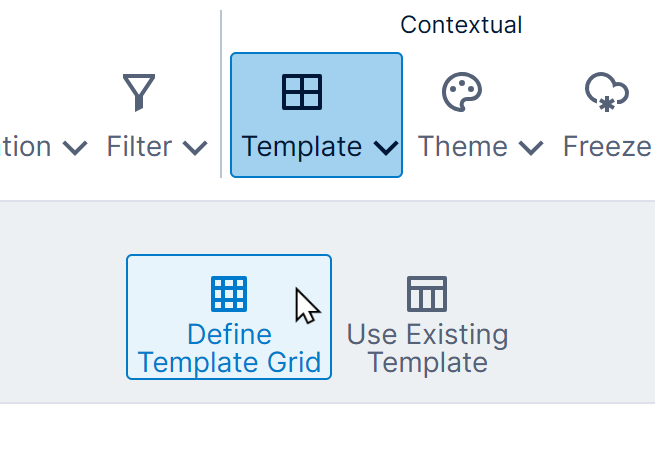
In the toolbar, click Template and then Define Template Grid. (If an element on the dashboard is selected, first click an empty part of the dashboard to see this option.)
In the Template Grid dialog, grid cells are highlighted as you move the mouse.
Move your mouse around until the desired layout of grid cells is highlighted (e.g., 2x3 or 3x3) and then click to select it.
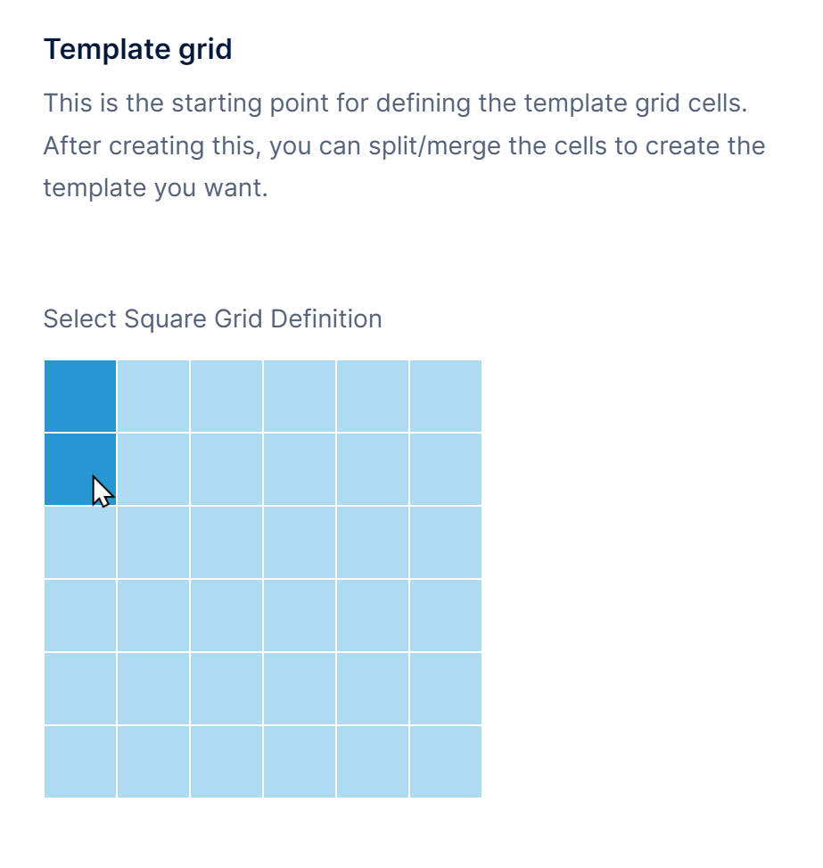
Click Save to go back to your dashboard. You'll see that a grid of cells has been added.
4.3. Add elements to grid cells
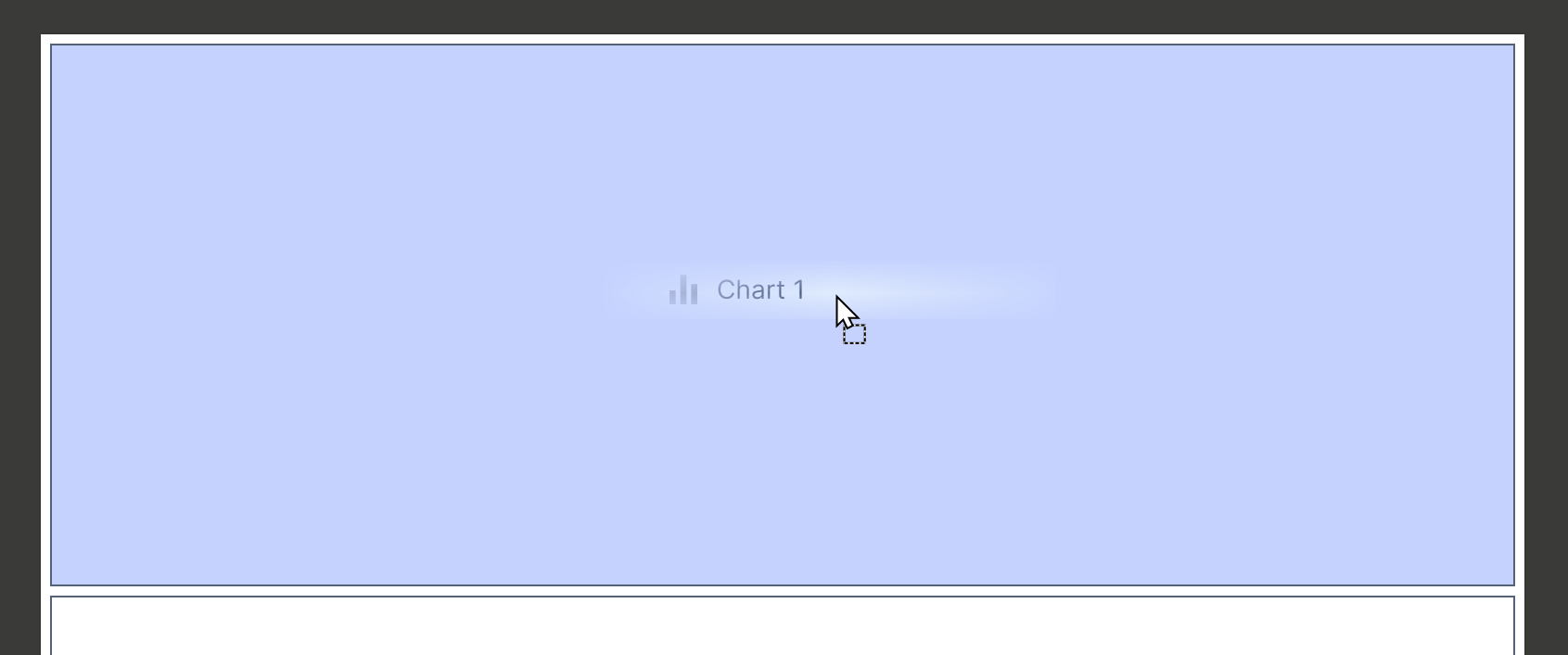
Each element on the dashboard needs to be attached or added to one of the template grid cells in order for it to resize with the rest of the dashboard or screen.
Drag new items from the Explore window or existing items on the canvas into the cell where you want it displayed.
If it's the first element dragged into that cell, the element will automatically resize to fill the cell. You can then resize it if you want, for example to leave room above a chart to add a title or legend.
In the Properties window, you can see that the positioning of the element is now relative to its cell.
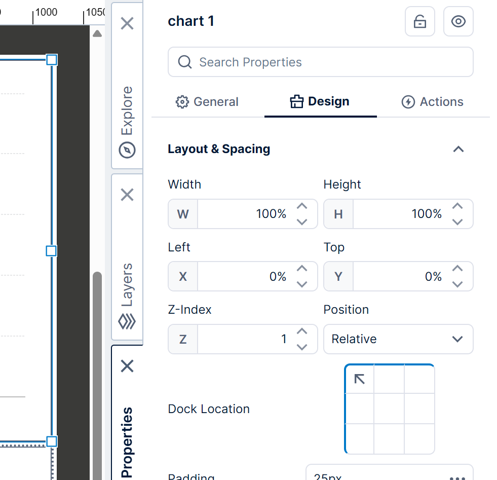
The position coordinates are now percentages relative to the size of the cell by default, but you can change the Position type use to absolute pixels relative to the top-left corner of the cell, or click to change the Dock Location to another side or corner instead.
4.4. Test resize behavior
Test the resize behavior by switching to View or Sandbox View in the toolbar and resizing your browser window if needed.
With the dashboard set to Resize in this example, observe that the dashboard can be manipulated into different aspect ratios, or made smaller, but visualizations such as charts are able to adjust their layouts intelligently to match.
5. Merge and split cells
The template grid initially fills your dashboard with the same number of cells in each row and column. For a more customized layout, you can split any cell horizontally or vertically into two, or merge two or more selected cells into a single cell.
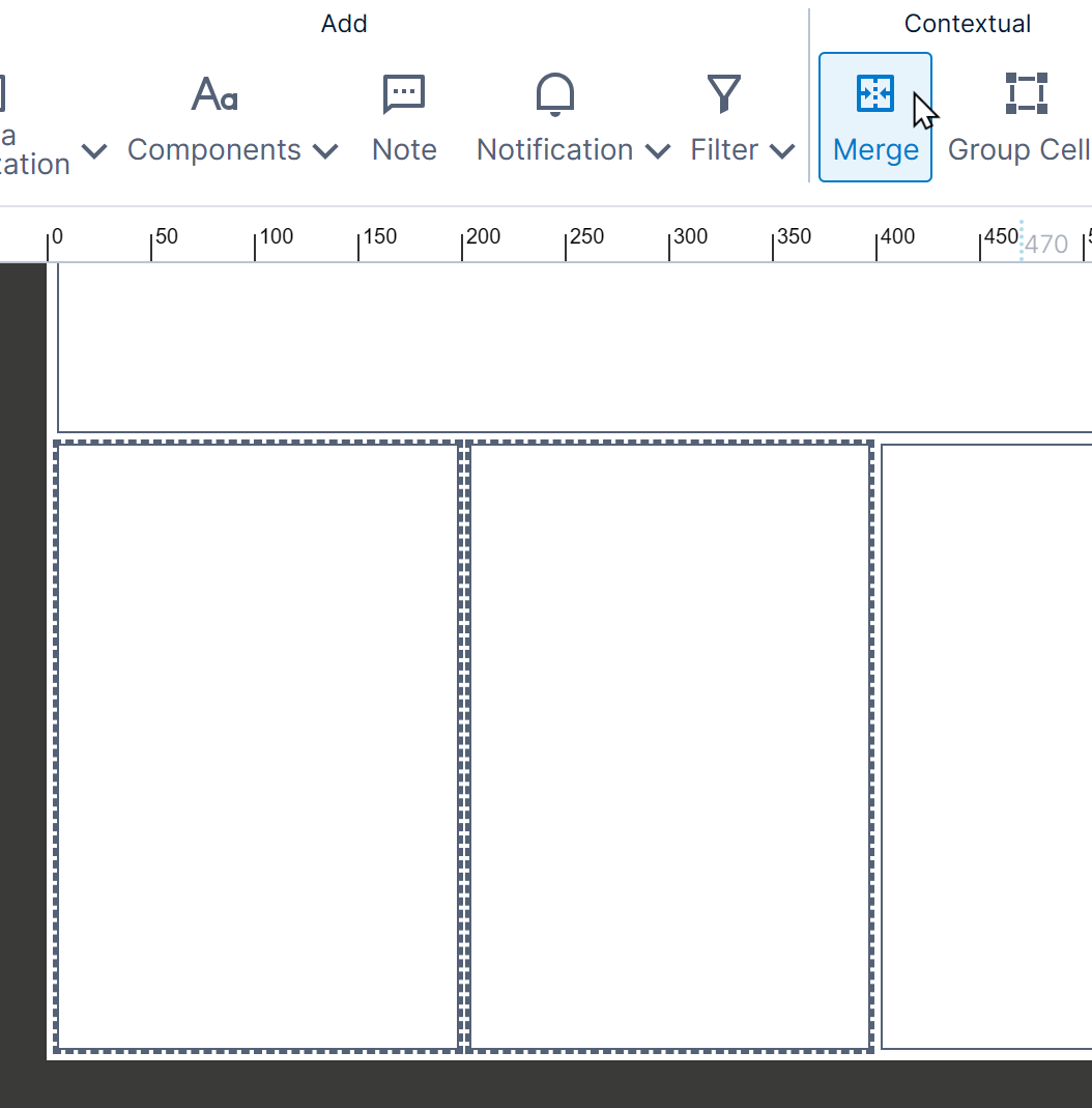
For example, in a dashboard with a 1x2 template grid as shown below, you can split the bottom cell into left and right parts by clicking to select the cell and then clicking Split Horizontally in the toolbar.
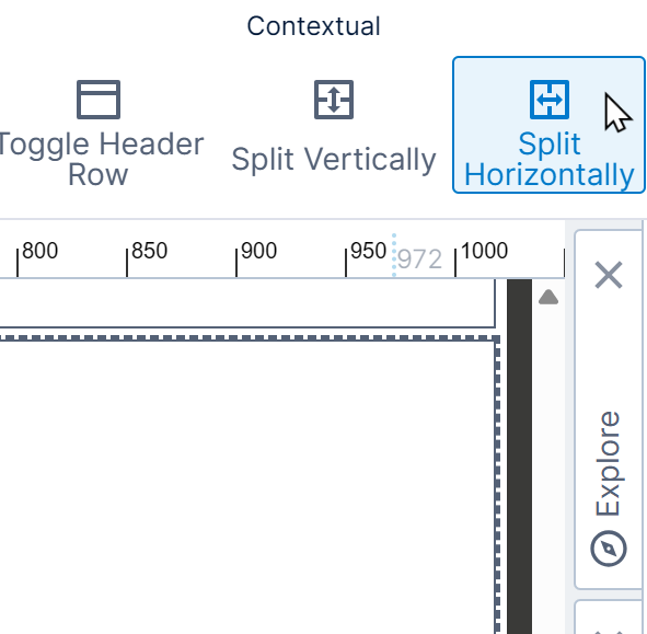
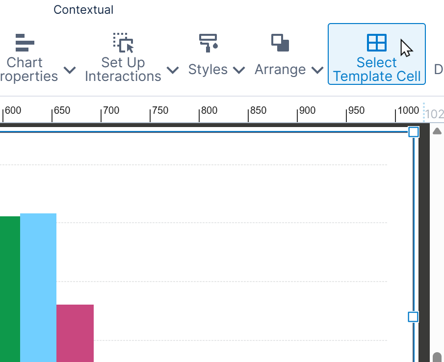
If you've already completely filled a template grid cell with content, you may not be able to click directly on the cell but instead one of the elements you placed there. With one of the elements in the cell selected, you can click Select Template Cell in the toolbar.
After splitting horizontally, the bottom cell is now divided into a left cell and a right cell. (Click Split Vertically to divide a cell into top and bottom cells.)
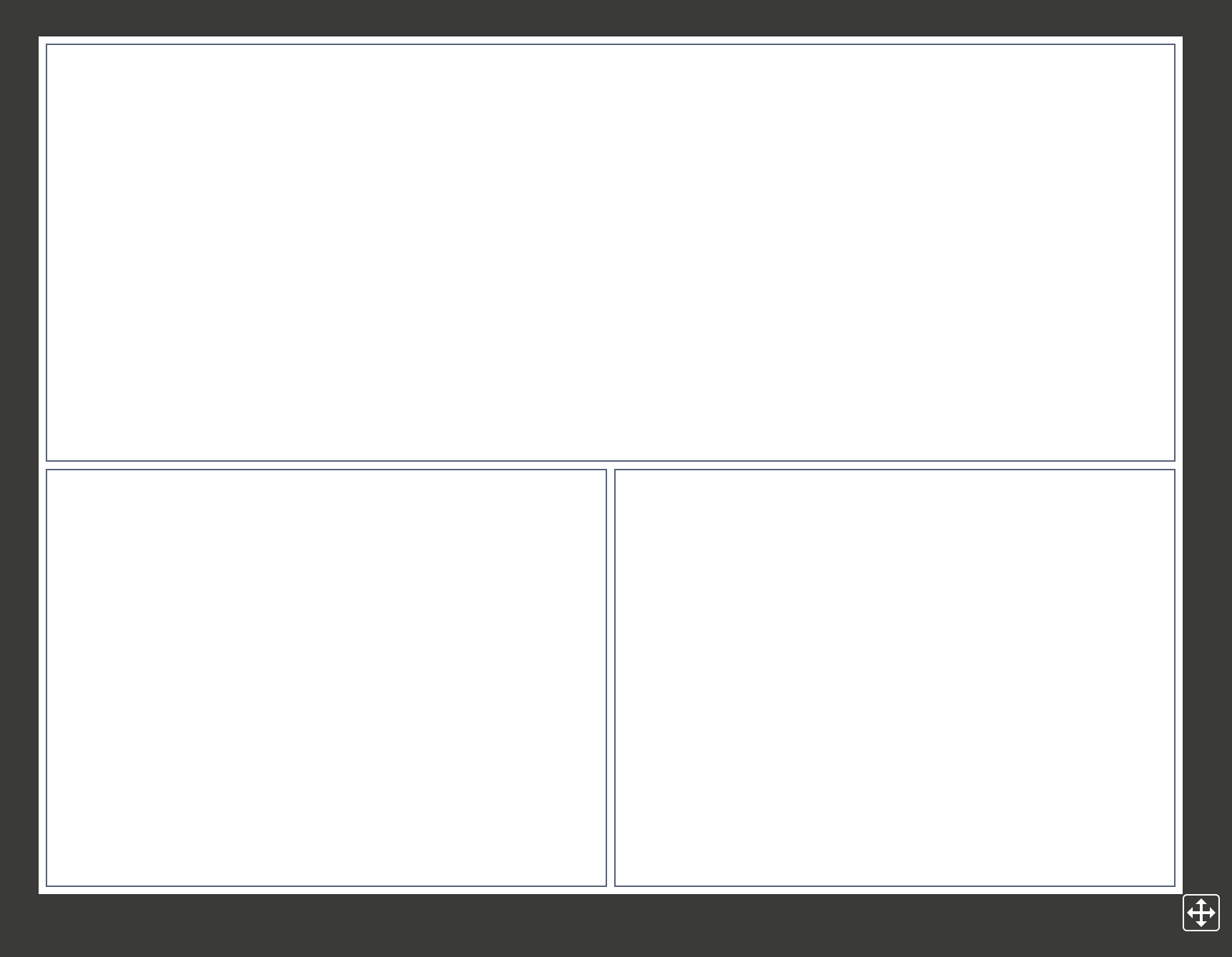
You can split multiple times: for example, select the bottom left cell and divide again by clicking Split Horizontally. There are now 3 cells in the bottom row of the template grid.
To merge two or more cells, including cells that may have previously been split, select one cell and then hold the Ctrl or Shift key while clicking on adjacent cells in the same row or column. Go to the toolbar and click Merge.
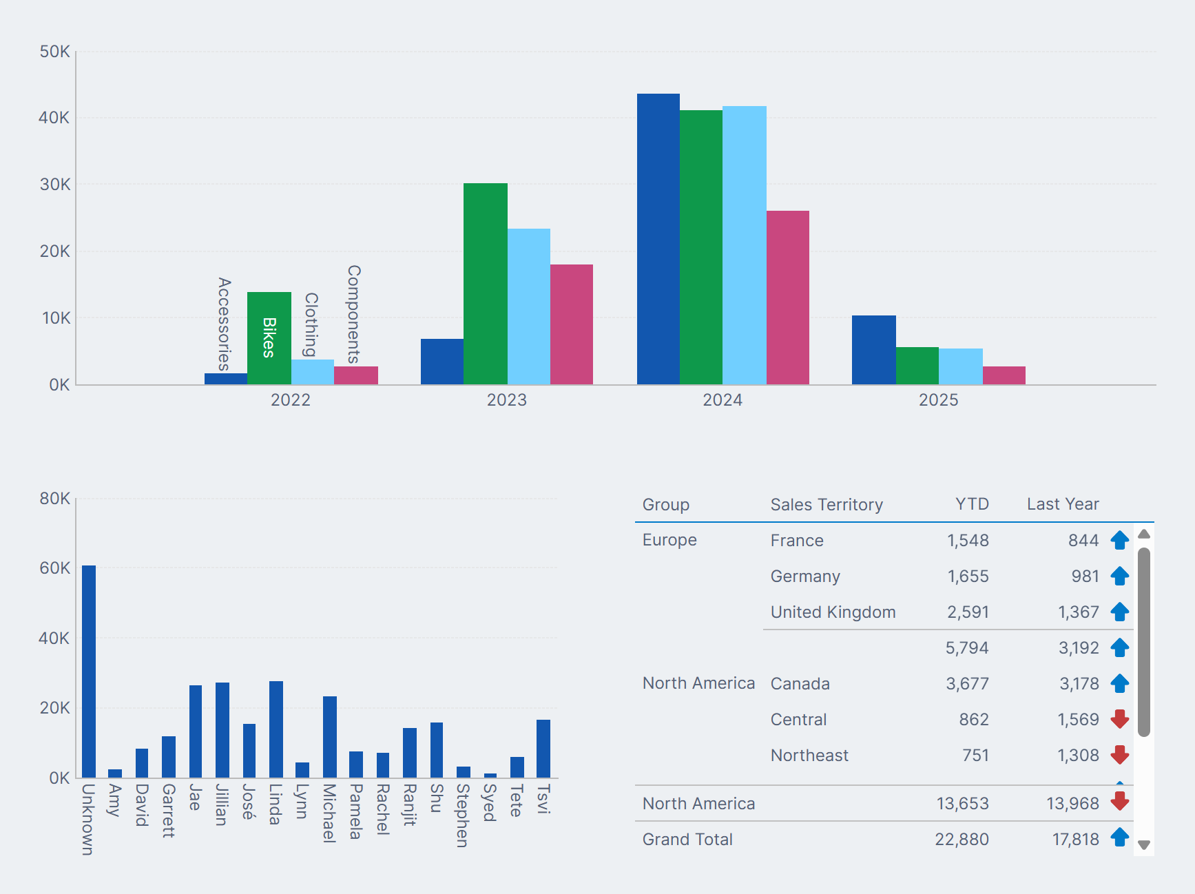
In our example, we've left the bottom cell split into two cells horizontally and added visualizations to each of the three final cells, as shown below in view mode.
6. Resize template grid
The initial template grid that you define is uniform where each cell has the same size. You can adjust their sizes by clicking Template and then Resize Template Grid in the toolbar.
While resizing, the divisions between grid cells are outlined by thick blue bars that you can drag. You can also resize the grid by clicking on a percentage or pixel size, typing in a new value, then pressing the Enter key.
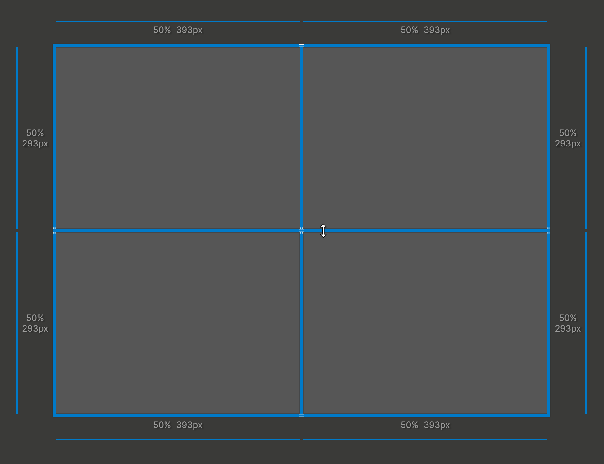
Once you're done resizing the grid cells, click anywhere outside of the canvas.