1. Overview
Dashboards are traditionally created for displaying on a large device, such as a computer monitor or TV, however some may be viewed on smaller mobile devices such as phones.
Typically, multiple dashboards would need to be created for the best possible use of space on the display. With the responsive dashboard re-size mode, dashboards laid out in a grid can automatically re-flow themselves when necessary to fit different displays.
To build a responsive dashboard, its contents must be docked into the cells of a template grid. See Using a template grid for resizing for details.
Related video: Resize Mode
2. The responsive mode flow algorithm
Responsive mode re-flows the individual grid cells from left to right, then top to bottom, as the available size of the screen changes:
- The dashboard will attempt to fit as many cells as possible by using the edit-time width of the template cells. When there is not enough space, it will start a new row. The left-over space will then be filled by evenly resizing all the cells.
- The height of the row is defined by the cell with the largest edit-time height, after it was already placed in the row. All the cells in the row will expand to match that height.
- The header in a group of cells will be placed before the content cells, in the left-top position of the group. The remaining content cells in the group will be positioned according to the two points described above.
When the responsive dashboard is loaded, the layout is calculated based on the current page size, and is re-calculated each time it changes size. This can happen either by resizing the browser window or changing the device from portrait to landscape mode.
3. Grouping and headings
In a regular template grid, headers and groups do not need to be defined because the overall layout does not change. However in responsive mode, some extra information is required on the cells to preserve certain important positioning.
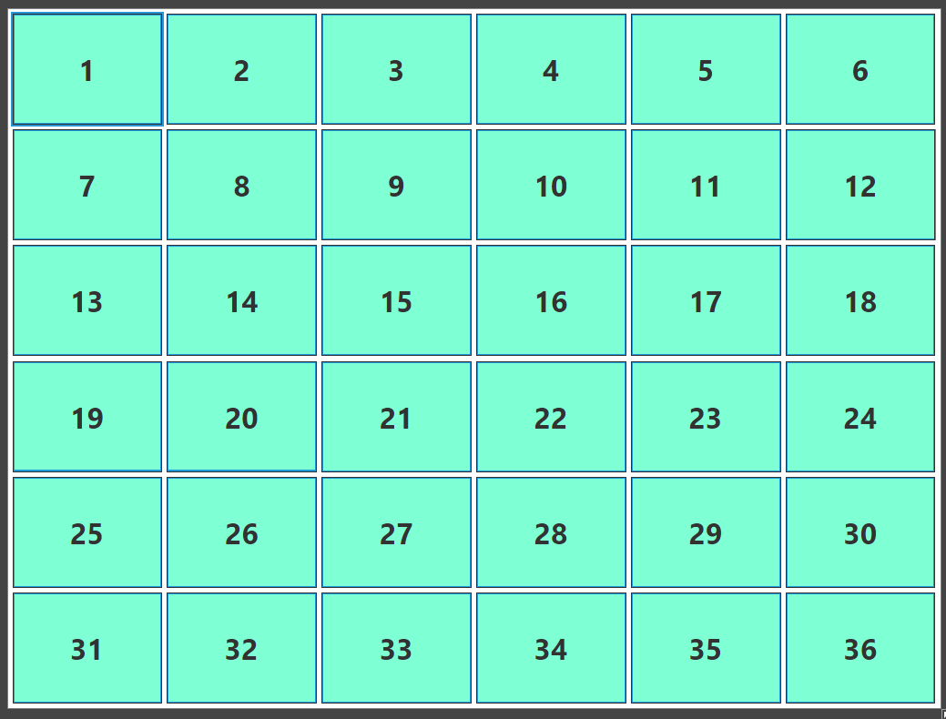
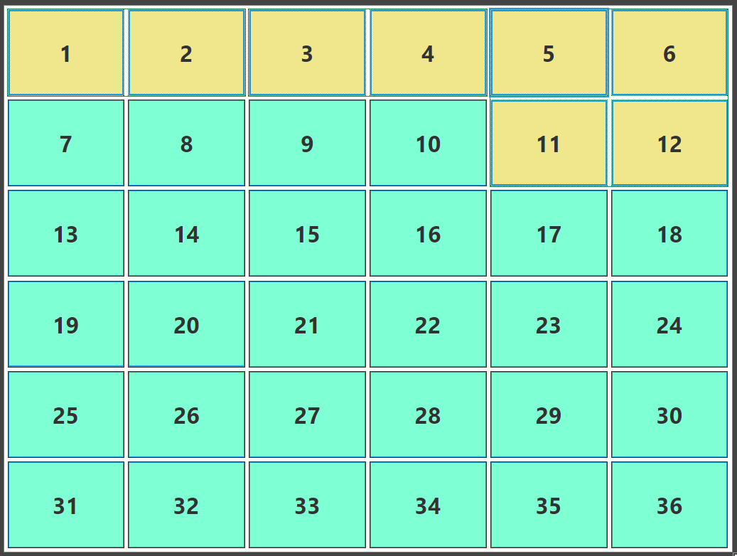
In the layout below, a template grid with 6 rows and 6 columns has been created:
3.1. Groups
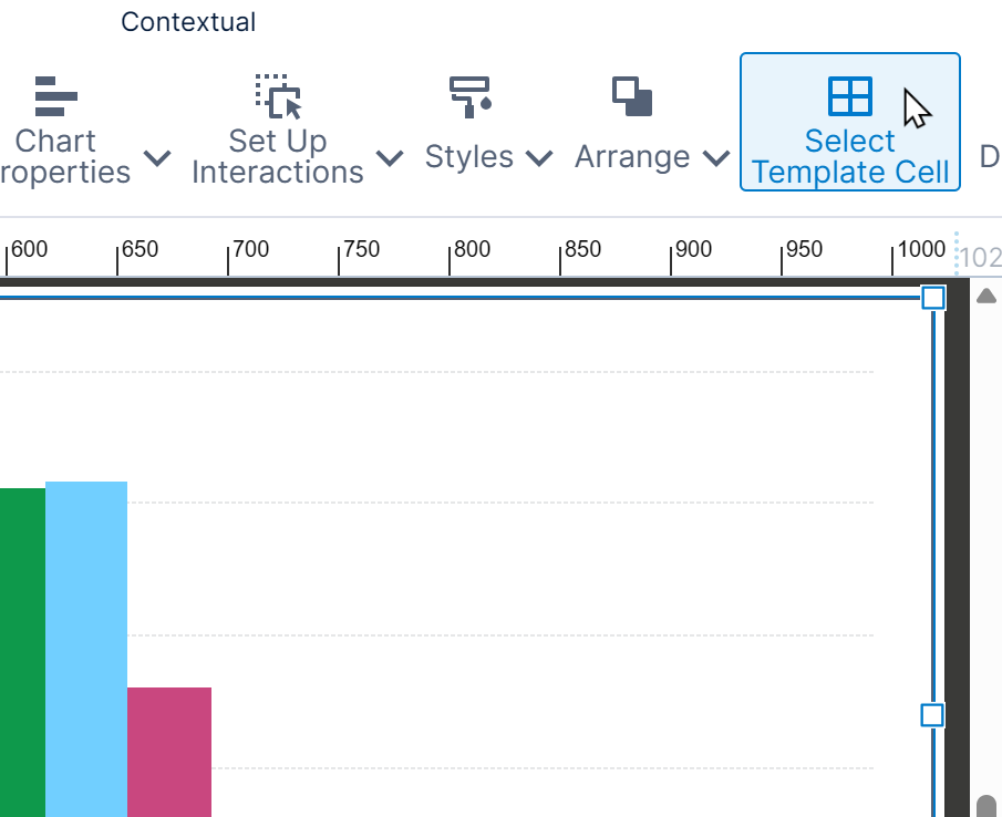
Grouping several cells together ensures that these cells are kept together when the page layout is computed. The group is considered a single cell when the layout is computed. To configure several adjacent cells to form a group, select the cells by holding Shift while clicking them, or click and drag to select elements in the cells and choose Select Template Cell in the toolbar.
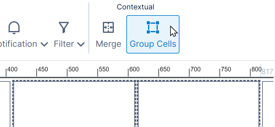
Select Group Cells in the toolbar to create a group.
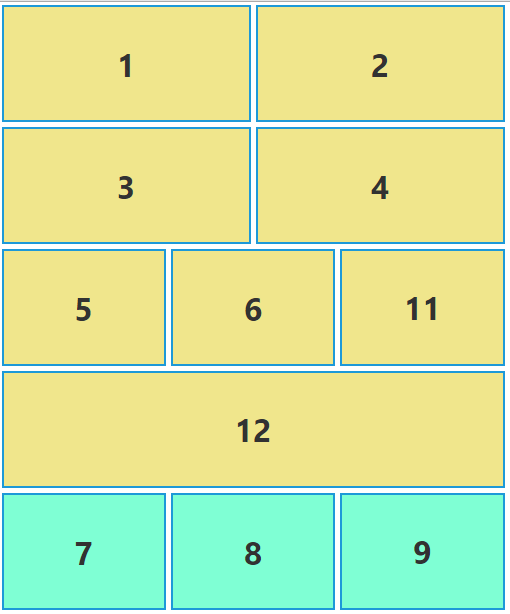
In this example, 1 is grouped with 2, 3 with 4, and 5, 6, and 11 with 12. In responsive mode, the layout is recalculated to keep all groups together. Cells 1 and 2 take up the whole row because while cell 3 can fit onto that row, cells 3 and 4 cannot. Cells 5, 6, 11 and 12 appear before cells 7, 8, 9 and 10 because the group is kept together, and cells 5 and 6 come before cells 7, 8, 9 and 10.
3.2. Headers
When displaying related data in adjacent cells, you may want a row along the top to be considered a 'header'. When the layout is computed, a cell or group that is tagged a header row will always span the entire row, even if there is space to display additional cells to the left or right. (When the header row is inside a group, this only applies within the group.)
A cell or cell group can be designated a header row if it spans the entire row. If you have grouped rows of cells together and want to designate one of its rows as a header for the group, one cell can be made a header if it spans the entire row within that group (this may require selecting and merging cells to create a header row).
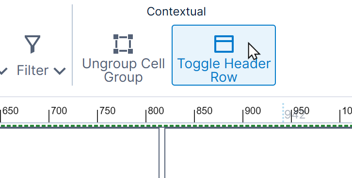
Select the header cell or group, and click Toggle Header Row in the toolbar. (When enabled as a header row, the button will appear with a darker background.)
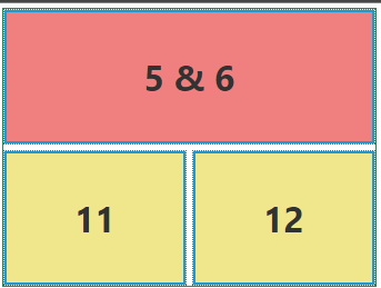
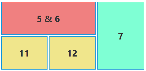
In the example below, cells 5 and 6 have been merged. Note how, despite the merge, they do not function as a header.
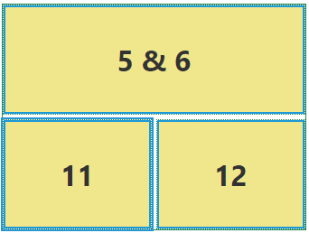
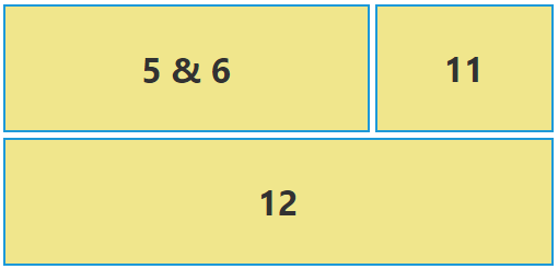
When the header property is set, cell 5 & 6 (which is now one cell), contains no cells to the immediate right that are in its group (5 & 6, 11 and 12). As 11 and 12 can fit underneath 5 & 6, the group is shrunk, and cell 7 is placed to the immediate right of the group.
3.3. Sticky headers
Once a cell or row of cells is toggled as a header row for the dashboard, you also have the option to make it a 'sticky' (or frozen) header, which will stay in position as the rest of the dashboard below is scrolled up.
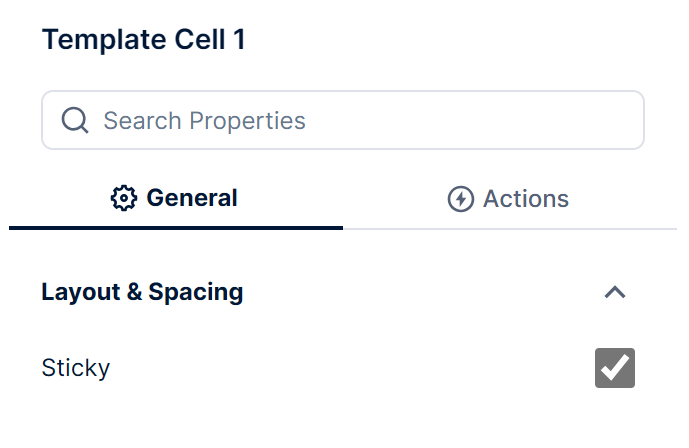
To enable this setting, select the cell or group that was designated a header. You can click to select it, or select its contents and choose Select Template Cell in the toolbar.
Go to the Properties window and enable the Sticky option.
When viewing the dashboard and scrolling down, once the header would have been scrolled out of view it is pinned back into place with the rest of the contents scrolled below it.
Depending on your header's contents, you may want to place a Rectangle or another component behind the other header contents so that its background is not transparent.
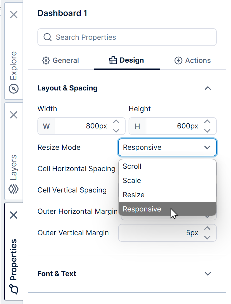
4. Enabling responsive mode
To enable responsive mode, click on the dashboard and open the Properties window.
Under Layout & Spacing, set the Resize Mode property to Responsive.
5. Using responsive mode
For the dashboard's contents to be responsive, you need to add a template grid to the dashboard and place all contents within one of its cells.
For details on how to define a template grid, see Using a template grid for resizing.
5.1. Relative font sizes
When using responsive resize mode for your dashboard, you can optionally allow the font size to automatically adjust based on the browser size or device used for viewing.
In the Properties window for the dashboard under Font & Text, set Responsive Font Sizing Strength property to a number between 1 and 100, where smaller numbers result in smaller font size changes while larger numbers result in larger changes relative to the device or window size.
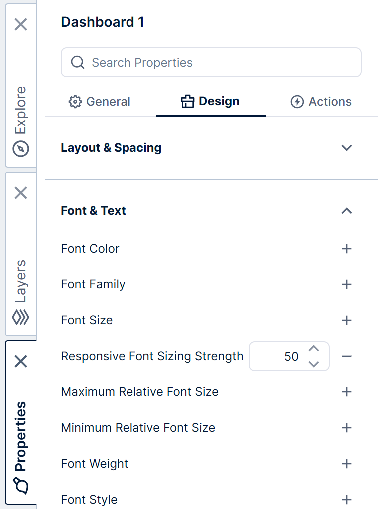
You can also set minimum and maximum font sizes in em units to ensure they do not go beyond the specified limits. For example, a minimum of 1 em means the font size can only be increased compared with the font size set in edit mode.
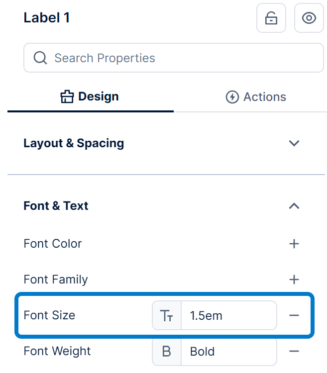
When the Responsive Font Sizing Strength property is set, any elements on the dashboard with font sizes set in em units will automatically change in size according to the browser size. This applies to all text by default, or you can make only some text change in size automatically by setting some font sizes to a px size in pixels to always keep their text at the same size, and others to an em size for text that you want to resize automatically. To customize font sizes, click on the dashboard or an element, and in the text settings of the Properties window, type in your preferred Font Size setting including the desired unit:
Any elements that don't have their own set Font Size will inherit their setting from the dashboard.
6. Design notes
Responsive mode is designed to cleanly modify the layout of the dashboard when viewing on a device with a smaller display size or different orientation. It's possible that viewing at screen sizes larger than the size the dashboard is designed for may cause undesired layouts, and designing a dashboard targeted for these larger displays is one alternative. For smaller screens, also consider how information is conveyed in a small area with other content potentially scrolled away.
The recalculation of the layout for different screen sizes can impact the positioning of sections of the dashboard, for example two related visualizations that are adjacent at one screen size may not be for another if one has been re-flowed or wrapped into the next row. To ensure that related visualizations are kept together, the cells should be configured in a group.
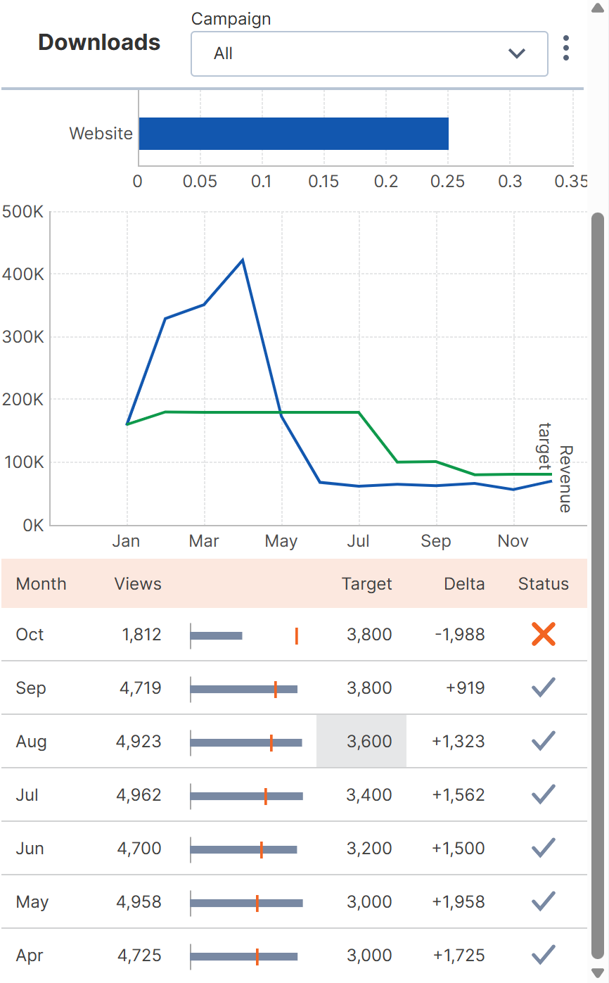
6.1. Example dashboard
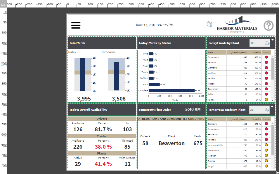
The dashboard below has been created using responsive design. When editing the dashboard there is a base size that is used, however when viewing the dashboard on smaller displays, the dashboard layout is recomputed to take into account the smaller sized display.
When editing, the dashboard is designed to have a grid that is 3 across and 2 down. When viewed at full size, this is the display that is seen.
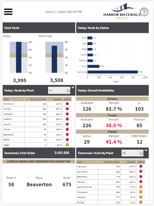
When the dashboard is viewed on a tablet device, it may be used in portrait mode. In this case, the dashboard layout is re-computed, and it is able to fit a layout of 2 across and 3 down.
On a smartphone, which has a much smaller screen, the layout can only fit a grid one cell wide.