Pareto Charts - The Vital Few vs. The Trivial Many

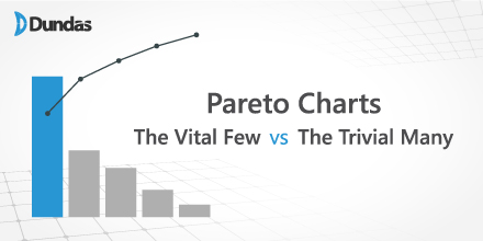
The Pareto Chart is a unique visualization in that it contains both bars and a line graph, where individual values are represented in descending order by bars, and the cumulative total of those values is represented by the line from left to right. For instance, the line begins at the top of the first bar, and as we move right, towards the second bar, the line displays the combined total of both bars as a percentage, representing the total share of these 2 items (i.e. products) out of the entire group of items. Upon reaching the final bar, the line’s total will always be equal to 100%, representing the cumulative percentage share of all the bars (items).


