Dundas BI was designed from the ground up with one thing in mind:
Flexibility.
Dundas BI’s flexibility is present every step of the way with a rich set of options that allow you to get extra value out of the tool. While Dundas BI offers smart default, out-of-the box functionality to help all users quickly work with their data, we wanted to show you some NEW and UNCONVENTIONAL yet SIMPLE ways that Dundas BI can analyze and present your data, and explain how this can help your business.
I’m going to break these down into 3 different categories:
- Interactions & Data Explorations
- Configurations & Properties
- Data Preparation
While there are countless different tips and tricks you can utilize with Dundas BI, I’m going to list my top 4 favorites.
Interactions & Data Explorations
Single Click Drill-Down
Simplifying the user’s experience can really help with the adoption of the dashboard or report. In Dundas BI, complex interactions are easily setup using the interface. Here is the process for configuring a visualization to automatically drill-down on click or press:
Instead of right clicking and drilling into that particular data point (as you may commonly do), you may want to just have your users click on the data point and have it automatically drill-down. This is really handy for things like mobile experience, because in a mobile experience you would normally have to press and hold to expose the context menu. This eliminates the need for that and simplifies the experience by making it a single interaction.
In order to do this, simply select your chart in Dundas BI, use the ‘Set Up Interaction’ menu from the tool bar or the right click context menu, and add a ‘drill-down’ interaction.
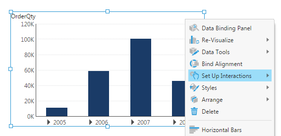
This has created the interaction. Dundas BI automatically creates the parameters (i.e. drill-down to the next level), however you can change that to whichever level you’d like. This eliminates the need to expose the context menu and automatically drills-down.
Configurations & Properties
Re-Visualize the Columns in a Table
Often times, when examining your data, you’re left with a very large table, with a number of columns. These columns may contain a quantitative value that looks great, but as text, is not terribly informative. What we can do, is re-visualize the column in the table to something that is easier to digest.
This is accomplished by right clicking on an individual column in a table, and specifying the actual column-type itself (i.e. Data Bar Column, Bullet Graph Column, Image Column, etc.).
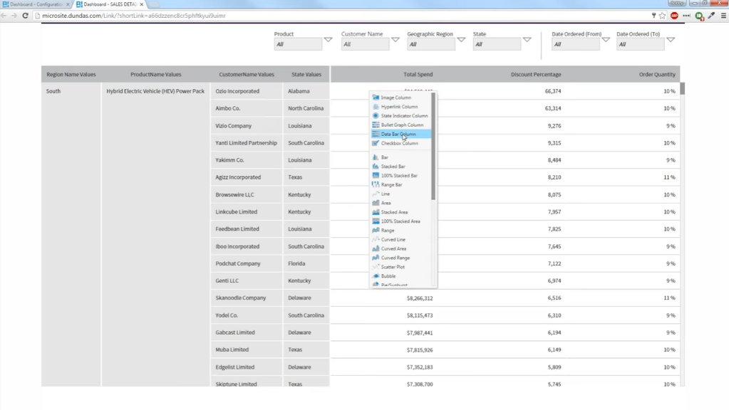
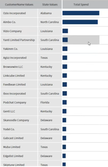
By doing this, your data now tells a completely different story. From a text perspective you can still identify the variances in row quantity, but it’s not obvious the actual difference in sizes until you’re able to visualize it. By re-visualizing the columns to something like this (image below), the differences in your data becomes much more visually apparent.
Hyperlink Columns in a Table
There are a number of ways you can navigate to other dashboards, views, and sites. This next tip showcases the ability to use a location’s latitude and longitude values in your data to find the location on a map. But before we jump into that, let’s take a look at how to hyperlink values in a column, as that will act as a predecessor to navigating to a map.
Let’s begin with a sample table with a Column labeled: “City”. We’ve told this column to be a hyperlink column, instead of just a regular text column, and the hyperlink URL is dynamic, meaning it’s based on the value that’s within it.
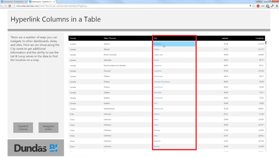
In order to do this, jump into edit mode, and open the properties panel. You’ll want to select the column you want to work with from the table drop, and then change the column type to ‘hyperlink’. Here’s the fun part. Within the ‘hyperlink address’, insert the URL of where you’d like to be directed to when interacting with specific data in the column, and place square brackets around the dynamic value that you want to change (i.e. if the column is named ‘city’ – https://www.google.com/#q=[city] – this would take you to the google website with a search for that city you clicked on within the ‘city’ column).
Now let’s apply this technique to latitude and longitude values. Here we have another regular table, but instead of clicking on the ‘city’ column and being directed to a webpage, we’ll use the latitude and longitude plotting to show it on a map.
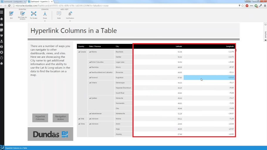
Here’s how we can accomplish this – It’s straight-forward, but easier to understand in bullet-point:
- Enter edit mode
- Similar to our first tip ‘Single Click Drill-Down’, you’ll want to select the ‘Set Up Interaction’ menu, but this time select the navigate interaction.
- From here you can take the Google Maps URL with the query string, and you can put latitude and longitude in placeholder tags (i.e. http://maps.google.com/?q=<lat><long>).
- I’ve labeled these placeholder tags as <lat> and <long>, but you can specify in the parameters that the value ‘Latitude’ and ‘Longitude’ in the row you are clicking on is going to be passed into whatever placeholders you want.
Data Preparation
Adding Searchable Tags to Dundas BI Objects
Within Dundas BI, users are provided the ability to open up the properties of a particular object (such as a data cube), and add tags to be able to search for it. For example, if you have a data cube containing webinar information (labeled: ‘Webinar Cube’), you can tag it however you’d like (i.e. Webinar_Q1) and then search for that tag within Dundas BI’s search functionality. Upon doing so, the ‘Webinar Cube’ will pop up. This is really helpful for allowing users to quickly search for things based on relationships. Also, if you desired, you could apply this tag to multiple items, not just cubes. It could be applied to metric sets, styles, dashboards, or anything else. All these items would populate the search functionality when the tag is searched.
If you’ve enjoyed these tips and tricks, be sure to check out our webinar – 20 Tips & Tricks to Elevate Your Visualizations – and we’ll show you how to jazz up your dashboards and reports and make them more user friendly.


Follow Us
Support