
1. Overview
This article shows you how to configure a button component to display an image and perform a navigate action when clicked.
2. Steps
2.1. Create a target dashboard
First, create a new dashboard from the main menu and have it display a simple chart.
This will be the dashboard (Dashboard1) to navigate to.
2.2. Create a source dashboard
Create a second dashboard (Dashboard2) which will contain the navigational image button.
Go to the toolbar, click Components, and then select Button to add a button component to the canvas.
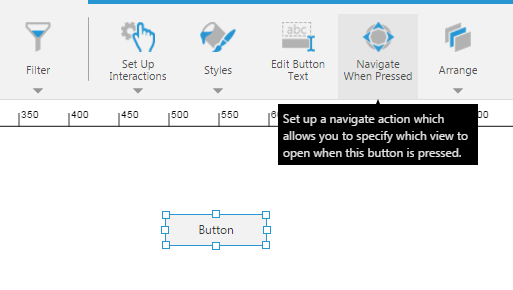
2.3. Set up the navigation
With the button selected on the canvas, go to the toolbar and click Navigate When Pressed.
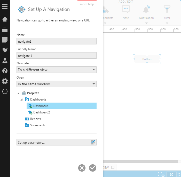
In the Set up a Navigation dialog, choose a Navigate option from the following:
- To a different view - This is the default. Use this option for this example.
- To a URL
- Back - This is for navigating back. You use this on a target dashboard to go back to the source dashboard.
- To this same view
Next, choose the Open option:
- In the same window - This is the default. Use this option for this example.
- In a new window
Finally, select the target dashboard to navigate to.
2.4. Add an image to the button
You can use the image brush option to add an image to your button. For example:
- Add an image resource to your project by dragging an image file from Windows Explorer or Finder to the Explore window. The image will appear under the Images folder.
- Select the button on the canvas, open the Properties window, and expand Lines & Fills (formerly the Look tab).
- Open the Rest Background property options and set the Brush type to Image.
- Click the Select button and choose the image from within the Images folder in the dialog that opens.
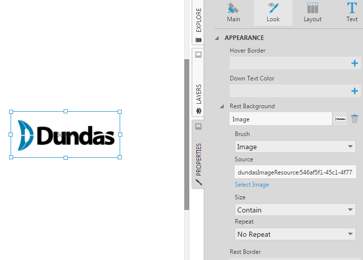
Repeat the above steps for the Hover and Down states of the button using the same image or different images.
2.5. Adjust the button text
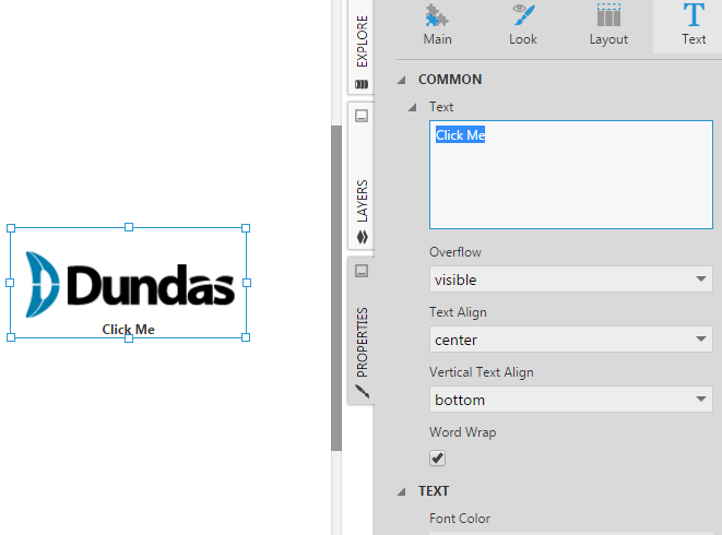
If you would still like to display text in the button, go to its text properties to find settings for the text, overflow, text alignment, and vertical alignment that you can use to position the text below the image, for example.
2.6. Test the navigation
Switch to View mode and click the button to test the navigation.