
This article provides an overview of the design experience when creating and editing dashboards and other views such as reports. You will also find a subset of these features when editing metric sets, hierarchies, and data cubes, for example.
Related video: Introducing the Dashboard Designer
Simple walkthrough: View data with a chart and drill down
1. Elements
Elements of the editor include the toolbar at the top, a status bar along the bottom, and the actual design surface with horizontal and vertical rulers. The white, rectangular portion of the design surface represents your dashboard and is generally referred to as the canvas.
You design dashboards and other views simply by dragging items from the Explore window on the right, and placing them on the canvas. For example, drag a metric set to the canvas and it will automatically appear as a chart or other type of visualization showing actual data values. Or, add a label component to the canvas and use the Properties popup or window to change its font size and color.
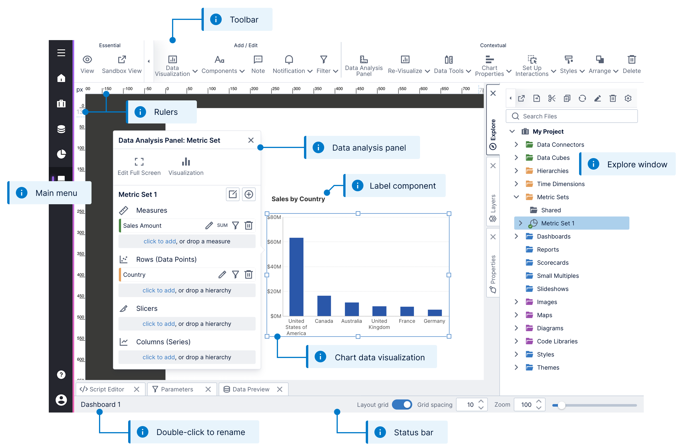
Here's a quick tour of the main elements of the user interface (UI) for editing views.
1.1. Toolbar
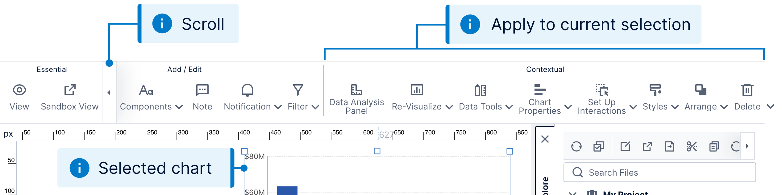
The toolbar at the top of the screen lets you perform a wide range of design functions. You can copy and paste items from the clipboard, add different types of content to the canvas, or apply a style or theme. Essential operations such as switching to view mode are always visible in the toolbar while the remaining buttons may be scrolled left or right depending on the available space.
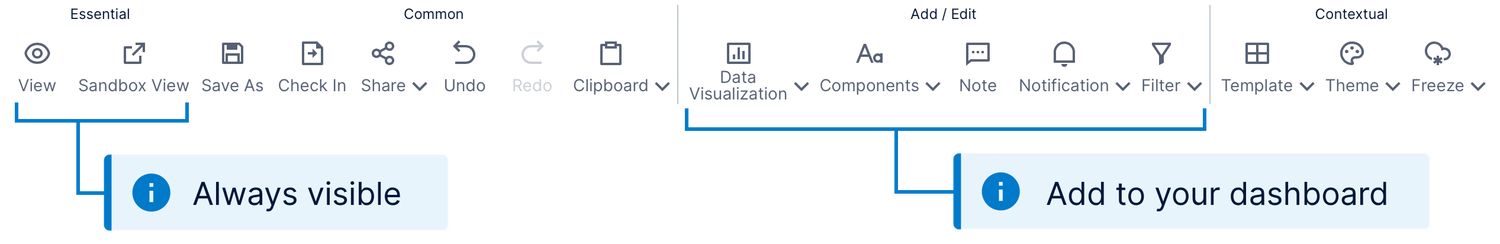
Certain operations appear or disappear from the toolbar according to the current selection. For example, if you select a data visualization on the canvas, you'll see a set of Contextual buttons on the right corresponding to the selected visualization, such as Re-Visualize.
1.2. Status bar
The status bar (also known as a taskbar) displays the name of the current dashboard or view, and lets you rename it as well with a double-click. Hover over or long-tap the name to see its location, including its project and any subfolders.
Next to the name is a message area that informs you whenever your editing has been auto-saved. Further to the right, you'll find a set of controls for adjusting the zoom level and snap-to-grid options for the canvas.

See the section below on the canvas and the article Using the status bar to learn more.
1.3. Rulers
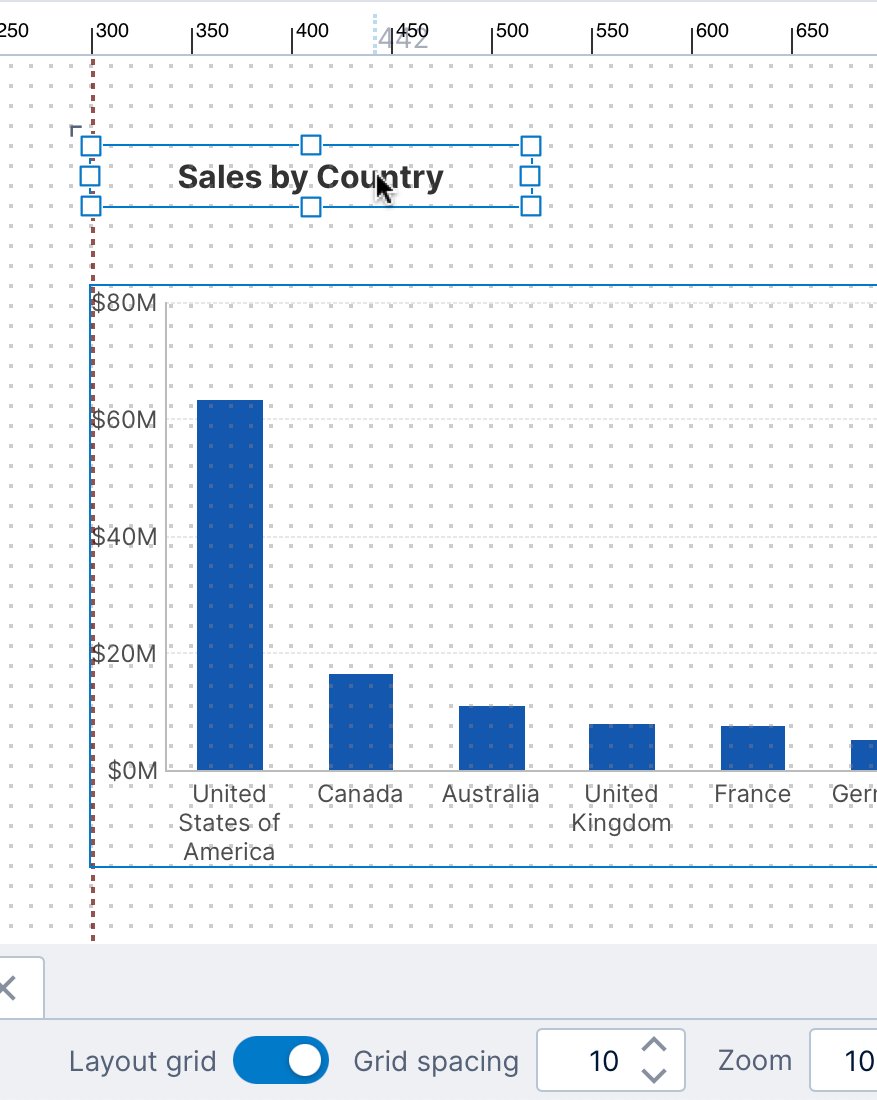
The horizontal and vertical rulers attached to the design surface help you to size and position items on the canvas. The default units are pixels (px), with the top-left corner of the canvas corresponding to the position 0,0. The rulers also track the location of your mouse pointer as you move it.
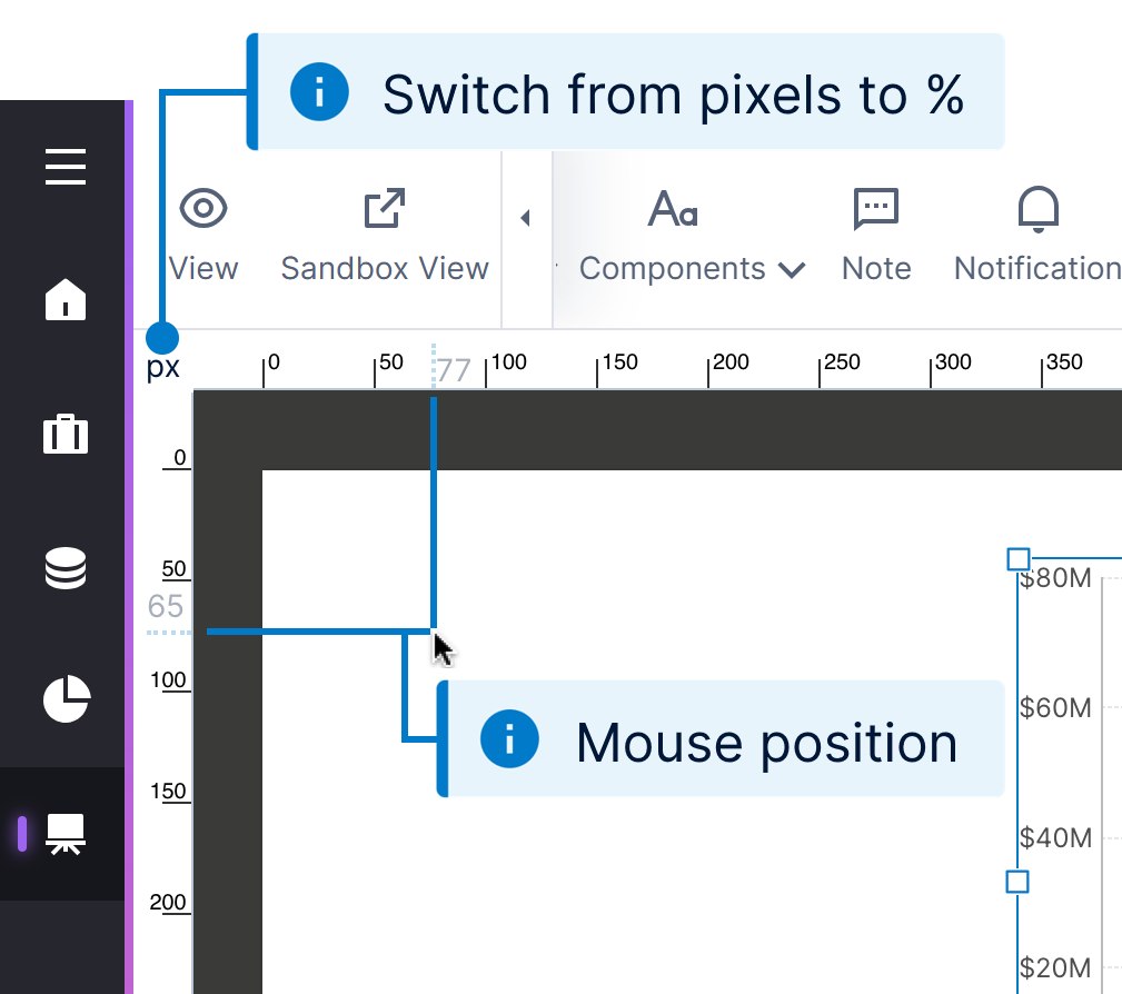
To switch the rulers to percent units, click px. In this mode, the bottom-right corner of the canvas corresponds to the position 100%,100%.
1.4. Canvas
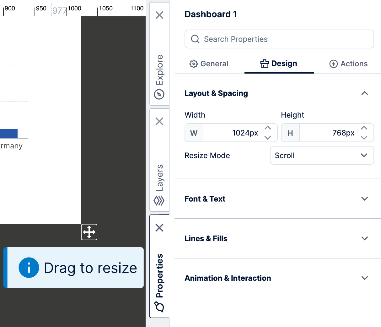
The canvas is the rectangular portion of the design surface that corresponds to the dashboard (or other view) that you are editing. When you click outside of any content, the toolbar presents options that are applicable to the view itself and the Properties window displays its properties such as Resize Mode and Height.
As you drag content around the canvas, a grid of dots appears by default to snap content into place to help you with pixel-perfect positioning and spacing. When one item lines up with an edge or the center of another, dashed red lines also appear to easily line them up.
There are more design tools to help with aligning content. You can also choose a dashboard template based on a grid when creating a new dashboard, or add a template grid yourself to more easily snap content into a grid layout.
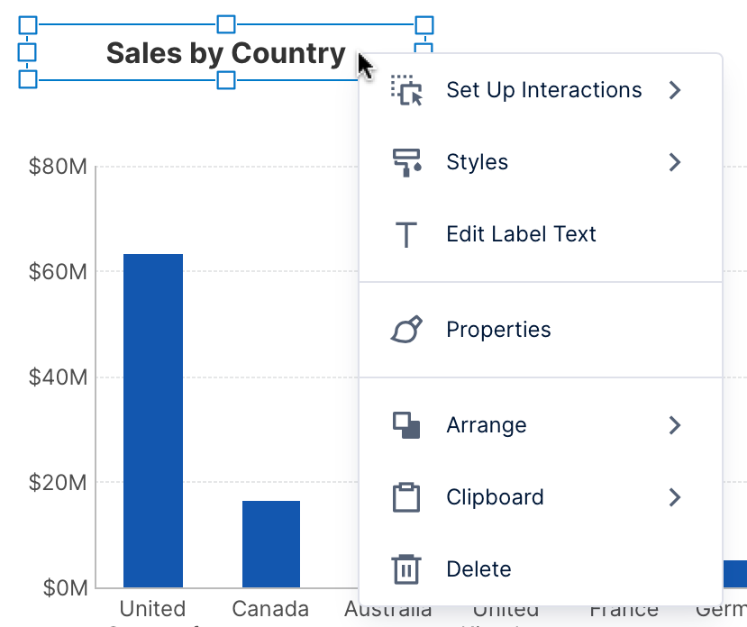
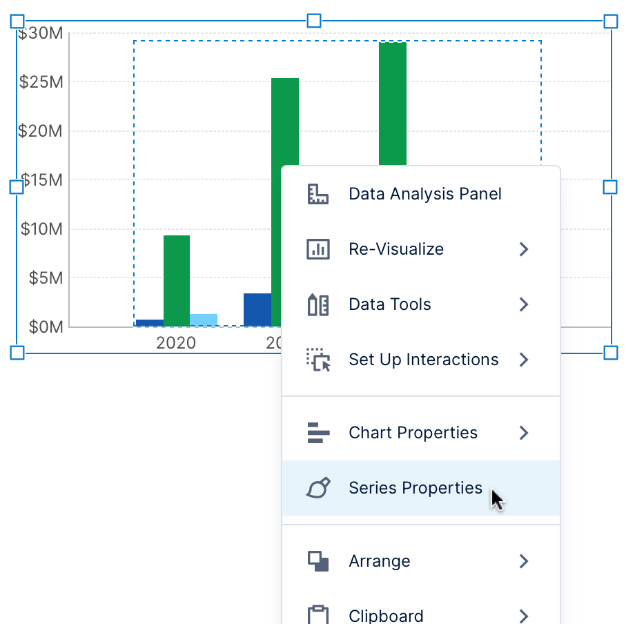
Right-click (or long-tap) an item on the canvas to open a context menu, which gives you convenient access to many of the same functions available from the toolbar.
2. Windows
A set of tabbed windows are docked along the bottom and right sides of the screen that you can click to expand, collapse, or switch between. By default, the windows docked on the bottom are collapsed (e.g., the Parameters window), while the ones docked on the right are expanded (e.g., the Explore window). For details on how to work with and arrange these windows, see Using dockable windows.
2.1. Explore
All of your work is done within the context of a current project, which allows users to collaborate together on the same dashboard or BI effort. The Explore window lets you navigate this project, which appears as a collection of folders containing files such as data connectors, metric sets, and dashboards, some of which can be expanded further to more folders.
You can drag any of these items directly onto the canvas or on top of a relevant item on it, including all types of data, metric sets, maps, themes, and even other dashboards or views. Expand another dashboard or other view to find its visualizations, which you can drag onto your canvas to reuse.
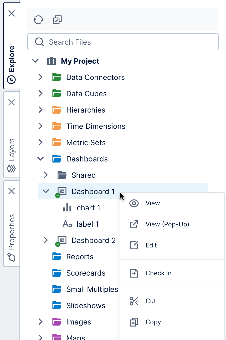
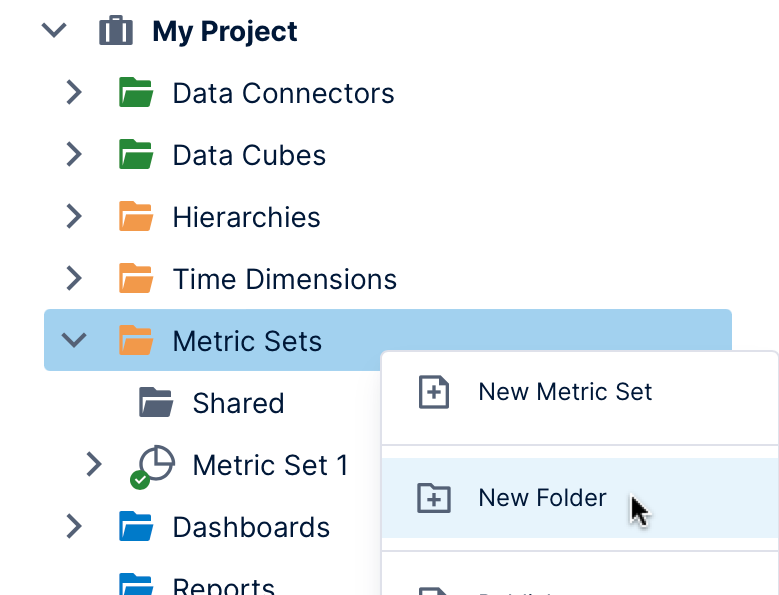
You can quickly switch between different kinds of tasks using the Explore window as an alternative to the main menu, from editing dashboards to creating data cubes and more. For example, right-click (or long-tap) on the Metric Sets folder and select New Metric Set to edit a metric set full-screen. Or, click New Folder to create a sub-folder, then right-click and Cut and Paste files to better organize your project items.
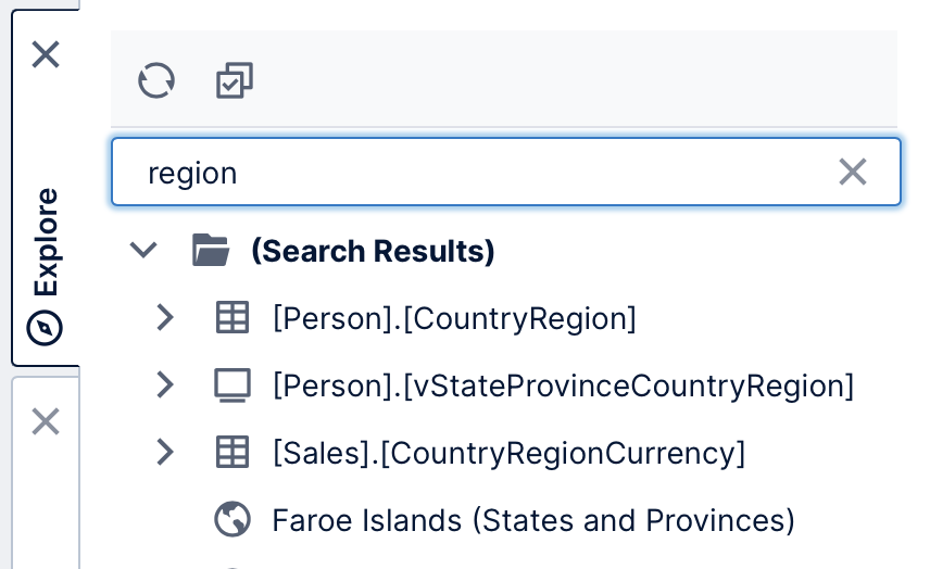
Enter search terms in the search box to quickly find the files you want, from database tables to maps.
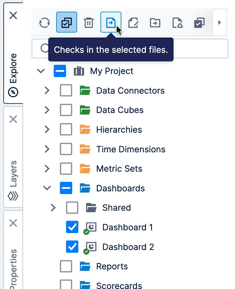
The toolbar at the top of the Explore window lets you enable checkboxes on project items and apply operations such as check in and check out on multiple files at once. The Explore toolbar is also responsive to the current selection in the treeview and presents options similar to those of the context menu.
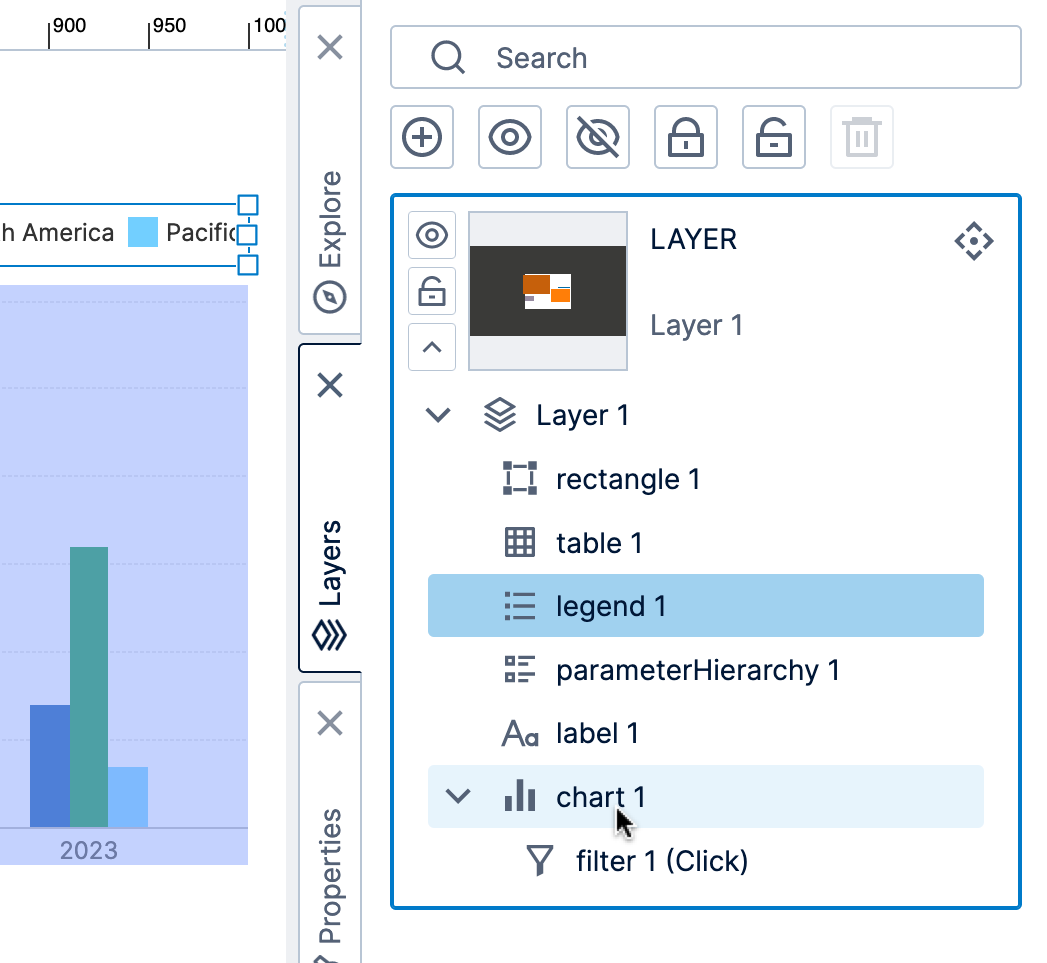
2.2. Layers
For power users and up, Layers give you a way to organize items on your canvas as a collective unit, which you can either show or hide while editing, or set up for viewers through interactions to show additional content. When editing a complex dashboard with overlapping content, you can hide or lock layers that you aren't working on.
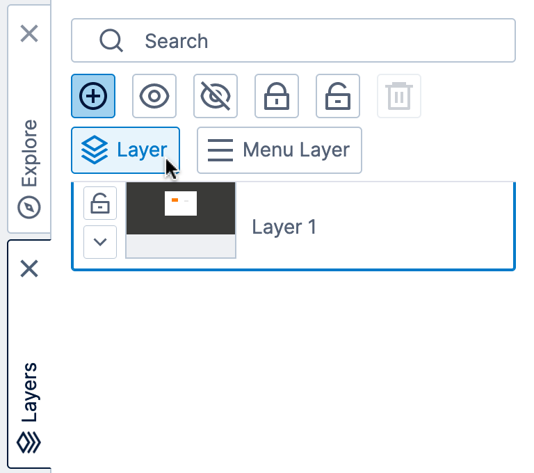
Every view starts with one layer. Even if you don't add any additional ones, the Layers window is useful for navigating around your canvas because it lists all of its content elements as well as any interactions such as filtering or scripting.
Click to expand a layer to list its elements placed on the canvas. You can also click a listed element to select it or hover over one to highlight it on the canvas.
For more details, see Layers and groups.
2.3. Properties
Properties are settings you can customize for visualizations, components, or parts of a view such as the dashboard's canvas.
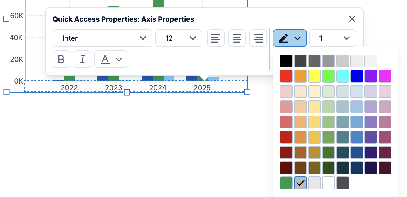
Some of the most common properties can be accessed from the Quick Access Properties panel that appears when right-clicking an item on the canvas or the canvas itself (left-click in previous versions). All user types can access these properties when editing, which can include various font settings, fill color, and border/outline styling.
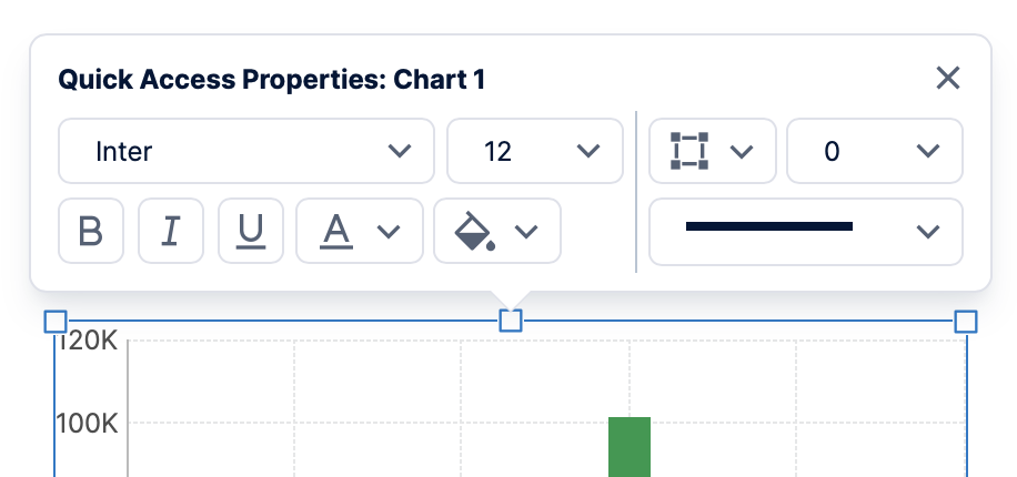
Quick Access Properties can list different properties depending on where you click, such as the overall font and outer border when right-clicking an empty area of the chart.
Many visualizations contain various elements within them that each have their own settings. Right-click on an individual element that you want to customize, such as a cell in a table, a chart axis and its labels, or a data point series in a chart (in previous versions, left-click again). The Quick Access Properties will show the settings that currently apply to that particular element if available.
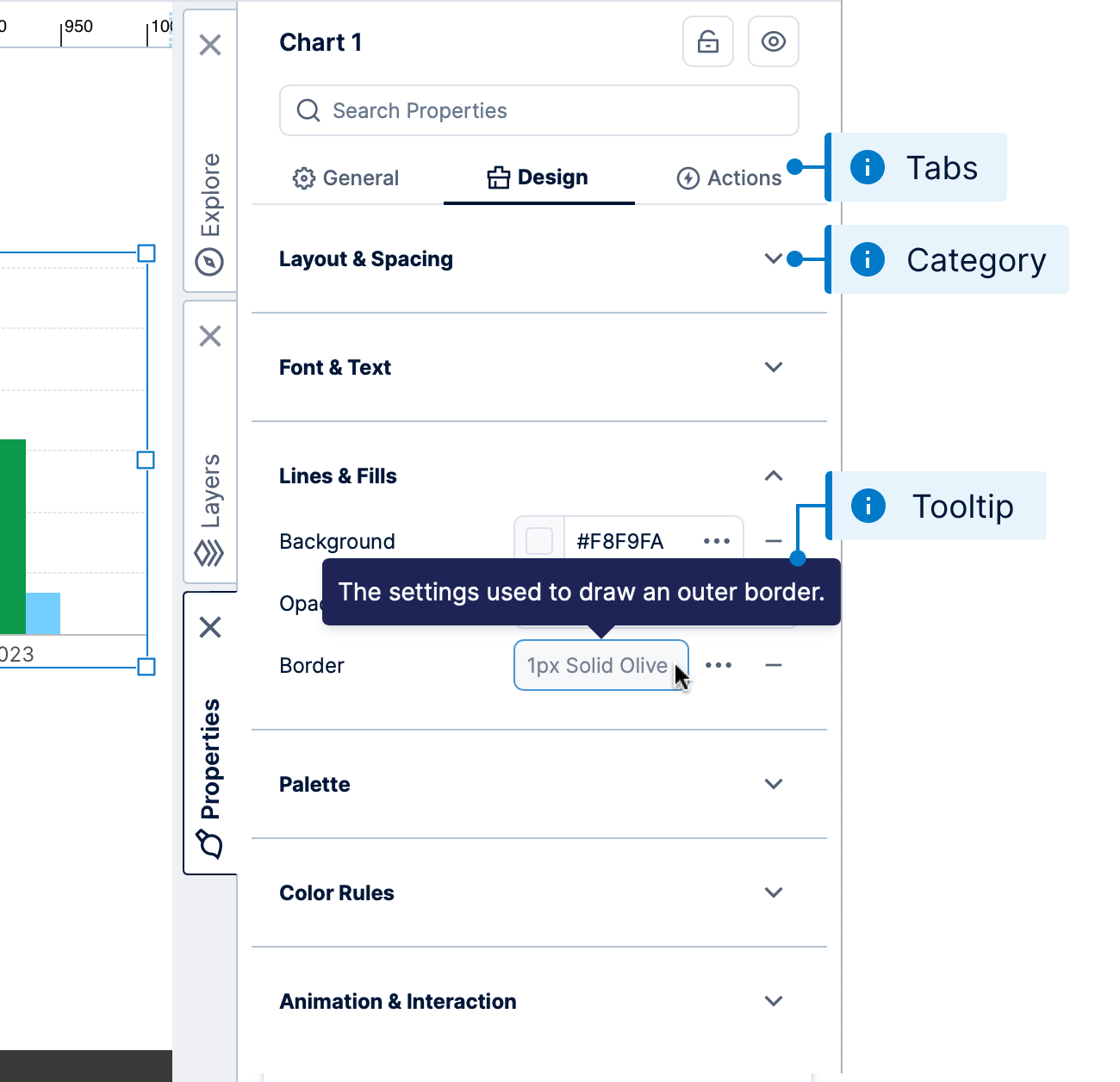
The full Properties window is available to users with at least a power user seat type, and lets you view and change the complete set of properties available for the selected items.
Hover over (or long-tap) a property name to view its description in a tooltip. Click the + button to set a value if currently not set, or to add an item.
If nothing is selected (e.g., you clicked on the canvas outside of any content), the Properties window shows the properties of your dashboard or whichever type of view you are editing. When multiple items are selected, you can set any available properties that are in common for them all at once.
Similar to the Quick Access Properties, click on part of your selected visualization or right-click to select a particular element (such as a chart axis or table column) and open its particular subset of properties. Alternatively, go to the General (or Main) tab of a visualization's properties to find a list of its elements and click one to customize it.
The Properties window also gives you access to the complete set of events supported by the selected item or view. You can add actions to these to trigger some behavior when an event occurs while viewing. See Using interactions for details.
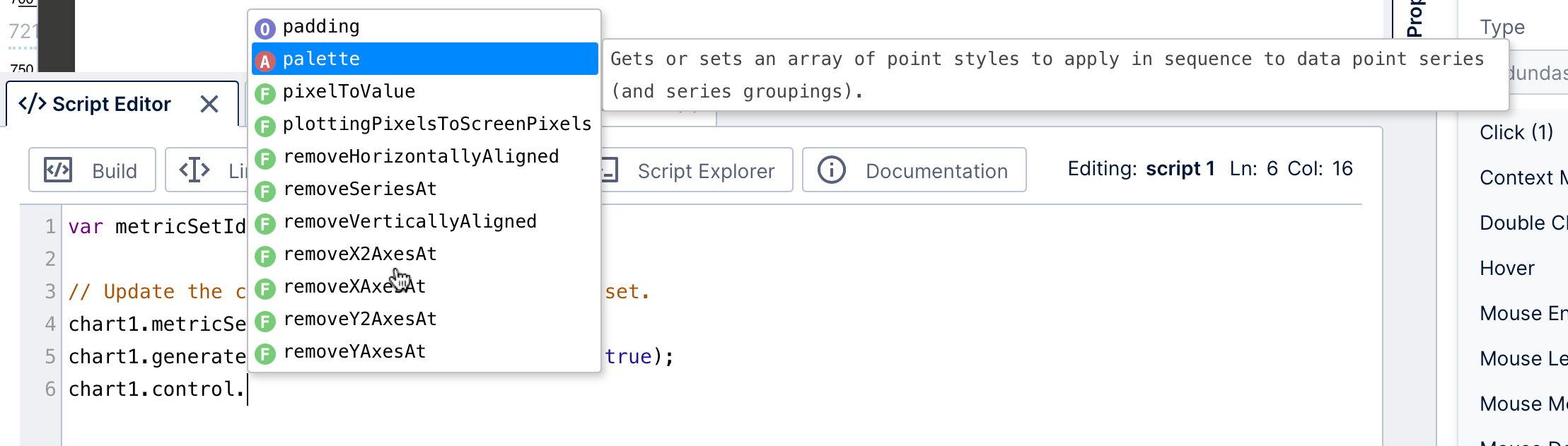
2.4. Script Editor
The script editor lets developer users write JavaScript code using the API to further customize and enhance views beyond the built-in interactions. Various script examples can be found in our script library.
There are built-in popups listing members and descriptions as you type that can you insert into your script, with direct links to the API reference. You can use code libraries to organize and reuse code between multiple scripts, dashboards, or other views.
2.5. Parameters
View parameters pass selected values to data visualizations from a filter, interaction, or script. When you add a filter, a view parameter connects it to visualizations to pass them the selected filter values, or you can create one without a filter control.
Open the Parameters window to view and manage the parameters of your dashboard, report, or other view.
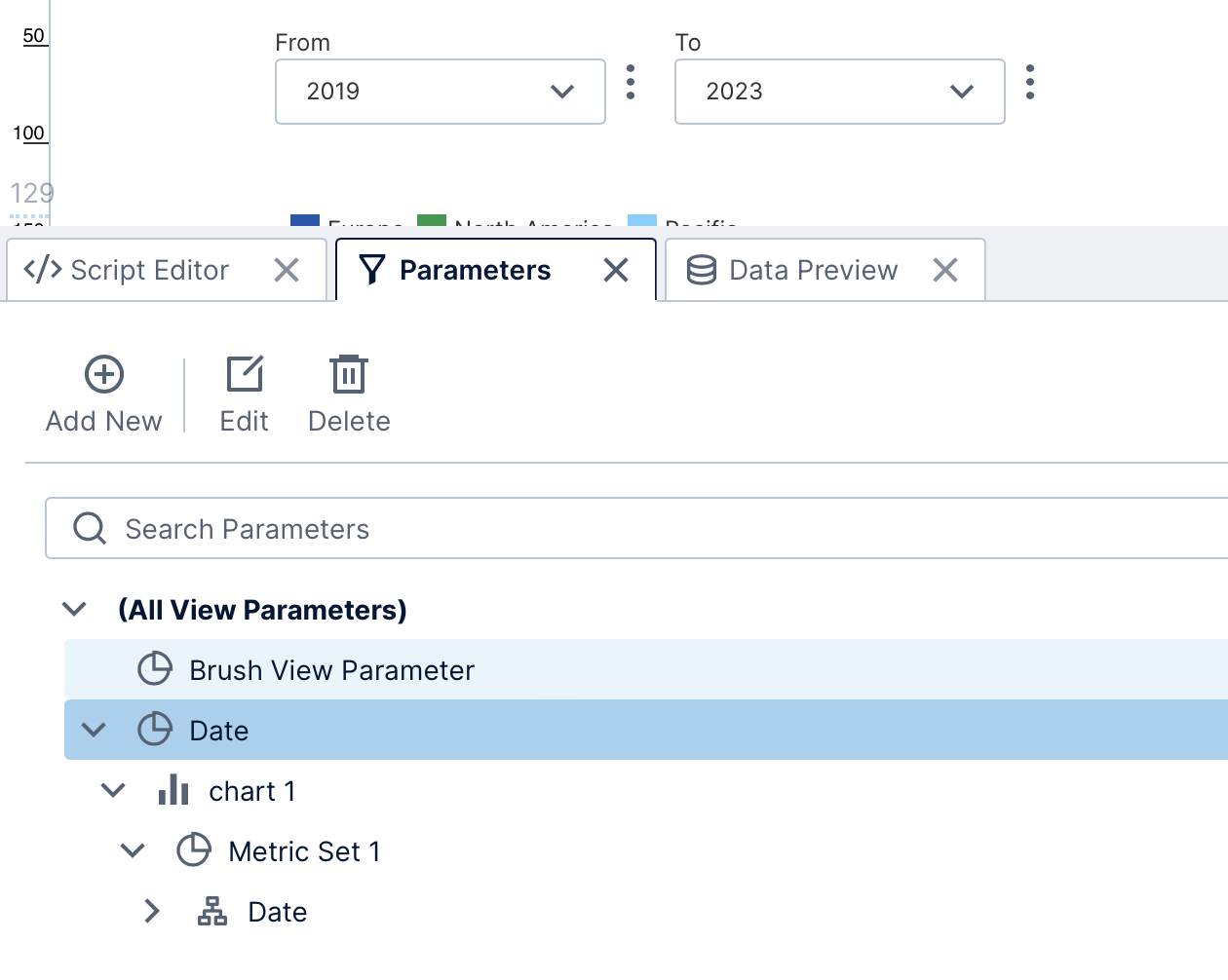
Parameters are used when setting up interactions to pass data from one visualization or component to another, so that you can click directly on data, for example, to filter, drill down, navigate to details and more.
The Brush View Parameter that appears by default in the Parameters window is used for data brushing (or brushing and linking), which is a built-in feature that allows you to select or hover over data in one visualization and have the same data automatically selected or highlighted in another. The brush view parameter facilitates communication between different data visualizations on your view, automatically indicating the selected data item based on its measure and hierarchy values behind the scenes.
Open the Properties window for the view itself (click an empty part of the canvas to de-select any other items) to change the view parameter used for data brushing or disable automatic brushing.
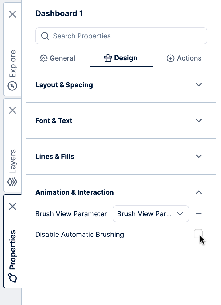
With automatic brushing disabled, you can set up your own custom brushing or selection behavior by setting up a filter interaction with the Brush View Parameter as the target parameter.
2.6. Data Preview
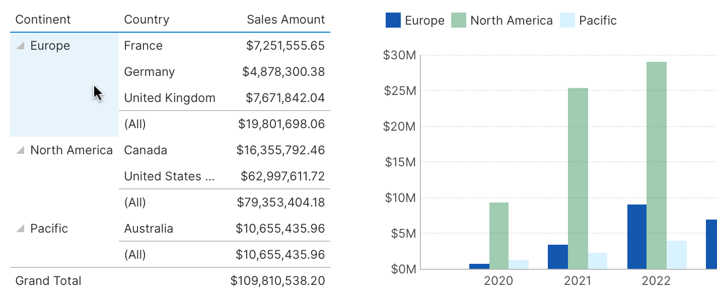
Select a data visualization on the canvas if you are editing a dashboard or view, and then open the Data Preview window to see the underlying data values displayed in a table. Note that the displayed preview may differ from the resulting data visualization, for example totals are normally hidden in charts.
Hover over a table cell, or click to select a row or column in the Data Preview window, and corresponding data will be highlighted in your own visualizations. This is an example of the automatic data brushing.
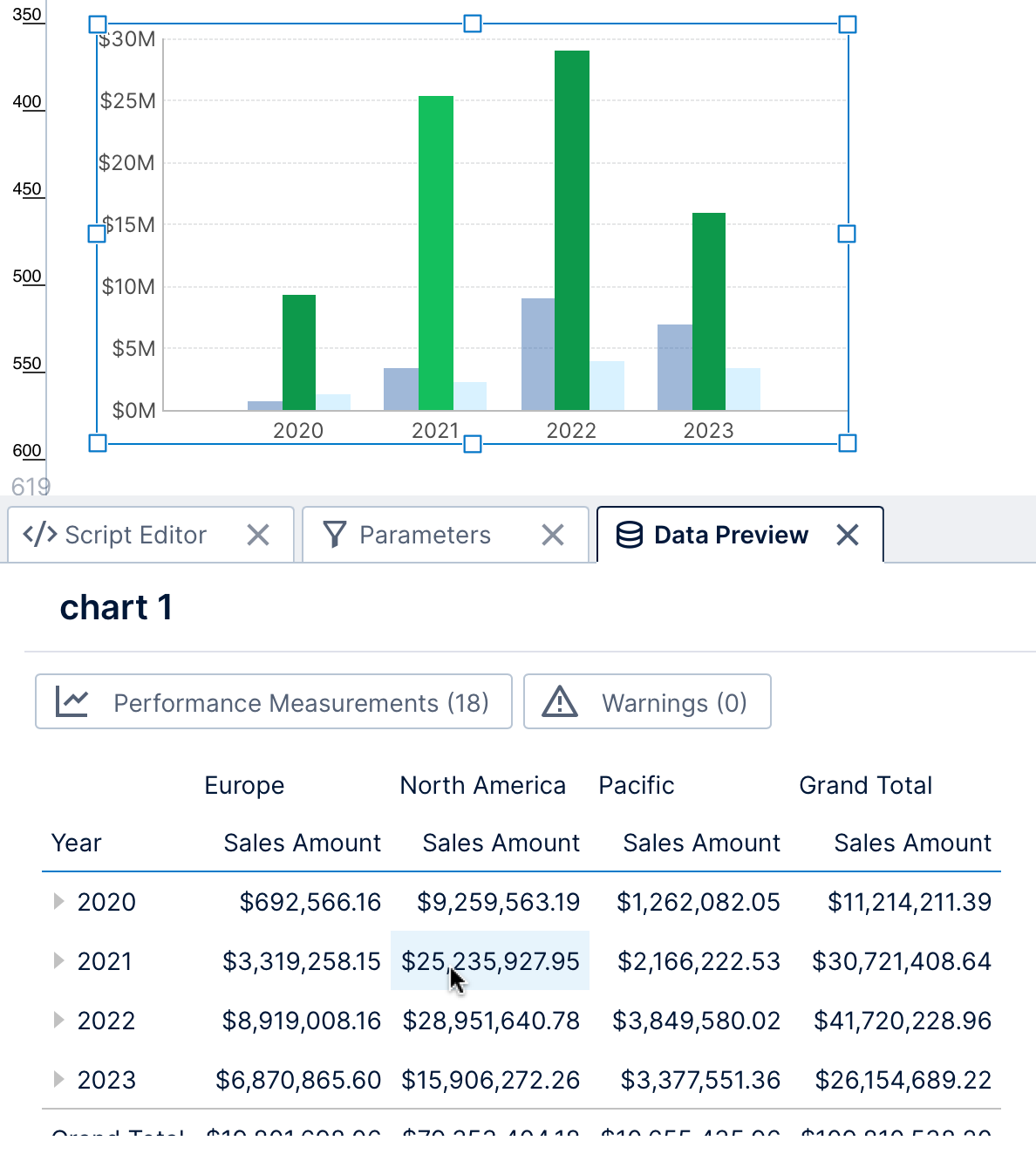
Clicking to select rows or columns will also display corresponding statistics in the status bar.
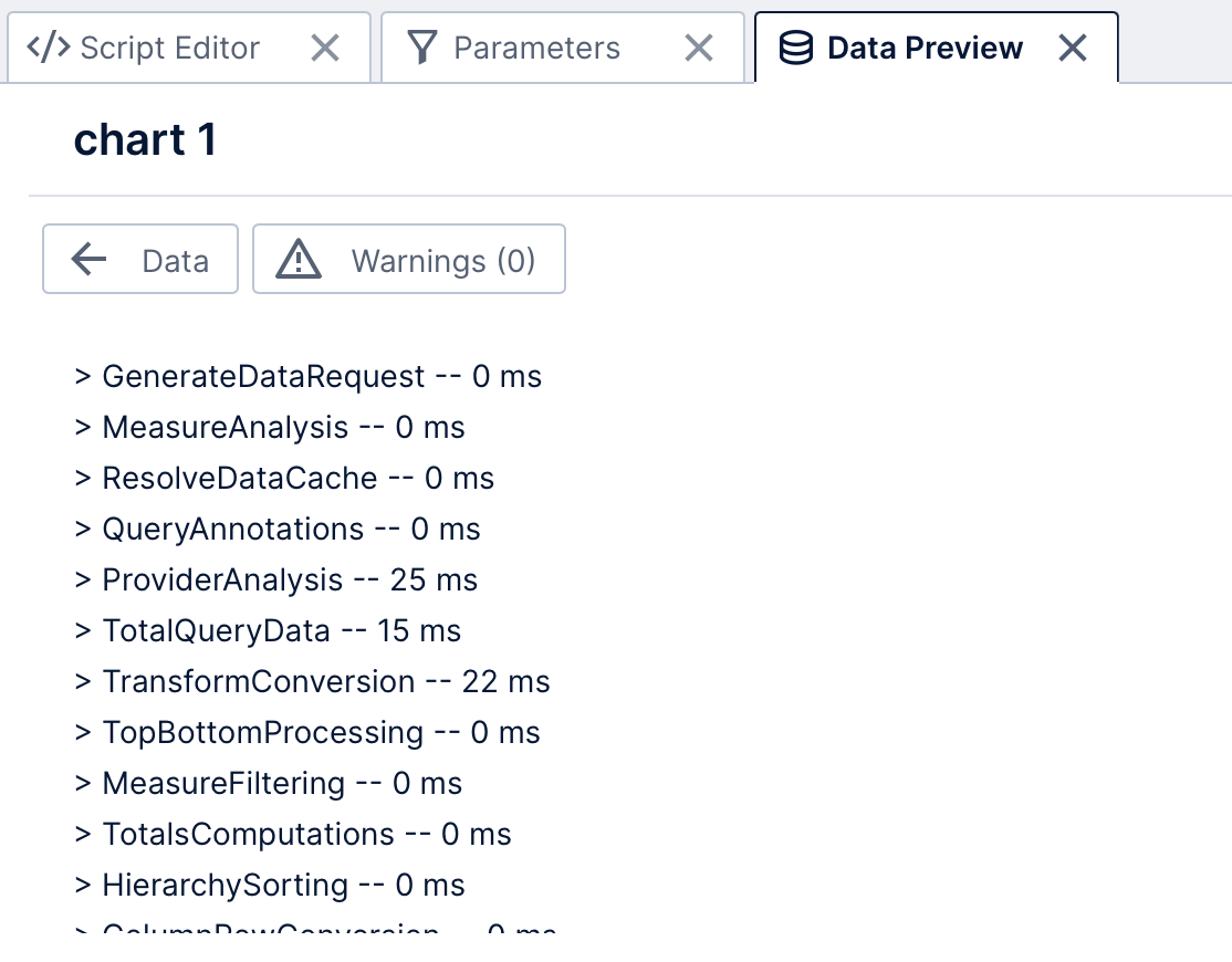
The Data Preview window also lets you view performance measurements and warning messages related to data retrieval for the selected data visualization on the canvas.
3. Data Analysis Panel
For every data visualization, there is a corresponding metric set that encapsulates the data itself, and visualization settings that assign data to parts of the data visualization. The Data Analysis Panel manages all these data-related settings, whereas the Properties window is used for visualization-specific settings for appearance, animation, interactivity, etc.
If not yet open, click to a select a visualization and choose it from the toolbar or right-click/context menu.
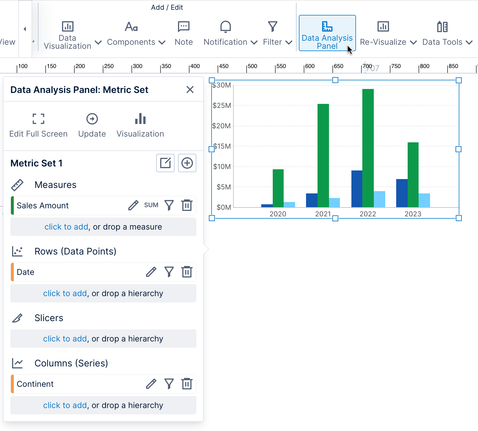
If the metric set is checked out to you (including if you created it on the dashboard or view directly), you can add or remove data and change other metric set settings from the Data Analysis Panel. Switch to the Visualization settings using the button at the top.
See Metric set analysis tools, Slicers versus columns and rows, and Setting up the visualization for more details.
4. See also
- Video: Introducing the Dashboard Designer
- Walkthrough: View data with a chart and drill down
- Using the home screen
- Working with projects
- Using the status bar
- Edit versus view mode and sandbox view
- Using dockable windows
- Using a template grid for resizing
- Using interactions
- List of keyboard shortcuts
- Script Library