Adding a diagram
1. Overview
A diagram connects your data with a custom diagram that can arrange and display your data however you choose. Some examples are an interior floorplan, a figure of a piece of machinery, or a flow chart.
Similar to a map visualization, diagrams are made up of shape, path, and symbol elements. You assign data to these elements to change their appearance (e.g., color or size) and to display in labels or tooltips.
- Shapes – Areas defined by boundaries on all sides, such as rectangles or circles, or any irregular figure that is also a closed shape.
- Paths – Lines that can have their own attached data, often used to connect two shapes. These can be defined as part of the diagram, or you can use a data source that refers to pairs of symbols.
- Symbols – Location points at a specific place on the diagram. These can either be defined as part of the diagram, or from coordinates in your data source that correspond to the coordinates in the original diagram file.
2. Supported formats
2.1. SVG
The diagram visualization supports the SVG (Scalable Vector Graphics) format. Many tools can produce SVG diagrams, including Microsoft Visio and Adobe Illustrator.
An example SVG file looks like this:
<?xml version="1.0" encoding="UTF-8"?>
<svg xmlns="http://www.w3.org/2000/svg" viewBox="0 0 1296 864">
  ...
	<g>
		<g id="shape2-1" transform="translate(277.795,-680.315)">
			<title>Square</title>
			<rect x="0" y="750.614" width="113.386" height="113.386" class="st1"/>
		</g>
		<g id="shape3-3" transform="translate(85.0394,-680.315)">
			<title>Circle</title>
			<path d="M0 807.31 A56.6929 56.6929 0 0 1 113.39 807.31 A56.6929 56.6929 0 1 1 0 807.31 Z" class="st1"/>
		</g>
		<g id="shape4-5" transform="translate(198.425,-729.921)">
			<title>Dynamic connector</title>
			<path d="M0 856.91 L72.33 856.91" class="st2"/>
		</g>
	</g>
</svg>
Your diagram can name its elements using a <title> element or id attribute. Alternatively, elements are assigned names when importing the diagram, which you can find listed in the Properties window when using it in a diagram visualizaztion.
In Adobe Illustrator, you can rename the object in the Layers panel. When using Visio to create a diagram, use the right-click option Data > Define Shape Data to enter a Label titled Name or ID and a shape name as its Value. If the Developer tab is enabled, you can use the Shape Name option in the ribbon.
2.2. XAML
The diagram visualization also supports Microsoft's XAML file format when the application is installed directly on a Windows server. Some tools may support XAML, or you can edit it using Microsoft's Visual Studio.
An example XAML file looks like this:
<Canvas xmlns="http://schemas.microsoft.com/winfx/2006/xaml/presentation" xmlns:x="http://schemas.microsoft.com/winfx/2006/xaml" x:Name="floorplan" Width="800" Height="600" Clip="F1 M 0,0L 800,0L 800,600L 0,600L 0,0">
	<Canvas x:Name="Layer_1" Width="800" Height="600" Canvas.Left="0" Canvas.Top="0">
		<Path x:Name="OuterWalls" Width="457.932" Height="461.235" Canvas.Left="72.4715" Canvas.Top="93.5018" Stretch="Fill" StrokeLineJoin="Round" Stroke="#FF000000" Data="F1 M 529.904,141.916L 481.918,94.0018L 120.078,94.0019L 72.9715,141.108C 72.9715,141.108 72.9715,499.975 72.9715,506.173C 72.9715,512.371 121.036,554.237 121.036,554.237L 486.085,554.237L 529.725,510.598L 529.904,141.916 Z "/>
		<Rectangle x:Name="Desk1" Width="17" Height="17" Canvas.Left="115" Canvas.Top="125" Stretch="Fill" Fill="#FF000000"/>
		<Rectangle x:Name="Desk2" Width="17" Height="17" Canvas.Left="139" Canvas.Top="125" Stretch="Fill" Fill="#FFFF0000"/>
		...
3. Displaying a diagram
3.1. Import a diagram
You can create a diagram visualization in a metric set, or in a view such as a dashboard. Create or open one for editing from the main menu.
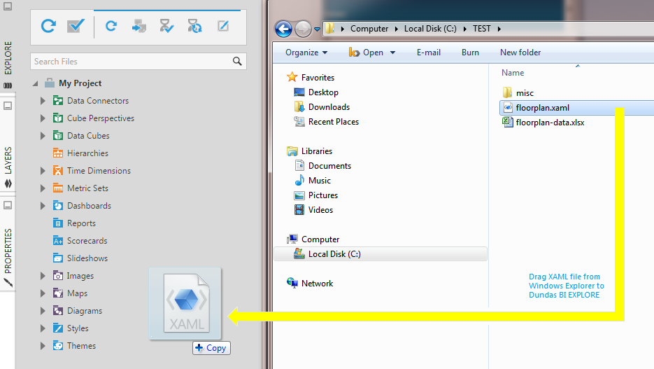
Locate your diagram file in Windows Explorer or Finder.
Drag the file and drop it over the Explore window.
The diagram file is imported into the Diagrams folder in the Explore window.
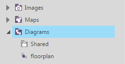
Like with other types of files, you can also import a diagram by right-clicking (or long-tapping) the Diagrams folder and choosing Upload File from the context menu.
3.2. Drag the diagram to the canvas
When editing a dashboard or other view, drag a diagram from the Diagrams folder to the canvas.
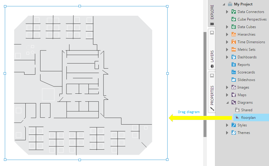
A diagram visualization appears on the canvas.
3.3. Re-visualize to a diagram
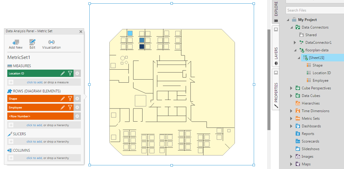
When editing a metric set full screen, you will need to start by selecting the data you want displayed in your diagram. You can also start with existing data selected on a dashboard or view.
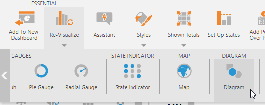
In the toolbar, Re-Visualize your data to a Diagram.
You can then drag the diagram from the Explore window that you imported earlier onto the visualization to display it.
3.4. Appearance
You can go to the Properties window and change the default appearance settings that take effect for the diagram when not using data to change colors and sizes.
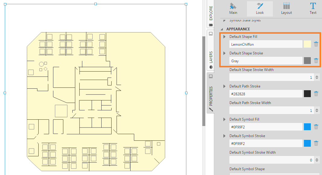
4. Add data to the diagram
When data is added to a diagram or re-visualized to a diagram, it is connected automatically to the names from one of the hierarchies you selected. A measure is assigned automatically to change the colours of diagram elements based on the values.
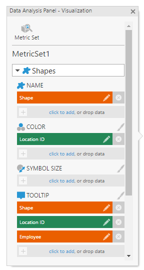
To change which hierarchy or measure is assigned to the diagram and where, go to the Data Analysis Panel, click Visualization, add or remove data from the visualization options.
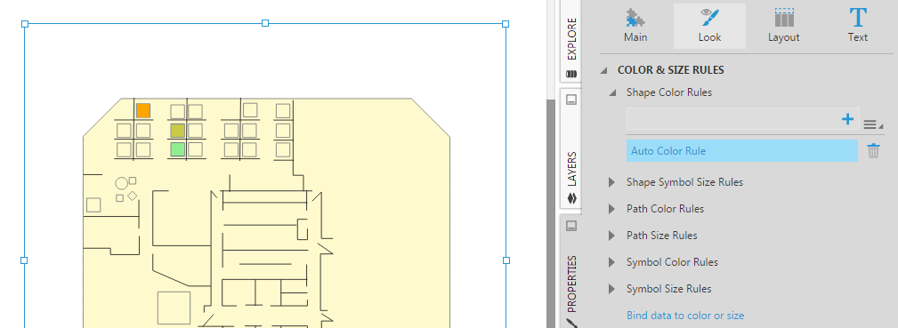
Colors and sizes are determined using color rules and size rules, which you can configure via the Properties window.
For example, select the diagram, go to Properties window, and modify the shape color rule in order to change the colors of the shapes in the diagram.
Symbols can also be placed according to the coordinates from your data source if they correspond with the coordinates used in the diagram, the same way symbols can be plotted on maps with latitude and longitude coordinates. Paths can be set up to connect between pairs of symbol names that come from your data source.
For more details on changing colors and sizes of diagram elements based on data, or plotting symbols and paths from your data source, see Displaying symbols on a map.
5. Compatible names
In case the data you want to use has column values that cannot be matched against the names of elements from the file, the diagram visualization will attempt to use alternate names. Uploaded diagrams will use groups and custom properties from the diagram file as sources of alternate names.
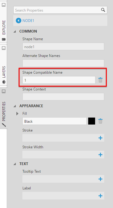
If the data does not match the names or the alternate names, you can manually set the Shape Compatible Name property for the shape element.
Path and symbol elements also have compatible name properties.
6. Using a diagram
Once your design is complete, go to the toolbar and click View.
In View mode, you can:
- Zoom in or zoom out on the diagram by using the mouse wheel.
- Pan across the diagram by clicking and dragging it in any direction.
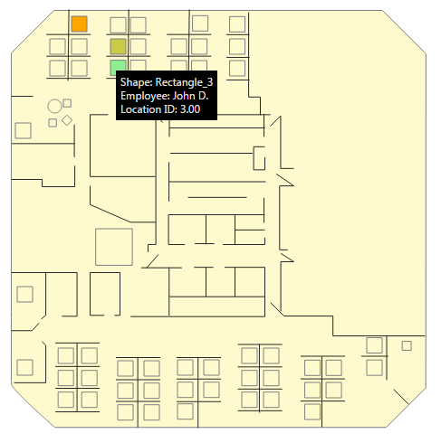
- Hover over a shape on the diagram to view its corresponding tooltip (which shows the connected data values).
Note that zoom or pan changes that you make in View mode will persist even when you switch back to Edit mode.

