
1. Overview
A legend is used to identify data in visualizations by its color, size, or other distinguishing features.
Simply connect one or more data visualizations to a legend and they will automatically display a table of symbols and descriptions to help users understand what is being displayed.
Related video: Using a Legend
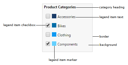
2. Elements of a legend
The figure below shows the main elements of a legend. By default, the background of a legend is transparent, and no border is visible.
3. Add a legend for a chart
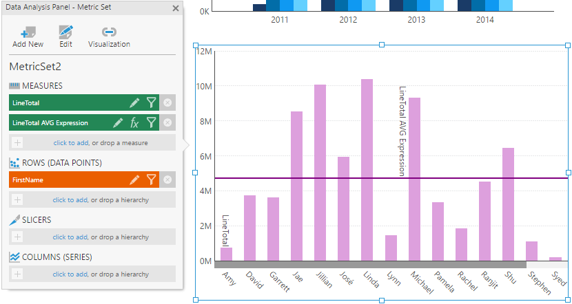
As an example, consider a metric set configured as follows:
- Measures: OrderQty
- Rows: OrderDate
- Columns: Product hierarchy
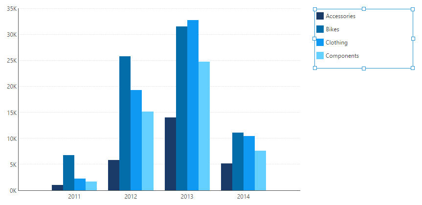
When this metric set is added to a dashboard, a bar chart appears showing multiple bar series. Each bar series (bars with the same color) corresponds to a different product category such as Bikes or Accessories.
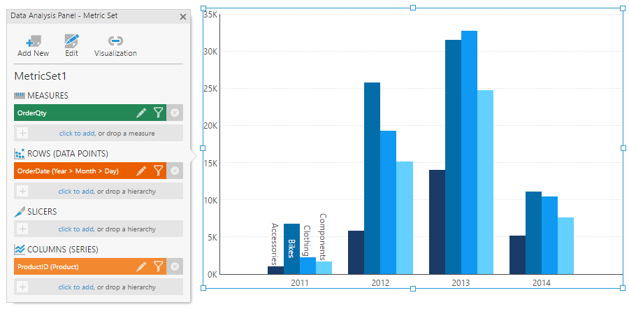
In the figure above, you'll notice that the bar chart displays the name of each product category for the first set of data points. This is the default behavior for the chart when there is no legend attached.
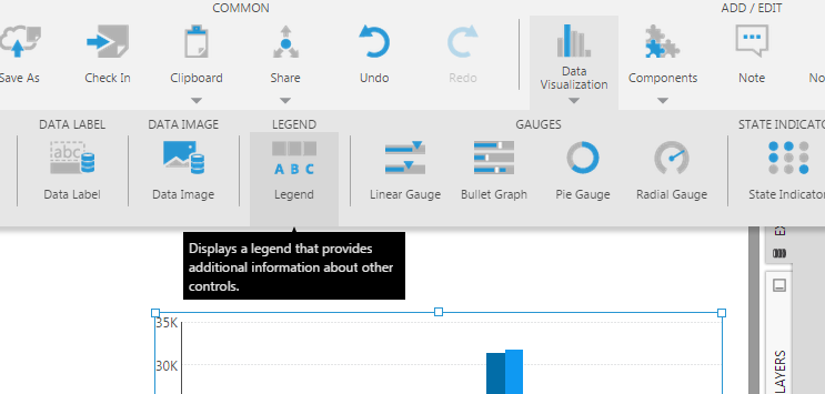
To connect a legend to a visualization, click to select it, then choose Data Visualization in the toolbar and then Legend (you may need to scroll to the right).
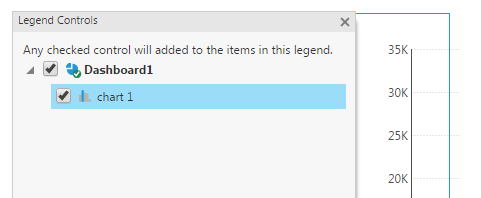
You'll see a popup panel asking you to choose one or more data visualizations to associate with the legend. The visualization you had selected should already be checked. You can connect to multiple visualizations to use one legend for all of them. Click the x button when finished.
The legend now displays items corresponding to the chart. You can reposition or resize the legend as you like (scrollbars will appear as needed).
Notice that the bar chart no longer displays the product category names for the first set of data points. This is because the chart is now connected to a legend.
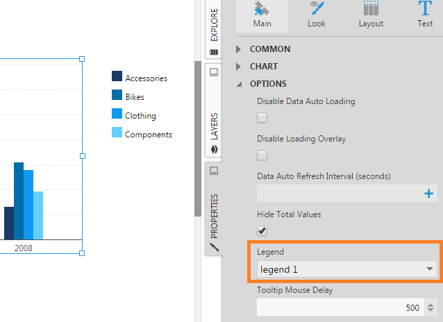
4. Legend-related properties
Select the bar chart and go to the Properties window. Scroll down and look for the Legend property. You'll see that it is set with the name of the target legend.
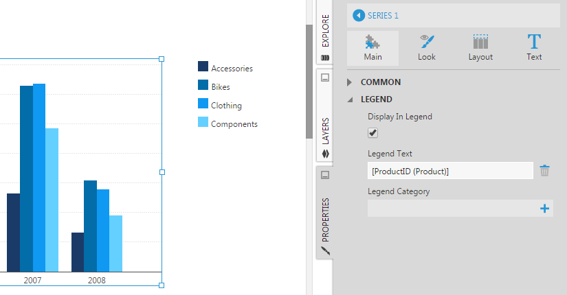
Most visualizations have additional legend-related properties on whichever elements are identified in the legend, for example, in the properties for a chart's data point series.
- The Display In Legend property determines whether auto-generated legend items should be displayed for this chart series.
- The Legend Text property determines the text for each auto-generated legend item. It may contain the name of a measure, or a placeholder keyword for a Columns hierarchy. You can edit this value and insert some additional text, which will be reflected in the legend items.
- Use the Legend Category property to set the text for a category heading which will appear above the auto-generated legend items for this chart series.
5. Visualization tab description
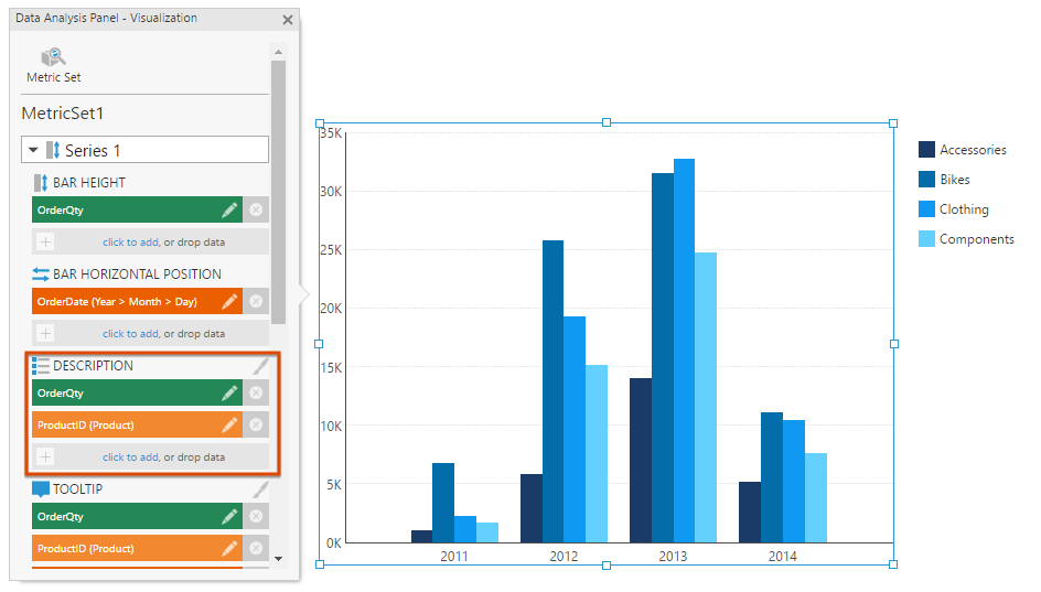
Right-click (or long-tap) on the bar chart to open its Data Analysis Panel. Click Visualization in the top-right, and then scroll down to find Description for the chart series. You can assign data here or change what data is assigned to determine how this chart will automatically label its legend items for this series.
6. Category headings
Multiple data visualization controls can be connected to a single legend control on the canvas. For example, two charts can have the Legend property point to the same legend. In this case, some of the items in the legend correspond to one chart, while the remaining items correspond to the second chart. To help group or separate legend items, you can use category headings.
As an example, add a second metric set to the dashboard as shown below.
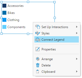
To connect this second chart to the same legend, right-click (or long-tap) on the legend and select Connect Legend from the menu.
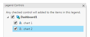
Select the checkbox for the second chart.
Two legend items corresponding to the second chart are automatically appended to the existing legend (LineTotal and LineTotal AVG Expression).
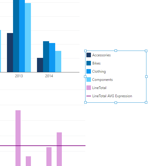
Since legend items from both charts are grouped together, it's not easy to see which items correspond to which chart.
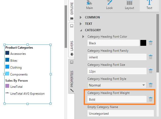
To address this with category headings, go to each chart's properties, edit the series, and set their Legend Category properties.
The category headings appear in the legend just above their legend items. You can select the legend and go to its properties to change the appearance or layout of the category headings. For example, align the headings on the left and set the font weight to bold.
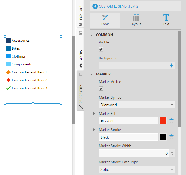
7. Custom legend items
In the Properties window with a legend selected, you can add Custom Legend Items in the General (or Main) tab, each with the text and appearance of your choice.
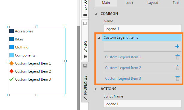
Each custom legend item can have its own marker symbol, fill color, and other property settings.
8. Legend item checkboxes
8.1. Chart series
Legend items can have checkboxes displayed beside them. You can use these with chart series to allow them to be shown or hidden, by editing the properties of the series and selecting Show Legend Checkbox.
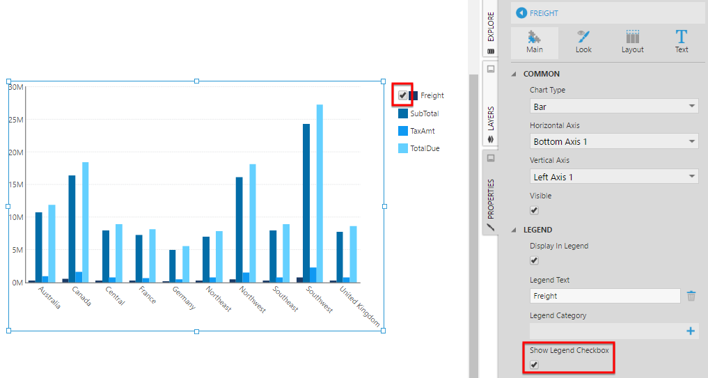
Switching to view mode, you can now check and uncheck these series from the legend to show or hide them in the chart.
8.2. Scripting checkboxes
When using custom legend items, you can add your own functionality for their checkboxes using script rather than rely on the built-in functionality shown above, by selecting the legend's Script Checkboxes Visible property option. In recent versions this is found in the Design tab under Animation & Interaction.
For example, add three custom legend items with the text Total Due, Tax and Freight, then show or hide the pointers of a linear gauge with script like the following in the legend's Item Check Changed actions:
var item = e.originalEvent.legendItem;
if (item.text == "TotalDue") {
    gauge1.control.pointers[0].isVisible = item.isCheckboxChecked;
} else if (item.text == "TaxAmt") {
    gauge1.control.pointers[1].isVisible = item.isCheckboxChecked;
} else if (item.text == "SubTotal") {
    gauge1.control.pointers[2].isVisible = item.isCheckboxChecked;
}