
1. Overview
Use color rules to apply colors to data points or series based on their values. There are three types of color rules you can apply:
- Discrete Color Rule – Applies a specific color to a member of a hierarchy.
- Auto Color Rule – Automatically divides the range of data and the set range of colors into ranges of values with colors assigned.
- Range Color Rule – Applies a specific color to a set range of values.
2. Apply a discrete color rule
Discrete color rules assign what color is used for a particular hierarchy value. You can add multiple to assign different colors for a series of values.
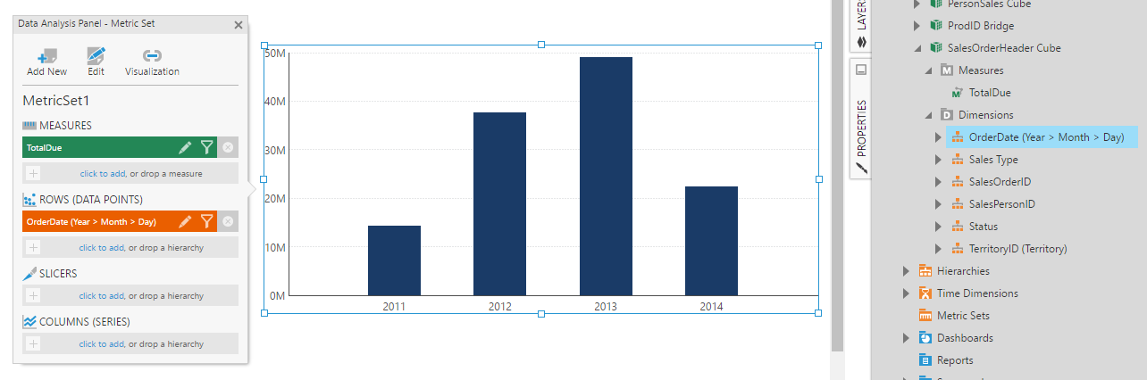
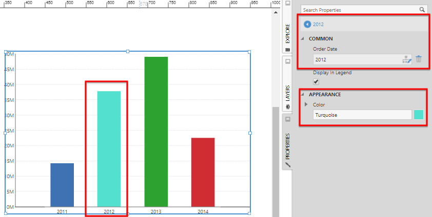
As an example, we will drag TotalDue to the canvas as a measure, add OrderDate and re-visualize the resulting visualization as a bar chart.
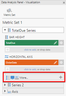
In the Data Analysis Panel, click Visualization, then click More under TotalDue Series.
Add the hierarchy under Color, which is OrderDate in this example. You can click click to add, drag the hierarchy from the Explore window, or from elsewhere in the Data Analysis panel.
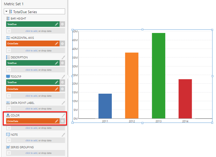
The color rules are now activated and discrete color rules are created for each value. Click the brush icon to the right of the Color heading to open the color rule properties found in the Design (or Look tab).
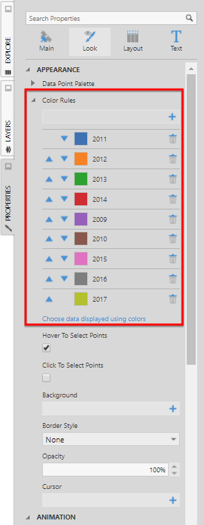
Click the + button to add a Discrete Color Rule or click an existing rule (for example, 2012) to edit it. For each rule, choose the color you want and its corresponding hierarchy value (e.g., Order Date value).
Click the back button at the top of the properties to go back to the list of color rules.
3. Apply an auto color rule
Auto Color Rules automatically come up with a series of colors applied based on measure values. You can change their settings to determine how different ranges of values are calculated and assigned colors.
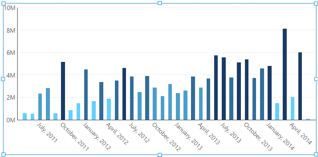
For this example, we will use the same bar chart setup as in the example above, changing the default OrderDate hierarchy level to Month.
This time, instead of OrderDate, drag the TotalDue measure under Color.
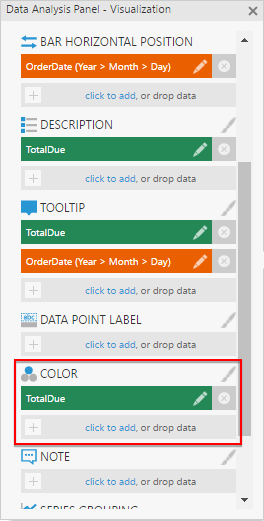
An auto color rule is automatically created and applied to the chart.
Click the brush icon to the right of the Color heading to open the related properties.
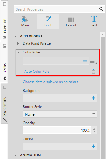
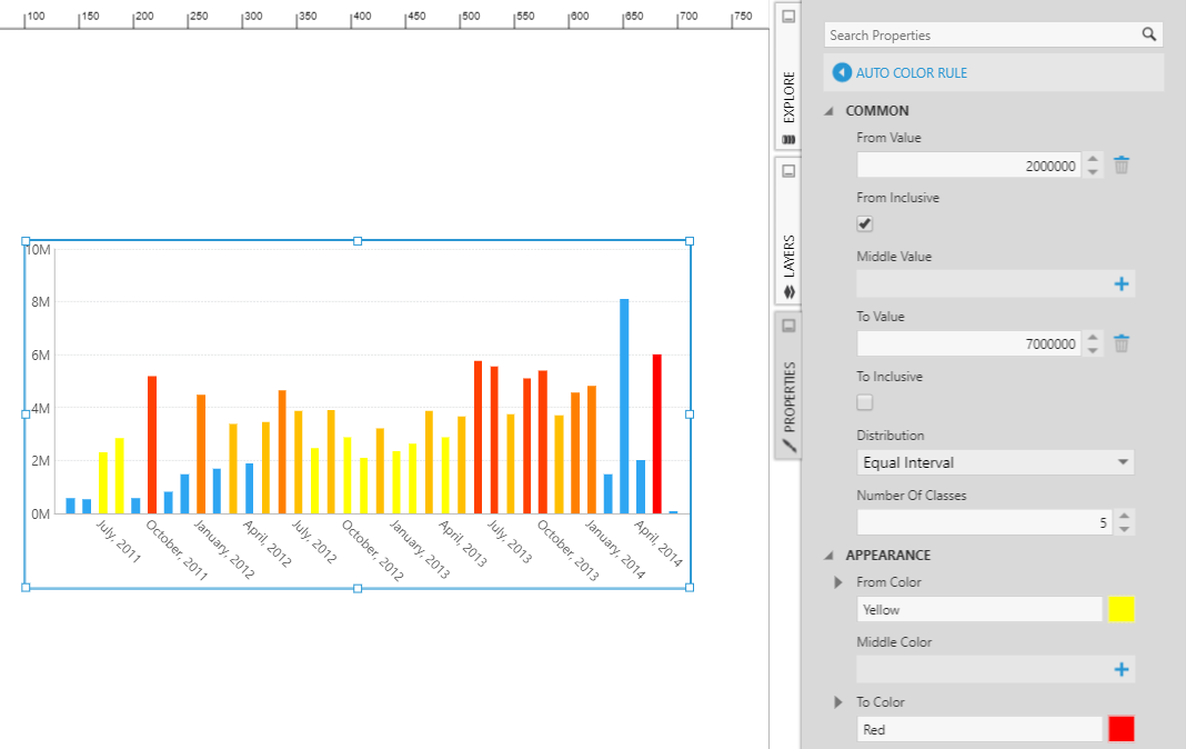
If not already opened, click Auto Color Rule to edit it. For example:
- Click on the + button next to From Value and enter 2000000. This will prevent values under 2M from being included in the color rule.
- You can specify a Middle Value if needed.
- Click on the + button next to To Value and enter 7000000. Uncheck To Inclusive to prevent values over and including 7M from being included in the color rule.
- Set Number Of Classes to 5 and the Distribution to Equal Interval. This will assign a different color to each million in the range.
- Set From Color to Yellow and the To Color to Red. This will create shades of colors where the hue changes from yellow to red as the values increase. If you specified a middle value, then specify a Middle Color.
The distribution determines whether and how the ranges and colors will be divided into 'classes' or 'bins'. There are more details on each distribution type in the article on displaying symbols in a map.
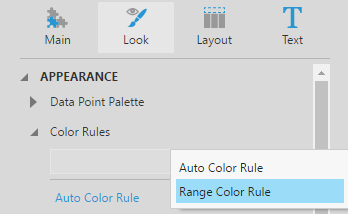
4. Apply a range color rule
Range Color Rules can set a specific color to use for a range that you specify. You can add multiple to set up a series of ranges.
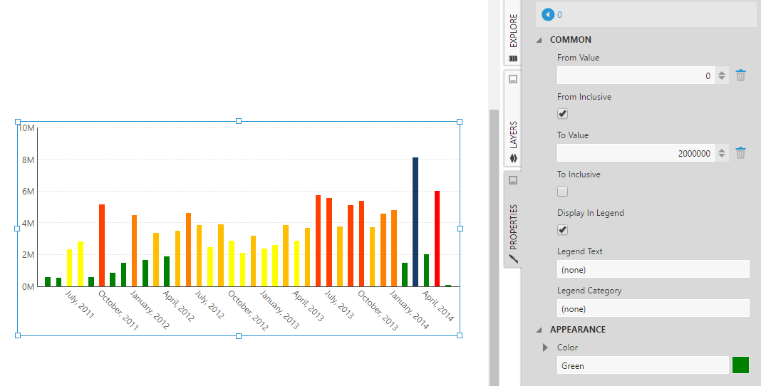
Open the Properties window to the chart's Design (or Look) tab, and find Color Rules (click the Properties window's back button if you are not at the top level chart properties).
Click the + button next to Color Rules, and select Range Color Rule to add a new custom range.
Click the range color rule to edit it. For example, set To Value to 2000000, uncheck To Inclusive, and select a color.
5. See also
- Video: Configuring Metric Sets
- Displaying symbols on a map
- Create a metric set and add a filter
- Using chart properties
- Setting up the visualization
- Visualization tab examples