
1. Overview
For every data visualization, there is an underlying metric set that encapsulates the data, and there are settings that determine how each element in the data is visualized.
The visualization options are different depending on the type. A bar chart, for instance, has a number of options for each series of bars such as:
- Bar Height - the data that determines the height of each bar data point
- Horizontal Axis - the values determining the position of each bar data point along the x axis
- Description - what data should identify this series in the legend or a series label
- Tooltip - values to be displayed in a popup when the user hovers over or long-taps a data point
- Data Point Label - values to display in labels on or next to each data point
- Color - change the colors of data points based on the values you select
- Note - specify values to display as notes, the same way user-added notes or annotations are displayed
- Series Grouping - group each series into multiple based on the values
- Side-By-Side Position - determines which bar chart series or similar are overlaid or stacked together based on matching values
Other chart types and other data visualization types have different options, although some are common.
Related video: Configuring Metric Sets
2. Metric set editor
2.1. Default visualization
When you create a new metric set from the main menu, the visualization created there acts as a default visualization for that metric set. It serves as a template for a new data visualization when you add this metric set to a dashboard or other view, although from then on the two visualizations are separate. A metric set can be reused multiple times on the same view or in different views, and by different users, where each visualization can be customized and re-visualized differently.
The visualization is set up from the Visualization tab of the Data Analysis Panel. Switch to this tab at any time to see or change how the data is visualized.
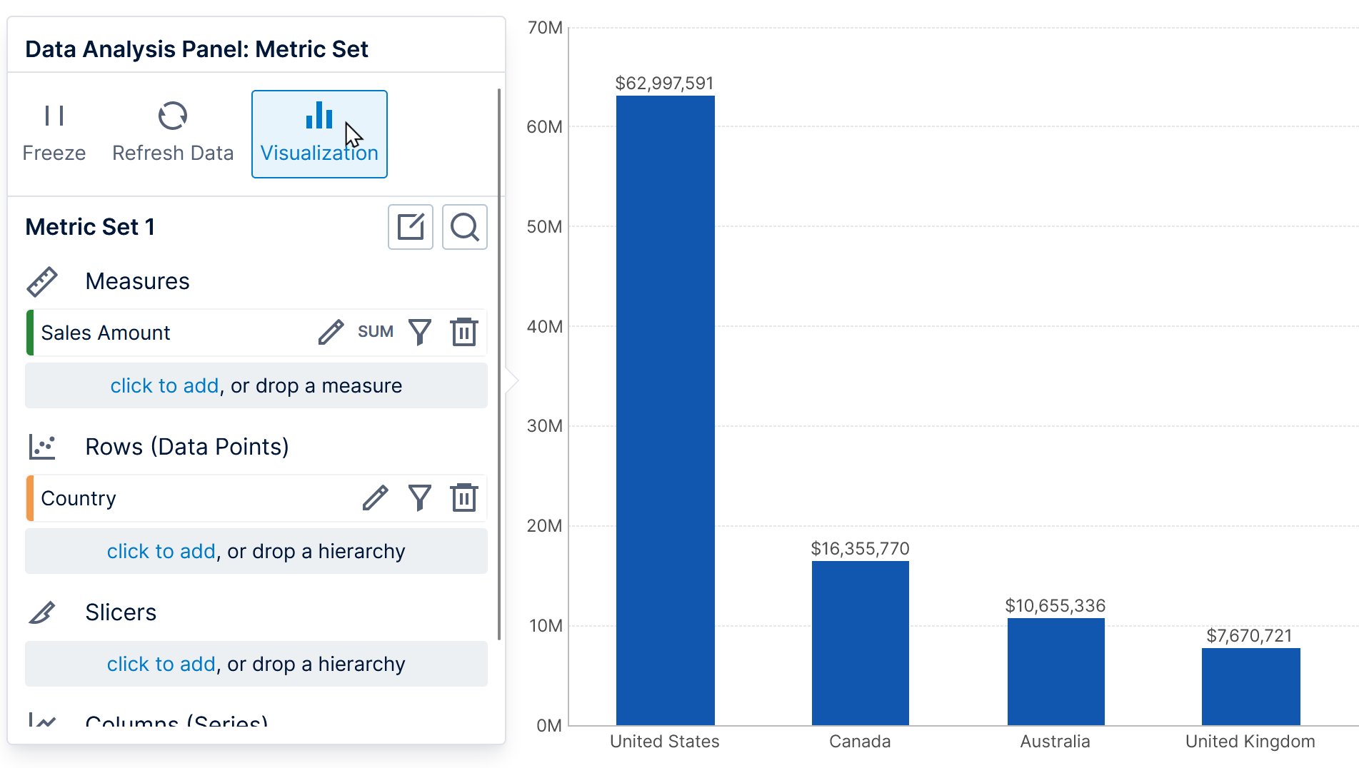
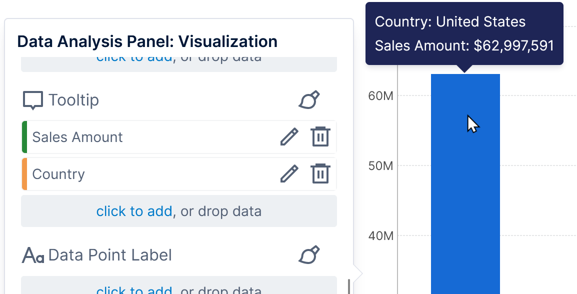
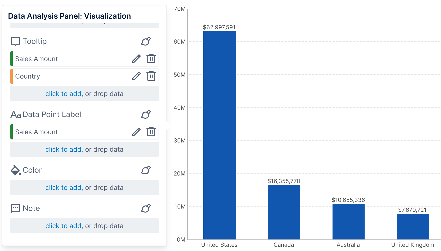
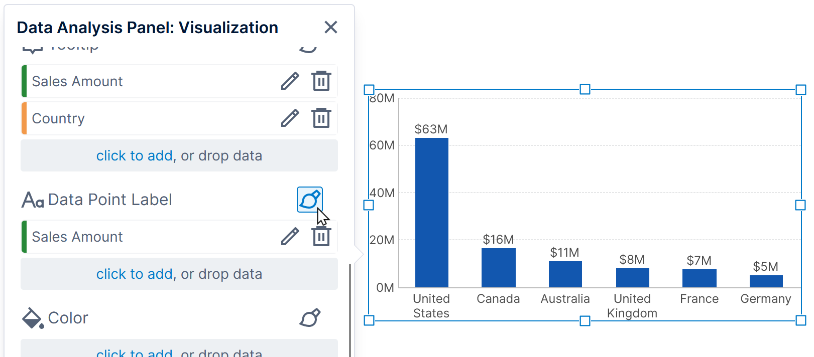
In the example below, the Sales Amount measure and Country hierarchy were automatically added under Tooltip for the data point series when that data was added to the metric set.
2.2. Assign data to the visualization
When you add data to the Metric Set without specifying a particular part of the visualization, that data is visualized for you using the default options.
If you want to choose how to use data in a visualization instead, there are several ways:
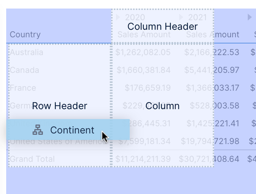
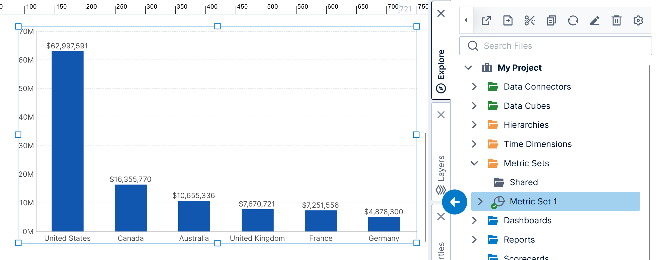
- Drag from the Explore window: drag a measure or hierarchy (or one of its levels) from the Explore window from under a data connector or data cube. Drop it in the Data Analysis Panel's Visualization tab, or onto one of the corresponding labeled areas over the visualization if available.
Dropping data onto a specific table visualization area - Drag within the Visualization tab: drag a measure or hierarchy already selected elsewhere in the Data Analysis Panel's Visualization tab, and drop it where you want to add it. Note that this is a copy to use that data in both places, unless you press the Shift key and drag within the Visualization tab to move that data from one option to another.
- Click to add: use a click to add link in the Data Analysis Panel's Visualization tab and select the measure or hierarchy you want from the existing data source already in use.
- Click to remove: click the delete icon next to assigned data in the Data Analysis Panel's Visualization tab to remove it from the visualization (this does not remove it from the metric set itself).
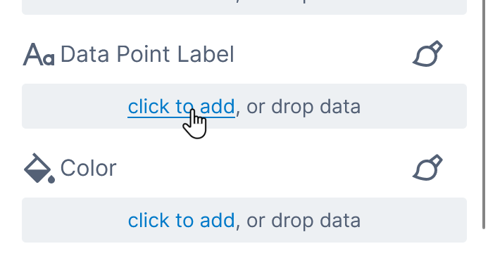
For example, click to add under Data Point Label to display data as labels.
Choose data from the list that appears, and the visualization will be updated with the new setting.
For example, our bar chart visualization now displays the Sales Amount value at each data point.
If you drag or click to add a new element not previously added to the metric set, it will be added there as you can see in the Data Analysis Panel after switching out from the Visualization tab.
Next, if you drag this metric set onto the canvas of a dashboard, the resulting bar chart will also display data point labels because of this setting in the metric set's default visualization.
3. Editing dashboards and other views
When you add an existing metric set to a dashboard or other view, for example by dragging it from the Explore window onto the canvas, a new data visualization is created based on the metric set's default visualization.
In the figure below, the newly added bar chart displays data point labels just like the metric set's default visualization.
You can also create a new metric set directly on a dashboard or other view by dragging data from a data connector or data cube directly onto the canvas or onto a new visualization.
Each visualization's settings can be customized differently even when reusing a metric set. Just like when editing a metric set full screen, you can customize the visualization from the Data Analysis Panel.
3.1. Data Analysis Panel
The same Data Analysis Panel is used in dashboards and other views as when editing a metric set full screen.
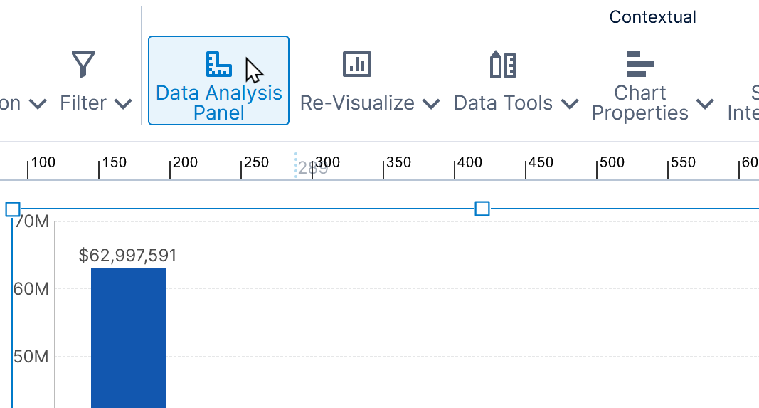
It is initially open by default, but will close if you click away. To open it again, click Data Analysis Panel in the toolbar when the visualization is selected, or right-click the visualization and choose this option in the context menu.
The Visualization tab settings are specific to this data visualization on the dashboard or view and are not saved with the metric set itself. This allows you to reuse a metric set and visualize it differently.
By contrast, metric set settings are reused between visualizations. These consist of all the data-related settings of the Data Analysis Panel when its title contains Metric Set, as well as the options in Data Tools in the toolbar.
3.2. Update the default visualization
If you added a metric set from the Metric Sets folder to your view, once you've customized its visualization, you can apply its settings back to the metric set's default visualization by clicking the Update Metric Set button in the Data Analysis Panel's Visualization tab.
(In earlier versions, click Update in the Metric Set tab.)
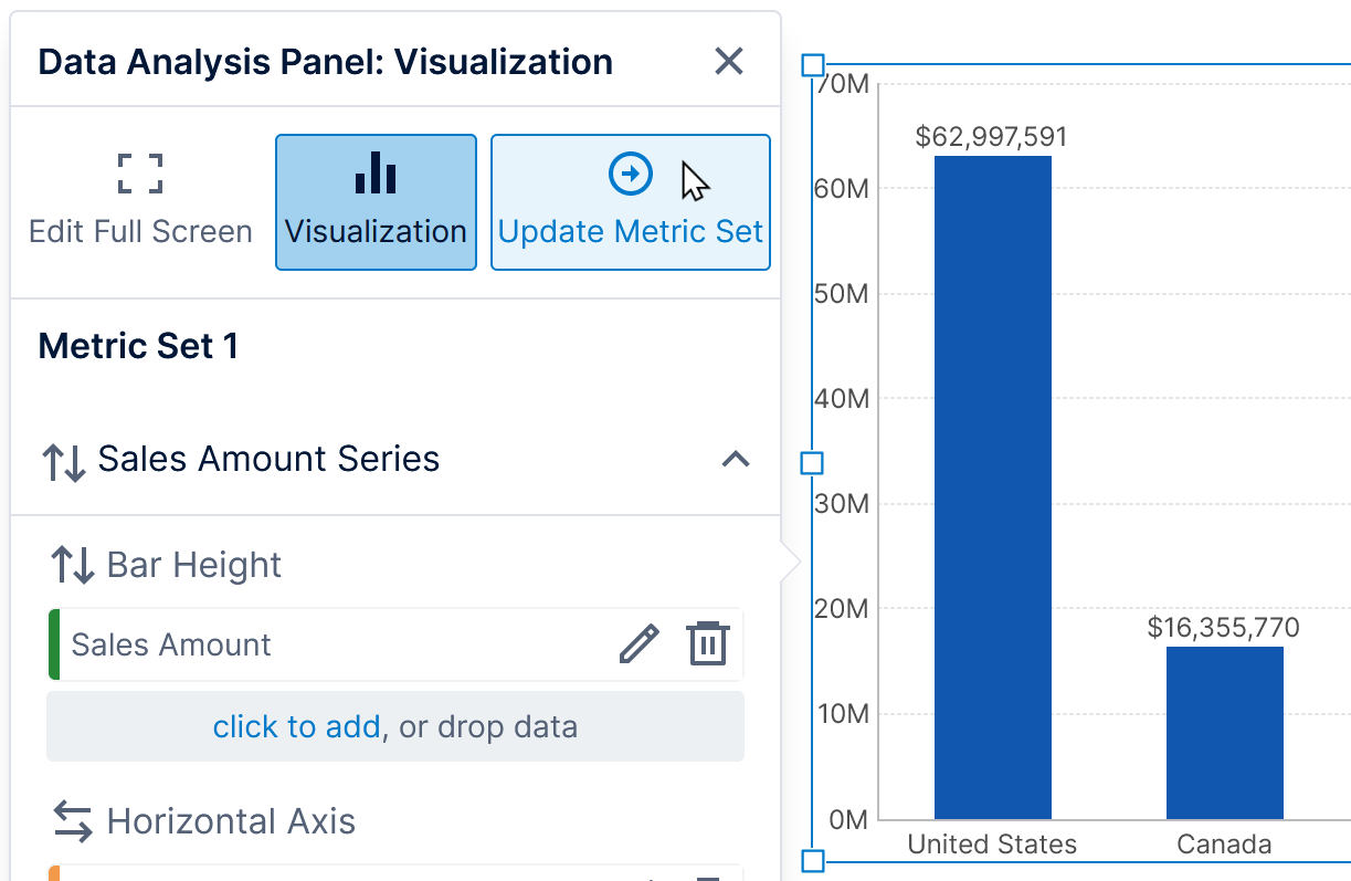
Afterwards, the next time this metric set is dragged to the canvas, the newly added data visualization will be of the same type and have the same settings as the one you have now.
3.3. Properties
You can use the Properties window or the Quick Access Properties popup for a data visualization to customize its settings, including colors, fonts, or further customizing the visualized data assigned from the Data Analysis Panel. For example, you can change data point colors based on your data.
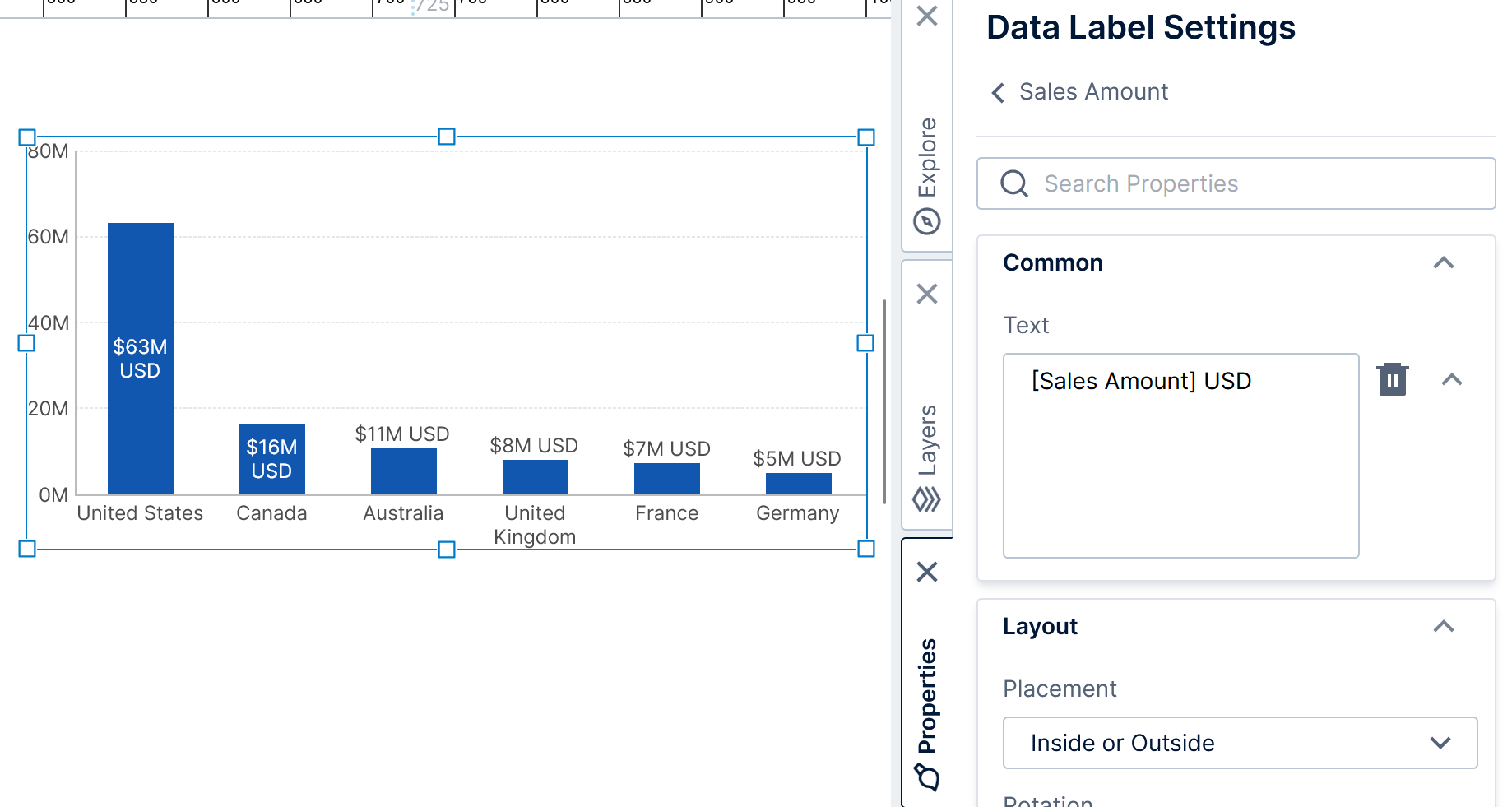
For text properties such as label and tooltip text, you can use the Properties window to customize how the data is formatted into text. As an example, click the paintbrush icon next to where data has been assigned to Data Point Label in a chart: this is a shortcut to open the Properties window directly to the related data label settings.
The data label settings include options to customize the placement of the labels as well as the text.
The Text property is automatically populated based on data you assigned in the Data Analysis Panel's Visualization tab, but you can change it to include any arbitrary text in addition to placeholder keywords for displaying data values enclosed in square brackets, and you can also optionally customize the value's text formatting. See Formatting text for details.
4. See also
- Video: Configuring Metric Sets
- Visualization tab examples
- Metric set analysis tools
- Design overview
- Using chart properties
- Apply colors to data points or series using color rules
- Formatting text