
How can you operationalize your machine learning model and apply it to new data coming through your applications like all other data analyzed through your business intelligence system?

How can you operationalize your machine learning model and apply it to new data coming through your applications like all other data analyzed through your business intelligence system?

Adoption is vital to the success of a business intelligence project, and a superior navigation experience can act as a catalyst for retaining a higher volume of standard users.

The Pareto Chart is a data visualization that contains both bars and a line graph. It's a derivative of the Pareto principle, which states that roughly 80% of the effects come from 20% of the causes

To help sales teams improve their performance, we’ve highlighted the top 4 ways business intelligence can supercharge sales strategies.
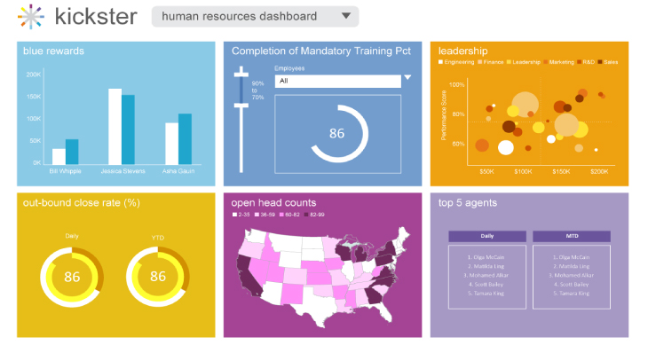
In order to implement a successful BI project, the key decision-makers need to focus first on ‘why’ the business is embarking on this project, and then on the business processes and behaviors of the users of the BI solution.

The use of icons in reports within the market research community is increasing, whether as standalone images within reports or as a means of data representation via infographics.

Automatic data prep reduces the steps required to progress from data to desired visual. It allows users to be proactive, and focus on the data they need, and from there, easily enrich and share it.

Differentiate your applications with beautiful analytics and better serve your customers.
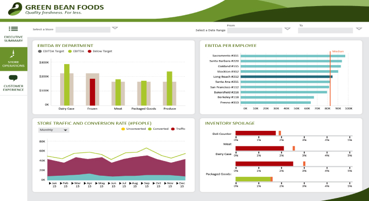
When discussing Business Intelligence (BI) tools, adoption is arguably the single most important indicator of success. Little value will be derived from the tool if it is not adopted by end users.