
Everyone probably has more relationships in their data than they realize.
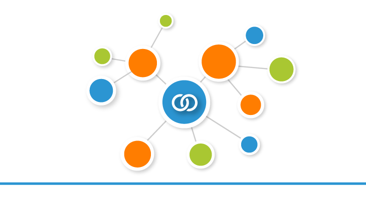
Everyone probably has more relationships in their data than they realize.
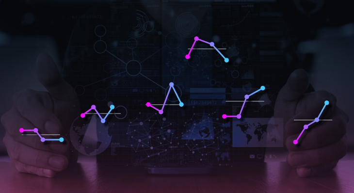
Cycle plots are an elegant visualization very few people have heard of but especially useful to understand data trends across individual segments.

Finding a perfectly clean database is like finding a unicorn, and sometimes I question if they exist.
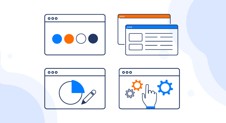
Dashboard design is as important as the data itself. If you want to evoke emotion and keep your users coming back for more, you'll want to incorporate these four dashboard design tips.

All sales activity is measurable, meaning sales teams can leverage business intelligence and analytics to measure and maximize sales performance, to better understand sales trends and results
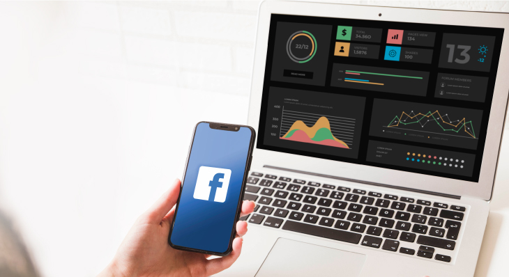
Dundas BI is able to interact with social networking platforms like Facebook. Let's use Python to fetch data from your corporate Facebook page and then create a sleek dashboard using it.
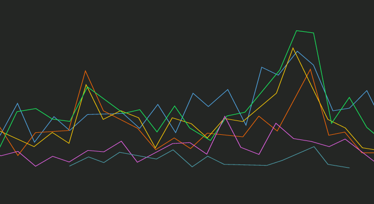
Finding an alternative to simply jamming too many series onto a single chart.
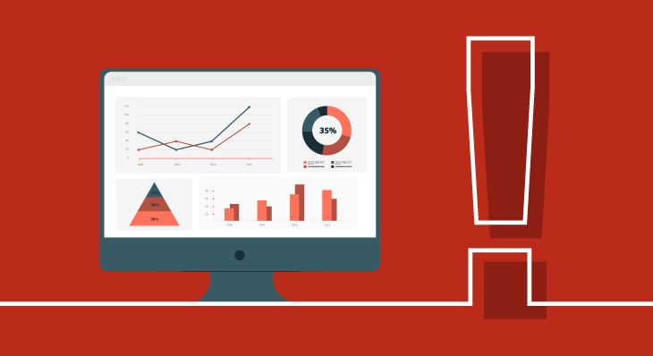
Dashboards are meant to give insights. Don't just treat them like 'pretty reports'.
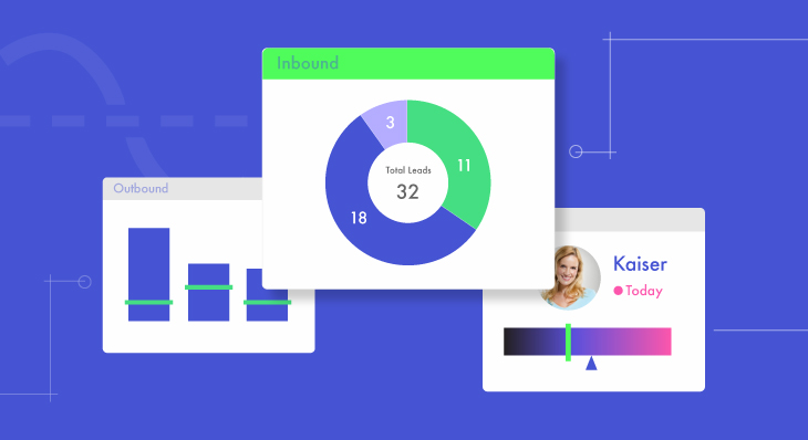
The best way to build and facilitate a Sales culture – one that rewards hard work and recognizes tangible successes – is by visualizing the status of all Sales activities using real-time dashboards.

Tracking employee performance and monitoring an increasingly distributed workforce is a top concern of many businesses today. Use BI to boost ROI, maximize performance, and enjoy sustained success.
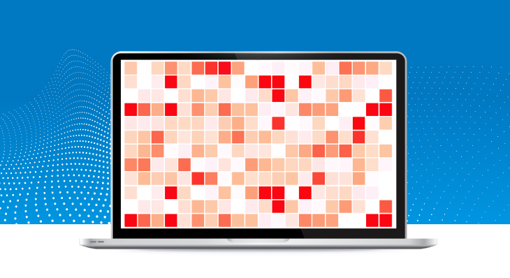
Analyzing and making sense of large volumes of raw data is dizzying. By using Heat Map Charts, you can leverage color variety and intensity to visualize and examine complex, multi-variate data easily!

Venturing into a new Business Intelligence (BI) project can be as exciting as it is daunting. Here is a 4-step guide to implementing a successful Business Intelligence solution.