Using a pie chart
1. Overview
A pie chart displays each value as part of a pie or donut representing its percentage of the total. Multiple hierarchies and levels can be displayed by a pie chart as multiple rings that each break down the previous ring's values into its component parts, which is sometimes called a sunburst.
2. Add a pie chart from the toolbar
To add a pie chart to your dashboard, report, or other view, click Data Visualization in the toolbar, and then select Pie / Sunburst. An empty pie chart is added to the canvas.
(The steps are similar for a full screen metric set after re-visualizing to a pie chart.)
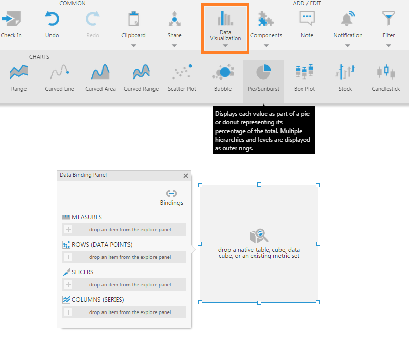
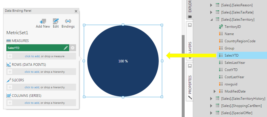
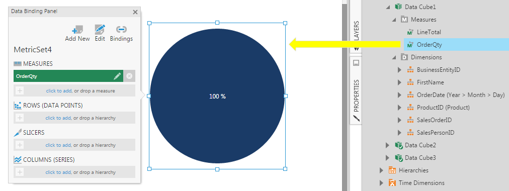
Go to the Explore window and expand a data connector. Drag a measure (numeric values) onto the pie chart or metric set.
A pie chart will then show a single pie slice representing 100% of the total.
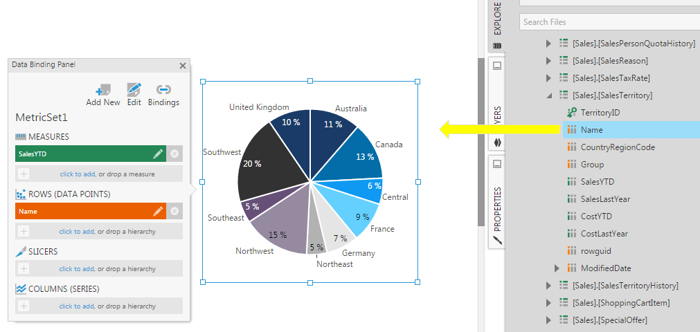
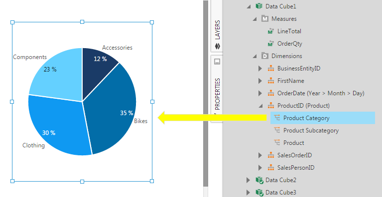
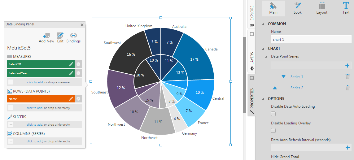
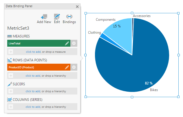
Next, add a hierarchy or a column of text or date/time values, for example a sales territory Name column. Drag this onto the pie chart, or directly to Rows (Data Points) in the metric set.
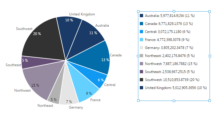
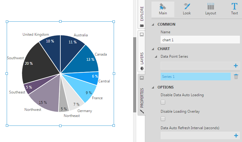
You'll see the pie chart animate into multiple data points or 'slices' where each slice (e.g., for each territory) corresponds to the percentage of the total.
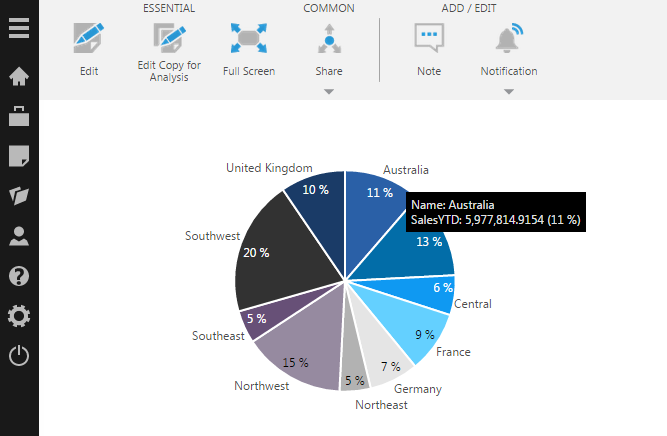
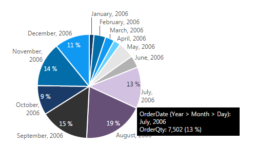
Switch to View mode and hover over a pie slice to see a tooltip showing the measure value and corresponding percentage.
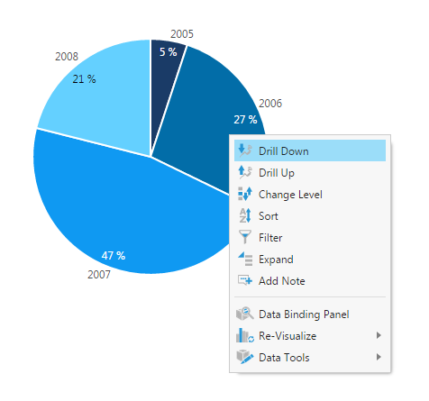
If the hierarchy added to the pie chart has multiple levels, you can drill down, change the level, or access other metric set functions by right-clicking (or long-tapping) on a data point in View mode.
3. Re-visualize as a pie chart
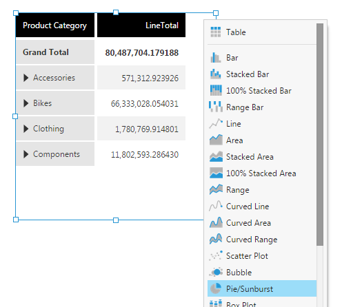
You can Re-Visualize other types of visualizations to a chart and choose the Pie/Sunburst chart type, from either the toolbar or the context menu.
4. Create a sunburst
A sunburst displays multiple hierarchy levels using concentric rings, visualizing how data is broken down between higher and lower level groupings. The innermost rings correspond to the top hierarchy levels (e.g., years or product category) whereas the outermost rings correspond to the bottom hierarchy levels (e.g., months or product subcategories). As you move outward from the center of a sunburst chart, the pie pieces are broken down into smaller and smaller pieces. Sunbursts are similar to treemaps in being useful for representing hierarchical data but use a different layout.
To create a multi-level sunburst chart, first drag a measure (your numeric values) onto your pie chart or metric set.
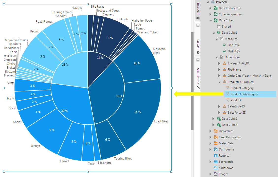
A multi-level hierarchy is used here as an example, where products are grouped by category, then by subcategory.
In the Explore window, expand the hierarchy to view its levels, and drag the top level to the chart or directly to Rows (Data Points) on your metric set. This displays a pie chart, which will become the inner ring of the sunburst.
Drag a lower level of the hierarchy onto the chart (highlighted in blue) to display the range of levels between this one and the level you dragged earlier. (Alternatively, you can set the Level and Top Level of the hierarchy.)
This becomes the outer ring of the sunburst.
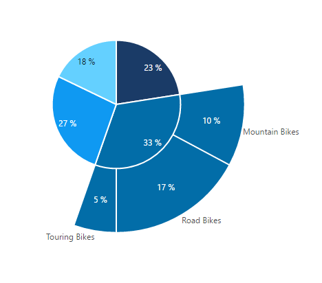
When your hierarchy has multiple levels and you are displaying a higher level as a pie chart or sunburst, you can right-click a data point and choose Expand.
This displays the original chart plus a new outer ring containing just values you expanded in that level. You can continue expanding more slices in this level or further down to lower levels if available. See Expand and collapse hierarchy members for details and examples.
4.1. Multiple hierarchies
Instead of adding different levels from the same hierarchy, you can add multiple hierarchies, or columns of text or date/time values (e.g., add the Products hierarchy first, and then add a time dimension displaying order dates).
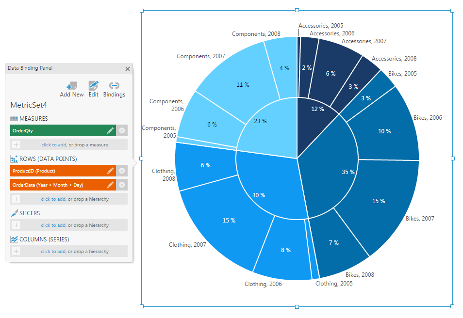
In the same way as with a multi-level hierarchy, this displays your data broken down into smaller groupings by the next hierarchy.
4.2. Multiple measures
It is also possible to add multiple measures to a pie chart. This will result in a ring for each measure, each displayed by a separate chart series, however this type of visualization is generally not considered to be a sunburst. Typically, the slices of one measure will not correspond with the slices for the other measure.
4.3. Legend
When you add a legend for a pie chart or sunburst, each slice or data point is represented in the legend instead of each series or grouping.
5. Properties
Pie-specific properties can be found in the pie chart's data point series. Open the Properties window, and click on a series.
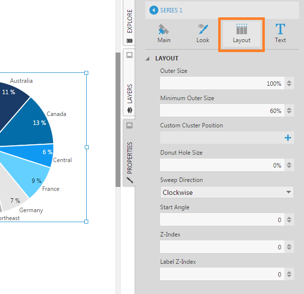
Pie charts have unique properties found in the Layout section, labelled as Layout & Spacing in recent versions.
5.1. Outer Size
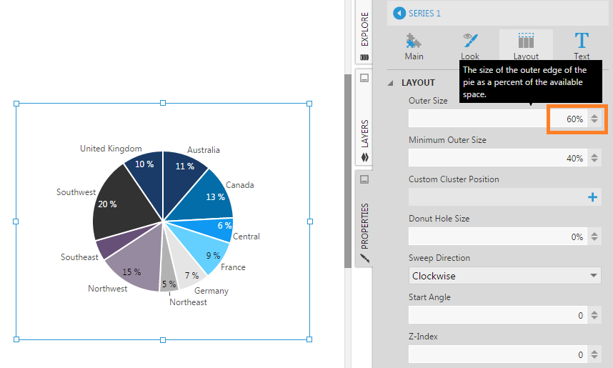
The Outer Size property specifies the size of the outer edge of the pie as a percentage of the available space.
5.2. Minimum Outer Size
The Minimum Outer Size property specifies the smallest percentage of the available space that the pie can be reduced to in order to fit labels.
5.3. Donut Hole Size
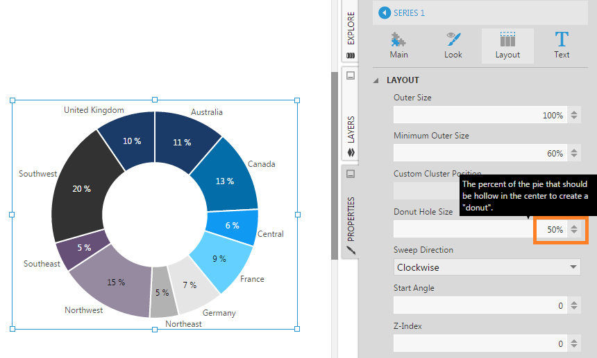
Use the Donut Hole Size property to create a hole in the center of the pie chart and display a donut chart.
5.4. Start Angle
The Start Angle property specifies the angle of the start of the first pie slice, measured in degrees from North.
5.5. Label Text and Tooltip Text
In the text properties, you can customize the Data Point Labels and Tooltip Text properties like for other chart types, using regular text as well as placeholder keywords for values from the data.
For pie/sunburst charts, the [Percent] keyword can display the percentage represented by each slice, and a percentage format can be included as in [Percent:P1]. For a sunburst displaying multiple hierarchies, the [Member] keyword is useful for displaying the member caption for whatever hierarchy is represented by slices in each ring.
For additional information about available keywords and formats, see Formatting text.

