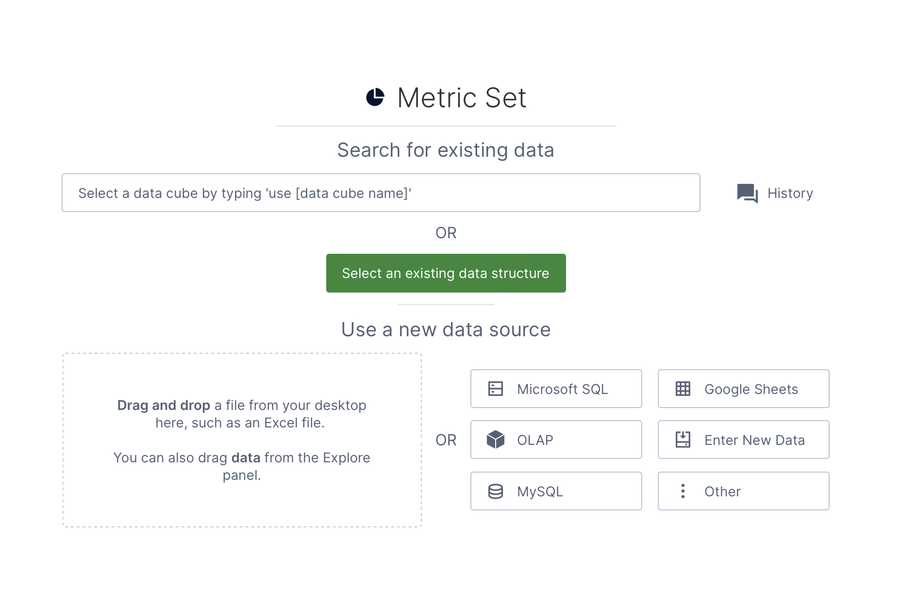
A metric set allows you to select and analyze a set of data. It's displayed in your choice of data visualization while you work with one, but can be reused in different visualizations and by other people you share it with.
Metric sets power all visualizations. You can work with metric sets one at a time in the full screen editor, or combine them in a dashboard or another view to edit and analyze them together. This article introduces metric set functions as seen when editing one full screen, but they are also available when working with metric sets on a dashboard or another view.
The full set of analysis capabilities are available while editing a metric set that is checked out to you, while anyone viewing the metric set is able to access powerful metric set features such as drill down, sorting, and grouping.
Tip
When viewing a checked-in dashboard as a power user or above, you can right-click a visualization and choose Data Tools, then Analyze Data to open a copy of that metric set for editing.
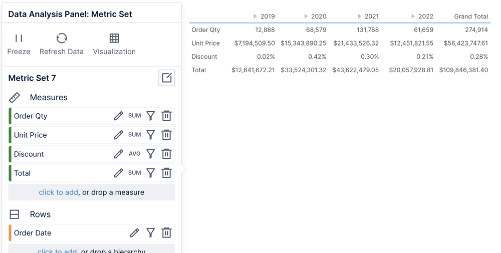
Create and edit metric sets directly on a dashboard or other view by dragging data onto its canvas, then using the same Data Analysis Panel.
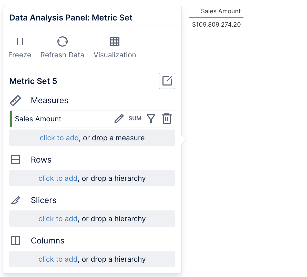
A table visualization now displays whatever data you chose with the Data Analysis Panel to the left.
2.2. Adding more data
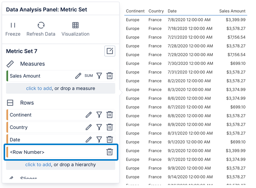
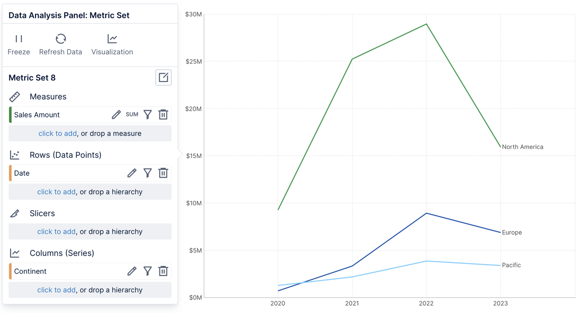
The Data Analysis Panel is central to choosing and analyzing data. Regardless of which visualization you use, you can group and filter your data by placing it under one of these same four options:
Measures: numeric values that can be grouped and filtered
Rows: group by this data into a row for each value
Slicers: filter the data by the selected values
Columns: group by this data into a column for each value
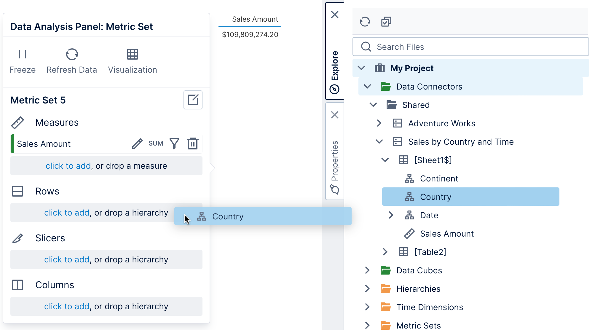
In the Explore window, different icons indicate whether data is has been categorized as a measure (numeric data) or a hierarchy (usually non-numeric data). If you are working with data from a data connector directly, you can use numeric data as either a measure or hierarchy regardless, or you can right-click and choose Change Category to switch between them. (Database primary keys with key icons are typically numeric but used as hierarchies.)
When dragging, you can drop data directly where you want it in the Data Analysis Panel, or onto the blue highlighted area of the visualization if you're not sure where to drop it. In a full screen metric set, you can also access the Assistant from the toolbar and type what you want to see.
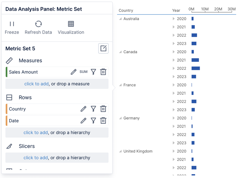
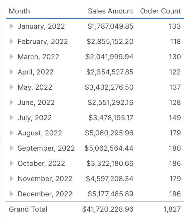
By placing data on Rows or Columns, you are grouping by those values in the order they are placed. For example, place a time dimension hierarchy on Rows to see sales numbers grouped by year, even if the data source contains many rows for individual dates.
You can drag data from another table or data source in the Explore window and it will be automatically joined. This uses database relationships for tables from the same database, or user-defined relationships which can work even for different data sources.
If you click to add the special option <Row Number>, the data will not be grouped and all original rows will be displayed unaggregated and unsorted as 'raw data'. There are various limitations with raw data mode, but in return this allows you to view the underlying data unmodified. This option may also be initially selected when you select or drag an entire table or spreadsheet as the data for your metric set.
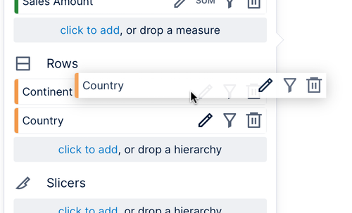
To move data between Rows, Slicers, and Columns, drag it from where it is placed already in the Data Analysis Panel to the new area where the label drop a hierarchy appears.
To change the order of multiple items placed under the same heading, drag and drop an item to the desired location.
The order of hierarchies determines their grouping order. The order of measures determines their sorting priority when sorting by more than one measure.
Click the delete button to the right of the hierarchy or measure to remove it from the metric set.
2.4. Replacing with a hierarchy
If you are working with data directly from a database, spreadsheet, or another regular table of data that was not prepared as a cube, you can replace a regular column with a hierarchy from the Explore window.
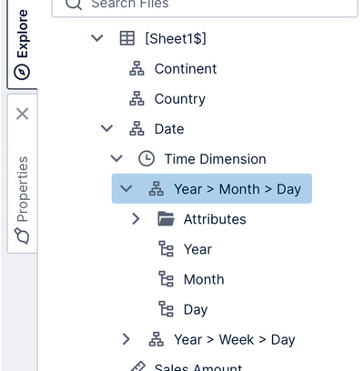
Date/time columns can be expanded in the Explore window to find time dimension hierarchies and attributes, which you can drag onto the Data Analysis Panel or your visualization to group by time periods such as Year, drill up & down, and more. You can expand a hierarchy and drag a specific level you want to group by, or change the level later.
If you already added data related to a hierarchy that was created or if you dragged date/time data without a time dimension, drag the hierarchy from the Hierarchies or Time Dimensions folder on top of it in the Data Analysis Panel. You can also drop a simple column displaying friendlier names on top of a column of IDs or keys. See Automatic joins and hierarchies for details.
A metric set's data is always shown in a visualization that you can change and customize. When you edit a metric set full screen, this visualization is the default visualization used when the metric set is first added to a dashboard or other view, but you can also use it just for your own analysis.
Note
The metric set defines all of the data that's displayed and its settings such as initial filtering and sorting. Each visualization is separate so it can be changed and customized when reusing a metric set.
If you didn't choose a particular visualization yet or customize it, a visualization will be generated for you automatically each time you add more data to a new metric set. For example, a measure and a time dimension hierarchy will be automatically visualized as a line chart, which is best for seeing the trending of a measure over time.
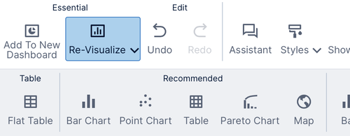
At any time, you can change to the visualization of your choice by clicking Re-Visualize in the toolbar and choosing an option. Once you have chosen a visualization yourself, customized it, or saved and re-opened this metric set, it will not be changed automatically.
You can customize a particular visualization in a number of ways:
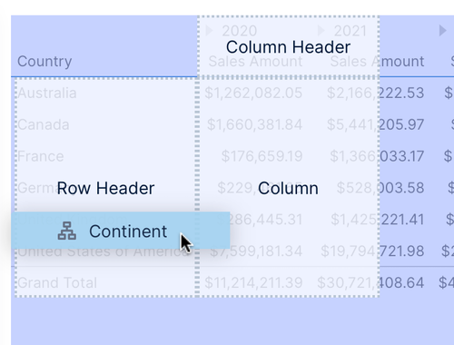
Drop zones may appear over your visualization when dragging data from the Explore window, allowing you to choose how it will be visualized. For example, you can decide whether to display a hierarchy as a regular column, a row header column, or as a row of column headers in a table.
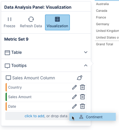
Similarly, you can click the Visualization button in the Data Analysis Panel of any visualization and drag data from the Explore window or click to add data directly under a visualization option, such as Tooltip for displaying additional details in a popup when hovered or long-tapped.
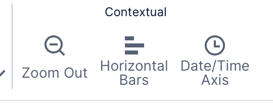
Common visualization options can be found in the toolbar under Contextual section, and in the right-click context menu, such as changing a vertical bar (column) chart to a horizontal bar chart.
The full set of visualization settings are found in the Properties window.
When a metric set is added to a dashboard or another view, the default visualization from the full screen editor is used as the template for a new visualization. The metric set is reusable and each visualization is separate, so you and other people you share the metric set with can customize it and visualize it differently.
Tip
If you want to reuse a visualization in multiple places and be able to make changes to all of them at once, you can create a dashboard for that visualization and drag it onto other dashboards and views.
4. Sorting and filtering
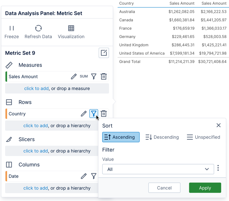
To quickly filter or sort data while editing, use the sort & filter icon shown for the values you want to sort by or filter.
For example, you can filter the range of dates shown on a chart, or sort a table's rows by a measure.
For measures, this quick sorting option reorders the rows of data by its values. If you want to reorder the columns by this measure instead, use the right-click sorting options or set up custom measure sorting.
This is the same popup shown when sorting a table visualization from one of its column headers, and it can contain options such as changing the grouping of the data.
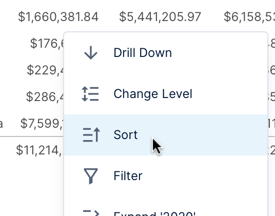
You can also right-click (or long-tap) data directly in the visualization and access sorting and filtering options from the context menu.
If you choose Sort, a list of measures or hierarchies may appear if there is more than one related to what you clicked. Choose what values should be used to sort the rows (or columns), then choose the sort order. For an example of sorting using the context menu, see Sorting a table visualization.
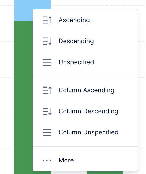
If there are multiple columns (or series) of data that can be sorted, additional options appear allowing you to sort the Columns Ascending or Columns Descending instead of sorting the rows. The More... option brings up the same sort & filter popup shown above with options to change how the data is grouped.
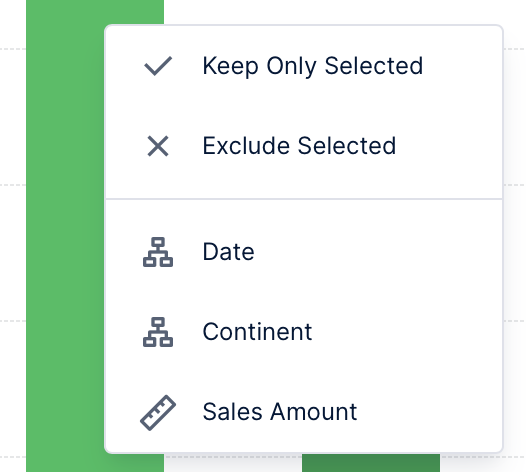
If you choose Filter, you can choose to keep only or exclude the data you right-clicked on. This can apply to multiple rows, columns, or data points at once if you clicked or dragged to select multiple. You can also choose the name of a hierarchy listed to choose some of its values to filter by, or choose Clear All to clear any previous filtering (if applicable).
These context menu options are available even when you or others are viewing this metric set after it's been added to a dashboard and shared. By sorting and filtering with the metric set checked out to you, you can determine the initial settings when it's viewed the first time.
When displaying data from a multi-level hierarchy, you can change which levels are displayed, or drill down to see the values in the level below that make up a value.
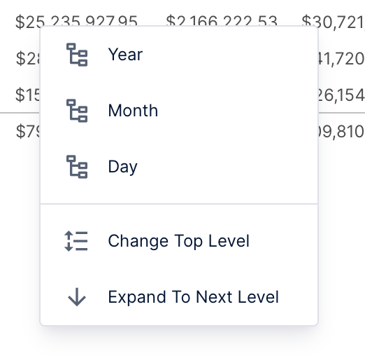
To quickly change the level, right-click (or long-tap) anywhere on the visualization and choose Change Level. (If there are multiple hierarchies to choose from, choose one from the list that appears next.)
Choose a level to change the level for the entire current set of data.
Many visualizations can display multiple levels at once, including tables and relationship diagrams. To select a range of levels instead of just one, choose Change Top Level and then a level, or Expand To Next Level to display both the current level and the next level down. When the main level is different than the top level, both levels and the levels in between will be displayed at once.
Since these are metric set settings, you can also set the Level and Top Level from the Data Analysis Panel by clicking to edit the hierarchy and expanding the Parameter Values section. You can also drag hierarchy levels onto your visualization from the Explore window as a shortcut.
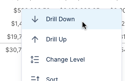
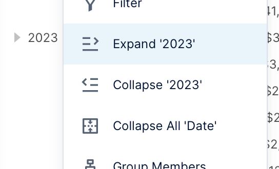
Right-click (or long-top) data in a visualization and choose Drill Down to filter to that value and change the level of the hierarchy down. (If there are multiple hierarchies to choose from, choose one from the list that appears next.)
For example, drill down on 2022 to see the individual monthly values that make up that year.
To change the level back up and clear the filtering, choose Drill Up in the context menu.
Like sorting and filtering, these context menu options are available even when you or others are viewing this metric set after it's been added to a dashboard and shared. Changing the level and drilling down while the metric set is checked out to you determines the initial settings when it's viewed the first time.
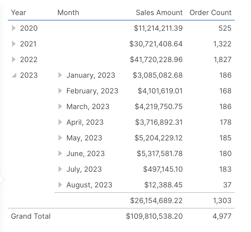
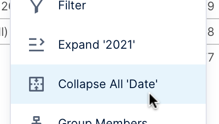
6. Expanding and collapsing
When multiple hierarchies are added under Rows or Columns in the Data Analysis Panel, or if a multi-level hierarchy is added, you can right-click (or long-tap) values and choose Expand or Collapse. Some visualizations may also offer triangular expander buttons.
Expanding is similar to drilling down, except the other data remains displayed as before, with the values added from the level below or from the next hierarchy just for the expanded value.
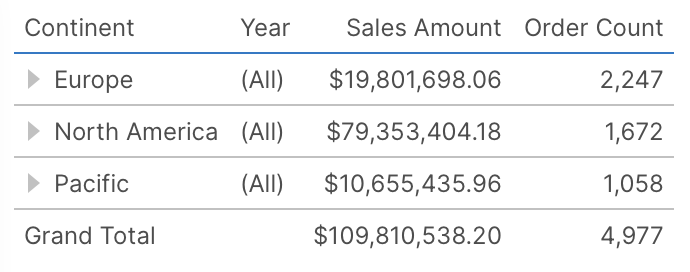
Notice above how this is similar to collapsing all the individual values in the leftmost column.
Use Expand All to reverse this action.
Note
If you want to expand all of a hierarchy level's values at once to the next level of that hierarchy, e.g., expand all the years down to months, you can use the options under Change Level for this as shown in the previous section.
Unlike expanding and collapsing individual values, Collapse All is a metric set setting that is saved, and can also be found in the dialog for each hierarchy in the Data Analysis Panel by clicking its orange tile to edit it. For more details and examples of expanding and collapsing, see Expand and collapse hierarchy members.
7. Measure options
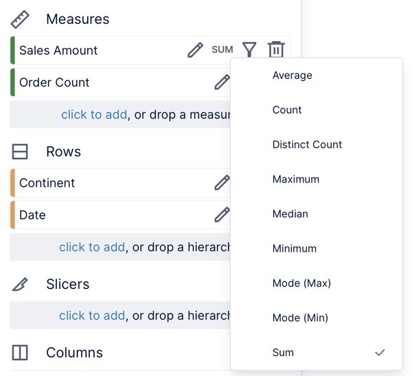
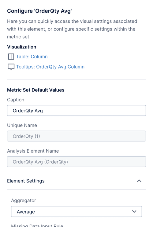
When numeric data is first added under Measures in the Data Analysis Panel, its values are grouped and normally summed, as indicated by the displayed text SUM.
To quickly change this aggregator to another one, click this indicator and choose another from the list. For example, you can see the average order quantity for each year instead of the sum.
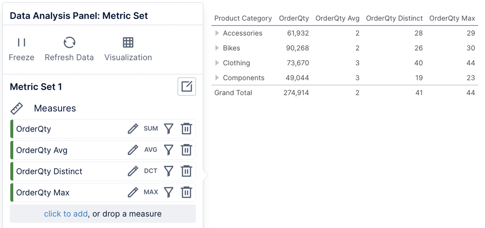
You can add a measure multiple times: drag the same data from Explore or click to add it again under Measures. Each copy of the measure can be set to a different aggregator (you should edit their captions to distinguish between them).
Caption: Determines how this measure is identified in visualizations.
Format: Determines how numeric data is formatted and displayed as text. See Formatting text for details on formatting.
Missing Data Rules: These settings determine if rows or columns of data should still be displayed if there is no corresponding measure value available, and whether to fill them in with replacement values. See Handling null data points for details.
Hidden: If you don't want to display the measure but only use it for a formula, sorting, or other metric set features, check this box to prevent the measure's values from being seen directly or exported.
Changing settings such as Caption and Format here take effect everywhere at once as long as you haven't customized a visualization setting on top of them. For example, changing the caption affects column headers and tooltips, and changing the format affects the cells of a table, chart labels, and tooltips. They will also take effect if you re-visualize the metric set.
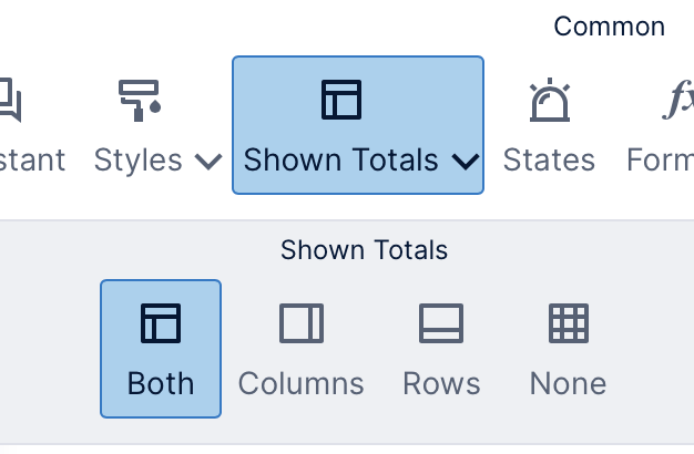
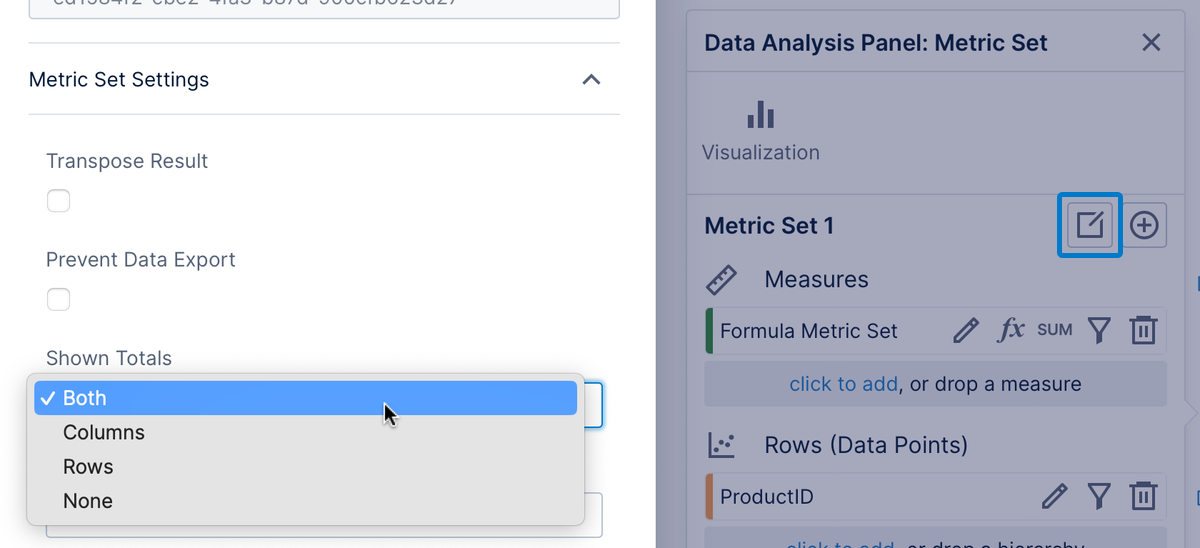
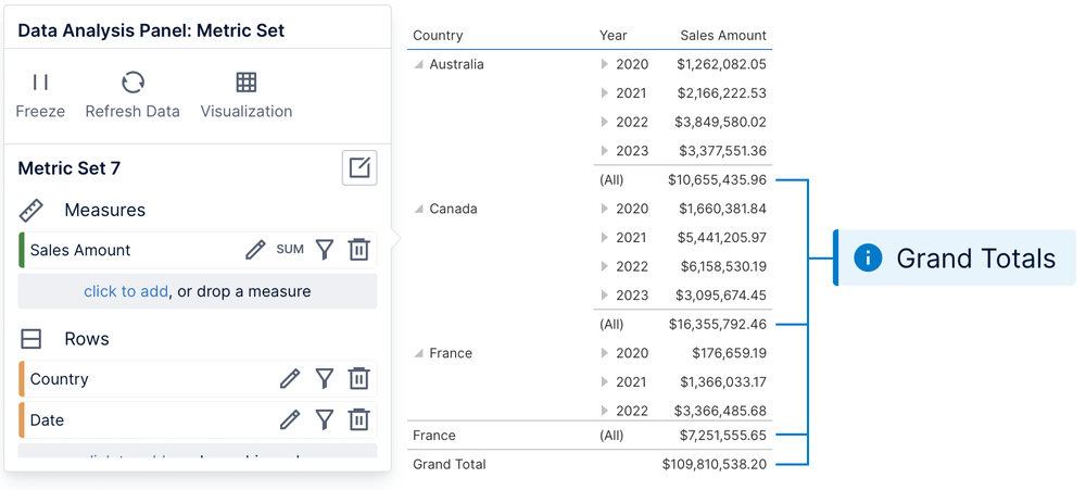
8. Totals
Tables and some other visualizations have support for displaying totals. To quickly turn all totals on or off when they are available, choose Shown Totals in the toolbar when editing a full screen metric set and choose which totals you want to show.
Charts would typically be disrupted by totals, so they are hidden by default by the property Hide Total Values in the Properties window for most chart types. This can be un-checked to Show or hide total values on a chart.
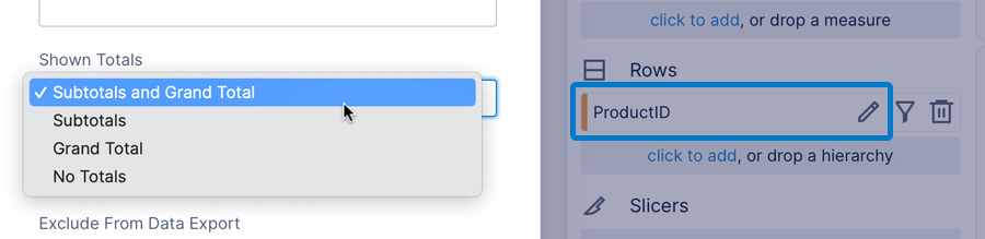
There are also separate settings available on each hierarchy, which you can access by clicking its orange tile in the Data Analysis Panel.
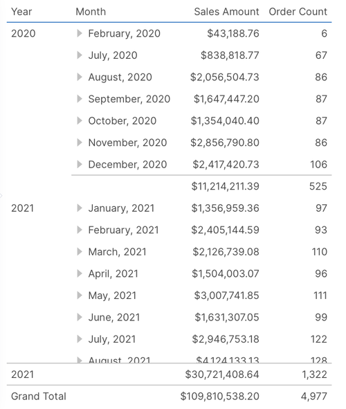
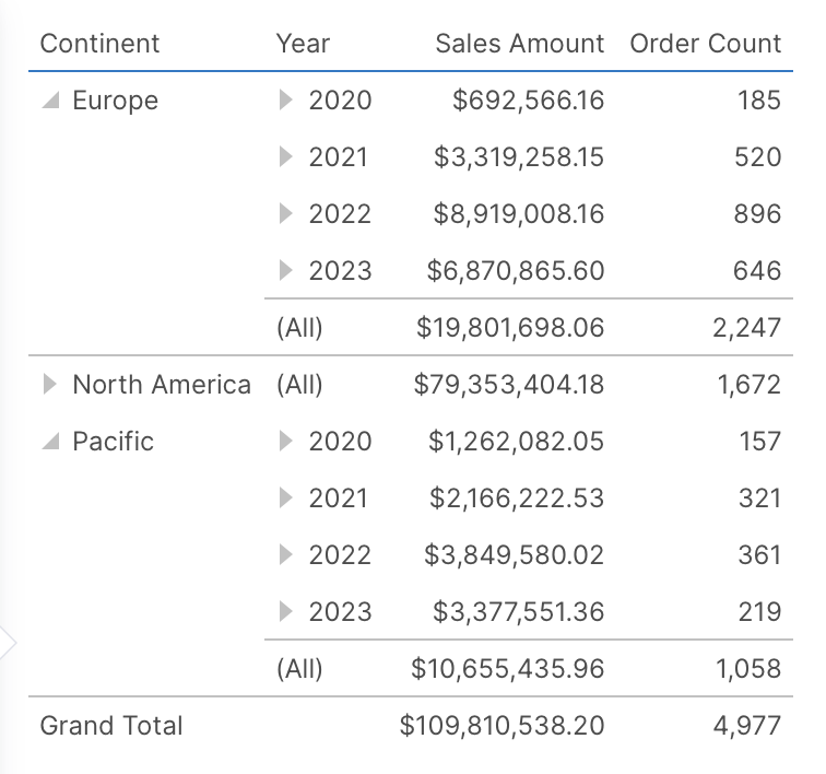
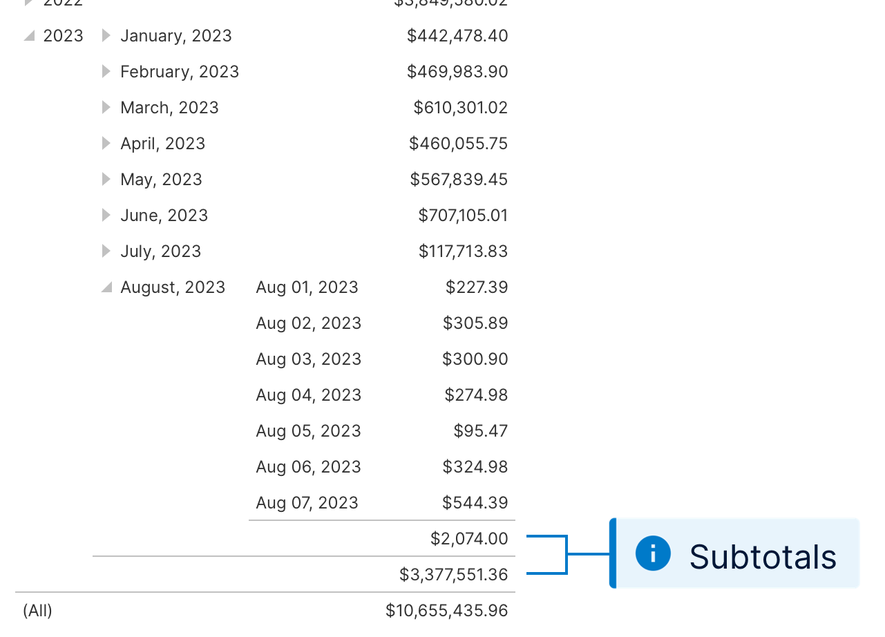
A hierarchy's Subtotals are displayed for its upper levels when displaying more than one or when it has been expanded to a lower level. The figure below indicates the subtotal for 2011 above months, and the subtotal for June, 2011 above its days because it has been expanded.
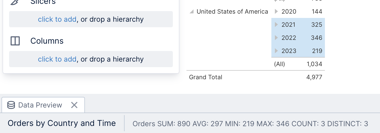
When selecting rows or columns in a table, or data points in a chart, some basic statistics of that data will appear in the status bar: sum (SUM), average (AVG), minimum (MIN), maximum (MAX), the number of points (COUNT), and number of distinct values (DISTINCT).
If there are multiple measures, it will cycle through the statistics for each measure plus the statistics for all measure values mixed together. Hover over the data summary for a tooltip showing all of the statistics at once.
Data summary is not available for waterfall and stacked chart types.
You can click and drag your mouse to select multiple points in a chart. Hold the Ctrl or Shift keys while doing this to select additional areas of data points. To select multiple rows or columns in a table, hold Ctrl while clicking them, or hold Shift to select a group of rows or columns in between the ones you click.
10. More tools
Metric sets include many more tools to help with your analysis, which are detailed in separate articles.
In the toolbar, you can find:
States for calling attention to some data, or displaying it differently based on conditions.
Period over period or slicer comparisons for viewing data from different time periods or filter values, or using it for state conditions or formulas.
Formulas for adding a new measure or an entirely new metric set based on a formula or script.
Contextual measures for inputting values to compare against your data, such as goals or targets.
The context menu provides you with additional options when you right-click or long-tap data:
Group members: for grouping together the items of your choice into a single item.
Transpose Result: A transposed metric set swaps the rows with the columns in the result, including displaying a different measure in each row instead of a separate column for each measure. This can be used to display a single column or chart series comparing different measure values, whereas each measure is normally a separate column or series.
Top/Bottom Items and Other Group:you can filter the metric to display only the top or bottom 'N' items of some number, or group together the smallest items into a single item (or use other criteria).