Create a custom data visualization control
1. Overview
This sample shows how to add a custom data visualization control. This is part 2 of 2, where the focus will be on a control that binds to data from a metric set.
The article walks through the parts of adding a custom data visualization control that are in addition to the steps for a regular custom control described in part 1.
2. Getting started
The current version of the sample solution targets both .NET Framework and .NET Core/.NET 5+ so that the packaged extension will work for version 7 of the application and higher on all platforms.
The following prerequisites must be installed on your computer to build the provided sample without modifications:
- Visual Studio 2017 or higher
- Microsoft .NET Framework 4.7.2 or higher
- Microsoft .NET Core 3.1 or higher
You can modify the sample project to target different versions of .NET if preferred depending on the version used by your application instance.
The NuGet packages referenced as dependencies are initially set to version 7.0.2. If your version of the application is newer and the APIs you are using may have changed, you can update the version of the package references.
2.1. Downloading sample solution
To download the custom sample data control solution, click here.
(A version of this solution is also available for version 6, and versions 2 through 5.)
2.2. Opening solution
Extract SampleDataControl.zip to a folder and open the solution in Microsoft Visual Studio to build the extension.
To use the option to publish directly to your application instance, run Visual Studio as an administrator before opening the solution. For example, you can right-click Visual Studio in the start menu and find the Run as administrator option.
The solution file is located at:
[Extracted Folder]\SampleControl\SampleControl.sln
3. The project
The project is a class library. It is based on the same extension as part 1 but adds data binding capabilities for controls that should load data, such as visualizations.
- mycompany.controls.sample.stickynote.adapter.js - Contains the sticky note adapter class, responsible for integrating your custom control.
- mycompany.controls.sample.stickynote.css - The custom style sheet for the sticky note adapter.
- mycompany.controls.sample.stickynote.info.js - Gets the information about the control (such as what adapters it supports).
- PublishExtensionTemplate.props - Used for auto publishing the extension after the build succeeds, and defines extension properties, and files.
- SampleControlExtensionPackageInfo.cs - Contains the package information about the extension package.
- StickyNoteAdapterInfo.cs - Contains the connection to JavaScript files, and defines the full JavaScript name.
- StickyNoteExtension.cs - Contains the information about the adapters.
- stickyNoteIcon.png - An icon to represent the sticky note in the toolbar.
3.1. Modifying the JavaScript info class
In order to place the sticky note adapter in the data visualization toolbar menus, the getControlInfos needs to be modified. In the example below, we change the categoryName to Data Visualization.
getControlInfos: function () {
    /// <summary>
    /// Gets the information about the control (such as what adapters it supports).
    /// </summary>
    /// <returns type="Object">Meta-information about the control and what adapters it supports.</returns>

    var infos = [
        {
            "categoryName": "Data Visualization",
            "subCategoryName": "Fun",
            "caption": "Stickynote extension",
            "description": "Simple stickynote sample control",
            "adapterObjectName": 'mycompany.controls.sample.stickynote.Adapter',
            "defaultWidth": 240,
            "defaultHeight": 240  ,
            "toolbarIconUrl": dundas.Utility.getContextualUrlPath('ExtensionResources/MyCompany.Sample.SampleControl/stickyNoteIcon.png')
        }
    ];

    return infos;
}

3.2. Modifying the JavaScript adapter class
3.2.1. Removing the text property descriptor
In the previous article, we created a Text property that displayed the main text for the sticky note. The data visualization version of this sample will leave out this property as it will determine the text using data binding:
getControlProperties: function (path, options) {
    /// <summary>
    /// Called to get the object with the list of properties on the root control, or any sub-element of the control.
    /// </summary>
    /// <param name="path" type="Array" elementType="dundas.view.controls.PropertyPathItem" optional="true">(optional) The path to the sub-element
    /// of this control. Undefined if the root is requested, otherwise an array of plain objects with properties.</param>
    /// <param name="options" type="Object" optional="true">(optional) The options in which to get the control properties. Structure:
    ///     doNotRecord             [type: Boolean, optional: true]             - (optional) True to generate control properties that do not record any adapter state for undo/redo-ability.
    ///     isSimpleMode            [type: Boolean, optional: true]             - (optional) True to get the 'simple' properties for displaying the quick access property editor.
    /// </param>
    /// <returns type="dundas.controls.ObjectDescriptor">An object with the list of properties on the desired element.</returns>

    var objectDescriptor,
        propertyDescriptor,
        elementName;

    // Base path properties.
    if (!path) {
        // Object descriptor.
        objectDescriptor = this._super(path, options);

        // Angle.
        propertyDescriptor = new dundas.NumericPropertyDescriptor;
        propertyDescriptor.name = "Angle";
        propertyDescriptor.id = "angle";
        propertyDescriptor.category = "GS_PropertyGrid_Category_Common".localize();
        propertyDescriptor.description = "The angle.";
        propertyDescriptor.value = this.angle;
        propertyDescriptor.defaultValue = -3;
        propertyDescriptor.section = dundas.controls.PropertyGridSections.Look;

        objectDescriptor.addProperty(propertyDescriptor);

        // Background.
        propertyDescriptor = new dundas.PropertyDescriptor();
        propertyDescriptor.name = "Background";
        propertyDescriptor.id = "background";
        propertyDescriptor.category = "GS_PropertyGrid_Category_Common".localize();
        propertyDescriptor.description = "The background";
        propertyDescriptor.value = this.background;
        propertyDescriptor.defaultValue = new dundas.controls.SolidColorBrush(dundas.controls.Color.fromString("#cfc"));
        propertyDescriptor.isNullable = true;
        propertyDescriptor.section = dundas.controls.PropertyGridSections.Look;

        objectDescriptor.addProperty(propertyDescriptor);
    }

    return objectDescriptor;
},
3.2.2. Defining the supported settings
To allow the adapter to handle data, the getSupportedSettings method must be overridden. This method returns an object with the variety of settings available for the adapter. In the following example, we indicate that we support data for a single metric set, and do not allow styles to be applied:
getSupportedSettings: function () {
    /// <summary>
    /// Gets the settings for the supported operations of this adapter.
    /// </summary>
    /// <returns type="Object">An object with the variety of settings available for this adapter:
    ///     isParameterSelectionSupported   [type: Boolean, optional: true]
    ///     isParameterInputControl         [type: Boolean, optional: true]
    ///     isParameterUpdateControl        [type: Boolean, optional: true]
    ///     isDataSupported                 [type: Boolean, optional: true]
    ///     isSingleMetricSetOnly           [type: Boolean, optional: true]
    ///     isAnnotationsSupported          [type: Boolean, optional: true]
    ///     isLegendSupported               [type: Boolean, optional: true]
    ///     isLegendControl                 [type: Boolean, optional: true]
    ///     isContainerControl              [type: Boolean, optional: true]
    ///     isAlignable                     [type: Boolean, optional: true]
    ///     isAxisAlignable                 [type: Boolean, optional: true]
    ///     isStyleable                     [type: Boolean, optional: true]
    ///     isTransformControl              [type: Boolean, optional: true]
    ///     isContextMenuExpanderSupported  [type: Boolean, optional: true]
    ///     isShownTotalsSupported          [type: Boolean, optional: true]
    /// </returns>
    /// <remarks>Implementers should call this._super() first to get the default settings.</remarks>

    var supportedSettings = this._super();

    supportedSettings.isDataSupported = true;
    supportedSettings.isSingleMetricSetOnly = true;
    supportedSettings.isStyleable = false;

    return supportedSettings;
},
3.2.3. Overriding request options
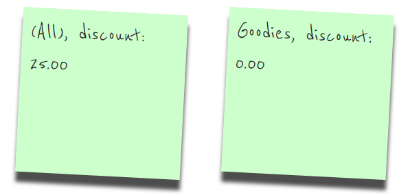
Totals are normally added to the metric set's data result by default. The sticky note adapter would then read this total as the first row, but this is not the desired behavior. The image below illustrates this difference:

To override the metric set and disable totals regardless of user settings, the _getDataRequests method (considered a protected method) is overridden. The following demonstrates how to override the _getDataRequests method on the adapter to turn off totals:
_getDataRequests: function (useOriginalIds) {
    /// <summary>
    /// A helper method which creates the default request objects from the current metric set
    /// bindings.
    /// </summary>
    /// <param name="useOriginalIds" type="Boolean" optional="true">
    /// (optional) Value indicating whether or not <see cref="originalId"/> should be used
    /// when building the requests. Required for generating exports of cloned adapters in repeaters.
    /// </param>
    /// <returns type="Array" elementType="dundas.data.Request">
    /// An array of request objects.
    /// </returns>

    var requests = this._super(useOriginalIds);

    requests.forEach(function (request) {
        var overrides = request.overrides;

        if (overrides) {
            // Turn totals off.
            overrides.shownTotals = dundas.data.CellsetAxis.NONE;
        }
    }, this);

    return requests;
}
3.2.4. Setting up bindings
Data visualizations display data from a metric set, and typically use a set of bindings that specify how the various parts of the data visualization are connected to data elements.
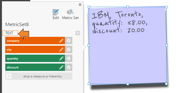
Users can use these bindings to decide for themselves whether each measure or hierarchy is visualized and where. These are set up in the Visualization tab of the Data Analysis Panel (see Setting up the visualization for details).
In order to make bindings available, you need to override the getAvailableBindings Method. In the following example, we return a list of one text binding:
getAvailableBindings: function (metricSetBinding, node) {
    /// <summary>
    /// Gets the available bindings for this adapter.
    /// </summary>
    /// <param name="metricSetBinding" type="dundas.view.controls.MetricSetBinding">The metric set binding to get the bindings for.</param>
    /// <param name="node" type="dundas.controls.ExplorerNode" optional="true">(optional) The node that should be used for getting the available bindings.</param>
    /// <returns type="Array" elementType="Object">An array of plain objects with properties:
    ///     targetId            [type: String]                                                                      - A unique identifier for this binding.
    ///     targetName          [type: String]                                                                      - The displayed text for this binding.
    ///     bindingType         [type: dundas.data.PlacementPosition, optional: true]                               - (optional) The placement that should be assigned to an analysis element dropped onto this binding. If not specified, it is assigned to rows.
    ///     iconUrl             [type: String, optional: true]                                                      - (optional) A URL pointing to the icon image to be shown next to the header.
    ///     tooltipText         [type: String, optional: true]                                                      - (optional) Any tooltip text that should be shown for this binding header.
    ///     propertyPath        [type: Array, elementType: dundas.view.controls.PropertyPathItem, optional: true]   - (optional) If specified, the property path will be linked to the binding with a small icon to allow it to quickly open in the properties.
    ///     groupName           [type: String, optional: true]                                                      - (optional) The group name for the binding. If set, the binding can be grouped.
    ///     isAdvanced          [type: Boolean, optional: true]                                                     - (optional) If specified, the binding is advanced and will be not displayed within the group by default, but rather as 'more...'. This only applies if groupName is specified.
    ///     rect                [type: dundas.view.controls.Rect, optional: true]                                   - (optional) The rectangle co-ordinates for the adorner to display for drop-zones on this adapter.
    /// </returns>

    return [{
        "targetId": "text",
        "targetName": "Text"
    }];
},

The visualization can automatically assign bindings when data is added to it, so that users don't necessarily need to also assign the data themselves, by overriding the generateBindings method. In the following example, data is automatically assigned under Text when added:
generateBindings: function (options) {
    /// <summaryglt;
    /// Asks the adapter to create/update the bindings on the given MetricSetBinding.
    /// The _super method should be called first if automatic adding/removal is desired from metricSetBindings property, and bindings created/removed.
    /// </summaryglt;
    /// <param name="options" type="Object"glt;The options object for the creation of the bindings. Structure:
    ///     metricSet           [type: dundas.entities.MetricSet]               - The metric set object that is the source of the metric set binding.
    ///
    ///     metricSetBinding    [type: dundas.view.controls.MetricSetBinding]   - The metric set binding that is being modified.
    ///
    ///     addedElements       [type: Array, elementType: Object]              - (optional) An array of objects describing what is being added.
    ///         elementUsage    [type: dundas.data.AnalysisElementUsage]        - The element usage from within the metric set that is the column.
    ///         bindingId       [type: String]                                  - (optional) The binding ID that the element was added for.
    ///         bindingName     [type: String]                                  - (optional) The binding name that the element was added for.
    ///         levelUniqueName [type: String]                                  - (optional) The level unique name that this element is for.
    ///
    ///     removedElements     [type: Array, elementType: Object]              - (optional) An array of objects describing what is being removed.
    ///         elementUsage    [type: dundas.data.AnalysisElementUsage]        - The element usage from within the metric set that is the column.
    ///
    ///     adapterData         [type: Object]                                  - (optional) An object specified as the adapter data for the requested adapter info class.
    /// </paramglt;

    var addedElements = options.addedElements;

    if (options.removedElements && options.removedElements.length) {
        options.removedElements.forEach(function (removedElement) {
            options.metricSetBinding.bindings = options.metricSetBinding.bindings.filter(function (binding) {
                return binding.elementUsageUniqueName != removedElement.elementUsage.uniqueName;
            });
        }, this);
    }
    else if (!addedElements || !addedElements.length) {
        // The entire metric set was added.
        addedElements = options.metricSet.elements.map(function (elementUsage) { return { elementUsage: elementUsage }; });
    }

    if (addedElements) {
        addedElements.forEach(function (addedElement) {
            // Don't bind to slicers for now
            if (addedElement.elementUsage.placement != dundas.data.PlacementPosition.SLICER) {

                // Some elements have options to be hidden.
                if (!addedElement.elementUsage.isHidden && !addedElement.elementUsage.isNotVisualized) {

                    // If the user picked no specific binding binding target, or they picked Text:
                    if (!addedElement.bindingId || addedElement.bindingId == "text") {

                        // Generate a binding.
                        options.metricSetBinding.bindings.push(new dundas.view.controls.Binding({
                            elementUsageUniqueName: addedElement.elementUsage.uniqueName,
                            targetId: "text",
                            targetName: "Text"
                        }));
                    }
                }
            }
        }, this);
    }
},
3.2.5. Loading data
The sticky note text is set by overriding the loadData method. In the example below, the _getData method is called to request the data, and the DataResult that is returned and set on the metric set binding is used to display the text:
loadData: function (options) {
    /// <summary>
    /// Called when the adapter should load data, either for the first time or a refresh. Returns
    /// a jQuery.Deferred object.
    /// Implementers of this method should call this._super() first to get the deferred object to return as a promise.
    /// </summary>
    /// <param name="options" type="Object" optional="true"> (optional)
    ///     saveScrollPosition           [type: Boolean, optional: true]           - (optional) Saves the scroll position of applicable controls.
    ///     loadWhenHidden               [type: Boolean, optional: true]           - (optional) By default, adapters will not load their data if they are not visible
    ///                                                                              (either directly, or because they are on a hidden layer). Setting this to true will force it.
    ///     keepDrillDown                [type: Boolean, optional: true]           - (optional) Saves the expanded and collapsed member sets of the adapter (only applies to certain controls).
    ///     expandCollapse               [type: Boolean, optional: true]           - (optional) Indicates a call as a result of expanding or collapsing a hierarchy member (only applies to certain controls).
    ///     keepDataBindingPanelHidden   [type: Boolean, optional: true]           - (optional) Does not open the data binding panel when data loads.
    ///     resetPaging                  [type: Boolean, optional: true]           - (optional) Recalculate page size of applicable controls if the size of the result may have changed.
    ///     canvasResized                [type: Boolean, optional: true]           - (optional) Indicates the canvas has been resized.
    /// </param>
    /// <returns type="jQuery.Deferred">
    /// A deferred object that is resolved once the data is returned, and the adapter has processed it.
    /// </returns>

    // Get the original deferred from the super.
    var def = this._super(options);

    // Ignore if we are frozen.
    if (this._isFrozen) {
        return def.promise();
    }

    // Use the default get data call for simplicity.
    var dataDef = this._getData();

    // Bind the data when it's back.
    dataDef.done(function () {
        var metricSetBinding = this.metricSetBindings[0];

        this._bindData(metricSetBinding);

        // Tell the listener we're done with data.
        def.resolve();

    }.bind(this));

    // Pass along a failure.
    dataDef.fail(function (exceptionObj) {
        def.reject(exceptionObj);
    }.bind(this));

    return def.promise();
},

_bindData: function (metricSetBinding) {
    /// <summary>
    /// Responsible for binding data from metric set bindings to the
    /// control.
    /// <summary>

    var dataResult = metricSetBinding && metricSetBinding.dataResult;
    var cellset = dataResult && dataResult.cellset;

    // If the control was initialized.
    if (!this.control || !cellset || !cellset.rows.length || !metricSetBinding.bindings.length) {
        this.stickynoteText = "";
        return;
    }

    // Create a text bindings lookup.
    var textBindingsLookup = {};
    metricSetBinding.bindings.forEach(function (binding) {
        // If the binding is for the text property.
        if (binding.targetId == "text") {
            textBindingsLookup[binding.elementUsageUniqueName] = binding;
        }
    });

    var parameterValuesById = dundas.Utility.getLastModifiedParameterValuesById(dataResult.request.parameterValues);
    var memberLookup = {};
    dataResult.metricSet.elements.forEach(function (usage) {
        var binding = textBindingsLookup[usage.uniqueName];
        if (binding instanceof dundas.view.controls.Binding) {
            if (usage.targetHierarchyParameter) {
                // Dynamic hierarchy members have their own hierarchy's unique name.
                var parameterValue = parameterValuesById[usage.targetHierarchyParameter.id];
                if (parameterValue && parameterValue.uniqueName) {
                    memberLookup[parameterValue.uniqueName] = binding;
                }
                else if (usage.parameter.hierarchy) {
                    // The dynamic hierarchy parameter is set directly on the hierarchy usage.
                    // We can access the effective hierarchy directly.
                    memberLookup[usage.parameter.hierarchy.uniqueName] = binding;
                }
            }
            else if (usage.isHierarchy && usage.analysisElement.uniqueName != usage.uniqueName) {
                // After re-wiring a metric set, the actual hierarchy may be named differently.
                memberLookup[usage.analysisElement.uniqueName] = binding;
            }
            else {
                memberLookup[usage.uniqueName] = binding;
            }
        }
    }, this);

    // text is empty until we add items that belong to the bindings.
    var text = "";

    // Look for the first populated row.
    for (var rowIndex = 0; rowIndex < cellset.rows.length; rowIndex++) {
        if (cellset.rows[rowIndex]) {
            // Iterate through the row members.
            var measureMember = null;
            for (var memberIndex = 0; memberIndex < cellset.rows[rowIndex].members.length; memberIndex++) {
                var member = cellset.rows[rowIndex].members[memberIndex];

                // If the row member is bound to the text binding.
                if (memberLookup[member.hierarchyUniqueName] instanceof dundas.view.controls.Binding) {
                    // Add the member caption for the row member to the text.
                    text += member.caption + ", ";
                }
                else {
                    measureMember = member;
                }
            }

            // Check measures for bindings to the text property.
            for (var columnIndex = 0; columnIndex < cellset.columns.length; columnIndex++) {
                if (cellset.columns[columnIndex]) {
                    // Iterate through the column members.
                    for (var memberIndex = 0; memberIndex < cellset.columns[columnIndex].members.length; memberIndex++) {
                        var member = cellset.columns[columnIndex].members[memberIndex];

                        // If the column member is bound to the text binding.
                        if (memberLookup[member.hierarchyUniqueName] instanceof dundas.view.controls.Binding) {
                            // Add the member caption for the member to the text.
                            text += member.caption + ", ";
                        }
                        else {
                            measureMember = member;
                        }
                    }

                    // If the measure is bound to the text binding.
                    if (measureMember
                        && memberLookup[measureMember.uniqueName] instanceof dundas.view.controls.Binding
                        && cellset.cells[columnIndex]
                        && cellset.cells[columnIndex][rowIndex]) {

                        text += measureMember.caption + ": ";

                        // Get the cell display value
                        text += cellset.cells[columnIndex][rowIndex].formattedValue;

                        // Add a comma.
                        text += ", ";
                    }
                }
            }

            break;
        }
    }

    // Trim the last comma.
    this.stickynoteText = text.substring(0, text.length - 2);
},
4. Result
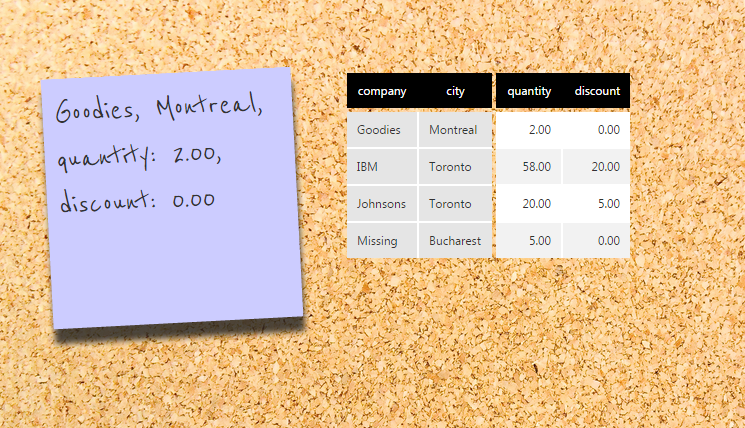
The result of this sample is a new sticky note data control that is added to the data visualization section of the toolbar, and displays multiple elements connected to its text properties.

5. See also
.NET
JavaScript
