
1. Overview
This sample shows how to create a custom control that users can add to dashboards and other views just like built-in components. This is part 1 of 2, where the focus will be on a control that does not bind directly to data. This example demonstrates a sticky note control.
This article walks through:
- How to create a extension
- How to create a custom control
2. Getting started
The current version of the sample solution targets both .NET Framework and .NET Core/.NET 5+ so that the packaged extension will work for version 7 of the application and higher on all platforms.
The following prerequisites must be installed on your computer to build the provided sample without modifications:
- Visual Studio 2017 or higher
- Microsoft .NET Framework 4.7.2 or higher
- Microsoft .NET Core 3.1 or higher
You can modify the sample project to target different versions of .NET if preferred depending on the version used by your application instance.
The NuGet packages referenced as dependencies are initially set to version 7.0.1. If your version of the application is newer and the APIs you are using may have changed, you can update the version of the package references.
2.1. Downloading sample solution
To download the custom sample control solution, click here.
(A solution is also available for version 6, and versions 2 through 5.)
2.2. Opening solution
Extract SampleControl.zip to a folder and open the solution in Microsoft Visual Studio to build the extension.
To use the option to publish directly to your application instance, run Visual Studio as an administrator before opening the solution. For example, you can right-click Visual Studio in the start menu and find the Run as administrator option.
The solution file is located at:
[Extracted folder]\SampleControl\SampleControl.sln
3. The project
The project is a class library.
- mycompany.controls.sample.stickynote.adapter.js - Contains the sticky note adapter class, responsible for integrating your third party sticky note control.
- mycompany.controls.sample.stickynote.css - The custom style sheet for the sticky note adapter.
- mycompany.controls.sample.stickynote.info.js - Gets the information about the control (such as what adapters it supports).
- PublishExtensionTemplate.props - Used for auto publishing the extension after the build succeeds, and defines extension properties, and files.
- SampleControlExtensionPackageInfo.cs - Contains the package information about the extension package.
- StickyNoteAdapterInfo.cs - Contains the connection to JavaScript files, and defines the full JavaScript name.
- StickyNoteExtension.cs - Contains the information about the adapters.
- stickyNoteIcon.png - An icon to represent the sticky note in the toolbar.
3.1. Publish extension template
This sample has a mechanism to automatically publish the extension when building, which is the Dundas.BI.PublishExtension NuGet package. When this package is added to the project, it creates a PublishExtensionTemplate.props file containing MSBuild property and item groups, which define how to create and publish the extension.
When the DtFilePath property is set to the file path of the dt tool of an application instance, it will then publish the extension directly to that instance when you build the solution. It will also touch the web.config file to force the web application to reset.
If the DtFilePath property is not set, it will create a .zip file you can add to your application instance using the Extensions page in the administration UI. After building the solution with default settings and the solution configuration set to Release, this .zip file can be found in the bin\Release\netcoreapp3.1 subfolder of your solution. It targets both .NET Framework and .NET Core.
The stickyNoteIcon.png file is included as a file resource so that it can be referred to in the JavaScript Info class as the control's toolbar icon.
For more details on using this package to automate publishing extensions, see Using the Dundas.BI.PublishExtension NuGet package.
3.2. ExtensionPackageInfo class
In order for a custom adapter or package to be recognized, it needs to contain a class that extends the ExtensionPackageInfo2 class. This class contains a call to the base constructor that reads extension package information from the extension manifest file.
/// <summary>
/// This class contains the package information about the extension package.
/// </summary>
public class SampleControlExtensionPackageInfo : ExtensionPackageInfo2
{
    /// <summary>Initializes a new instance of the
    /// <see cref="SampleControlExtensionPackageInfo"/>
    /// class.</summary>
    /// <param name="extensionManifest">The extension manifest.</param>
    public SampleControlExtensionPackageInfo(ExtensionManifest extensionManifest)
        : base(extensionManifest)
    {
    }
}
3.3. Defining the AdapterInfo
Controls are 'plugged into' the application using adapters. Your adapter class is what will allow your custom control to behave the same as any built-in control.
To create a custom adapter, you will first need to extend the AdapterInfo Class to provide information about it. In the constructor, you should give the full name of the JavaScript version of the Info class. In the case of the sticky note example, this is mycompany.controls.sample.stickynote.Info.
using Dundas.BI.Web.Extensibility.Parameters;

  ...

namespace MyCompany.Sample.SampleControl
{
    /// <summary>
    /// This class represents a stickynote adapter.
    /// </summary>
    public class StickyNoteAdapterInfo : AdapterInfo
    {
        /// <summary>
        /// Initializes a new instance of the <see cref="StickyNoteAdapterInfo" /> class.
        /// </summary>
        public StickyNoteAdapterInfo()
        {
	        this.FullJavaScriptName = "mycompany.controls.sample.stickynote.Info";
        }
        ...
    }
}
3.3.1. Overriding the GetResources method
The GetResources method is where the JavaScript file contents are defined. The GetCssResources method is where the CSS file contents are defined. This example demonstrates how to read the project's embedded resource JavaScript and CSS files, and return them as a list of strings:
#region Private Methods

/// <summary>
/// Gets the resource as string from current assembly.
/// </summary>
/// <param name="name">The full path to the resource.</param>
/// <returns>The resource as <see cref="T:System.string" />.</returns>
private string GetResourceFromCurrentAssembly(string name)
{
	System.Reflection.Assembly currentAssembly =
		typeof(StickyNoteAdapterInfo).Assembly;

	using (StreamReader streamReader =
		new StreamReader(currentAssembly.GetManifestResourceStream(name)))
	{

		return
			streamReader.ReadToEnd();

	}
}

#endregion Private Methods

#region Public Methods

/// <summary>
/// Gets all the JavaScript resources as <see cref="T:System.string" />s for this info.
/// The order they are returned should be the ordered they need to be included in.
/// </summary>
/// <returns>
/// The JavaScript resources as <see cref="T:System.string" />s. This might be null.
/// </returns>
public override IList<string> GetResources()
{
	return new List<string>
	{
		GetResourceFromCurrentAssembly(
                  "MyCompany.Sample.SampleControl.mycompany.controls.sample.stickynote.info.js"
                ),
		GetResourceFromCurrentAssembly(
                   "MyCompany.Sample.SampleControl.mycompany.controls.sample.stickynote.adapter.js"
                )

	};
}

/// Gets all the CSS resources (as strings) for this info.
/// The order they are returned should be the ordered they need to be included in.
/// </summary>
/// <returns>The CSS resources (as strings). This might be null.</returns>
public override IList<string> GetCssResources()
{
    return
        new List<string>
        {
            GetResourceFromCurrentAssembly(
               "MyCompany.Sample.SampleControl.mycompany.controls.sample.stickynote.css"
            )
        };
}


#endregion Public Methods
3.4. Implementing the IAdapterExtension interface
The IAdapterExtension Interface is used to define all the adapter info objects for a particular extension. The following demonstrates this interface implementation for the sticky note:
/// <summary>
/// The class represents the Sticky Note extension.
/// </summary>
public class StickyNoteExtension : IAdapterExtension
{
    /// <summary>
    /// Gets the all the adapter info objects for this particular extension.
    /// </summary>
    /// <returns>
    /// The adapter info objects for this extension.
    /// </returns>
    public IList<Web.Extensibility.Parameters.AdapterInfo> GetInfos()
    {
        return new List<AdapterInfo>() { new StickyNoteAdapterInfo() };
    }
}
3.5. The JavaScript info class
The sticky note info class extends the dundas.view.controls.Info Class. In the example below only the getControlInfos method was overridden. In this method we are passing the meta information about the control and what adapters it supports.
"use strict";
window.mycompany = {};
window.mycompany.controls = {};
window.mycompany.controls.sample = {};
window.mycompany.controls.sample.stickynote = {};
// Sandbox.
(function ($) {
// The sticky note control class infos.
mycompany.controls.sample.stickynote.Info = dundas.view.controls.Info.extend({
init: function () {
/// <summary>
/// Initializes the Info. Called during construction.
/// </summary>
},
getControlInfos: function () {
/// <summary>
/// Gets the information about the control (such as what adapters it supports).
/// </summary>
/// <returns type="Object">
/// Meta-information about the control and what adapters it supports.
/// </returns>
var infos = [{
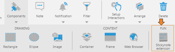
"categoryName": "Components",
"subCategoryName": "Fun",
"caption": "Stickynote extension",
"description": "Simple stickynote sample control",
"adapterObjectName": 'mycompany.controls.sample.stickynote.Adapter',
"defaultWidth": 350,
"defaultHeight": 200,
"toolbarIconUrl": dundas.Utility.getContextualUrlPath(
'ExtensionResources/MyCompany.Sample.SampleControl/stickyNoteIcon.png'
)
}];
return infos;
}
});
})(jQuery);
3.6. The JavaScript adapter class
The adapter class is what allows your custom control to integrate with the application. It extends the dundas.view.controls.Adapter Class. The following demonstrates how to create this class:
(function ($) {
    mycompany.controls.sample.stickynote.Adapter = dundas.view.controls.Adapter.extend({
        init: function (adapterOptions) {
            /// <summary>
            /// Initializes the Adapter. Called during construction.
            /// </summary>
            /// <param name="adapterOptions" type="Object" optional="true">(optional)
            /// An object literal parameter specifying default values.
            /// </param>

            // Call base.
            this._super(adapterOptions);
        }
})(jQuery);
3.6.1. Creating the control and elements
The place to define the control and elements is on the adapter's onLoaded method. This is called when the adapter is loaded and set up. The control should be set up by the adapter now and added to the DOM, using the container element in the container property. Implementers of this method must call this._super() to invoke the base implementation for inherited actions and events to be set up correctly.
In the following example, we create three DOM elements in a _createControl method if our control has not been initialized. Each element is a div element.
onLoaded: function () {
    /// <summary>
    /// Called when the adapter is loaded and set up.
    /// The control should be set up by the adapter now and added to the DOM (container property).
    /// Implementers of this method must call this._super() at the end if they want actions
    /// and events to be automatically set up.
    /// </summary>

    // Set up my UI control here.
    if (this.control == null) {
        this._createControl();
    }

    this._super();

    this._stickyNoteContainer.click(function () {
        $(this).fadeOut( "fast" );
    });
},

_createControl: function() {
    // Control.

    this._stickyNoteContainer =
        $(document.createElement("div"))
        .addClass(Constants.StickyNoteContainerCssClass)
        .appendTo($(this.container));

    this.control = $(document.createElement("div"))
        .addClass(Constants.StickyNoteControlCssClass)
        .appendTo(this._stickyNoteContainer);

    // Label.
    this._label = $(document.createElement("div"))
        .addClass(Constants.StickyNoteControlLabelCssClass)
        .appendTo(this.control);

    // Set default font family and size
    this.fontFamily = "'Reenie Beanie'";
    this.fontSize = "36px";

    // Set defaults properties for the controls.
    this.stickynoteText = "Lorem ipsum dolor sit amet, consectetur adipiscing elit.";

    var randomAngle = Math.floor((Math.random() * 4));
    randomAngle = (Math.random() < 0.5) ? -randomAngle : randomAngle;

    this.angle = randomAngle;

    var randomColorIndex = Math.floor((Math.random() * 3));

    switch (randomColorIndex) {
        case 0:
            this.background =
               new dundas.controls.SolidColorBrush(dundas.controls.Color.fromString(
                  "#ffc")
               );
            break;
        case 1:
            this.background =
               new dundas.controls.SolidColorBrush(dundas.controls.Color.fromString(
                  "#cfc")
               );
            break;
        case 2:
            this.background =
               new dundas.controls.SolidColorBrush(dundas.controls.Color.fromString(
                  "#ccf")
            );
            break;
    }
},
3.6.2. Defining the properties
Control adapters can expose 'properties' to allow users to customize the control's settings using the Properties window in the UI.
The next step is to override the getControlProperties method. In this method, we will return an Object Descriptor that lists and describes the available properties on the control or one of its elements. The following example shows the implementation of this method for the text, angle, and background properties for the sticky note adapter:
getControlProperties: function (path, options) {
    /// <summary>
    /// Called to get the object with the list of properties on the root control, or any sub-element of the control.
    /// </summary>
    /// <param name="path" type="Array" elementType="dundas.view.controls.PropertyPathItem" optional="true">(optional) The path to the sub-element
    /// of this control. Undefined if the root is requested, otherwise an array of plain objects with properties.</param>
    /// <param name="options" type="Object" optional="true">(optional) The options in which to get the control properties. Structure:
    ///     doNotRecord             [type: Boolean, optional: true]             - (optional) True to generate control properties that do not record any adapter state for undo/redo-ability.
    ///     isSimpleMode            [type: Boolean, optional: true]             - (optional) True to get the 'simple' properties for displaying the quick access property editor.
    /// </param>
    /// <returns type="dundas.controls.ObjectDescriptor">An object with the list of properties on the desired element.</returns>

    var objectDescriptor,
        propertyDescriptor,
        elementName;

    // Base path properties.
    if (!path) {
        // Object descriptor.
        objectDescriptor = this._super(path, options);

        // Label text.
        propertyDescriptor = new dundas.StringPropertyDescriptor();
        propertyDescriptor.name = "Stickynote Text";
        propertyDescriptor.id = "stickynoteText";
        propertyDescriptor.category = "GS_PropertyGrid_Category_Common".localize();
        propertyDescriptor.description = "Sample Sticky note control";
        propertyDescriptor.value = this.stickynoteText;
        propertyDescriptor.defaultValue = "Lorem Ipsum";
        propertyDescriptor.section = dundas.controls.PropertyGridSections.Text;

        objectDescriptor.addProperty(propertyDescriptor);

        // Angle.
        propertyDescriptor = new dundas.NumericPropertyDescriptor;
        propertyDescriptor.name = "Angle";
        propertyDescriptor.id = "angle";
        propertyDescriptor.category = "GS_PropertyGrid_Category_Common".localize();
        propertyDescriptor.description = "The angle.";
        propertyDescriptor.value = this.angle;
        propertyDescriptor.defaultValue = -3;
        propertyDescriptor.section = dundas.controls.PropertyGridSections.Look;

        objectDescriptor.addProperty(propertyDescriptor);

        // Background.
        propertyDescriptor = new dundas.PropertyDescriptor();
        propertyDescriptor.name = "Background";
        propertyDescriptor.id = "background";
        propertyDescriptor.category = "GS_PropertyGrid_Category_Common".localize();
        propertyDescriptor.description = "The background";
        propertyDescriptor.value = this.background;
        propertyDescriptor.defaultValue =
           new dundas.controls.SolidColorBrush(
              dundas.controls.Color.fromString("#cfc")
           );
        propertyDescriptor.isNullable = true;
        propertyDescriptor.section = dundas.controls.PropertyGridSections.Look;

        objectDescriptor.addProperty(propertyDescriptor);
    }

    return objectDescriptor;
},
The property descriptors above expose settings to the UI. The real properties in code that store settings values could be defined either on the adapter class, or in the control itself, depending on your implementation. Each adapter class should implement a __classtype property, however.
The following example stores settings values in properties defined on the adapter, and applies the settings values directly to the DOM when set:
__properties: {
    "__classType": {
        get: function () {
            return "mycompany.controls.sample.stickynote.Adapter";
        }
    },

    "stickynoteText": {
        /// <summary>
        /// Gets or sets the text label displayed in the control.
        /// </summary>
        /// <value type="String">The value to display.</value>
        get: function () {
            return this._stickynoteText;
        },
        set: function (value) {
            this._stickynoteText = value;
            if(this._label) {
                this._label.text(value);
            }
        },
        notEnumerable: true
    },

    "background": {
        /// <summary>
        /// Gets or sets the background property of the control.
        /// </summary>
        /// <value type="dundas.controls.SolidColorBrush" mayBeNull="true"></value>
        get: function () {
            return this._background;
        },
        set: function (brush) {
            this._background = brush;
            if (this.control) {
                if (brush) {
                    brush.applyToElement(this.control.get(0), 'background');
                }
                else {
                    $(this.container).css({ background: '' });
                }
            }
        },
        notEnumerable: true
    },

    "angle": {
        /// <summary>
        /// Gets or sets the angle of the control.
        /// </summary>
        /// <value type="Number" mayBeNull="true">The angle of the control.</value>
        get: function () {
            return this._angle;
        },
        set: function (value) {
            this._angle = value;
            if (this.control) {
                this.control.css("-o-transform", "rotate(" + value + "deg)");
                this.control.css("-webkit-transform", "rotate(" + value + "deg)");
                this.control.css("-moz-transform", "rotate(" + value + "deg)");

            }
        },
        notEnumerable: true
    }
}
For properties defined directly on the adapter class, these are set for you automatically by the Properties window when a user makes a change, so the provided sample does not listen for property changed events. If your getControlProperties method adds any property descriptors of type CollectionPropertyDescriptor (describing an array-type property) or ComplexObjectDescriptor (an object-type property), if the objects returned by these properties are 'sub-elements' with their own set of properties for users to set, you will need to listen for the ObjectDescriptor's PropertyChangedEvent and apply these property changes yourself. You would also need to do this if you defined properties on the object stored in the adapter's control property rather than as shown above on the adapter class. For example, in getControlProperties:
$(objectDescriptor).on(
    dundas.controls.ObjectDescriptorConstants.PropertyChangedEvent,
    this._onPropertyChanged.bind(this, path)
);
An _onPropertyChanged method can then listen for which property was changed by a user in the UI and apply the change, using the getControlProperty method's path argument to determine which object was changed:
_onPropertyChanged: function (path, e) {
    if (path && path[0].elementName == "subElement") {
        if (e.propertyDescriptor.id == "subElementProperty") {
            this.subElement.subElementProperty = e.newValue;
        }
        // ...
Similarly, the object descriptor will fire its CollectionPropertyChangedEvent when a collection property is changed by a user adding or removing an item.
3.6.3. Setting the adapter name prefix
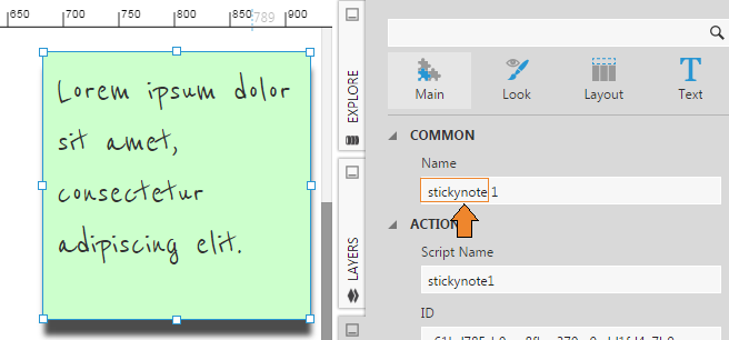
It is recommended to override the _getAdapterNamePrefix method (considered a protected method) to return a nice name for when the control is added to the dashboard. For example, the following code example will result in the name sequence (stickynote1, stickynote2, etc.):
_getAdapterNamePrefix: function () {
    /// <summary>
    /// Should be overridden by implementing adapters to return a nice name for name generation.
    /// </summary>
    /// <returns type="String">The prefix to use for any generated names.</returns>

    return "stickynote";
},
3.6.4. Getting and saving the state of the control
In order for the state to be saved, the adapter must override the stringifyControl method. This returns a string version of the underlying control's state. To load the control state, the adapter must override the parseControl method, to accept the string version of the state and restore it to the control. The base implementation should be invoked by calling this._super to correctly handle inherited properties.
The following is the sticky note implementation for getting and saving the state of the control.
var Utility = {
    parseItem: function (item) {
        return Class.fromJSON(JSON.stringify(item || {}));
    },
    parseItems: function (items) {
        return $.map(items || [], function (item, index) {
            return Utility.parseItem(item);
        });
    }
};

...

stringifyControl: function () {
    /// <summary>
    /// Called to instruct this adapter to get a stringified version of the underlying control.
    /// </summary>
    /// <returns type="String">A string representation of the underlying control to store.</returns>

    var object = {};

    object.background = this.background;
    object.angle = this.angle;
    object.stickynoteText = this.stickynoteText;

    return JSON.stringify(object);
},

parseControl: function (objectString) {
    /// <summary>
    /// Called to instruct the adapter to set the control up based on the stringified version.
    /// </summary>
    /// <param name="objectString" type="String">The stringified control.</param>

    var object = JSON.parse(objectString);

    if (this.control == null) {
        this._createControl();
    }

    this.background = Utility.parseItem(object.background);
    this.stickynoteText = object.stickynoteText;
    this.angle = object.angle;
},
4. Data controls and visualizations
To continue with part two of this article that focuses on adding data binding to the control, see Create a custom data visualization control.
5. See also
.NET
JavaScript
- dundas.view.controls.Adapter Class
- dundas.view.controls.Info Class
- getControlInfos method
- dundas.view.controls.Adapter Class
- onLoaded method
- getControlProperties method
- Object Descriptor
- stringifyControl method
- parseControl method