1. Overview
A histogram is a graphical representation of the distribution of values in numerical data, grouping each value into a 'bin' and displaying the bin counts across the range of values. Use a histogram when you have a single set of numeric values (a measure) and are interested in which numeric values occur the most or least, and patterns in how the values occur across the total range. For example, a histogram could show you that most orders have a quantity of 3-5 items, more than orders of 0-2 or 6-8 items, and indicate other patterns to you visually.
The Calculate Histogram option in Dundas BI can automatically create a histogram chart showing the frequencies of the values in your dataset as shown below. This is a shortcut to creating a formula visualization yourself that uses the Histogram function and styling it as a histogram chart.
2. Creating the Histogram
A histogram can be calculated given any set of measure values regardless of their current visualization.
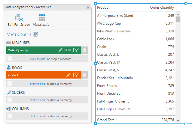
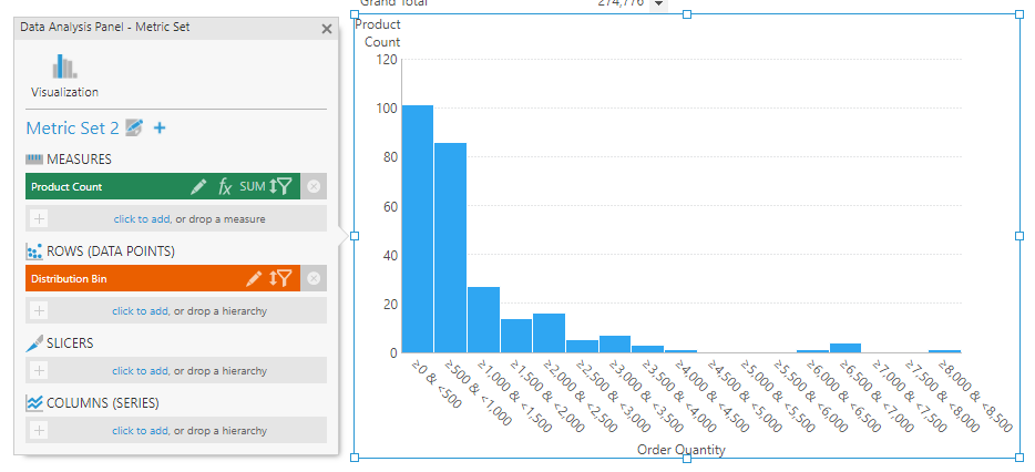
As an example, a table listing order quantities for each product is visualized below:
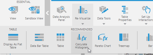
With your data visualization selected that contains this data, select Re-Visualize from the toolbar or the context menu, and then select Calculate Histogram.
This option may appear under Recommended in the toolbar depending on your data.
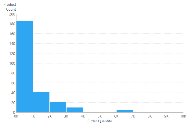
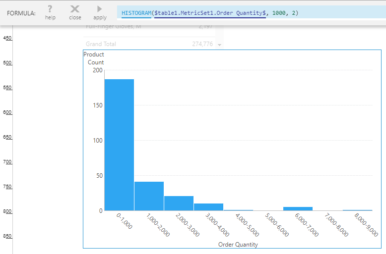
A new bar chart is created and automatically styled as a histogram. In this example, the heights of the bars indicate how many products there were in each bin (left axis) according to each product's order quantity (bottom axis).
Another way to create this histogram is to start by first adding a Calculate Histogram visualization to a view such as a dashboard. This is found under Data Visualization in the toolbar.
After dragging your data onto it, click Create Histogram in the toolbar.
3. Changing the bin size with a filter
The shape and patterns that you can see in a histogram are determined by the sizes of the 'bins' displayed along its bottom axis. You can change the bin size for a different look at the distribution.
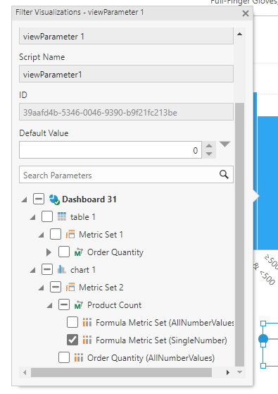
By default, the bin size parameter of the Histogram function is assigned a parameter placeholder called $BinSizeParameter$ when you use the Calculate Histogram option above. This parameter is ready to be connected to a filter on a dashboard or other view to allow you or other viewers to customize the bin size using a Single Number or Slider filter, found under More when adding a filter from the toolbar.
When connecting the filter to the bin size parameter, select the corresponding SingleNumber parameter under the histogram's measure. If a different parameter is selected, uncheck it first because incompatible parameters are not listed.
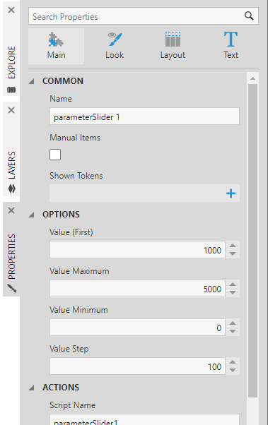
You can customize the filter settings in the Properties window, for example customizing the maximum bin size and a larger step between selectable values.
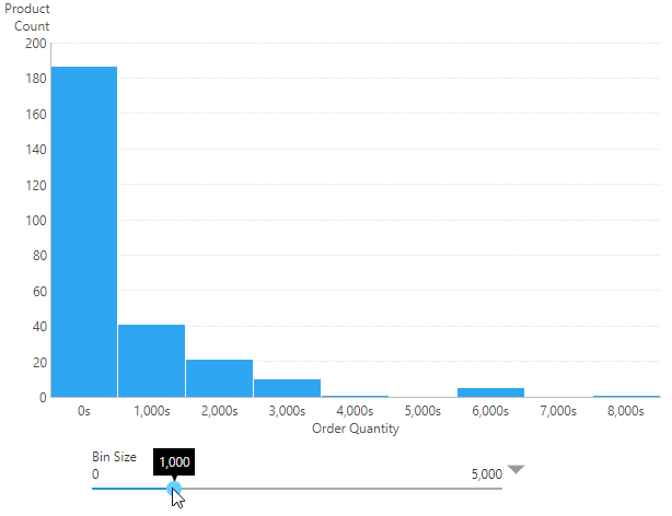
View the dashboard to use the filter to customize the bin size.
4. Configuring the parameters
You can optionally set a specific bin size and/or customize the formatting used for the bins. For details about the parameters in this formula, refer to the Histogram article.
In the Data Analysis Panel for the Histogram, edit the formula by clicking its fx icon.
You can choose to replace the parameter placeholder with your preferred bin size, and you can specify a preferred value for the format parameter, as shown in the formula bar in the image below.
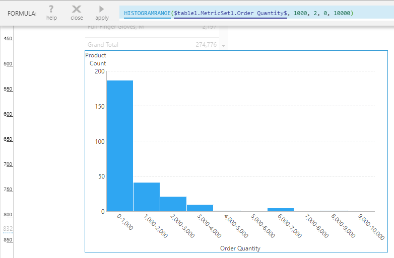
If you want to customize the start or end of the full range of values, you can use the Histogram Range function.
After replacing HISTOGRAM with HISTOGRAMRANGE, you can add the range start and range end parameters as the 4th and 5th arguments:
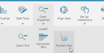
5. Labeling bin edges
By default, the bottom axis of a Histogram visualization displays a categorical scale where each bin is labeled in the middle by its range of values (e.g., 2,000s or ≥ 0 & < 2,000).
You can change this representation to a numeric scale, which labels the edges of the bins instead. Simply select Numeric Axis from the chart property options in the toolbar.