
1. Overview
A chord diagram displays interrelated data arranged around a circle, and the quantities between each pair of items.
While other relationship visualizations often show multiple levels of a hierarchy or multiple clusters, chord diagrams visualize the relationships between items in a single level or set.
2. Add a chord diagram
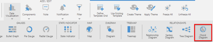
In the toolbar, choose Data Visualization or Re-Visualize, and select Chord Diagram.
If you have a blank chord diagram and have not added data yet, drag a hierarchy or a column identifying items to Rows in the Data Analysis Panel.
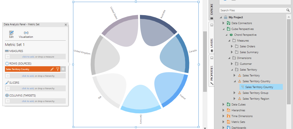
The diagram is displayed as a circle with nodes for each item.
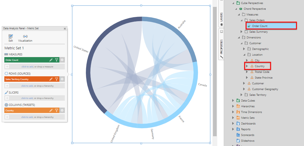
Drag a second hierarchy or column identifying items to Columns in the Data Analysis Panel.
Drag numeric data to Measures in the Data Analysis Panel. This measure is used to visualize the quantities transfered from each source to each target as semi-transparent filled links of varying widths.
By default, a single link can visualize movement in both directions if there is also a row of data corresponding to the target value with a column corresponding to the source, which determines the width of the other end of the link at the target. In version 26.2 and higher, you can show a directed chord diagram instead where the links appear as arrows.
3. Change colors
By default, or without any data assigned to Color in the Data Analysis Panel as shown below, a color palette is used to assign each node a color in sequence. These colors are also reflected in links based on the node where they each originate. You can open the Properties window and go to the Design (or Look) tab to find and expand the Palette settings, which you can customize.
To assign or change colors based on data values instead:
- Open the Data Analysis Panel, go to the Visualization tab, and under Nodes and/or Links you can click to add (or drag) data under Color.
- Click the brush icon next to the Color heading as a shortcut to the property settings, or in the Properties window, go to the Design (or Look) tab, expand Color Rules, and click to add or edit color rules.
The different types of color rules and their options are the same as in other visualizations such as charts. For more details, see Apply colors to data points or series using color rules.
4. Change the link width measure
The first measure selected when visualizing as a chord diagram is normally used automatically to determine the widths of the links between each pair of nodes. You can assign or change which measure is visualized as links as follows:
Select Visualization in the Data Analysis Panel.
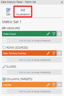
Click Links and find the Width heading. You can remove a measure here if one is already assigned, and add a measure to use for determining link widths.
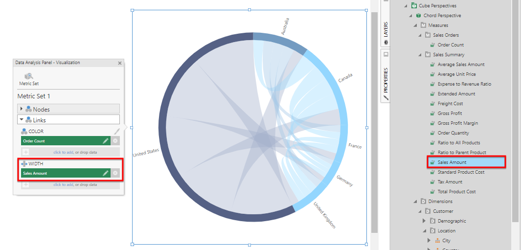
The width of each link is now defined by this measure's values.
5. Directed chord diagrams
In version 26.2 and higher, you can choose to show separate links in each direction (if applicable) and with the direction indicated more clearly.
In the Properties window, go to the Design tab and expand Lines & Fills to find the Show Link Arrows option.
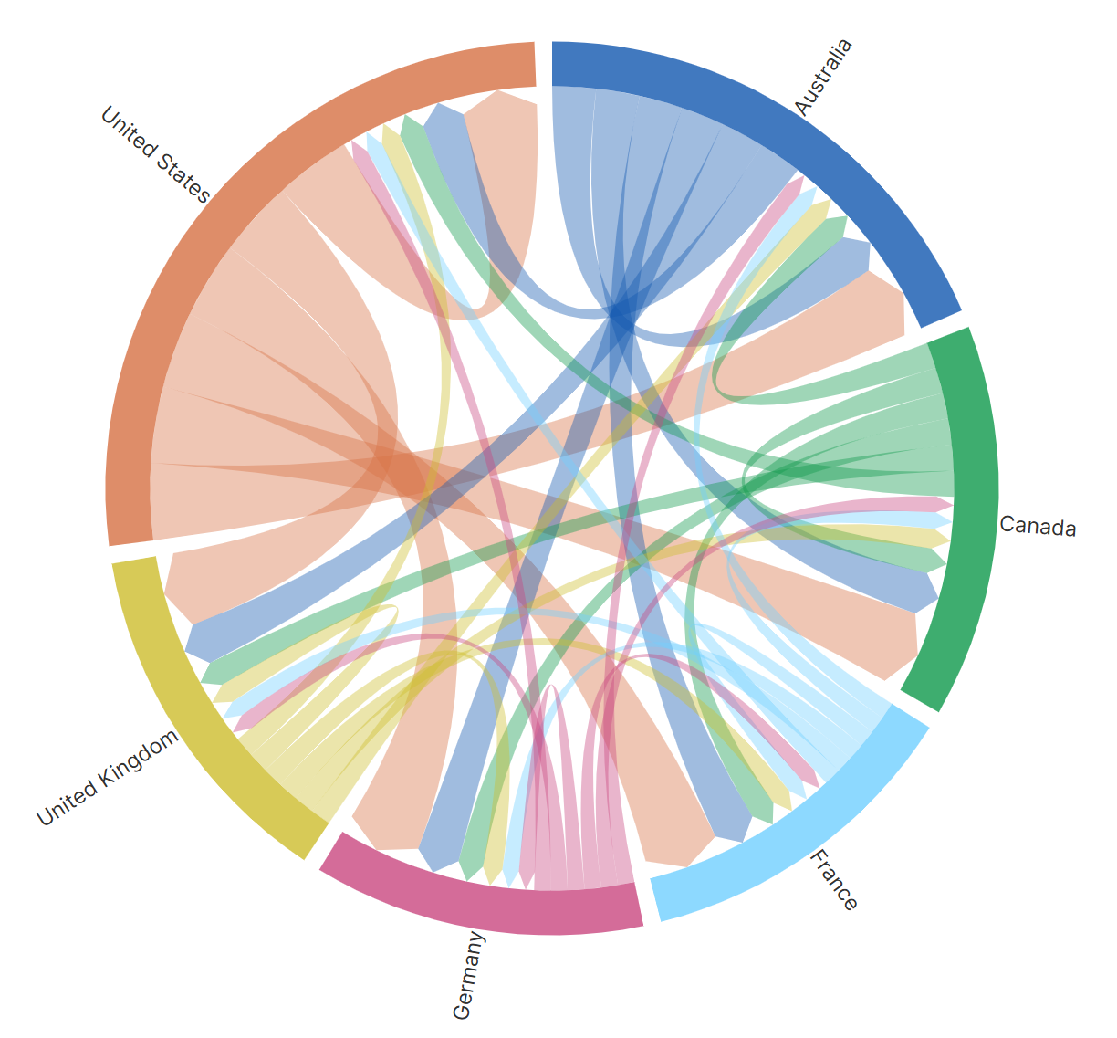
When this is enabled, the target of each link is indicated by an arrow shape at its end. You can customize the width of this arrow head using the Arrow Head Radius property.