Using a tree diagram
1. Overview
The tree diagram displays the hierarchical structure of your data. A common use is to display an organizational chart, but it can be used to visualize or explore any data broken down into multiple levels.
This article provides an example of a tree diagram that uses two types of data:
- A multi-level hierarchy showing countries and territories, which can then be expanded & collapsed, or drilled up & down between the levels.
- Multiple hierarchies, which are also each presented as one or more levels in the diagram. They can also be expanded and collapsed like the levels of a single hierarchy.
2. Creating a tree diagram
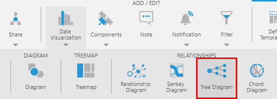
When editing a metric set, or a view such as a dashboard, choose Data Visualization or Re-Visualize in the toolbar, then find Tree Diagram under Relationships.
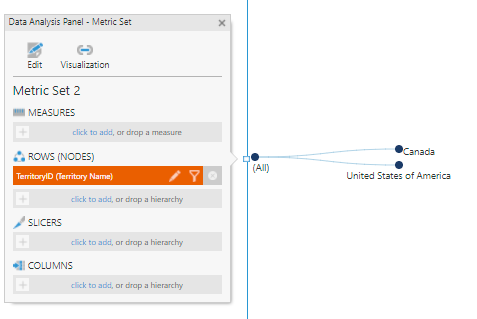
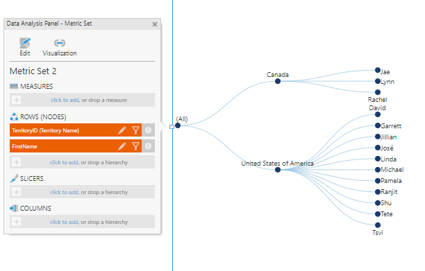
If you have added an empty tree diagram to a dashboard or view and have not selected data yet, drag a hierarchy or column of data to Rows in the Data Analysis Panel.
The hierarches placed on Rows in the Data Analysis Panel become the Nodes of the diagram, displayed as circles with connecting links.
You can choose to add more than one hierarchy, or drag a lower level from a multi-level hierarchy onto the diagram to select the range of levels between them. Both of these actions will expand the diagram to display additional levels.
3. Expanding and collapsing
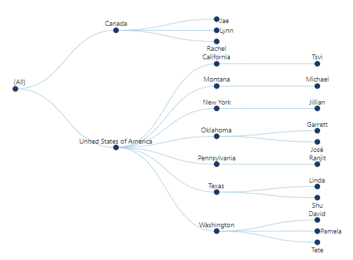
When there are more levels available in the hierarchy, you can right-click an individual node and select Expand to include the nodes in the level below that are under that node. (If editing a dashboard, first choose View in the toolbar to interact with the diagram.)
In our example, we have expanded United States of America and the nodes from the States & Provinces level are now displayed, only under that node:
In addition to expanding and collapsing individual nodes, you can expand and collapse entire hierarchies or levels:
- To collapse a hierarchy, right-click a node and choose Collapse All. You can then right-click the diagram and choose Expand All to reverse the change for that hierarchy.
- If a hierarchy offers multiple levels, right-click the diagram and choose Change Level. By setting both a level and a top level, you can display multiple levels or choose which level(s) to display.
For more details and options for expanding and collapsing data, see Expand and collapse hierarchy members.
4. Change node color and size
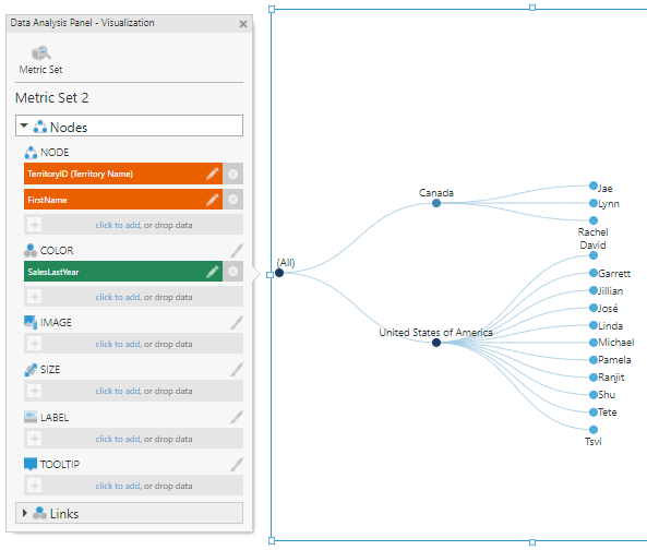
To change the colors or sizes of nodes based on your data, open the Visualization tab of the Data Analysis Panel when editing a metric set or dashboard.
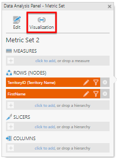
Under Nodes, drag or click to add a measure under Color.
An Auto Color Rule is automatically applied to the nodes in the diagram. You can change the settings of the rule by clicking the brush icon next to Color, or by finding the node color rules in the Design (or Look) tab of the Properties window and selecting Auto Color Rule.
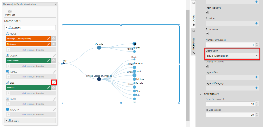
Under Nodes, drag or click to add a measure under Size.
Auto Size Rules are automatically applied to the nodes in the diagram. You can change the settings of the size rules in the same manner as for color rules. For example, click the brush icon next to Size and change Distribution to Equal Distribution.
You can also change node colors and sizes by hierarchy value.
Color and size rules work the same for tree diagrams as in other visualizations. For more details and examples, see Apply colors to data points or series using color rules.
4.1. Display images in nodes
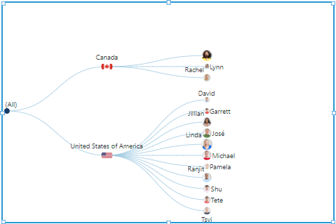
You can display images to identify each node in the diagram using values from your data that you've added to the Data Analysis Panel.
Open the Properties window's Design tab, then expand Lines & Fills and the Nodes settings to find the Image Path property.
Type the URL to the folder or directory containing your images, and use the [Member] keyword to refer to the hierarchy member displayed by each diagram node, or use another keyword to insert data as part of the image file name. For example:
/Content/Images/MyCompany/[Member].jpg
If you have the entire image path for each member in your database, you can add this hierarchy under Image in the Data Analysis Panel's Visualization tab instead, and the Image Path property will be updated accordingly.
If the images themselves are stored in your database, they can also be displayed this way by assigning it under Image, and then customizing the Image Path property. For details on how to encode image data and set the Image Path property to display it, see Adding a data image.
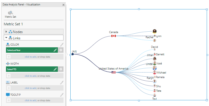
5. Change link color and width
Link colors and widths can be changed based on data the same way as for nodes.
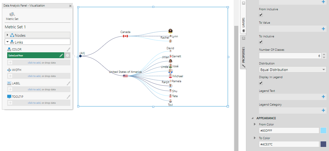
Open the Visualization tab of the Data Analysis Panel and expand the Links section, then add a measure under Color.
An Auto Color Rule is applied automatically to the links in the diagram. You can change the settings of the rule by clicking the brush icon next to Color, or finding it in the Design (or Look) tab of the Properties window. For example, change Distribution to Equal Distribution and adjust the colors.
Add a measure under Width.
An Auto Size Rule is applied automatically to the links in the diagram. You can change the settings of the rule by clicking the brush icon next to Width, or going to the Design (or Look) tab of the Properties window and selecting the rule under Link Width Rules.
6. Change labels and tooltips
In the Design tab of the Properties window under Font & Text (formerly the Text tab), you can customize the label and tooltip text for both the links and the nodes.
These properties accept regular text, as well as keywords such as [Member] and [Level] for the hierarchy member and level caption respectively. For additional information about available keywords, refer to the formatting text article.
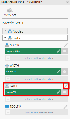
It can be easier to use the Visualization tab in the Data Analysis Panel. For example, add a measure under Label in the Links section.
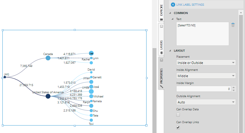
Click the brush image next to the Label field to open the relevant properties section. The keyword (e.g., [SalesYTD]) has already been added to the Text property. As with text properties in all visualizations, you can add a format inside the square brackets, e.g., [SalesYTD:N0] to remove the decimal places.
7. Tree orientation
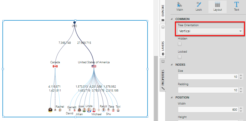
The tree layout can be either from left to right (horizontal) or from top to bottom (vertical).
To change the orientation, open the Design tab of the Properties window, expand Layout & Spacing (formerly the Layout tab), and change Tree Orientation.
