
Excel is an indispensable tool, however, it simply cannot hold its own in respect to all data processes – especially when it comes to Business Intelligence and Reporting.
![Dundas BI: The Case for Business Intelligence vs. Excel [PART 1]](https://www.dundas.com/resources/images/joomgrabber/2020-04/33bc42a15c.jpeg)
Excel is an indispensable tool, however, it simply cannot hold its own in respect to all data processes – especially when it comes to Business Intelligence and Reporting.

The use of icons in reports within the market research community is increasing, whether as standalone images within reports or as a means of data representation via infographics.

Using Dundas BI, Absorb Software whipped up a few dashboards to display some Key Performance Indicators to track the progression of The Bachelor, which they then displayed on large TV screens.

With Dundas BI 5, we’ve added two new visualizations to the relationship category. Dundas BI now has four, which include the Tree Diagram, Chord Diagram, Relationship Diagram, and Sankey Diagram.
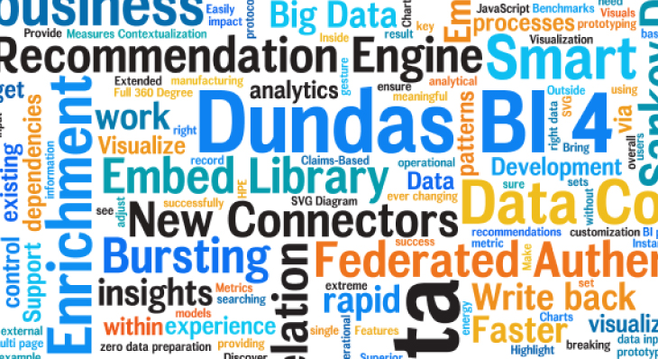
Word Clouds (or Tag Clouds) are excellent options to help visually interpret text and are useful in quickly gaining insight into the most prominent items in a given text

A Slope Graph is a line chart variation that is typically used to emphasize change in time for different categories in your data and how each stacks up against the other. Let's build one in Dundas BI

How can you operationalize your machine learning model and apply it to new data coming through your applications like all other data analyzed through your business intelligence system?
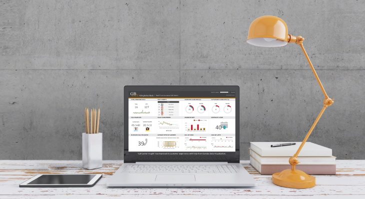
Dashboards are a great way to visually represent your data to track, analyze and display KPIs at-a-glance. One of the ways to enhance the readability of a dashboard is by making use of animations.

The ability to group data on-the-fly is incredibly powerful. It's helpful when correcting data errors or grouping similar datum to form single data points or for answering hypothetical questions

With Dundas BI 5, we’ve taken our existing Map Visualization and set its functionalities ablaze by incorporating Heat Maps.

We draw inspiration from our incredible community and provide content based on the topics we get asked about most. This blog encapsulates our best content from 2017, according to you!

Voice has the potential to completely revolutionize how BI systems are designed, built and used. This blog examines how you can put actionable insights directly into your hands (or voice)