
We've had some time to think of our (and your) favorite videos, blogs, eBooks, and business intelligence content from the past year, and have brought them together in one place. Enjoy!

We've had some time to think of our (and your) favorite videos, blogs, eBooks, and business intelligence content from the past year, and have brought them together in one place. Enjoy!
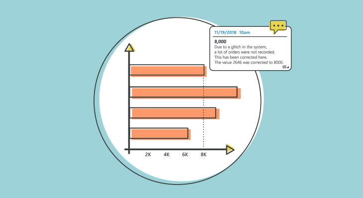
To get away from side discussions occurring in 3rd party tools, the conversations need to move directly into the BI tool – right next to the data. Here's how Dundas BI makes that possible.

Reacting to events as they occur helps businesses to make tactical decisions immediately and prevent any problems that may arise due to inadvertent delays. It's time you embrace real-time analytics.
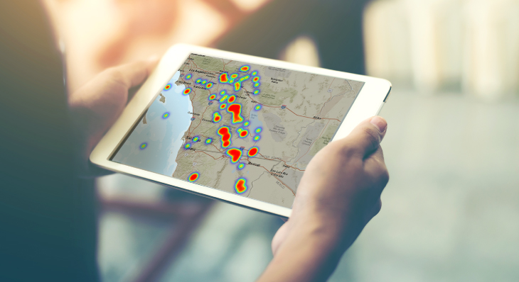
Heat Maps are graphical representations of data that utilize color-coded systems. What many people don’t realize, however, is that Heat Maps can be applied to a handful of data visualizations.
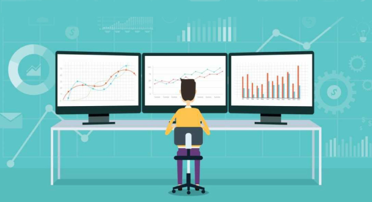
Awesome applications need awesome embedded analytics. Let's take a look at 3 data-savvy companies who've embedded Dundas BI and transformed their applications with polished, custom analytics.
![Dundas BI: The Case for Business Intelligence vs. Excel [PART 2]](https://www.dundas.com/resources/images/joomgrabber/2020-04/bd402ecb15.jpeg)
This is part two of a two-part series on why companies should consider replacing Excel with a Business Intelligence platform for more effective decision making.
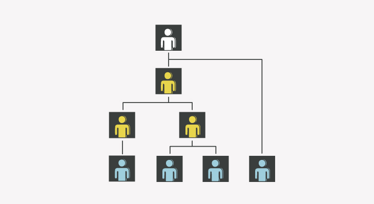
One of the more common challenges a lot of organizations encounter, is around being able to manage their hierarchies when they’re not perfect. Dundas' support for ragged hierarchies remedies that.
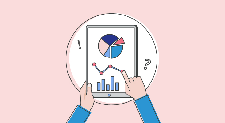
Whether you’re looking to embed real-time analytics within an existing product, or are looking to re-invent your current internal reporting structure with modern analytics, ask these 5 questions.
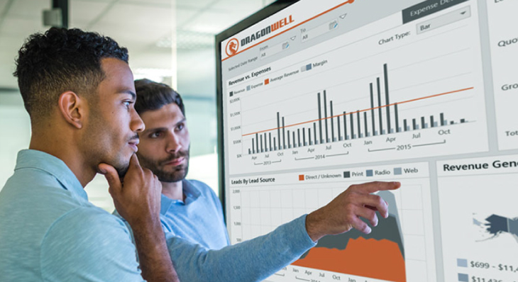
Wall-mounted dashboards are a great way to ensure key business metrics and analytics are made visible at prominent locations in the communal office space.

Use animated charts to tell stories with your data and make your audience understand how and why they got there and inspire action and/or behavioral changes.
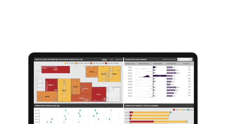
Don’t simply show your data, tell a story with it! By combining Custom Diagrams with an analytics platform like Dundas BI, we're able to visually communicate complex information with ease.

3D charts are frowned upon in the data visualization world, especially when it comes to 3D Pie and Bar Charts. This begs the question - are there any valuable 3D visualizations?