Using recommendations
1. Overview
To assist you in analysis, a recommendation engine provides guidance to help you find the most fitting visualization according to best practices.
2. Recommended data visualizations
Based on the measures and hierarchies you place on the metric set, certain data visualizations will be recommended. You can find these under the Recommended section of the Re-Visualize toolbar option, or at the top of the Re-Visualize context menu.

Some of the recommendations include specialized, pre-configured versions of regular visualizations that may incorporate formulas and other analytics:
- Point Chart – When Point Chart is recommended, you would use it the same way you would use a bar chart, except that the numeric axis may automatically start above zero, shrinking the range of values displayed along the axis and making it easier to see small differences between the values. When you use a bar chart, the numeric axis should always include zero because each bar starts from zero and it would be misleading otherwise.
- Correlation Matrix – This option uses the correlation matrix formula to create a new table with a color rule applied to the measure cells. This correlation matrix shows how each measure correlates with each other measure over the original dataset, which should ideally include many rows. There may be a positive correlation shown in a shade of blue, a negative correlation shown in a shade of red, or no correlation shown in light gray.
- Data Bar Table – A table of data bar columns with totals turned off on the metric set. Data Bar Table allows you to spot patterns of correlation between multiple columns of many bars, especially when sorted by measure. The row heights and padding are reduced to fit more bars.
- Parallel Coordinates – This option creates a new line chart where the metric set has been transposed to place measure names along the bottom axis and percentages along the left axis. Parallel Coordinates displays a separate line for each row of data that was originally selected, plotting where each of its values falls within the total range of each measure's values as a percentage. This allows you to look for overall patterns between the measures while also allowing you to single out individual lines to see its movement.
- Trend Line – Adds a trend line, also known as a regression line or line of best fit, to your chart. This could be recommended for a chart displaying measure values along a time axis, or for a scatter plot or bubble chart where both axes are numeric.
- Forecast Analysis – This option uses the exponential smoothing formula to add forecasting to a line chart when displaying dates along the bottom axis and numeric values along the left axis. Forecast Analysis produces a detailed forecast using the best available method, taking into account seasonality and emphasizing recent data, and displays it as a line on top of a semi-transparent confidence interval.
- Identify Clusters – This option automatically analyzes the data, finds the optimal number of clusters and assigns each cluster of data points a number and color. This option could be recommended for a scatter plot or bubble chart where both axes are numeric. For more information see the K-means Clustering article.
- Sort Stacked Totals – This option automatically calculates the stacked totals if necessary and sorts them in descending order, available when using a stacked bar chart regardless of how the data has been configured.
- Range Bar Chart – Also known as a Gantt chart, this may be recommended when two different dates have been added to the metric set's Rows to visualize the range between each pair of dates.
- Detect Outliers – Uses the Data Outliers formula and formats the result using states to highlight potential outliers when a chart's series each display a single measure.
The following formula-based chart options may also be recommended, but you can also choose them at any time from the Re-Visualize or Data Visualization toolbar options:
If you are currently working with a metric set full screen, choosing some formula-based recommendations such as Correlation Matrix and Histogram may take you to a new dashboard so that you can work with your original metric set plus the new automatically generated formula metric set together.
3. Smart data visualizations
When first selecting data for a new metric set, Smart data visualization functionality can automatically re-visualize to the most fitting recommended data visualization.
To activate this functionality, drop data directly onto a blank part of the canvas. You can also select the Smart data visualization from the toolbar in views such as dashboards. Selecting a specific data visualization will not activate this functionality.

As an example of the functionality, create a new metric set from the main menu, or create a blank dashboard.
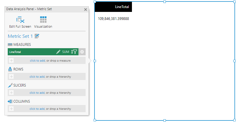
From the Explore window, drop the LineTotal measure from the [Sales].[SalesOrderDetail] table of the Adventure Works sample database onto the canvas.

The initially selected visualization is a table.
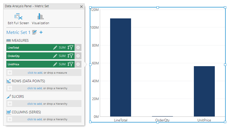
Next, add the OrderQty and UnitPrice measures to the metric set.

The metric set is automatically re-visualized into a bar chart.
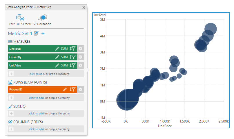
Next, add the ProductID hierarchy to the metric set.

The metric set is automatically re-visualized into a bubble chart.
3.1. Stopping the automatic behavior
You can stop the automatic behavior at any point by either re-visualizing to a data visualization of your choice or customizing the visualization, which includes any of the following actions:
- Making a change on the Visualization tab of the Data Analysis Panel.
- Applying a theme or style.
- Making a change in the Properties window.
- Using a contextual command from the toolbar or the context menu to change a visualization property.
- Using labeled drop zones that appear directly over a visualization (for example, using the Column drop zone shown over the table will add a column and not re-visualize).
- Navigating away from the metric set or view after it has been saved.
