1. Overview
A chart (or graph) lets you visualize data points plotted along axes. For example, use a chart to compare the sales amount with the sales target for each month, where these values are plotted against a vertical (Y) axis so that you can visually compare their quantities.
Many different types of charts are available to help you communicate your data effectively. This article explains how you can customize some of the key property settings that are common to multiple chart types.
Related video: DV Common Properties
2. Elements of a chart
The figure below shows the main elements of a chart visualization.
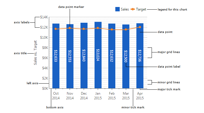
A data point series represents a group of related data points. The figure above shows a bar series and a line series, where each data point is displayed as a bar or a portion of the line.
3. Adding a chart
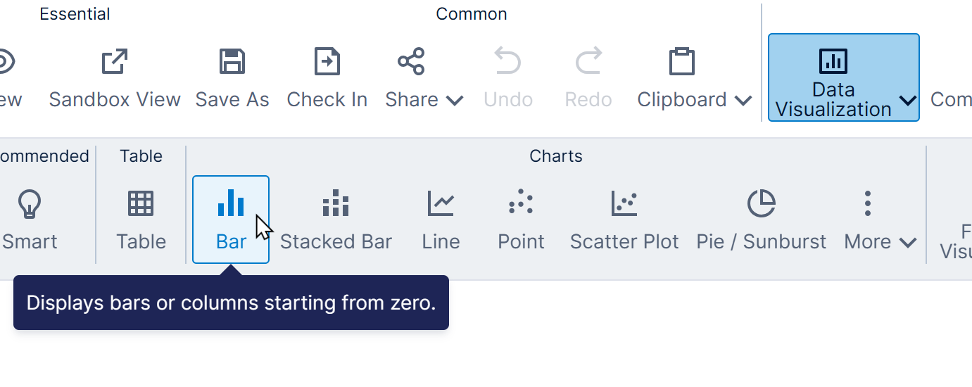
To add a chart when editing a dashboard, report, or other view, click Data Visualization in the toolbar and then select the type of chart you want to start with.
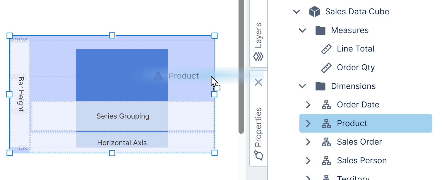
Next, drag data from a data connector or data cube in the Explore window onto the empty chart. When dragging more data you can drop it on the plain blue highlighted chart area if you don't want any specific labeled area.
You'll see the chart automatically reconfigured, for example a bar or line chart will have a left axis, bottom axis, major grid lines, and a series of data points.
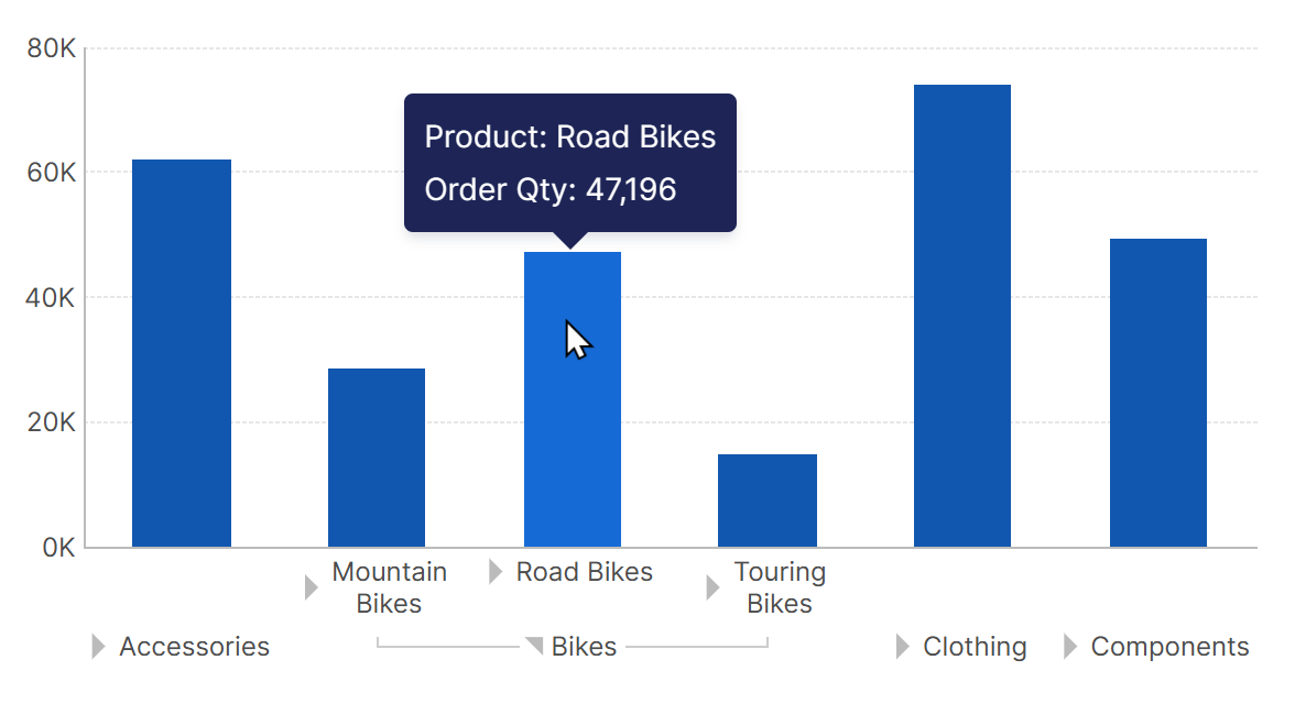
To interact with the chart, switch to View mode. If a multi-level hierarchy such as Product was added, you can click on a triangle along the bottom axis to expand one of the hierarchy values (e.g., Bikes). Hover over one of the expanded bars to see a tooltip showing the corresponding data values.
You can also right-click (or long-tap) on the chart and use the menu to drill down, change the hierarchy level, and access other metric set functions.
4. Re-visualizing
Another way to display a chart is to re-visualize a different type of data visualization. For example, right-click a table visualization or select it and go to the toolbar, choose Re-Visualize, and then select the chart type you want. Or if you already have a chart, the same menu will offer to change the current chart type to another.
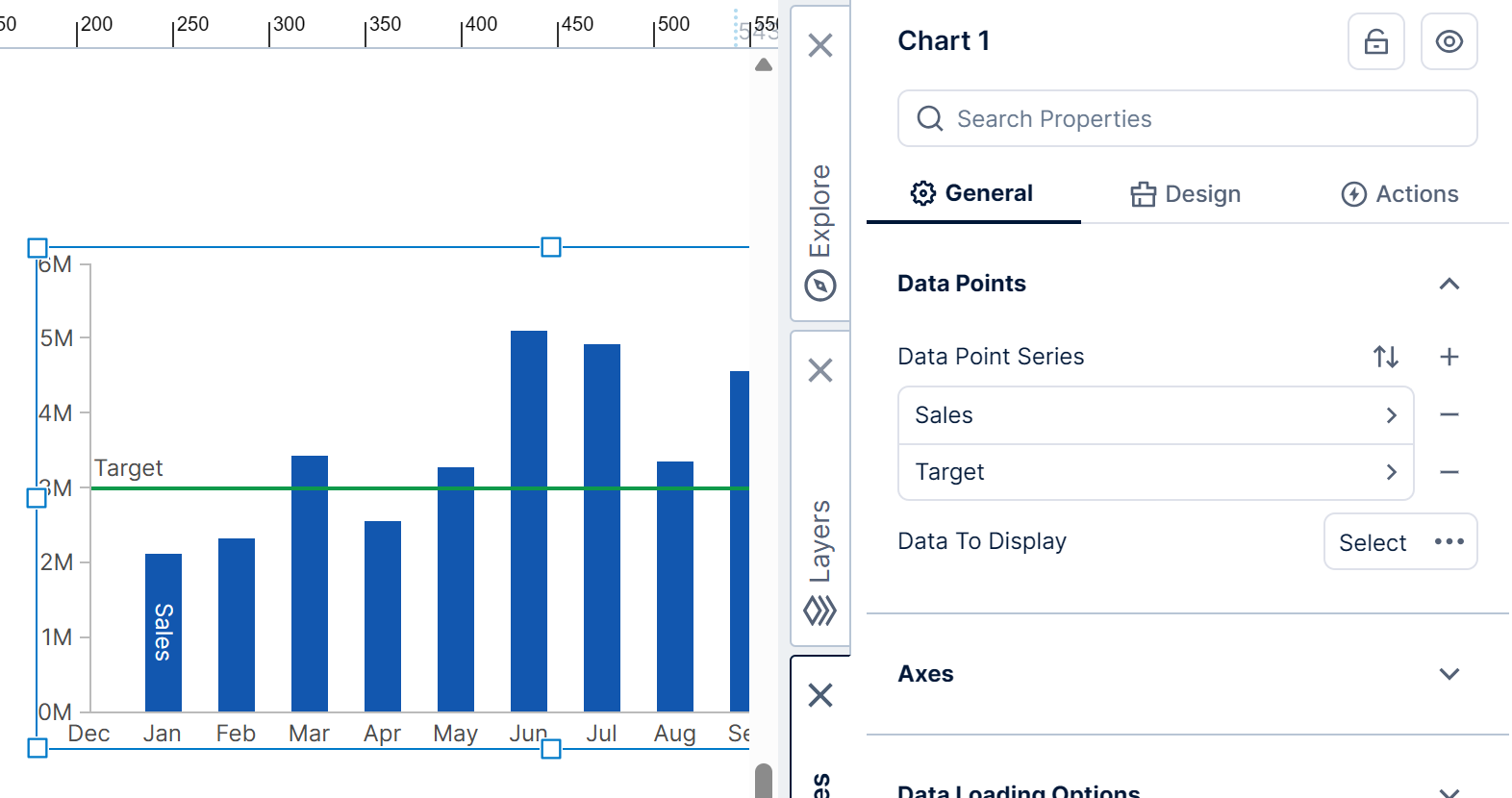
If you have multiple series of data points (e.g., for two measures), you can re-visualize each series independently. For example, right-click on a series of bars (you'll see a selection rectangle around them), choose Re-Visualize from the menu, and then next to the currently selected chart type (e.g., Bar) find and select a different one such as Line.
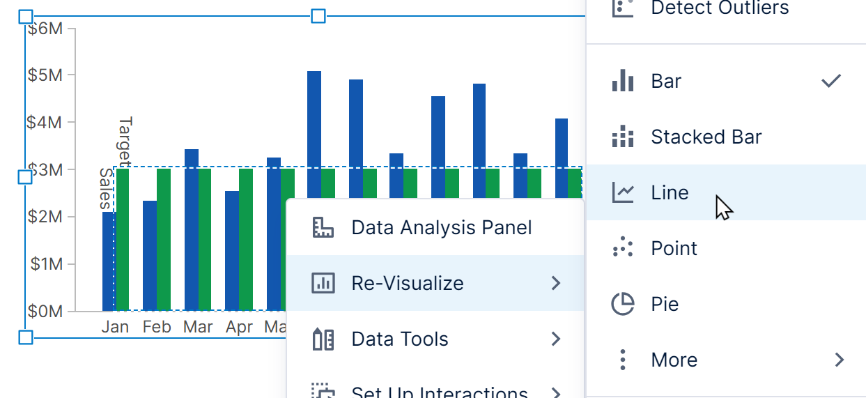
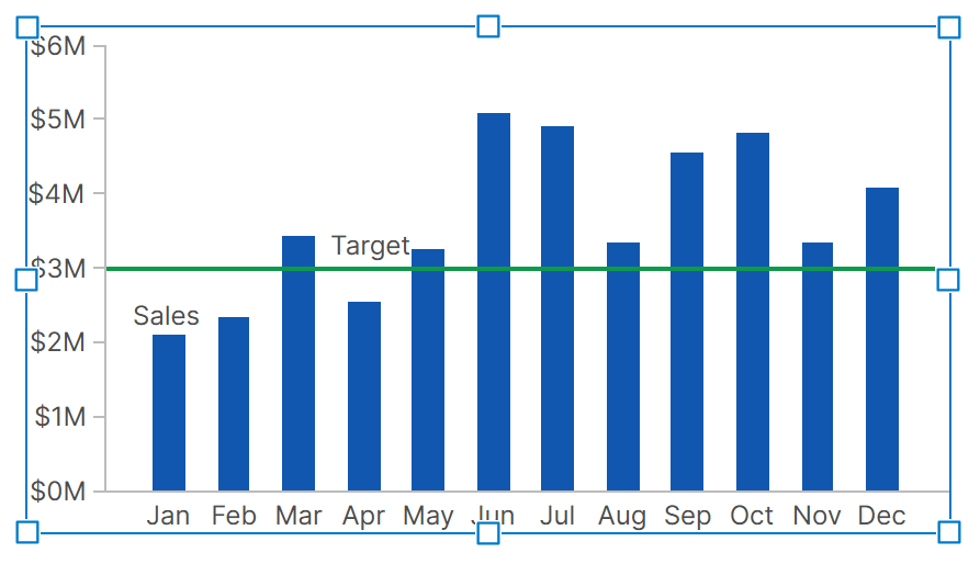
The series for the Target measure in this example is now displayed as a line series.
This is the same as setting the Chart Type of this series in the Properties window.
5. Axis properties
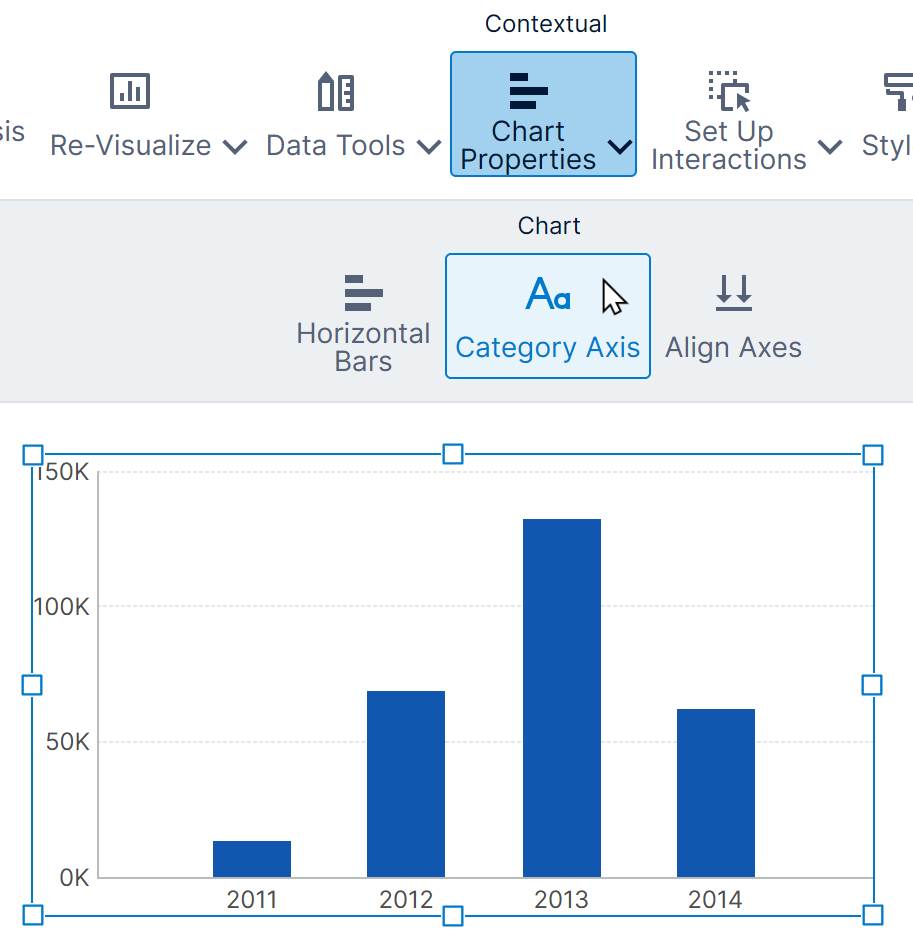
Charts are usually configured with a left axis (or y-axis) and a bottom axis (or x-axis).
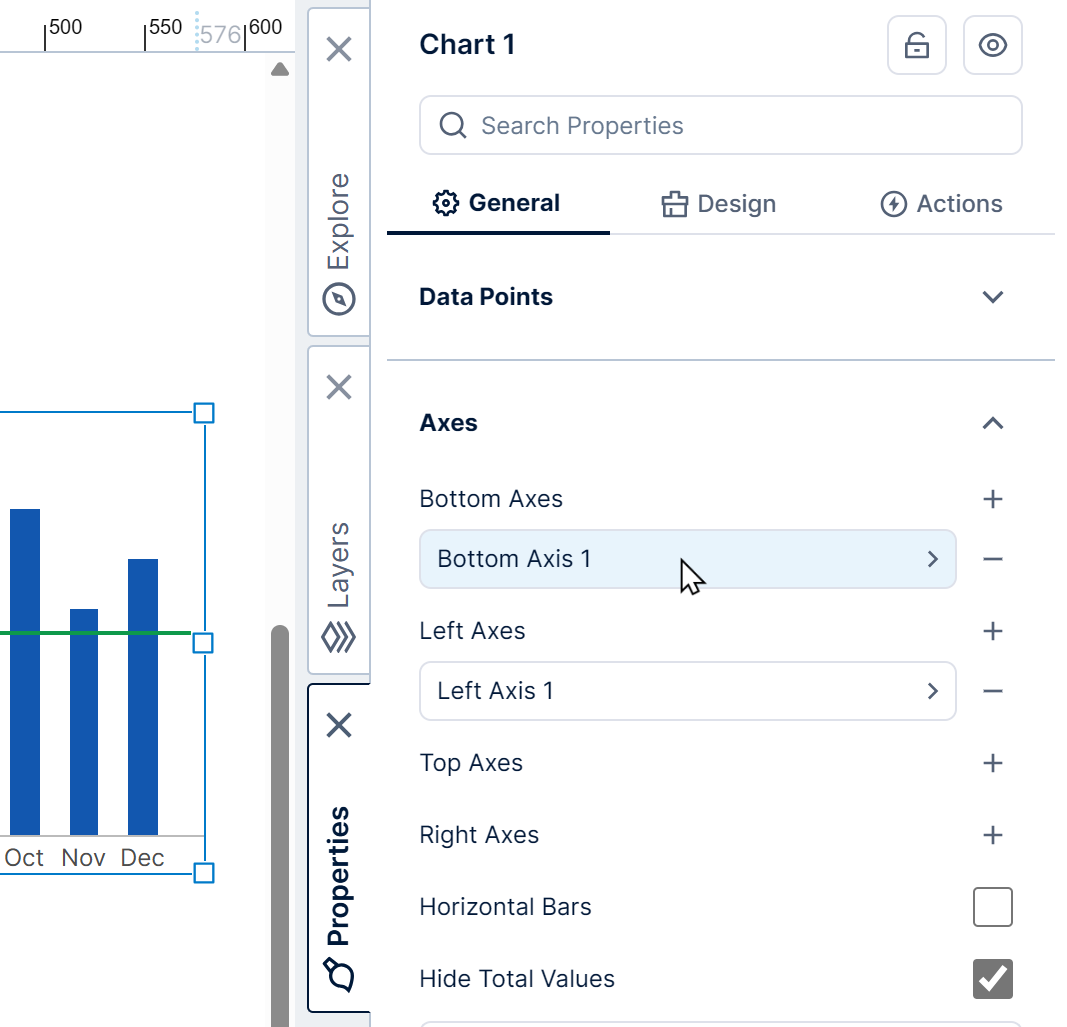
From the Properties window for a chart, go to the General (or Main) tab to see the list of axes for the chart, then click one to edit it. You can also click on an axis directly in the chart itself to go to its properties.
You can also use the Quick Access Properties popup to change common settings such as colors and line widths: right-click on a specific part of the axis such as a label or tick mark, and Quick Access Properties will appear with settings for customizing that element. (In earlier versions, left-click the element you want to customize once the chart is already selected.)
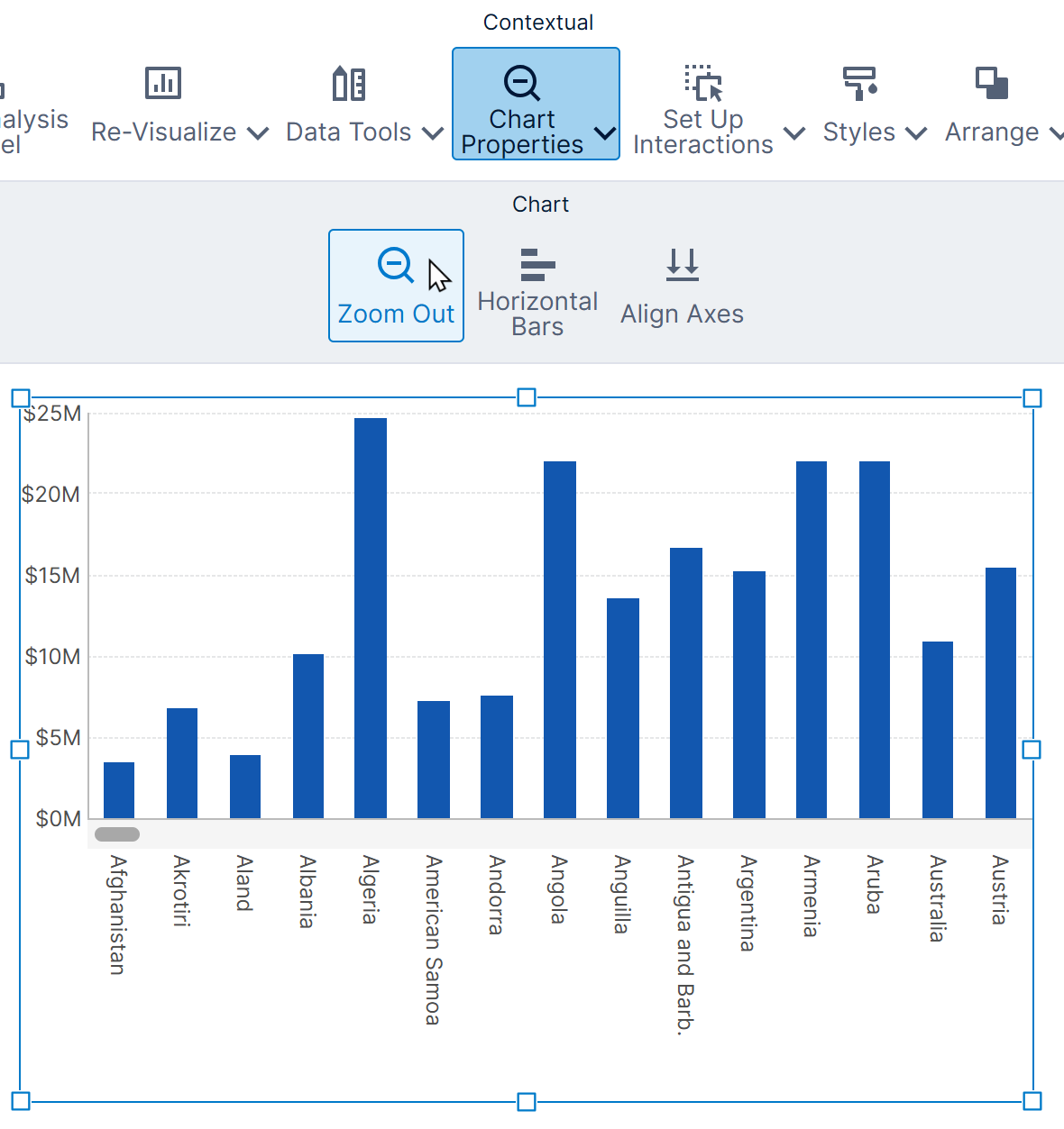
5.1. Invert axes (horizontal bars)
The most common reason to switch a chart's horizontal and vertical axes is to change vertical bars to be horizontal bars instead. A good reason to do this is to make it easier to read long axis labels.
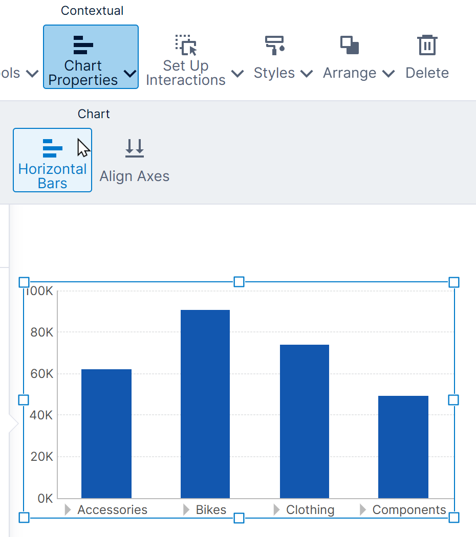
With a bar chart selected, choose Chart Properties in the toolbar, and then Horizontal Bars. (These options are also available from the right-click context menu.)
You can choose Vertical Bars the same way afterward to switch back.
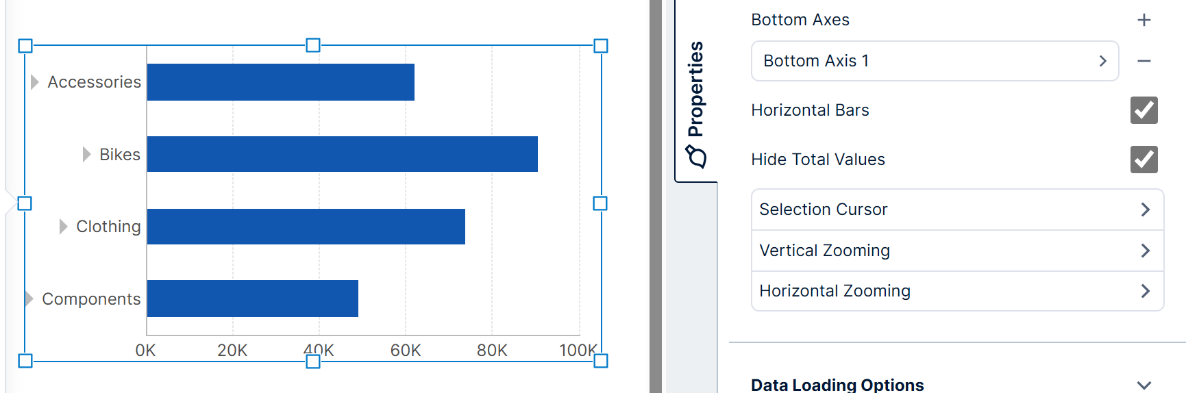
You can also find the Horizontal Bars or Invert Axes property in the Properties window for any chart type to switch the horizontal and vertical axes. This is located in the top level properties (click the back button in the Properties window first if there is one), near the other axis properties.
5.2. Scale type
Each chart axis has a scale determining how to position data along its length.
Choose one of the following types via the Scale Type property for each axis:
- Category - Designed for text, qualitative data, or other items you want displayed one after the other in sequence.
- Date/Time - Designed for date and time values, whether in order at regular intervals or irregular or out of order. They are always plotted in their place along a continuous time axis, even if data is missing for some time periods.
- Numeric - Displays numeric data along a linear scale as most people are used to, where the same distance between any two points indicates the same difference in values.
- Logarithmic - Displays positive (above zero) numeric data along a nonlinear scale where distance indicates the rate of change or the difference as a percentage rather than a difference in quantity.
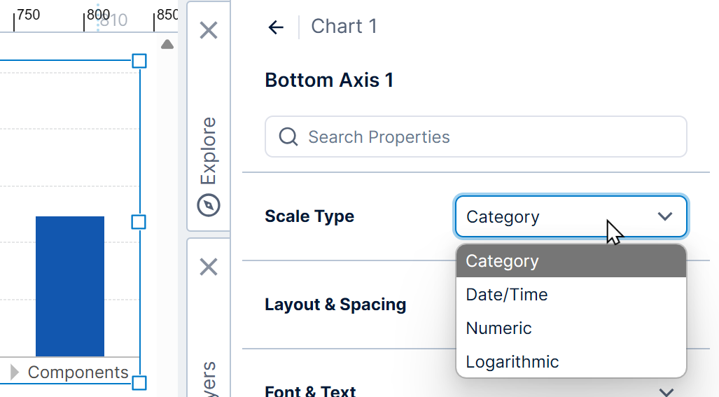
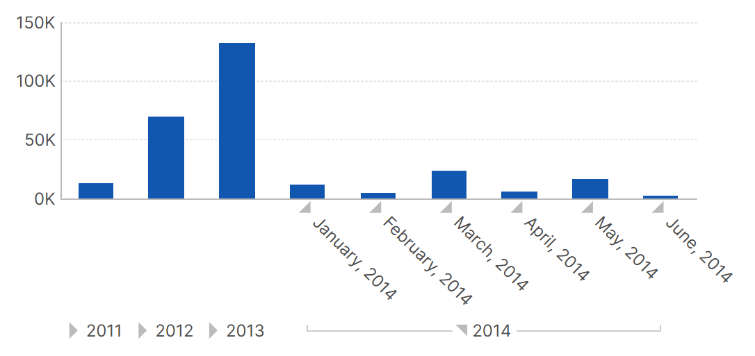
If the first or only hierarchy on the bottom (X) axis is date/time, then the chart will set the scale type to Date/Time automatically. If you want to use triangular expander buttons to easily expand and collapse hierarchy members, change the scale type to Category instead.
There's an easy way to switch the scale type between types when more than one is compatible with your data: right-click (or long-tap) on the chart, or find the option in the toolbar. Find it under Chart Properties where multiple property shortcuts like these are grouped together.
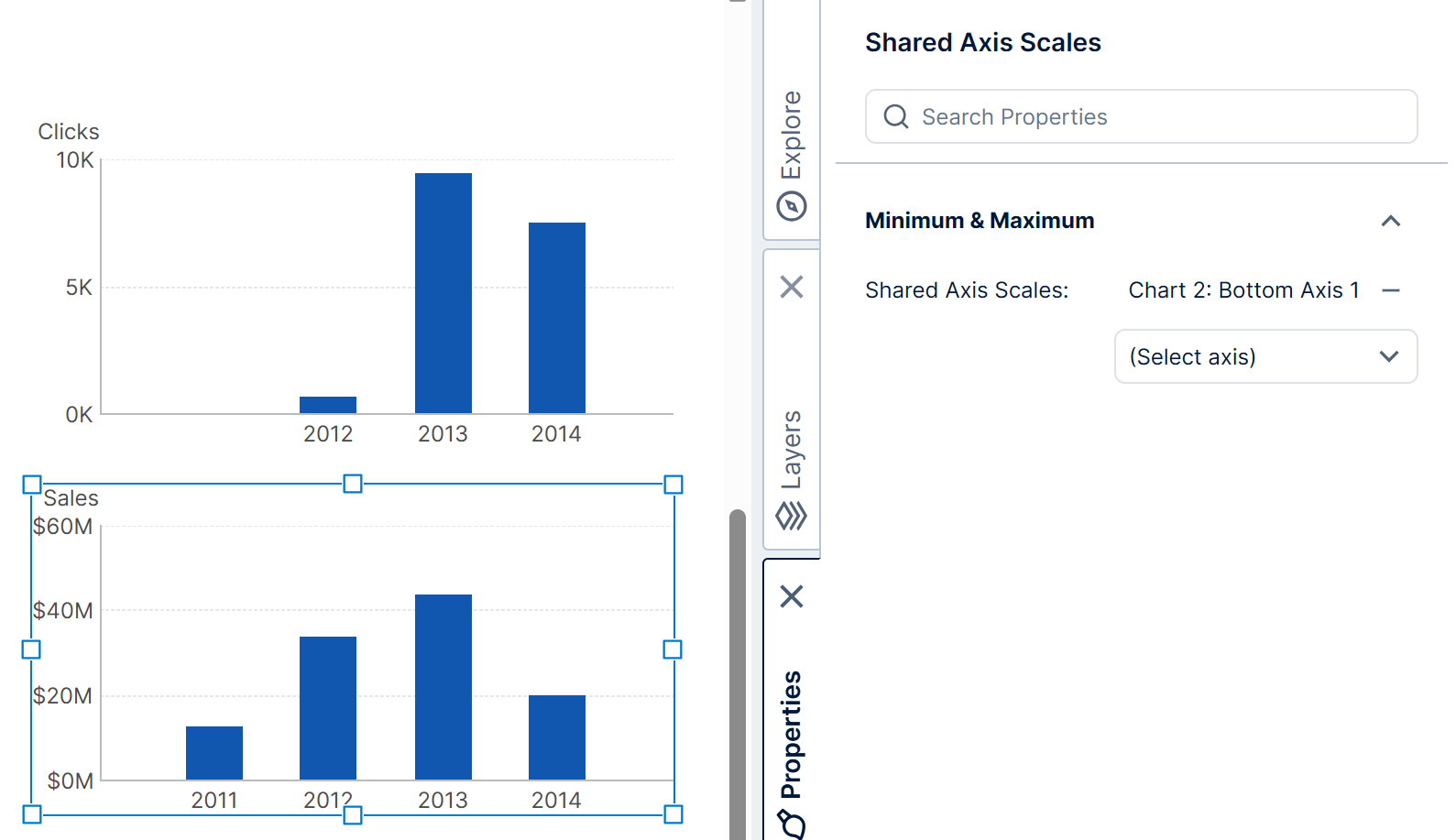
5.3. Sharing axis scales
When using the same scale type on multiple axes, either in the same chart or in different charts, you can set the axes to have the same range.
Under Minimum & Maximum select the Shared Axis Scales option.
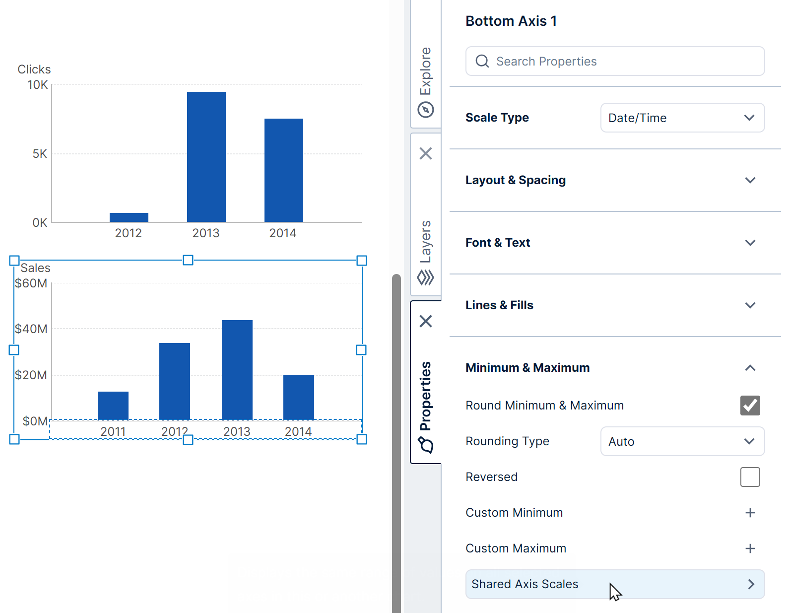
Use the dropdown to select and add an axis to the list, and they will display the same range of values.
5.4. Crossing axes
The axis property Cross Other Axis At defines the position at which two axes intersect.
The default setting Auto places the axis intersection at the minimum (usually bottom left corner) unless one of the axes is numeric, in which case the intersection will be at zero.
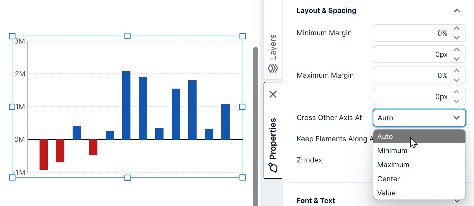
Select the property Keep Elements Along Axis to position tick marks and labels along the axis.
5.5. Titles
Each axis can show a title above or along the axis. A typical usage is displaying the name of the measure (numeric data) along the left axis, or y-axis.
In the text properties of an axis, click into the Title property setting and enter the text for the title.
You can incorporate placeholder keywords corresponding to filter values into the title, which can change according to interactions or filter changes. A popup will list any available keywords you can insert while you edit this setting (slicer filter values, slicer comparison filter values, or dynamic measure & hierarchy captions).
Click Title Style to change how the title is displayed. For example, set the Location property to Along, and the Rotation of the axis title to Clockwise.
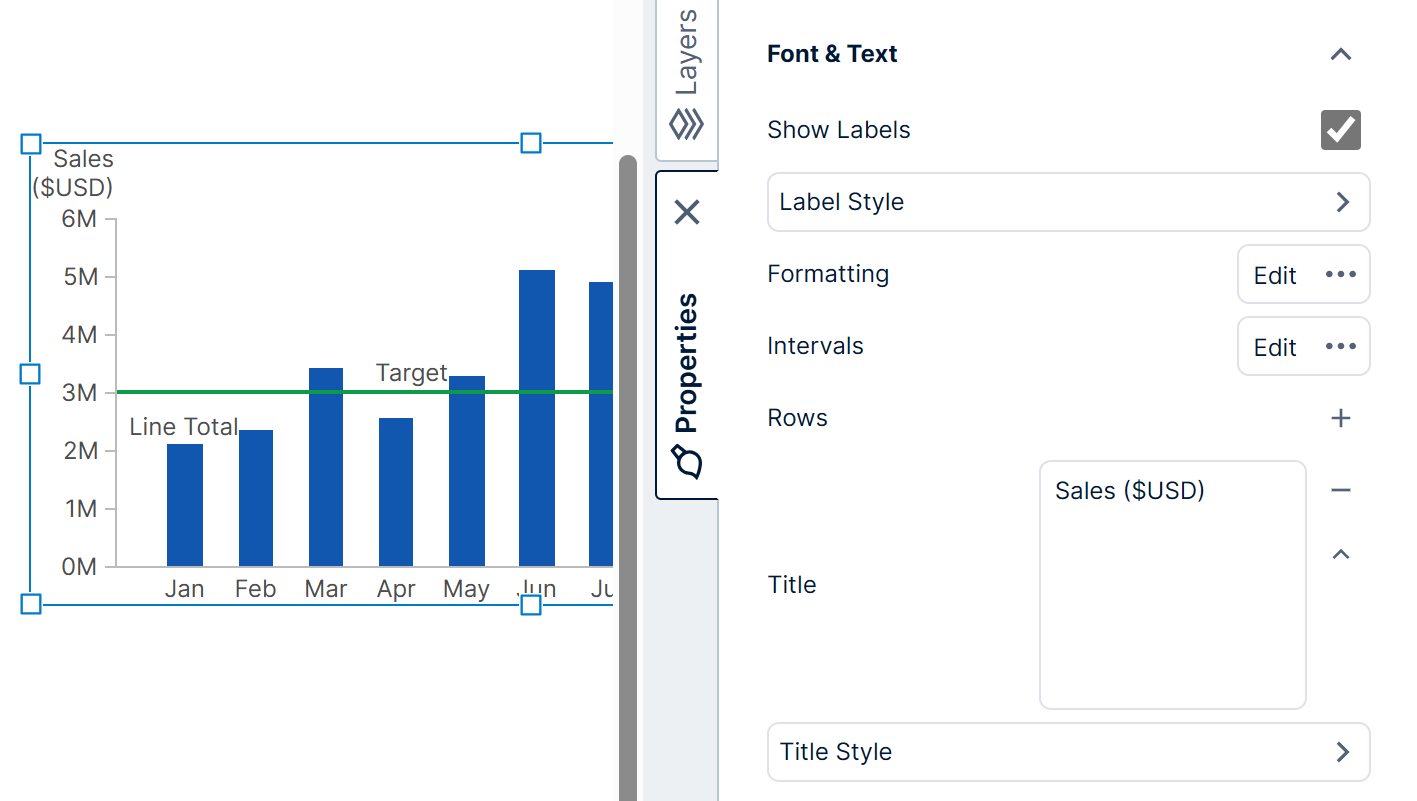
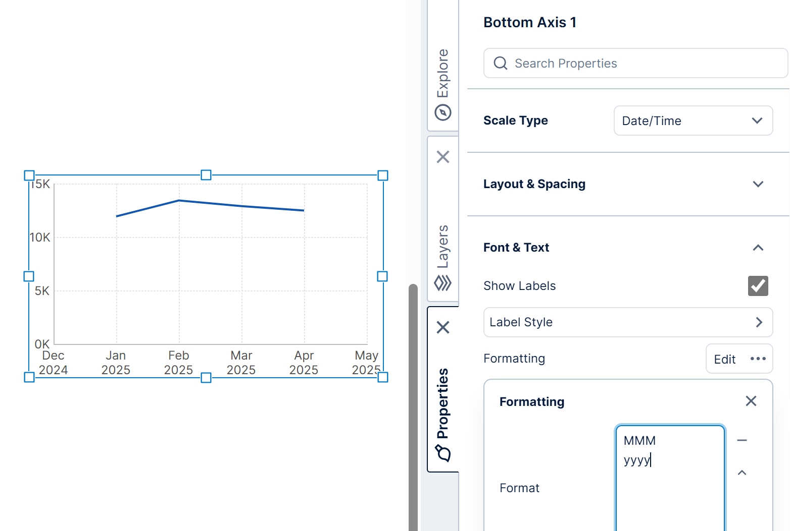
5.6. Labels
To change the formatting or appearance of the labels for axis values, edit the properties of the axis and open its text-related properties.
Use the Show Labels property to show or hide the axis labels. For example, it may be useful to hide the labels to create a more compact chart in a scorecard.
Edit the Formatting properties to use the Format property to enter a custom date format, for example, which will be applied to each label. See Formatting text for details on the different available kinds of formatting.
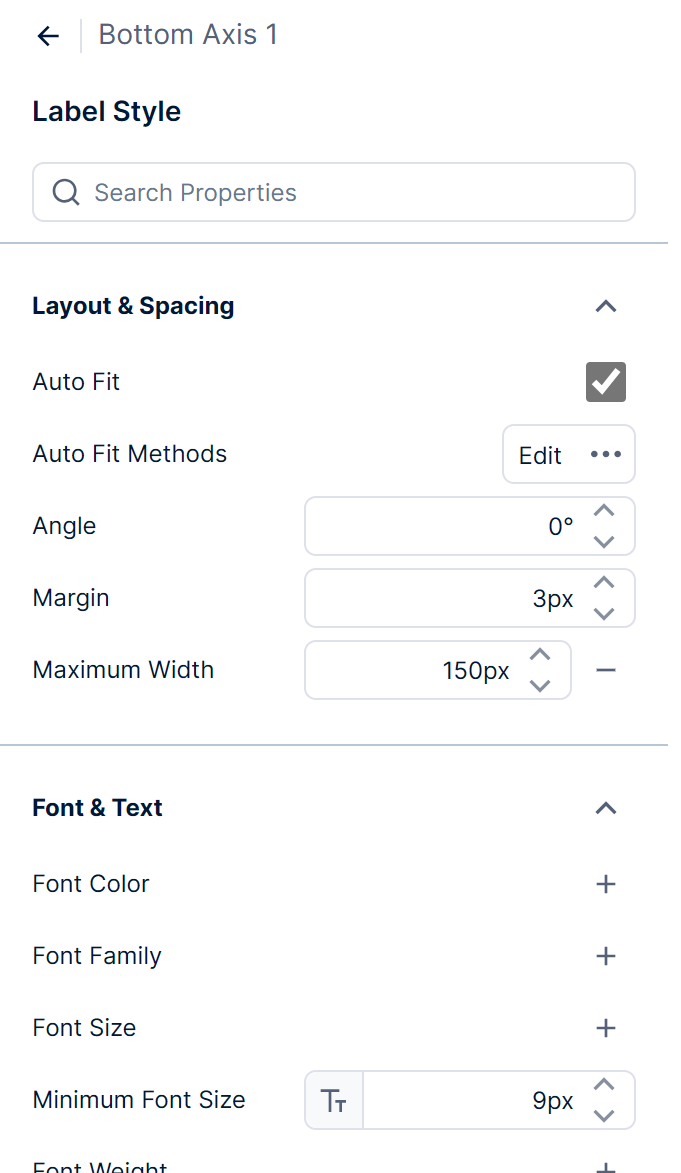
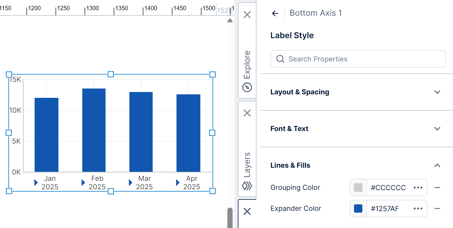
Click Label Style to change the appearance of the labels, such as the font size or color.
Keep the Auto Fit option selected in order to arrange as many labels on the axis as possible without overlap. Open and use the Auto Fit Methods options to customize the auto fit behavior.
If the axis is categorical and the axis labels can be expanded, use the Expander Color property to change the color of the expander buttons.
5.7. Tick marks
Tick marks are often not shown by default if grid lines are shown instead. Their settings are found in the property settings for each chart axis, under Lines & Fills in recent versions.
Select Show Tick Marks to display the major (or minor) tick marks.
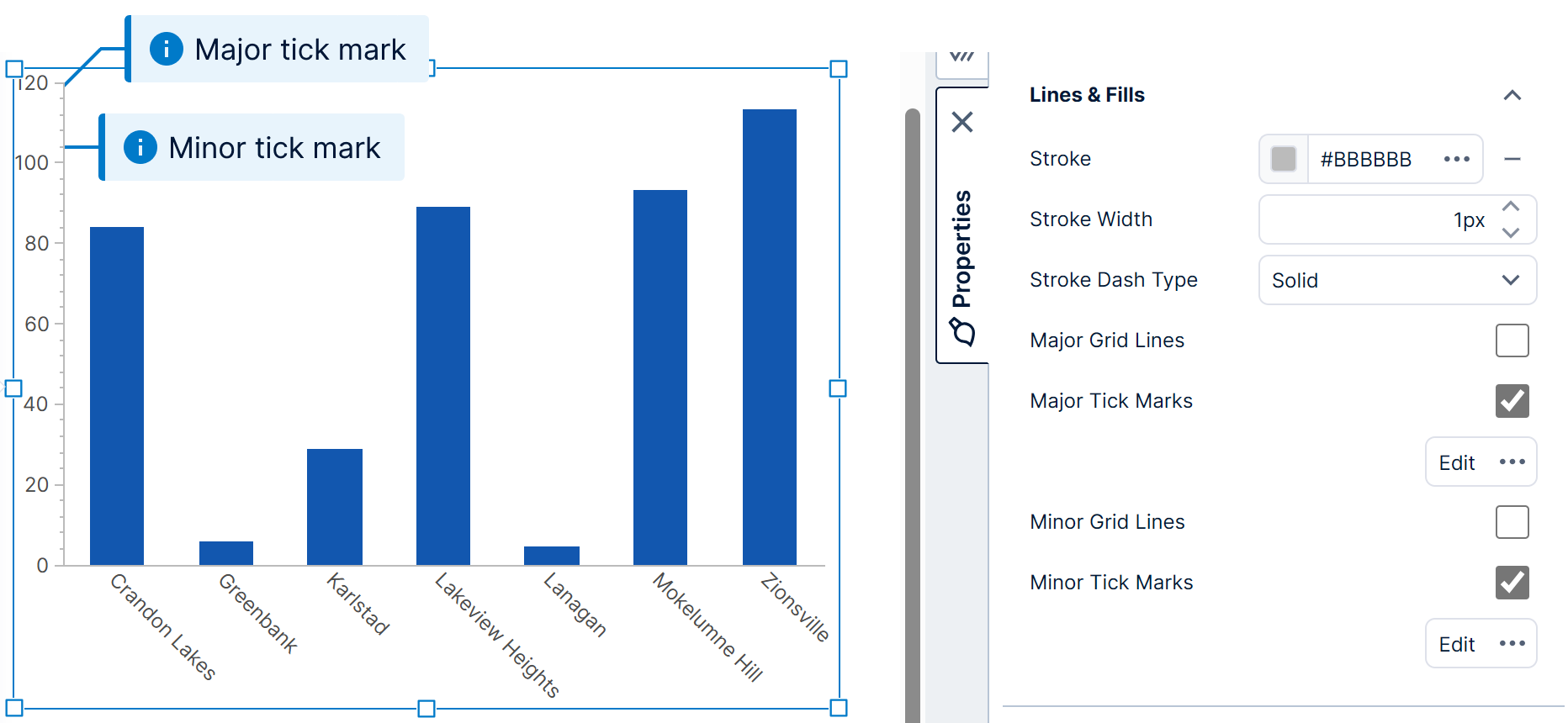
Click the button below the checkbox to access a variety of appearance settings to customize the tick marks.
5.8. Grid lines
Grid line settings are located next to the tick mark settings for each axis. See the section above for more details.
Select Show Grid Lines to display major (or minor) grid lines perpendicular to the axis.
Click the button below the checkbox to access a variety of appearance grid line appearance settings.
6. Series properties
Charts are automatically configured with data point series as you drag and drop data onto the chart from the Explore window.
In the Properties window for a chart, go to the General (or Main) tab to see its list of data point series, then click one to edit it. You can also click one of the data points of a series in the chart directly to go to its properties.
You can use the Quick Access Properties popup to change common settings such as colors and borders: right-click on a data point and Quick Access Properties will provide settings for customizing its corresponding series. (In earlier versions, left-click the element you want to customize when the chart is already selected.)
6.1. Chart type
Each series has a corresponding Series Chart Type property, located at the top.
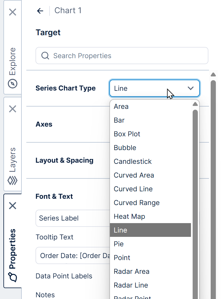
You can have multiple series in a chart, each with a different chart type. Most can be combined together, but you can only combine the Pie chart type with other series set to the same type, and Radar chart types are only compatible with each other (e.g., you can combine Radar Line with Radar Point).
6.2. Axis
You can change the Horizontal Axis or Vertical Axis property if you want to plot this series of points against a different axis, or an axis on the other side of the chart.
This allows you to set up a chart with multiple Y axes, for example: one left and one right, or more than one on each side.
6.3. Show or hide series
Check or uncheck the Visible property to show or hide that series of data points.
Any user viewing a chart with multiple series can also show or hide them using the context menu: right-click (or long-tap) the chart and select Show/Hide Series. (Switch to view mode first if you are currently editing a dashboard or other view.)
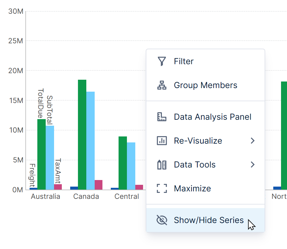
Series are listed with check marks indicating whether they are visible. Click to select or de-select a series.
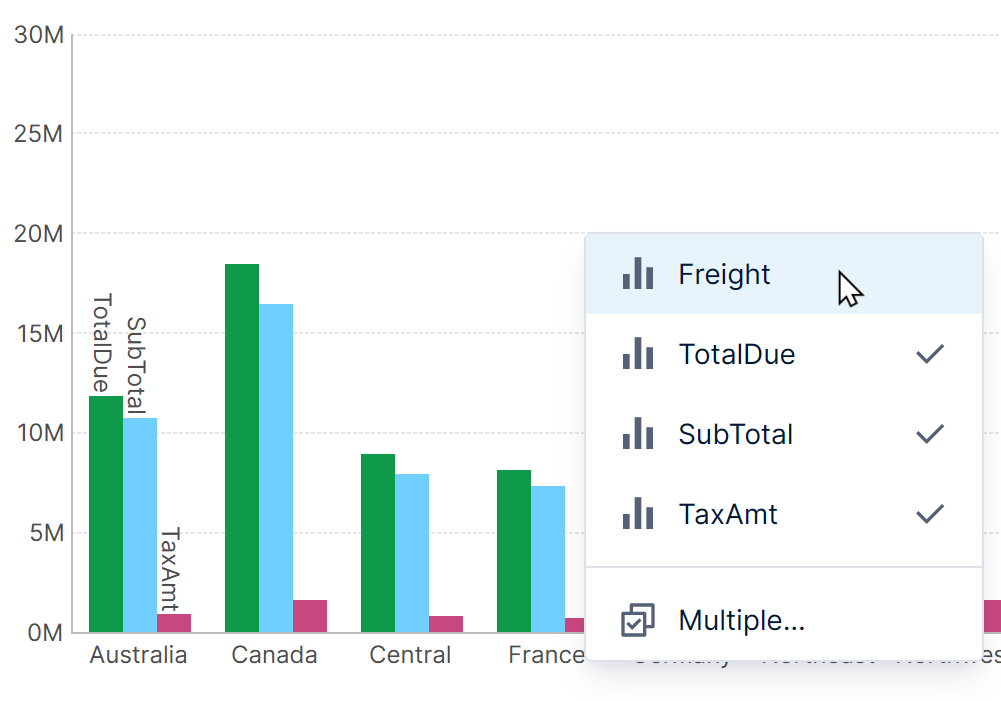
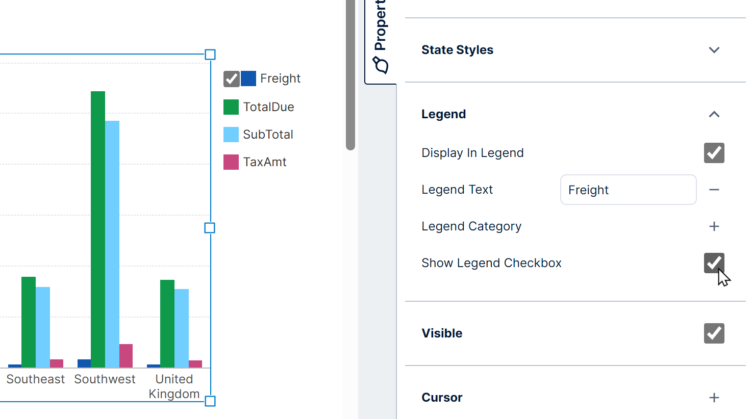
Alternatively, you can add a checkbox to a connected legend, which will provide the same functionality.
In the series properties, under the Legend category, select Show Legend Checkbox.
6.4. Data points
There are a wide variety of customization options for data points, found in the different categories of properties for a data point series.
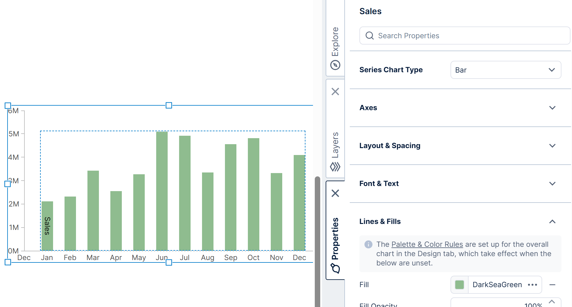
A common one is the Fill property, which can be set to override the data point color or fill set up in the chart's palette or color rules. Alternatively, click the shortcut provided to the overall chart's palette and color rules properties, and customize those instead.
Different settings may be available depending on which Series Chart Type is chosen.
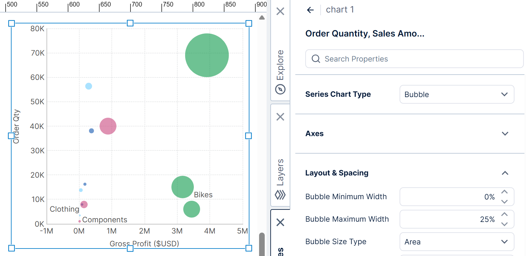
For example, bar sizes, overlapping, and gaps can be found in the layout section for a series of bars. For bubbles you will find settings determining bubble sizes.
You can apply conditional formatting by setting up states and using state styles, such as setting different fill colors to distinguish between positive and negative values.
6.5. Markers
Markers are symbols displayed at the exact location of the data point's values along both axes. They are used to plot the data points in Point (or Scatter Plot) and Bubble charts, but can also be added to any other chart type.
To display and customize markers, edit the properties for a series, open Lines & Fills (Look tab in earlier versions), and then open Markers:
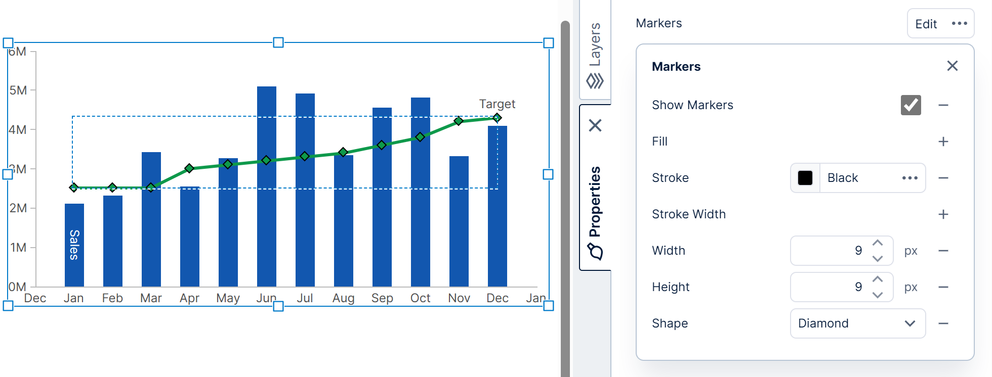
- Select Show Markers to display the markers if needed.
- Adjust the size of each marker with the Marker Width and Marker Height properties.
- Customize the shape of the markers using the Marker Shape property.
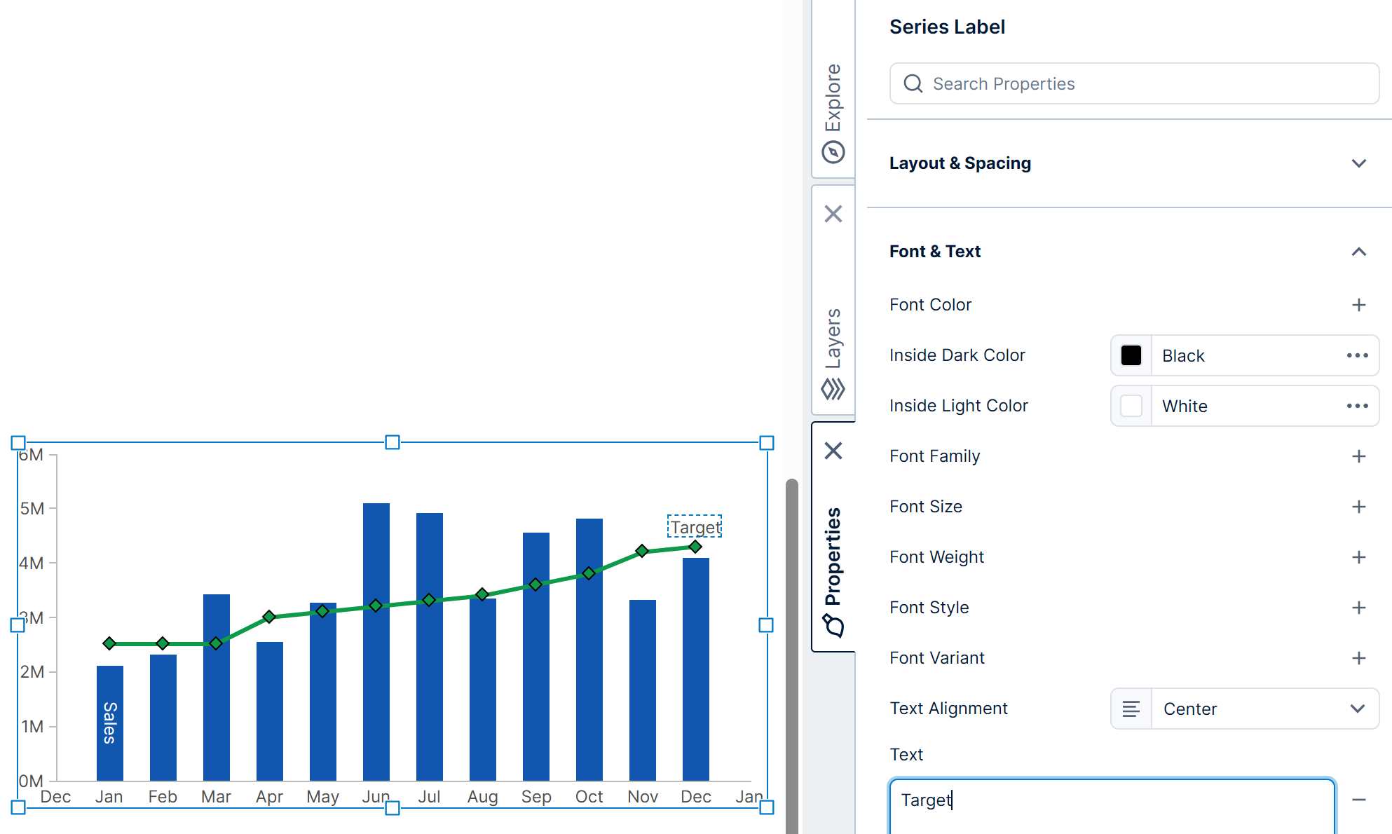
6.6. Series label
If your chart is not connected to a legend, you'll see a label on the chart identifying each series if you have more than one. This is called a series label, and this default behavior helps you to identify and distinguish between groups of data points.
For example, if you have a measure named Target Sales, you could see a corresponding label with the text Target Sales attached to one of the data points to distinguish it from the other series.
To customize a series label (including its text), edit the properties of the series, open the text-related properties, and then click Series Label.
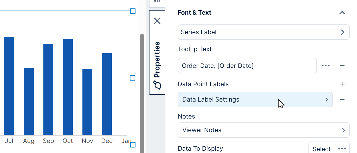
6.7. Data point labels
You can display a label with each data point in order to show each corresponding value. These labels can be set up in the Data Analysis Panel by following the steps in Setting up the visualization.
Chart properties also allow you to further customize the text, or to set up multiple labels: for example, one label on top of each bar to display its value, and another inside each bar displaying its percentage from a formula.
To change label properties, edit the properties of the series and go to its text properties.
Click the + button under Data Point Labels to add a new Data Label Settings item. Click an item to edit its properties.
In the Data Label Settings, set the Placement property to Inside to display text within the bars of the chart. Options such as Inside Or Outside first try to display labels inside when they fit, and outside when they don't.
Set the Text property, using the popup menu that appears to insert one or more available placeholder keywords for showing data values.
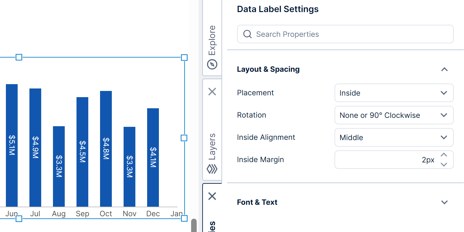
For details on the placeholder keywords and formatting you can use when setting up the text, see Formatting text. You can find examples of placing labels inside data points in Aligning data point labels inside bars.
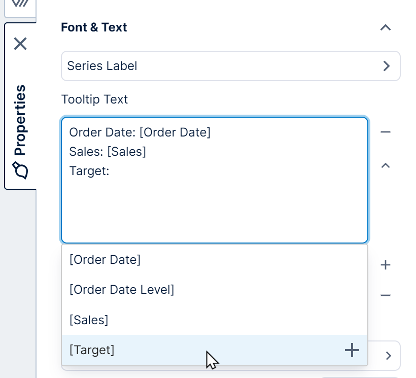
6.8. Tooltip text
Tooltips pop up with details about data points when you hover over them, or on touch devices when you tap and hold. The details shown can be customized in the Data Analysis Panel by following the steps in Setting up the visualization.
You can further customize how the text is arranged and access other options by editing the series Tooltip Text property directly rather than using the Data Analysis Panel.
In the properties of a series, find this property with the other text properties. You can insert regular text as well as one of the placeholder keyword options that pop up, such as the name of a measure or hierarchy enclosed in square brackets. See Formatting text for more details.
7. Selecting data points
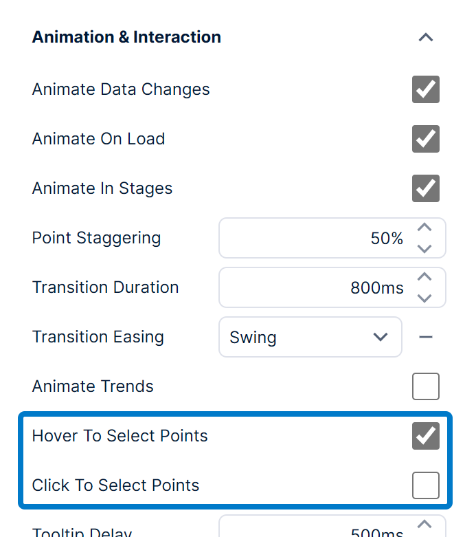
By default, users viewing a chart can highlight data points either by hovering over them (tap and hold on touch devices) or by clicking and dragging a selection box around one or more points. This may highlight other related data on a dashboard or other view through data brushing, display data summary statistics for that data if the status bar is visible, trigger custom interactivity via the Selected Data Changed actions, and more.
You can change how viewers select chart data in the Design tab of the chart's properties, under Animation & Interaction (in the Look tab in previous versions). For example, you can disable Hover To Select Points. Enable Click To Select Points if you want to click or tap data points to select them.
Clicking and dragging across a chart in view mode displays a selection cursor that marks your selected area against each axis for which selection is enabled. To change its properties, click on Selection Cursor in the General (or Main) tab, found near other axis-related properties.
For example, you can disable both Select Horizontally and Select Vertically to disable the selection cursor.
Another example is to change the Select Action to Zoom In instead of the default Select Data Points, which will automatically zoom the chart to the selection box.
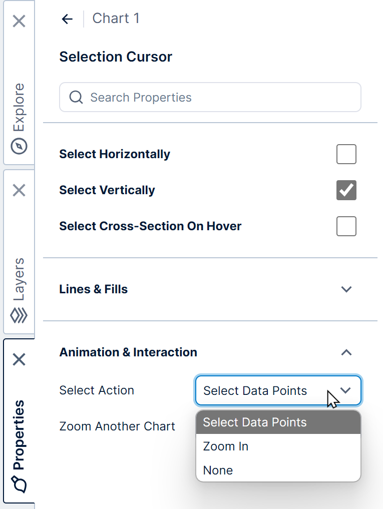
You can also enable Select Cross-Section On Hover to display details about all line chart data points located at the mouse's X axis position.
8. Zooming and scrolling
Charts typically fit all of their data points into the set size of the chart, but you can also zoom in to view the data in more detail or to restrict the number of data points displayed at a time.
When the selection cursor and context menu are enabled, you can zoom in interactively (switch to view mode first if you are editing a dashboard or other view): click and drag across a region of data to select it, then right-click/long-tap and choose Zoom In.
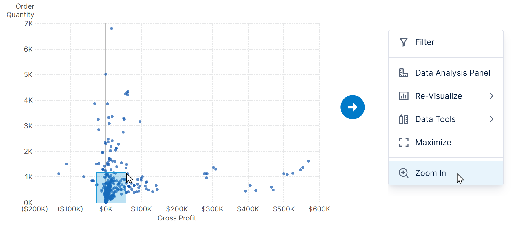
When zoomed in, scrollbars appear to allow you view the rest of the data at the same level of detail.
When text values are displayed along an axis or it's switched to the category scale type, charts can zoom in automatically to display only a certain number of values at a time along that axis.
You can easily zoom out by clicking Zoom Out in the toolbar or context menu.
To customize zooming and the scrollbar, go to the chart's Horizontal Zooming or Vertical Zooming properties in the General (or Main) tab, found near other axis-related properties.
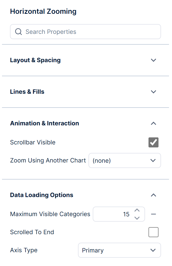
The Maximum Visible Categories property customizes how many values are automatically zoomed into along a category scale, or you can clear it to disable this behavior (which is the same as zooming out).
For a date/time axis, the Auto Zoom Start or Auto Zoom Token properties appear instead and can be used to initially display only data from the past year, for example.
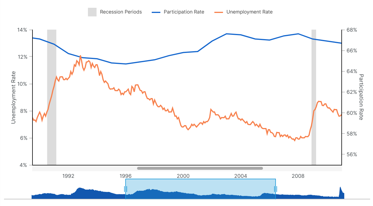
The Zoom Using Another Chart property can be used with another chart set up on the same dashboard with the same data, where viewers can click and drag to select, move, or resize a selected area to zoom and scroll around the original chart.
In the figure below, the light blue area in the bottom chart can be moved and resized to zoom and pan around data in the top chart: