The Waterfall Chart, popularized by consulting firm, McKinsey & Company, is a sterling way to delineate how a measure changes over a particular sequence, and how these changes impact the total. The Waterfall Chart clearly illustrates the cumulative effect of a sequence of events, or a process that has different transactions, some positive, some negative. In other words, it allows us to understand how we got from point ‘A’, to point ‘B’.
Often times, when observing incremental change of individual values over time, a Bar Chart is the go-to visualization. Unfortunately, a Bar Chart will only offer a decomposition of each value, and will not emphasize the status of the aggregate balance. This is where the
. It is a precise and versatile visualization that depicts static and active data, whether or not a value is positive or negative, and its final total. So go with the flow, and display your data clearly and concisely. What’s unique about the Waterfall Chart, is that its display changes in the aggregate as an abrupt increase or decrease from its prior value, which is more akin to the nature of this shift. Some of the most widely used examples of Waterfall Charts are representations of balance sheets, income statements, cash flows and other sequences, which ebb and flow quantitatively.Use Case
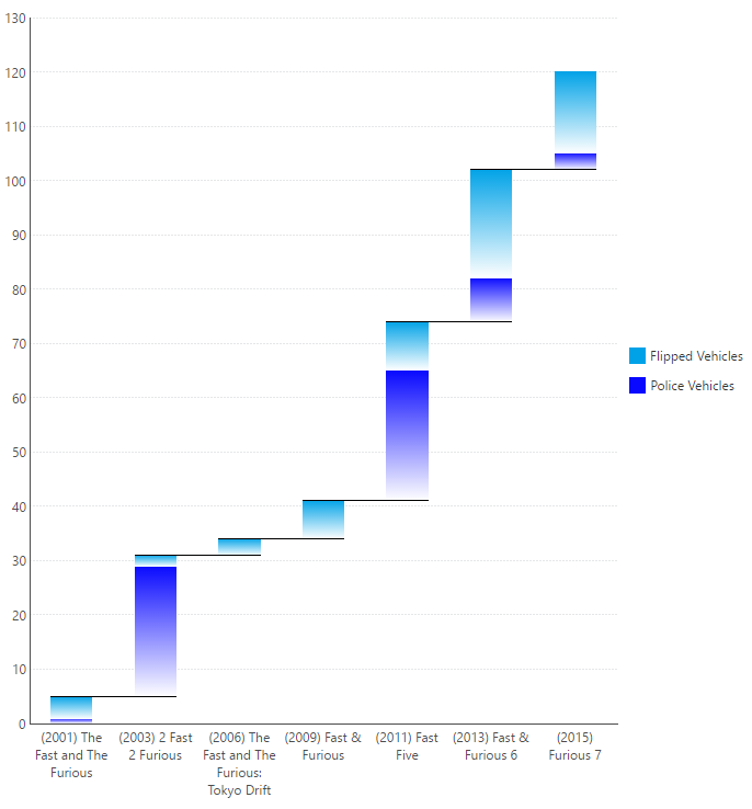
Waterfall Charts aren’t strictly used to display financial sequences though, and can illustrate any value that undergoes a positive and/or negative change. For example, let’s examine the increase in the number of vehicles that have been flipped plus the number of police cars that have been damaged in the popular car-chase-turned-heist movie franchise, The Fast and The Furious. This alone will give you 120 reasons to love Waterfall charts.
The dark blue bars represent the number of police vehicles damaged and the light blue bars represent that number of vehicles flipped per installment. Typically, it’s advised against to use gradients of changing colour (from light to dark, unsaturated to fully saturated), however with the Waterfall Chart, they effectively draw the viewers eyes in the direction of the change in aggregate value (in this case, always upwards). Furthermore, the Waterfall Chart clearly displays the increase in damage to vehicles and how the changes have impacted the total – 120 vehicles damaged. We’re also able to quickly visualize and understand which installments compiled the most carnage. So if total vehicular destruction is your forte, then we recommend 2 Fast 2 Furious, Fast Five, and Fast and Furious 6!


Follow Us
Support