What's the most important piece of the puzzle that you need to consider when creating your data visualizations? Making sure that your data sets are clean is important, but choosing the proper dimensions to display may rank as number one. If you select the wrong dimensions, your story will be unfortunately skewed, as I learned the hard way when I went for a drive.
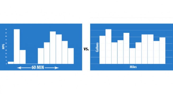
My new car comes with a "handy" feature that displays a bar graph to help me calculate my Average MPG over a set period of time. This graph generates a bar over an interval of 1, 2, 5, or 10 minutes (plotted on the x-axis) which shows my mileage in MPG (plotted on the y-axis). Although this visualization was (probably) added with the intention of helping me better understand and become more aware of my fuel usage, it ended up doing neither, all because the plotted dimensions were irrelevant. Since MPG is calculated by dividing the miles traveled by the gallons used, wouldn't it make more sense to plot 'Miles' on the x-axis instead of 'Time'? With my car's current display, the bars are not directly comparable to each other because I'm not driving all the time. If I spend two minutes at a stoplight and creep forward three meters, my next bar will skyrocket, making my mileage look dismal. Had the manufacturers changed the x-axis to display 'Miles', each bar would be directly comparable and this entire graph would become infinitely more useful.
When it's time for you to organize your data for public consumption, keep in mind how important it is that you use the proper measurements. The information you're showing may be relevant to you, but if you're not using it to tell the proper story then it's essentially useless. In the case of my car, the idea of displaying my mileage was a great addition, but because the manufacturer chose to display 'Time' instead of 'Miles' on the x-axis, it stopped being a useful addition. So ask yourself: just because you can display something, does that mean that people will want to look at it? And if so, will they be able to draw the proper message from the display? If not, you may want to reconsider how you're displaying your data.
Follow Us
Support