Sunburst Charts are beautiful and are great at both representing hierarchical data structures and increasing engagement of users. Often hidden in the simplicity of a circle, is a multitude of intriguing, distinctive qualities. What is lacked in precision, is often gained with an intuitiveness and aesthetic beauty that comes from its circular nature, which feeds our unique fascination with this shape.
A Multi-level Sunburst Chart, otherwise known as a Radial Treemap or Multi-level Pie Chart, shows hierarchy through a series of concentric circles, which are sliced and diced depending on their hierarchical relationship to the root node. The root node, or parent node, is the first part of a data structure, which links to multiple nodes, containing data fields. Essentially, a Sunburst Chart allows the user to drill down into their data without filtering the original members. These charts are particularly helpful when displaying multiple hierarchy levels at once, and allow for easier visualization of data at various levels. Furthermore, Sunburst Charts are extensible to numerous events and solutions that have anything to do with hierarchy.
As Torontonians here at Dundas, we’re abuzz with how well our Toronto Blue Jays have been playing – especially reigning and current MVP candidate, third basemen, Josh Donaldson. In fact we’re so excited, that we decided to dig deeper into his elite performance. Below is a Sunburst Chart that displays the outcomes of all pitches Donaldson has put in play this season.
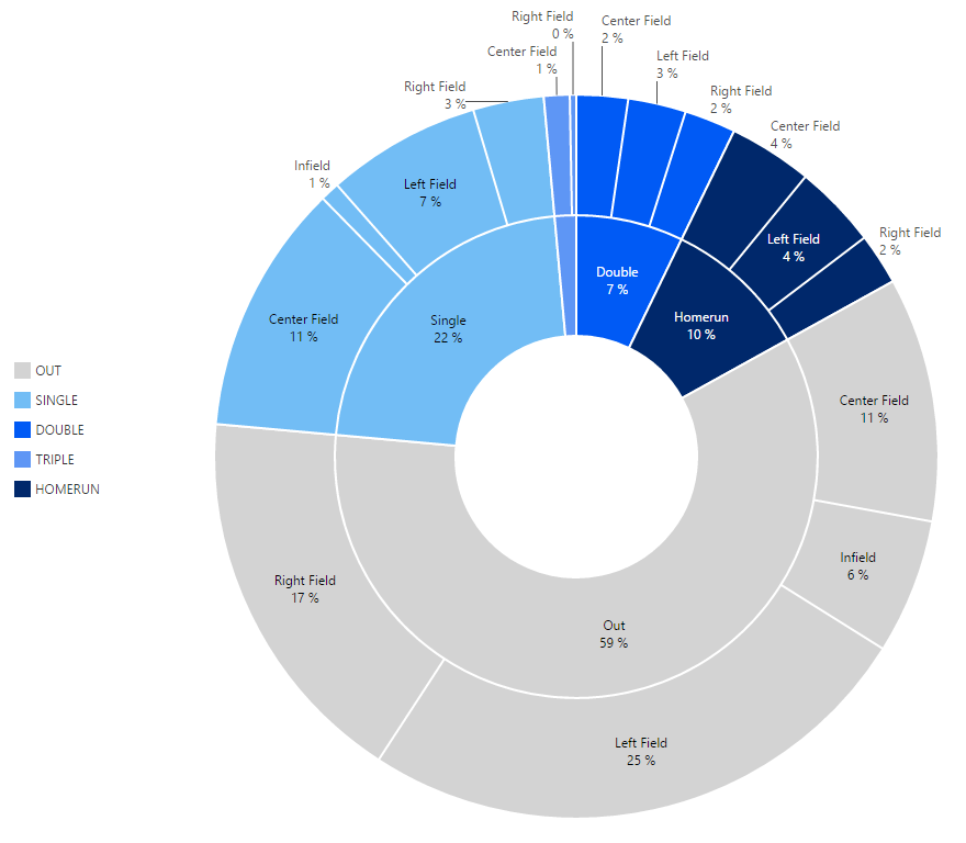
We can quickly visualize the proportion of balls in play that are outs and those that are hits. In addition to this, we’re able to navigate and drill into the data, without losing the middle layers of the hierarchy. For example, we’re able to clearly see the percentage of homeruns hit to left, right and center field, in relation to the total percentage of homeruns.
The Sunburst Chart, although not as space-efficient as some alternatives, allows the user to easily interpret it at a glance, and can elicit an immediate response. In addition to this, Sunburst Charts are simple, tasteful, ideal when representing hierarchical data structures, and above all else, effective. Effectiveness by the way, is a matter of speed and accuracy, both of which Sunburst Charts and Donaldson possess.
Follow Us
Support