Welcome back to Innovation Never Rests; our bi-weekly segment that highlights the newest features and enhancements available in Dundas BI, our modern business intelligence platform. Be sure to follow along to stay up to date on what’s new in the world’s most flexible BI platform (it’s true, take a look).
Dundas BI is constantly evolving, and is becoming increasingly more adept at handling your unique and complex data problems. With each release, you can expect more cutting-edge capabilities and new ways to interact with and visualize your data, smarter data prep functionality, and an assortment of new features driven directly by our customer’s requests. While this blog may only cover one new addition to Dundas BI, I encourage you to visit our New Features page to see highlights of the latest and greatest in Dundas BI.
Introduction to Small Multiples
In our second edition of Innovation Never Rests, we dive deeper into one of the new ways Dundas BI empowers you to better visualize and analyze your data using unique and dynamic data visualizations, and – more specifically – how it enables you to uncover patterns in complex data by using Small Multiples.
Small Multiples are a series of graphs or charts that may interchangeably be referred to as Trellis Charts, Lattice Charts, Grid Charts, or Panel Charts. It’s a type of data view that can be defined as a series of some visualization that displays the same data using the same scale and axes, but with one variable changed each time, allowing them to be easily compared. In other words, Small Multiples use multiple views to show different partitions of a large dataset; and allow for greater analysis using dynamically repeated visuals. Let’s take a look at a comparison between two views; the first being data that’s been represented using a single chart, and the second being the same data displayed using Small Multiples:
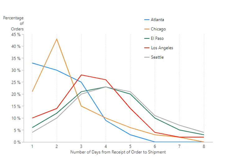
Figure 1: Single Chart in Dundas BI Displaying 5 Series – Delay in Shipments with Incremental Orders
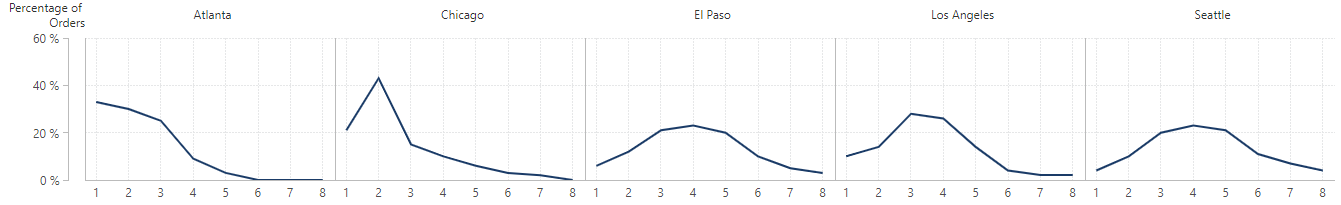
Figure 2: Small Multiples in Dundas BI Displaying 5 Series – Delay in Shipments with Incremental Orders
What’s readily apparent, is that by using Small Multiples, we’re effectively mitigating the effects of over plotting by presenting all the data at once in a manner that makes understanding comparisons effortless (rather than flipping back and forth between views). While the first view is by no means impossible to understand – and is in fact rather simple - its overlapping lines and offset legend make it more difficult to immediately comprehend, especially when we consider how simple the Small Multiples view is and how by organizing it as a series, how much easier it becomes to recognize the shape of each curve, which are no longer competing with other visuals.
They key idea behind Small Multiples, is to slice and dice your data and use a separate plot to visualize each chart. What you’ll end up with, is a grid of charts that all possess the same formatting, but are showing different parts of the data. It’s a simple concept, yet one whose benefits are numerous.
Here are some other great examples of Small Multiples that already exist today:
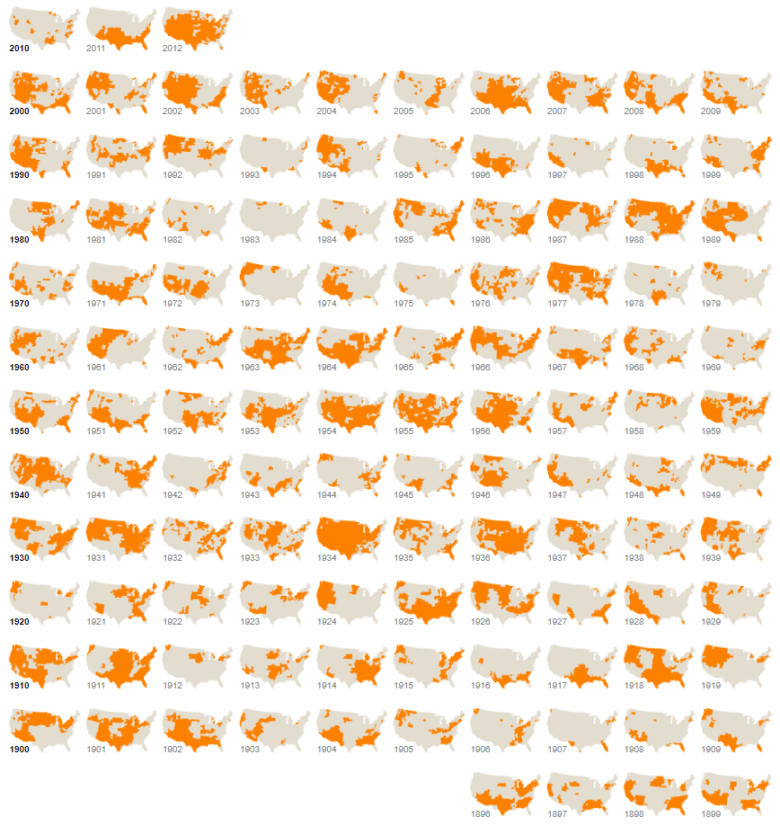
Figure 3: Drought’s Footprint – The New York Times
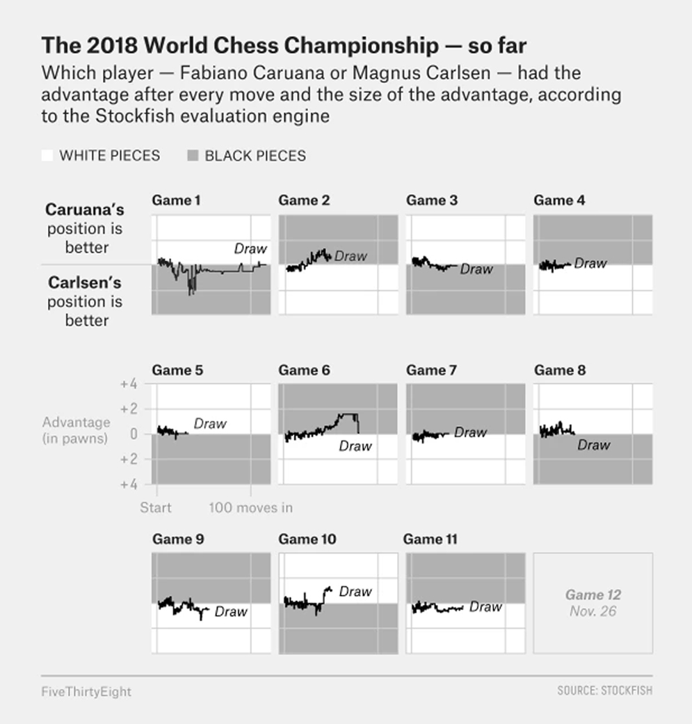
Figure 4: 2018 World Chess Championship – FiveThirtyEight
Small Multiples have even been used to track which hats Bill Murray loves!

Figure 5: Bill Murray Loves Hats – Derek Eads
When to use Small Multiples
More often than not, data analysis can be boiled down to a simple concept: the art of making comparisons. And as you can tell from the examples above, when analyzing data, we tend to compare elements against each other; one category vs. another category, this variable vs. that variable, a certain model vs. the same model but with different filters and constraints… You get the picture.
Edward Tufte, the sage statistician behind the popularization of Small Multiples explains the rationale behind using this type of visualization:
“At the heart of quantitative reasoning is a single question: Compared to what? Small multiple designs, multivariate and data bountiful, answer directly by visually enforcing comparisons of changes, of the differences among objects, of the scope of alternatives. For a wide range of problems in data presentation, small multiples are the best design solution” – Edward Tufte
What he’s claiming, is that Small Multiples are one of the greatest tools we can use when exploring large datasets, drilling into data, highlighting distinctions, and making direct comparisons across groups, and should be used as often as possible in these instances. And you know what? It’s tough to disagree with that. But perhaps what’s so great about Small Multiples – beyond what Tufte alludes to – is how economical they are; once we’re able to understand one design/chart, we’re immediately able to understand the data that’s being shown in the adjacent charts.
So when is it best to use Small Multiples? We’ve found them to be most valuable when:
- Used as an alternative to over-plotted, excessively-complex charts that display multi-variate data. Plus, they’re a powerful lever in reducing the risk of confusing your audience.
- Used to analyze and identify potential patterns across multiple variables.
Small Multiples in Dundas BI
Let me preface this by stating that the Small Multiples you’re able to create in Dundas BI are unlike any you’ve ever seen in other Business Intelligence platforms. While most BI software that offers Small Multiples in some capacity allow for a single visualization to be repeated with varying combinations, Dundas BI allows for multiple visualizations and design elements to be repeated across the varying combinations. What this does, is open up the door for myriad design options that can yield even more meaningful representations of the same data.
So how exactly is this accomplished? Dundas BI actually offers two Small Multiple Designer modes, each of which is available for use depending on whether the user is simply performing an individual analysis or is creating a specific/pixel-perfect design with the intention of sharing it with other users.
Default Mode
With the Default Small Multiple Designer, Dundas BI offers a simpler interface where we’re able to define repeating values across both rows and columns, and can add a single data visualization to represent the data.
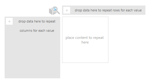
Figure 6: Default Small Multiples Designer in Dundas BI
With this Designer, we’ll end up with different charts that repeat across a certain dimension:
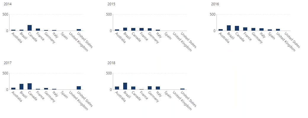
Figure 7: Conferences per Country per Year; Default Small Multiples View in Dundas BI
Advanced Mode
However, with Dundas BI’s Advanced Small Multiple Designer, we’re able to design a very unique display that combines multiple visualizations together with content that repeats across both rows and columns. In addition to the content we’re able to define in the Default Designer, we can also define column headers and row headers, along with top-right, bottom-right, top-left, and bottom-left elements.

Figure 8: Advanced Small Multiples Designer in Dundas BI
With the Advanced Small Multiple Designer, we’ve a lot of freedom in how we customize our view; here’s an example of what the finished product could look like:
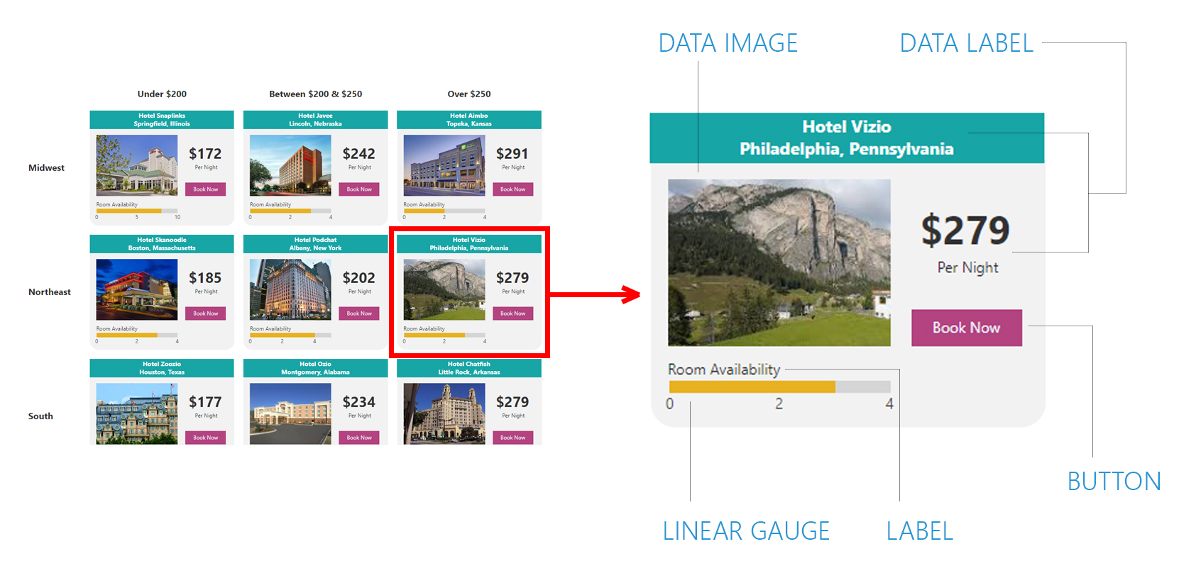
Figure 9: Hotel Availability by Region; Advanced Small Multiples View in Dundas BI
Here you can see we’re using Small Multiples to display the availability of hotels across different regions. We’ve broken these hotels into distinct categories (under $200, between $200 & $250, and over $250), and the Advanced Designer has allowed us to nicely visualize detailed information such as the state the hotel is located in, each hotel’s cost per night, the number of available rooms per hotel, images of each hotel, etc. You can read more on the specifics regarding the different design options, here.
Now, let’s take a look at how we’d actually go about creating Small Multiples in Dundas BI:
No Small Feat
With Dundas BI, we’re now able to easily create Small Multiples to better identify patterns in complex data. Instead of using one visualization to explain many data points, we’ll simply repeat our visualizations across rows and columns and use as many visualizations as needed to best describe each combination of data points.
New to Dundas BI? Schedule a demo or get your hands on it with a free trial/download.
Follow Us
Support