One of the most significant benefits of business intelligence (BI) software, is its ability to transform raw, meaningless data into digestible and actionable insights in the form of dashboards, reports and visual data analytics. Nothing – and I mean nothing – is as cathartic as taking a dataset with millions of rows of data, preparing and analyzing it using BI software, and producing a visual masterpiece that gets people talking like only a Warhol or Picasso ever could.
Unfortunately, not every business intelligence software on the market is capable of delivering that rush, that emotional high. Only a truly fluid and comprehensive software, with unequivocal versatility and enough agility and flexibility to move fast and eliminate any potential roadblocks, can completely remove the limitations to how one discovers and analyzes data, and free them to make incredible discoveries.
In fact, I’d argue that if you’re considering evaluating business intelligence software – which, let’s be honest, if you’re reading this then you likely are – then you’ll seriously want to ensure it has these 5 analytics features.
1) Forecasting
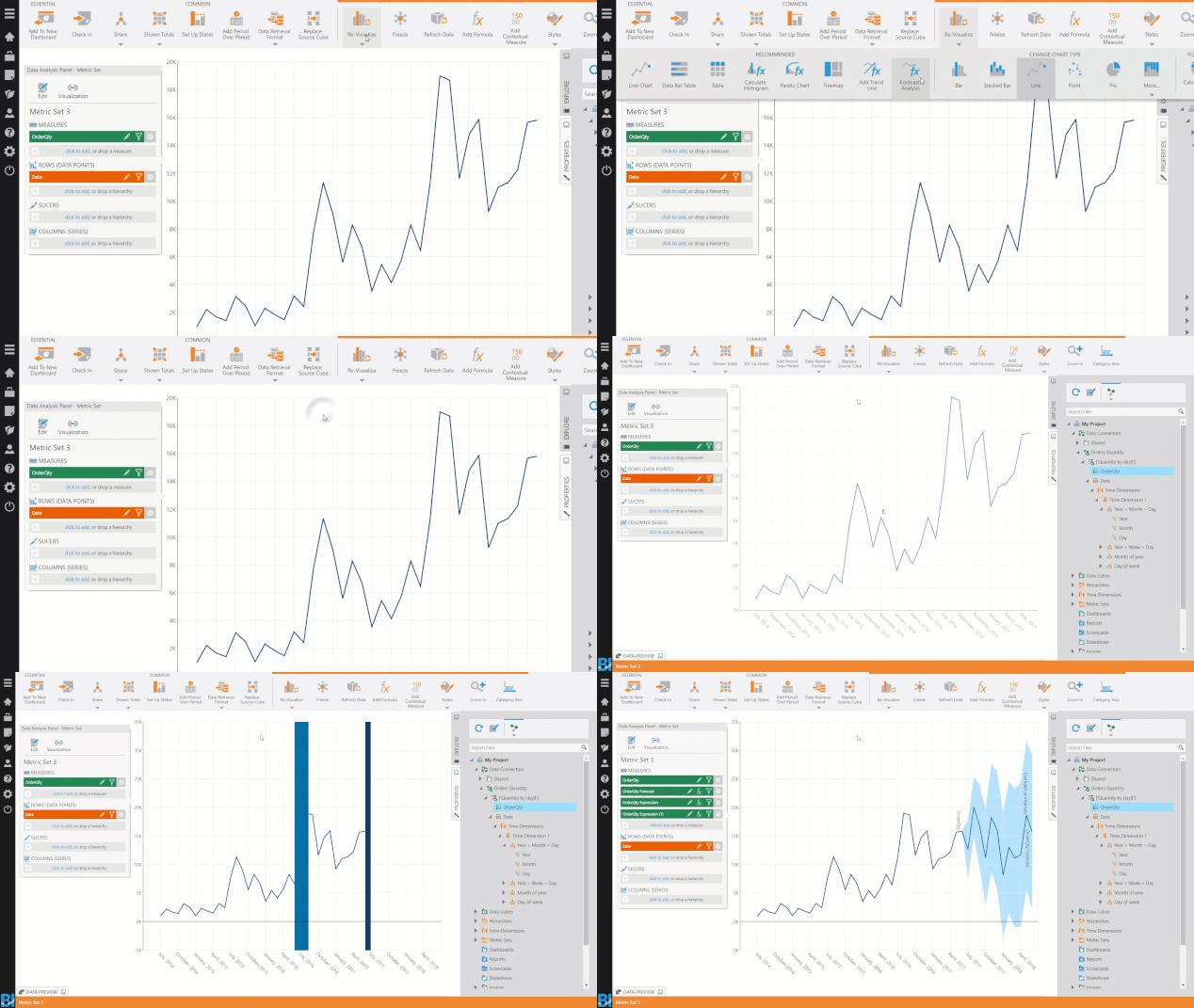
Wouldn’t it be nice to know how your business will perform tomorrow? How about two, four, twelve months down the road? Forecasting is invaluable as it gives businesses the ability to make more informed decisions and be proactive when developing strategies. With increased visibility into potential future outcomes comes an increase in confidence, leading to more accurate predictions, helping to mitigate, or even eliminate failure and losses before they happen.
Data analysis, however, is a historically reactive endeavor – based on past behavior. But to stay ahead of the competition, businesses need to be proactive. So, with that in mind, how great would it be to be able to predict and forecast future trends based on your past and current data? Highly educated guesses can only get you so far. With forecasting comes higher efficiencies, better productivity, and more cost-savings – amongst a host of other benefits. But forecasting is tricky business. From constantly changing market conditions, to economic uncertainties, to shifting demands and buyer behavior, forecasting can often feel like an uphill battle; a wasted effort.
When evaluating business intelligence software, look for an application that boosts predictive analytics with forecasting functionality that captures the evolving trends and seasonality of data, to accurately and precisely predict future outcomes.

The Exponential Smoothing formulas in Dundas BI – for example – apply exponentially-decreasing weight to historical data to forecast future values based on emerging trends. Check out this article to see how Dundas BI tackles trends and forecasting.
2) Automatic Data Prep
Before you’re able to transform your data into stunning dashboards, before you’re able to sit down and examine multi-page reports in a perfunctory manner, and well before you’re able to perform visual data analytics, you have to not only connect your data to a business intelligence application, but also ensure it’s clean and properly organized. Sounds fun, right? Think again, because not only is the process of prepping data for visual analysis one the more critical steps in any BI project, it’s also often the most time-consuming and difficult, especially for users that are less technical or unfamiliar with jargon such as inner joins and correlation formulas.
The thing is, most business intelligence software caters to a select audience, and in regard to data prep, that audience primarily consists of technical users – data analysts, developers, BI specialists, etc. Odds are your organization is not comprised entirely of developers though, nor will your user base be entirely made up of the same types of people. You’ll have C-level executives interested in reporting, you’ll have departmental managers tasked with generating dashboards and reports, you’ll have analysts who are interested in manipulating and mashing data sets together… The list goes on and on.
When evaluating business intelligence software, to ensure all types of users are freed to make those incredible discoveries you want them to, look for a platform that is designed to adapt to different users’ needs and skill levels, specifically when it comes to data prep workflows. Dundas BI – for example – enables automatic data prep, which ultimately reduces the number of steps it takes to progress from raw data to desired outcome. An automatic – and tailored – data prep experience allows users to be proactive and focus on the data they need. From there, they can easily enrich and share it, ensuring everyone gets to bask in the insights they’ve uncovered.
TAKE DUNDAS BI FOR A TEST RUN – FREE FOR 25 DAYS
3) On-The-Fly Grouping
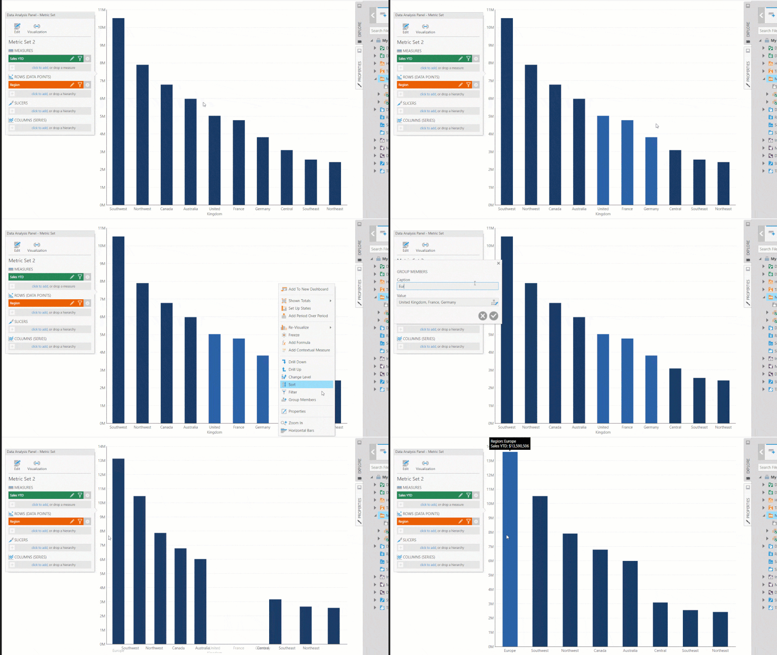
While on the topic of data preparation, there’s yet another feature you’ll want to look for in a business intelligence software to assist with automating data analysis processes, and that is the ability to model or group data on-the-fly.
As is the case with all BI software, prior to using data for reporting and other BI activities (dashboarding, creating data visualizations, etc.), it must first be ‘modeled’. And while data modeling encompasses a variety of tasks, the process can essentially be thought of as the activities that are required to be performed to prepare the data before using BI software for its intended purposes. In short, data modeling is a lot of upfront, heavy lifting that usually happens externally from a business intelligence software. So, with that in mind, what you want the software you evaluate to be capable of, is eliminating the many tedious data preparation steps that are typically required in most BI products between the data source and dashboard creation stages. A software that accomplishes this empowers users to move from data source to dashboarding without any intermediary steps, significantly reducing the time it takes them to create dashboards and generate value for the business.
The ability to model and group data on-the-fly is incredibly powerful and has multiple practical uses beyond what we’ve already discussed – such as for correcting data errors and answering questions of hypothetical nature. Dundas BI actually has proprietary, patented on-the-fly technology that enables faster data transformation in visual dashboards. It’s very, very cool, and I highly encourage you to check it out.

4) Outlier Analysis
Outliers are data points that differ significantly or are abnormally distant from other observations. They may be caused by variability in how data is measured, or by experimental error, or by something else entirely! To put it bluntly, outliers are unwanted nuisances that crop up all the time. And regardless the cause, you’d be hard-pressed to find a business that isn’t familiar with or that doesn’t maintain data containing outliers. This is unfortunate, as outliers are known to cause serious problems during data analysis due to their undesirable ability to completely skew scales and hide trends.
When outliers are encountered during data analysis, a user can typically take one of two courses of action. As outliers are primarily categorized as incorrect data, the first – and most common – action is to flat out remove them. The second, less common – but arguably more valuable – action, is to examine the outliers in isolation to perform deeper analysis (i.e., why on earth is this outlier here, and what insights can I glean from it?). Whatever the circumstances, the user needs to be able to identify outliers and separate them from the rest of the dataset.
When evaluating business intelligence software, seek out and take advantage of applications with powerful outlier analysis features. Dundas BI – for example – offers the ability to use interquartile range computations to help users better work with – and not against – outliers. It also leverages state indicators for highlighting outliers, can be configured to send notifications when outliers are detected, and provides a variety of data visualizations – such as Heat Map Charts – to illuminate outliers in your data.
TAKE DUNDAS BI FOR A TEST RUN – FREE FOR 25 DAYS
5) Correlation Matrix
Isn’t this a little specific? It most certainly is! While the preceding four ‘must-haves’ could all be categorized as high-level features you’d seriously want in a business intelligence software, I thought we’d have a little fun with our fifth! While not having this data visualization might not be considered a ‘deal-breaker’ by all, we thought it a powerful enough analytics feature to warrant inclusion in this blog.
The Correlation Matrix is, by most accounts, an advanced data visualization, meaning it’s functionality extends beyond that of traditional ‘vizzes’ such as Bar Charts and Line Graphs.
For reference, advanced data visualizations are rich, extremely interactive, flexible, aesthetically stunning, highly customizable, and fundamentally help users create best practice, interactive dashboards and reports for complete data insight.
It’s a terribly useful data visualization, particularly when the need arises to highlight the positive and negative dependencies between multiple variables within your data in a single visual, rather than having to analyze and look for a hidden dependency one variable at a time. And it’s needed more often than you think! It can be used for any number of situations where measuring meaningful relationships is the objective, such as identifying the next steps in a Marketing campaign, to improve the design of a website, or to continue in-depth analysis on customers for additional correlation dependencies.
Check out this Correlation Matrix we’ve built using Dundas BI. This particular example is showing which weather variables impact – or don’t – each other. For example, this matrix suggests there may be a negative correlation between the Wind Speed and the Dew Quantity. If this type of visual analysis is important for your line of business, then you’ll definitely want to ensure the business intelligence software you evaluate includes this feature.
Conclusion
There’s no doubt about it. Business intelligence software is some of the most powerful software you’ll ever get your hands on. But as the old adage goes, with great power comes great responsibility, and it’s your responsibility to make sure the BI software you evaluate is capable of giving you the power you so desire.
If you want to experience the rush that comes with visualizing unfathomably large datasets, and producing game-changing analytics that drive real, quantifiable, actionable decisions, then you need to be very deliberate in your evaluations. Not every business intelligence software is capable of delivering exactly what you need, and if you’re serious about doing what’s best for your data, then you’ll seriously want to ensure these 5 analytics features are present.
Transforming your data into stunning, actionable insights has never been easier, faster or more fun, than with Dundas BI. Start your free evaluation today and bring your data to life.


Follow Us
Support