Animations Are More Than Eye Candy
Dashboards are a great way to visually represent your data in order to track, analyze and display key performance indicators (KPIs) at-a glance. They allow you to monitor the performance of a business, department or process and make informed decisions accordingly. Typically, a well-designed dashboard will have the right set of metrics placed in the right layout as well as trends, contexts, interactions and highlighting to help the consumer quickly identify how metrics are performing. In other words, dashboards should be easy to read.
One of the ways to enhance the readability of a dashboard is by making use of animations. Aside from making the dashboard visually appealing (which is arguably a critical factor for a higher user adoption rate), animations allow you to:
- Easily draw attention to a specific area/part of the dashboard
- Help you understand data changes as you interact with the data
- Display more content than what the dashboard’s canvas would allow you to display with static content.
It is important to stress that while most users perceive animations as a cool “wow” factor, there is a lot of science behind it, and if done right, it can really boost the user’s ability to understand the data. Animations can also be referred to as data transitions. Dundas BI offers many of those out of the box using simple configurations.
Data transitions aren’t the only type of animation one can setup in Dundas BI. Dundas BI’s latest web standards design (HTML5, CSS3 and JavaScript) allows you to animate components of the dashboard, such as images or complete visuals (vs. just the data within the visuals). Those animations can be done using standard JQuery methods applied in the built-in script actions of each element on the dashboard.
The Value of Animations
We’re going to explore how animations can be used on a dashboard to enhance it, by drawing the user’s attention to the correct data. We’ll touch upon the advantages of animations that were mentioned above, by using our Operations dashboard as a reference:
At first glance you’ll see that it’s a standard dashboard that provides operational metrics for a call center. It’s also a real-time dashboard that updates every 60 seconds to return fresh results. However, you’ll notice that there are two sections that change at different intervals. The first is the table showing the top 5 agents and the other is an image of a phone that vibrates each time there is an incoming call.
Imagine this dashboard is mounted on big screens around the call center. Each time the phone vibrates, managers can notice the activity level; for example, if the phone shakes a lot, they can tell how busy the call center is without the need to even read the actual numbers. But beyond the perceived level of busy, the vibrating phone reminds agents of the need to handle their calls in a timely manner.
As for the table, this visual is designed to create a positive, competitive environment and motivate the agents. Since space on this dashboard is limited, a clever fade animation helps indicate to the user that the table is changing between the month and the day levels. This ends up saving a lot of valuable real-estate on the dashboard.
These animation effects have been placed on the dashboard using the respective jQuery methods we’re about to discuss below.
How to Implement JQuery Animations in Dundas BI
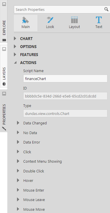
Dundas BI provides the ability to execute JavaScript and jQuery using the concept of actions available for each control on the dashboard under the properties panel. The types of actions available differ between the various controls on the dashboard. Typical actions that are available include Click, Hover, and Double-Click. However, there are many actions that are specific to a particular control, such as Selection Changed on a Drop-down list.
The image below shows the actions available for a chart visualization.

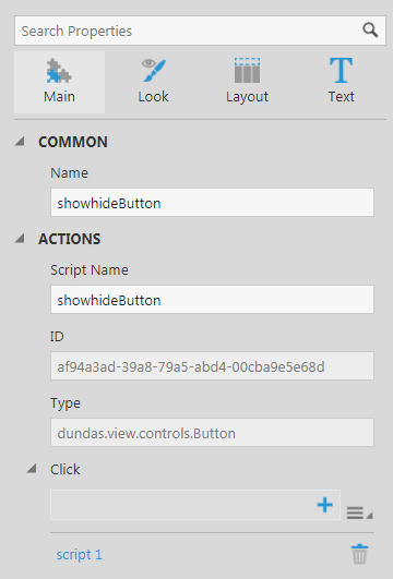
To execute an animation or an effect on a control using commonly available jQuery methods, first select what type of action would trigger it. Next, you can implement the method on that action. For example, if you wanted to show/hide a chart on the click of a button, then go to the Click action of the Button control under the properties tab, and use the JQuery fadeToggle() method.
- Note the script name of the control on which the action would take place and the script name of the control(s) it should affect. In this example, the script name of the chart is financeChart and script name of the button is showhideButton.
- Add the script action that will execute the jQuery. In this example, it is added to the Click action of the showhideButton

3. Add the jQuery in the script editor and build.
$(financeChart.container).fadeToggle();

4. The result will look like this:
Other Implementation Examples
Fade in/out Animation:implementing the effect of the table mentioned above:
The implementation of this method is done using a Timer control on the dashboard using the fadeIn() and fadeOut() methods. In the Timer Interval Tick action of the Timer, the following script looks for the text in the topAgentsLabel control and switches it between monthly (topAgentsMonthly) and daily (topAgentsToday) tables every time the timer ticks.
if (topAgentsLabel.labelText == "Today")
{
$(topAgentsToday.container).fadeOut(1000, function() {
$(topAgentsMonthly.container).fadeIn(1000);
topAgentsLabel.labelText = "Monthly";
});
}
else
{
$(topAgentsMonthly.container).fadeOut(1000, function() {
$(topAgentsToday.container).fadeIn(1000);
topAgentsLabel.labelText = "Today";
});
}
Note that instead of using the fadeIn() and fadeOut() methods, you can also use slideUp(), slideDown(),effect.puff(), effect.fold().
Vibration Animation:Implementing the vibrating effect on the phone image mentioned above.
Every time there is a new in-bound call in queue, the phone icon vibrates. Note this result here is providing a similar effect to the built-in table cell value change animation configuration but instead of having it on a table cell text it’s done on an image.
The vibration effect is implemented using the “shake” effect in the data changed action of the data label showing the total number of in-bound calls. Each time the number of calls changes, the image (phoneImage) vibrates:
$(phoneImage.container).effect("shake", {times:4, distance:5} );
Instead of using shake, you can use bounce, highlight and pulsate effects on the image as well.
Conclusion
As you can see from the above use cases, you can utilize the animations on your dashboard to enhance the user experience when looking at it. The examples mentioned are just few of the many you can implement using the various jQuery methods and effects - for a full library of jQuery effects, see https://www.w3schools.com/jquery/jquery_ref_effects.asp
Now it’s your turn – what useful animations will you add to your dashboards?


Follow Us
Support