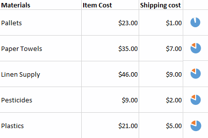
Everyone knows about pie charts so I won't bore you with an introduction. What I will say, is that pie charts are fascinating circles of controversies; users love them and experts like Stephen Few, despise them. Even the Export notes section of IBM Cognos says the following:
“Pie charts have a mixed reputation. They are popular in business and the media but many information designers have criticized the technique. Some claim that the pie slice shape communicates numbers less exactly than other possibilities such as line length.”
So, what's with all the pie chart hate? Experts time and time again avoid the little circles that could (or couldn't), because:
- It is hard to tell the exact value of a pie slice without using data labels, and
- One cannot draw a precise comparison between two slices in a pie chart.
(You can see an example of pie chart misuse in our post Circle Circle Dot Dot - What some dashboards should have not.)
The real problem with pie charts isn't that they simply suck, it's that most people aren't using them correctly. Ian Spence, Professor in the Department of Psychology at the University of Toronto, pointed out in his article No Humble Pie: The Origins and Usage of a Statistical Chart that:
“The pie chart is a simple information graphic whose principal purpose is to show the relationship of a part to the whole. It is, by and large, the wrong choice as an exploratory device, and it is certainly not the correct choice when the graph maker or graph reader has a complicated purpose in mind, such as displaying small changes in proportion over time, a task that would require several pies.”
Suppose you run into a situation where:
- You need to create a data grid jam-packed with data labels.
- You need to represent part-of-whole relationship between two columns.
- You have very limited horizontal screen estate.
- Each row of data should be read separately. In other words, you do not want to encourage comparison between two rows.
Think about having pie charts that are displayed within the data grid, like the following:

Pie charts are not completely unnecessary, and they have been proven to be useful in some cases. We should still remain skeptical about their usage, but I don't believe it's time just yet to throw them out completely.


Follow Us
Support