When we released Dundas BI 4, we knew that as a business analyst searching for answers, you are always exploring data. It’s with this in mind that we continually strive to help you spot insights with smarter visualizations and extreme customizations, providing the perfect combination to see them as you need them.
Based on the nature of the measures and hierarchies you place on the metric set, Dundas BI now recommends specific data visualizations. As part of these recommendations, Dundas BI may offer a handful of pre-configured visualizations, one of which is the Parallel Coordinates Chart.
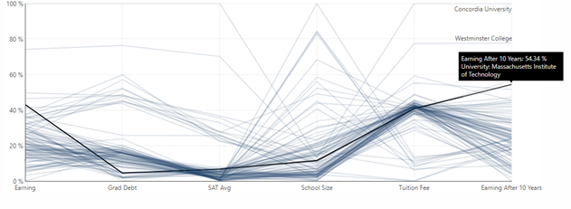
When selected in Dundas BI, the Parallel Coordinates visualization creates a new line chart where the metric set has been transposed to place measure names along the bottom axis and percentages along the left axis. The Parallel Coordinates Chart displays a separate line for each row of data that was initially selected (i.e. each row will show different measures for a single dimension value such as a specific school or specific business entity), plotting where each of its values falls within the total range of each measure’s values as a percentage. Overall patterns can now be found between the measures, while the ability to single out individual lines (i.e. a specific dimension value) to see their performance in comparison to all the other lines (i.e. all the other dimensions values) is readily available.
The Parallel Coordinates Chart is not pretty. From afar, it often looks cluttered and indecipherable with its overlapping lines. But aesthetics is not its forte. When dissecting the value of a Parallel Coordinates Chart, you must set aside any prior reservations you may have about its resemblance to a Line Chart. Unlike a Line Chart, which indicates change over time, the Parallel Coordinates Chart connects a series of values, each associated with a different value, that measure multiple aspects of something. In other words, its strengths lay not in its ability to communicate the truth of data, but rather to bring meaningful multivariate patterns and comparisons to light.
Use Case
Using Dundas BI and real data published by US universities, we’re going to examine how a Parallel Coordinates Chart can be used to search for predominant patterns and exceptions, and how vital observations can be derived from its clutter. The dataset we used includes US university statistics such as:
The dimension:
- The Different Universities of the US
The measures (each relates to the specific university):
- Graduates Average Earnings
- Graduates Average Earnings After Ten Years
- Graduates Average Debt
- Tuition Fee
- Graduates SAT Average
- The University (School) Size
We begin by dragging-and-dropping data onto the metric set (i.e. starting with the Universities dimension), and as we do so, Dundas BI’s recommendation engine starts to analyze and profile our data to understand the best way to represent it. Beyond the default chart types (Scatter Plot, Data Bar Table, Treemap, etc.), Dundas BI also provides smart visualizations that typically require calculations. However, in this case – as I’ve dropped at least four measurements, and the system understands the type of calculations that can be done easily with a single click that matches my dataset – Dundas BI has provided the option to re-visualize as a Parallel Coordinates Chart.

Figure 1: Dundas BI recommending visualizations based on the data selections
With a single click, we can now see our six measurements displayed in a Parallel Coordinates Chart. As this is not a time-based chart, each line emitting from the vertical axis represents a different university, showing across the various measurements, normalized to 100%. What we are now seeing is the percentage value against the rest of the universities.

Figure 2: Parallel Coordinates Chart created in Dundas BI - Measures several aspects of US Universities
The challenge of analyzing multivariate data often boils down to the analysts' ability to see all of the different combinations displayed together at once, to quickly identify patterns and make comparisons without having to isolate two variables at a time, out of the many variables the dataset contains. The Parallel Coordinates Chart is a powerful and handy visualization as it allows us to look at a lot of data points at the same time, and see how close specific measures are in regards to patterns or how they stack up against measures in the same category (i.e., university vs. university). However, as I mentioned earlier, the dominant quality of the Parallel Coordinates Chart, is its ability to allow us to quickly focus on (in this case) different universities and see how they behave/how similar they are, in comparison to the rest of the universities in specific measurements.
The following video demonstrates how upon hovering on different universities, the visualization is going to brush (i.e. highlight) the correct series in the Parallel Coordinates Chart:
For example, one of the patterns we can draw using this specific data visualization is that bigger schools tend to have lower tuition fees. We can then dive into specific universities and compare those against the rest to see, for example, that MIT will be one of the schools with the highest average earning after 10 years (just past Harvard), but the average SAT required to enter into the school isn’t above the main pack (though on the higher end of the pack).

As evidenced by this use case, the Parallel Coordinates Chart is a uniquely valuable visualization in the sense that it allows you to examine large quantities of data at a glance, while simultaneously analyzing individual measures to derive meaningful insights against the whole.
Feel free to try Dundas BI today, and explore for yourself what discoveries you can make with Parallel Coordinates Charts and other advanced visualizations, using your datasets.


Follow Us
Support