More and more businesses today are moving towards employing a data-driven approach when it comes to decision making. Whether the objective is to improve their customer service, choose the right investments area or fine tune processes for better efficiency, a data-driven approach provides an analytical way to make strategic decisions based on factual data (i.e. metrics) rather than just intuition.
Dashboards allow you to monitor and track these metrics in a visual way. Collaborating with others within the company on the basis of these metrics becomes important in the data-driven endeavor as it allows people to have meaningful conversations regarding the performance and required actions.
Wall-mounted dashboards, Wallboards, or simply put, “Dashboards on large screens on your office walls”, are a great way ensure key business metrics are made visible at prominent locations in the communal office space.
For example, you can display important dashboards on flat panels in numerous corporate settings such as hallways, operation centers, kiosks, and so on. Those large screen displays are a great way to engage users and encourage certain behaviors by providing key performance indicators, and can even promote healthy competition in an environment that can’t be missed.
A dashboard can always be opened on the computer or mobile device, but if it’s only accessible via those mediums, how often do you think your users would open it? It’s very easy to forget about dashboards when trying to keep up with your day-to-day work. However, if the dashboard was permanently mounted on a wall, with your KPIs and metrics front-and-center at all times at a highly-visible location, your users would surely have visibility into the information they need in order to stay on top of their jobs. It’s easy to dismiss viewing data on your personal device, but on a wall-mounted display; it’s unavoidable.
Having the dashboard on a wall-mounted display forces people to look at the information and more often than not, trigger an action.
Since dashboards are made visible in a shared space, you can often see people looking at it together and developing further discussions in regards to current performance and how it can be optimized.
To summarize, office walls are more valuable when dressed with wall-mounted dashboards than with art. With dashboards, you’re able to:
- Ensure visibility of performance indicators
- Drive faster actions to correct issues as they’re visible to all, and even change people’s behaviors to ensure issues don’t repeat
- Foster better collaboration as people are looking at data together
- Create healthy competition between employees as they can see their results being compared to others
Use Cases:
Enable Constant Monitoring
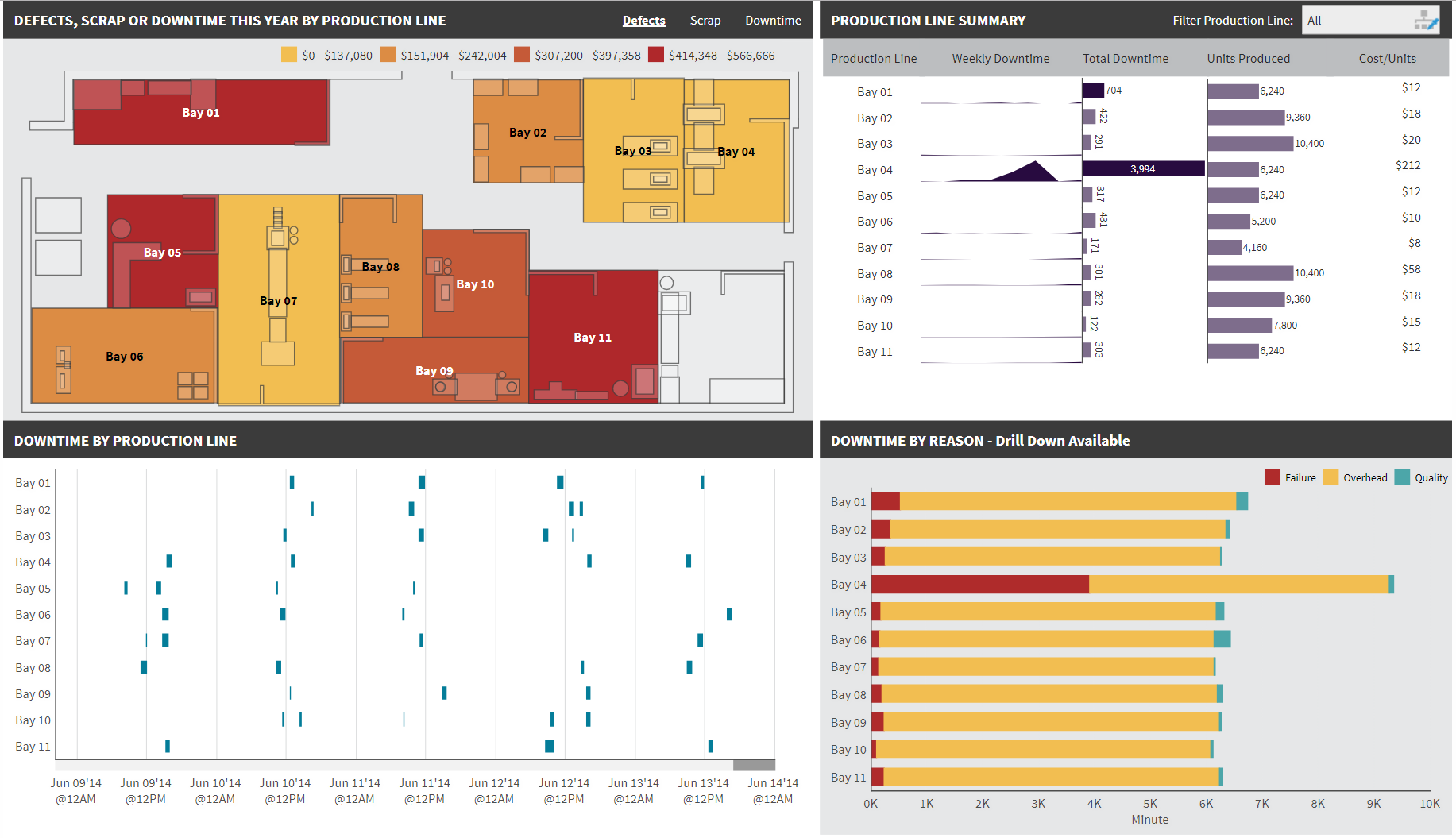
Reporting on operational metrics are ideal for monitoring lines of business that require constant attention. For example, you can place a wall-mounted dashboard on a manufacturing plant floor to see how the production line is performing. Here’s an example of a production dashboard that is updating every 10 seconds:
Figure 1: Production Dashboard Created in Dundas BI
Click here, or on the image to see the dashboard in action! Note how the different bays within the manufacturing floor are constantly updating to showcase the current defects, scrap, and downtime performance.
Display Key Performance Indicators
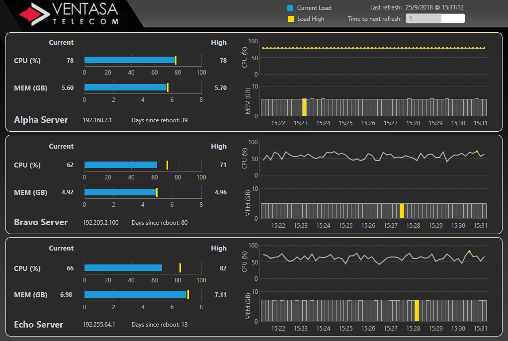
Now, what if you wished to monitor IT infrastructure, or more specifically, server performance? You could do so by placing a dashboard that details your metrics – such as the following – near the IT department. This would allow that team to constantly monitor your metrics and take action when necessary:
Figure 2: Telecom Dashboard Created in Dundas BI
Click here, or on the image to see the dashboard in action!
Drive Positive Competition
Wallboards can also be used as a great tool to drive positive competition amongst team members. Each individual will now have constant visual access to their overall team’s performance, which will motivate them to outperform the rest.
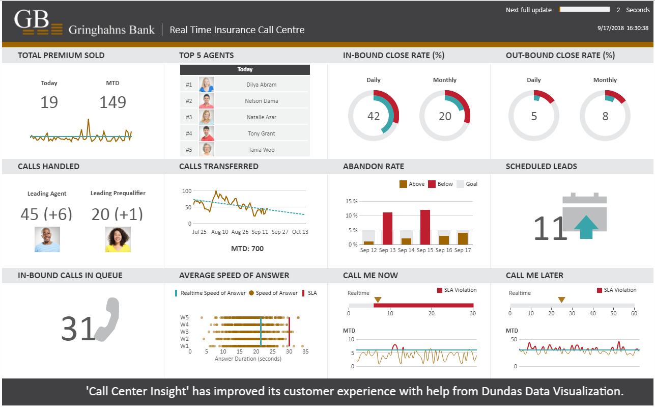
Here’s an example of a call center dashboard that shows all the relevant team metrics on one canvas, which updates in real-time. By placing this dashboard on a wall-mounted display, your team will know about more than just how many calls have been handled or are in the queue; they’ll also have a front-row-seat to which agents are top performances on both a daily and monthly basis. This will inspire team members to be motivated to either stay on the leaderboard or to get on it and will provide them with real-time feedback on their performance.
Figure 3: Call Center Dashboard Created in Dundas BI
Click here, or on the image to see the dashboard in action!
Points for Consideration and Design Tips:
For the most part, Wallboards are unattended displays. They are only meant for viewing with minimum to no human interactivity. The same dashboards can always be opened on a web browser on a computer or mobile device for interaction, but this isn’t possible if they’re wall-mounted. This means that they need to be created and designed in a way that allows them to be unattended, as well as provide all relevant information required without any human driven interactivity. Dundas BI allows you to create these Wallboards dashboards using many unique functionalities such as:
SLIDESHOWS
A slideshow lets you display a dashboard or report for a configurable duration before it is swapped out with the next view in the sequence, hence automating the display loop. This allows for the presentation of certain insights via a series of views, which form a logical business story for the viewers to get insights on. This can also help you make better use of a single screen display that needs to serve multiple groups.
AUTO-REFRESH
No interactivity from the users also means that the users cannot refresh the dashboard if they need updated information. For this you need the dashboard to refresh itself periodically. Dundas BI has a built in configuration that can be applied to specific visualizations when it comes to auto-refreshing data visualizations. You can even take this one step further and visually show to the user the refresh rate.
An example of this is provided here, where the dashboard is set to refresh every 10 seconds and a “time to next refresh” indicator [AP1]is visible to the user. This is done using the Timer component, and after a certain time period, such as 10 seconds, all the charts are refreshed by calling the loadData() method in the Timer Tick action of the Timer component. For example:
lineChart.loadData();
You can also call the method that refreshes the entire page instead of the individual visualization.
The “time to next refresh” indicator [AP2]is setup using a rectangle component whose width is updated on every refresh and a data label shows the value of the timer at that moment. For details on how the refresh has been implemented in the above example, please see the Implementation Examples section towards the end.
SCROLLING MARQUEE
Scrolling marquee text such as the one shown in the Call Center dashboard is a good way to convey and share relevant information in the form of scrolling text. You may have seen this form of a display on a stock market ticker showing all the stock prices for various companies.
This can be implemented by using the <marquee></marquee> HTML tag that shows the relevant information to be displayed in a HTML Label component. For detailed steps, please see the Implementation Examples section towards the end.
SOUND ALERTS
Sound alerts can also be setup to signify a particular event. For example, on a wall-mounted sales dashboard, it can signify as a new big sale. This will allow the users to pay attention to that metric when they hear it, and in this case, can help to increase motivation.
An example of the audio embedding can be found here: Audio/Video Embedding
It has been implemented using the HTML Label component and by adding the following to its Text property:
<audio autoplay controls><source src="https://microsite.dundas.com/xmas.mp3" type="audio/ogg">Your browser does not support the audio element.</audio>
You can replace the audio file with your own source file.
Implementation Examples
AUTO-REFRESH
These steps show how to implement a periodic auto-refresh of the dashboard as shown in this example: Call Center dashboard
Add the Rectangle component on the dashboard and provide a suitable fill color and dimensions such as the one shown in the sample. Overlay this on another rectangle with the same dimensions and white background. This will provide the effect of the refresh indicator once the timer starts ticking. Also, note the rectangle script name property should be populated. In this example, it’s called progress.
Add a label component that would display the interval time at that moment. Again, note the label script name. In this example, it’s called timerLabel.
Set the label text property to the dashboard refresh interval. This value will be used in the calculation in the script below. E.g., set the text to 60 if you want the dashboard to refresh every 60 seconds.
Add a Timer component and set the Timer Interval property to 1000 milliseconds. Note the script name. In this example, it’s called timer.
Start the timer on load by adding this script in the Ready event of the dashboard:
timer.start();
In the Timer Tick interaction of the Timer component, add the following script that, on every timer tick, reads the value from the text property of the timerLabel and uses that to update the width of the progress rectangle, reset the timerLabel and refresh the data in the visualizations.
// UPDATE THE TIMER
var curTime = parseInt(timerLabel.labelText);
curTime--;
if (curTime <= 0)
{
progress.width = 100;
timerLabel.labelText = "60";
// Update the data by applying the loadData() method on the script names of each visualization on the
dashboard.
Chart1.loadData();
Chart2.loadData();
Chart3.loadData();
}
else
{
// Resize the progress rectangle and update timer
var width = (100/60.0) * curTime;
progress.width = width;
timerLabel.labelText = curTime.toString();
}
Check-in the dashboard and refresh the page to activate the script.
SCROLLING MARQUEE
These steps show how to implement the scrolling text as shown in this example: Call Center dashboard
Add a HTML Label component on the dashboard and note the script name. In this example, the script name is htmlLabel.
In the Ready event of the dashboard, add a script, such as the one below, that gets the text to be displayed along with the appearance properties such as height, width, font, scroll speed etc. and generate an HTML by passing these properties using the <marquee></marquee> tag.
Then assign the HTML to the labelText property of the HTML label to display the text.
//Assign the text to be displayed
var text = "Text to be displayed.";
//Get the height/width of the target HTML Label that displays the text.
var height = htmlLabel.height;
var width = htmlLabel.width;
//Define the appearance
var fontFamily = "Calibri";
var fontSize = "26px";
var fontColor = "White";
var scrollSpeed = 5;
//Generate the HTML with the scrolling text
var html = "<style type='text/css'>.html-marquee {height:"+height+"px;width:"+width+"px;background-color:rgb(65, 64, 66);font-family:"+fontFamily+";font-size:"+fontSize+";color:"+fontColor+"}</style><marquee class='html-marquee' direction='left' behavior='scroll' scrollamount='"+scrollSpeed+"' >" +text+"</marquee>";
//Display the text in the HTML Label
htmlLabel.labelText = html;
Conclusion
People pay more attention to what’s easily visible to them or in other words “what’s in their face” :). The more often people see a dashboard, the more important the information becomes to them, inspiring action and causing the behavioral change desired. A dashboard cannot do this if it's hidden. Wall-mounted dashboards or wallboards allow you to make these dashboards prominent and visible to the users at all times.


Follow Us
Support