Introduction to Heat Maps
When you hear the term “Heat Maps”, what comes to mind? Do you immediately think of something related to financials? Or are you drawn to forecasts you’ve seen on weather networks? Maybe you’re an out-of-the-box thinker and think of website tracking and tools to optimize conversions?
By definition, Heat Maps are graphical representations of data that utilize color-coded systems. The primary purpose of Heat Maps is to better visualize the volume of locations/events within a dataset and assist in directing viewers towards areas on data visualizations that matter most.
But they’re much more than that. What many people don’t realize, is that Heat Maps can be applied to a handful of data visualizations. Because of their reliance on color to communicate values, Heat Maps are perhaps most commonly used to display a more generalized view of numeric values. This is especially true when dealing with large volumes of data, as colors are easier to distinguish and make sense of than raw numbers. However, Heat Maps are multifaceted and can also be used in more literal senses, for example, to showcase ‘hot and cold’ (density) zones on a map.
Heat Maps are extremely versatile and efficient in drawing attention to trends, and it’s for these reasons they’ve become increasingly popular within the analytics community, but that’s just the tip of the iceberg as to why. While other data visualizations must be interpreted – either by analysts or business users – Heat Maps are innately self-explanatory. The darker the shade, the greater the quantity (the higher the value, the tighter the dispersion, etc.). When existing data visualizations are paired with Heat Maps, their ability to rapidly communicate key data insights to the viewer is greatly enhanced.
Sounds great! But which visualizations pair best with Heat Maps and why? It’s important to remember, not all visualizations are created equal. You wouldn’t use a Pie Chart to visualize the share distribution of tens of categories (such as the 26 most referenced characters in J.R.R. Tolkien’s, The Hobbit), and you certainly wouldn’t use Heat Maps when analyzing social media connections or hierarchical relationships. However, there are instances when Heat Maps are perfect to use. Let’s take a look at what those are.
Heat Map Adaptations
Retail Matrix
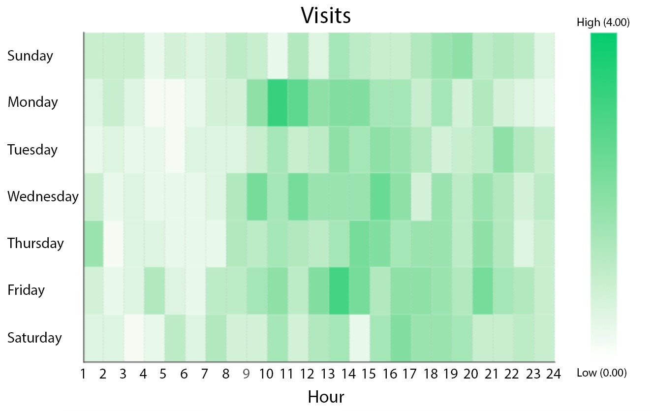
Imagine working as an analyst for a large, multi-national retail corporation that operates a chain of large department stores. You’re responsible for analyzing their flagship store, which is located in the downtown core of a large metropolis. What you’re interested in, is determining whether or not specific dates and times receive more traffic, in order to better allocate in-store resources.

Figure 1: Retail Matrix in Dundas BI
This Heat Map is displaying the dates and times whereby the store is most heavily trafficked. With this, we’re able to immediately identify which dates and hours are busiest. For example, it’s clear that the store experiences an influx of traffic on Monday’s beginning at 10:00 AM, which slowly dissipates throughout the day. This pattern is repeated throughout the week, with minor daily variances (for example, Friday’s tend to experience prolonged periods of traffic, whereas Sunday’s tend to be lighter).
Armed with these insights, the retailer is better positioned to maximize their operations by better allocating key resources; for example, by scheduling additional Sales Associates during lunch rushes, or by scheduling inventory shipments during down periods earlier in the week.
Manufacturing Diagram
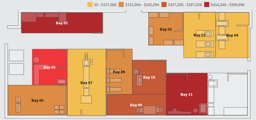
Any manufacturer intent on improving their operations must be willing to analyze data relevant to their production bays. In addition to having access to crucial KPIs such as Production Count, Downtime, or Cycle Time, manufacturers must also be able to monitor the performance of their production bays in real-time in order to identify critical issues as they arise and intervene as required. After all, production bays are most effective when all components (machines, equipment, and labor) are firing on all cylinders.

Figure 2: Manufacturing Diagram in Dundas BI
This Custom Diagram of a multi-bay production facility, is displaying which production bays are contributing the most defects from a monetary perspective. In this example, the darker the production bay, the higher the loss attributable to defects. It’s easy to immediately see that production bays 1 and 11 are producing defects at an alarming rate, while production bays 3, 4, and 7 are performing within their expected thresholds.
This rendition of a Heat Map is great to use on a high-level dashboard as it allows for at-a-glance monitoring of which production bays are in good condition, which require attention, and which are at risk. Once the statuses have been identified, the manufacturer is then prompted to perform deeper analysis and identify the root causes.
Population Map
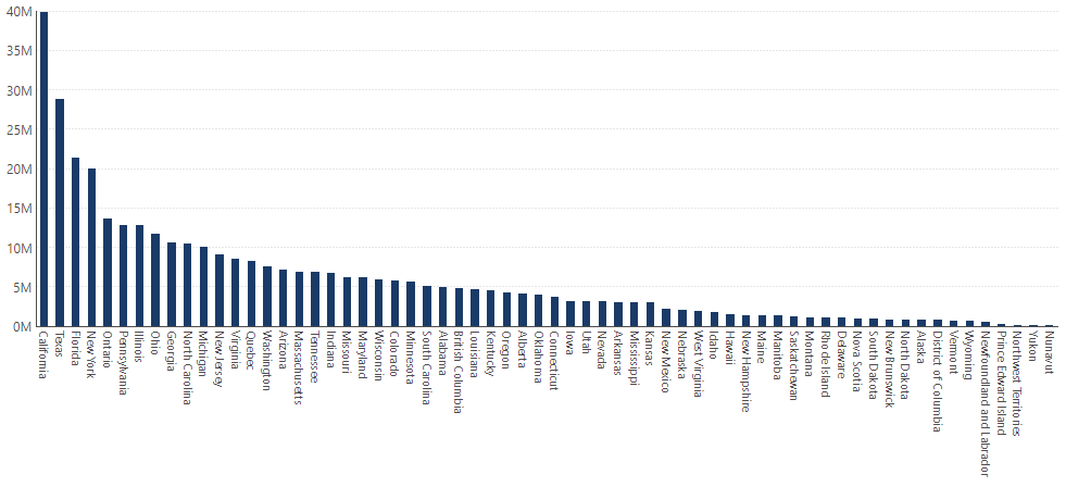
As mentioned earlier, Heat Maps work wonders on literal maps, because of the defined boundaries that are relevant to the data. In these scenarios, Heat Maps can be used to represent population density, per-capita income, average temperatures, and so on. Take the following Bar Chart for example, which features the populations of American states and Canadian provinces. It’s equally as difficult (if not more) to analyze as a Bar Chart, as you’d imagine it would be as a Table.

Figure 3: Population Bar Chart in Dundas BI
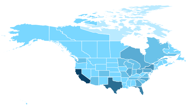
The best way to interpret this data is by using a Map visualization; specifically one that incorporates Heat Map components. The map leverages our knowledge of geography in place of text labels, and the colors attributed by the Heat Map, indicate approximate values.

Figure 4: Population Map in Dundas BI
PS – We actually have ANOTHER type of Heat Map that features the Map visualization that you can read more about here. This one should set your existing Maps ablaze.
When to use Heat Maps
Needless to say, the application for Heat Maps is truly astounding, and due to their immense versatility, can be used in a variety of situations, rather than be limited to ‘the right time’. After taking a closer look at 3 completely different use cases – which have barely scratched the surface on how Heat Maps can be used – it’s clear that Heat Maps have the ability to instantly transform and enhance a slew of data visualizations. They possess an uncanny ability to identify areas of interest quickly, and empower users to explore further and pinpoint where change must occur.
Regardless of what base visualization is used, with Heat Maps, the end result is a data visualization that quickly communicates its data to the viewer, using easy-to-understand color gradations. Try Dundas BI today, free for 25 days, and create your own Heat Maps!


Follow Us
Support