Navigating a business intelligence solution to find the exact dashboard or report you are looking for can be a daunting task if you are not familiar with the solution, and especially if you are not the one who authored the content. As the content author, it’s made more difficult when an organization’s standard users all have varying preferences regarding the navigation experience. Adoption is vital to the success of a business intelligence project, and a superior navigation experience can act as a catalyst for retaining a higher volume of standard users.
Dundas BI offers organizations the ability to customize the navigation experience in order for standard users to better find, analyze and understand data. This is accomplished by offering 4 different navigation methods, each with its respective pros and cons. But before jumping into each method, let’s define what a standard user is to Dundas BI.
Dundas BI uses a concept of seats, designed to control the abilities and data access of users in the application. The standard user seat is targeted at users looking to consume or explore the available data. As an example, consider business executives. Typically these individuals would want to view and interact with the dashboards that were created for them but would occasionally like to see a visualization from one dashboard on a second dashboard. In those cases, the executives can create a copy of a dashboard or a fresh one in their own project and drag in other visualizations of interest.
As stated, for standard users, it’s imperative they’re able to successfully navigate the business intelligence solution, and can easily access all that is important, and of interest to them. With that being said, let’s examine the 4 possible navigation methods that Dundas BI grants standard users:
- Default Landing Page
- Custom Navigation via Tile Navigation
- Main Menu & Recently Viewed Panel
- Home Screen Customization
Default Landing Page
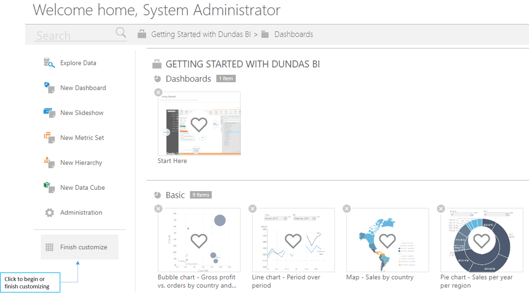
By default, standard users will land on the Dundas BI home screen when logging in. Here they will be allowed to quickly access the actions they’ve been permitted to do so, such as explore data or create new dashboards.
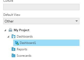
Instead of automatically landing on Dundas BI’s home screen, standard users can select their own default landing page and have it be set as an existing dashboard or report. Note that this selection can be performed either by the standard user themself, or by an administrator of the application. Administrators can specify the default view for individual users, for groups, or at the application level so that users will always land on a certain view. Note that by default, this setting will apply only to the view you land on upon login. That means that if the user clicks on the "home" button from the main (left) menu, they will be directed again to the Dundas BI default homepage. If you want to make sure that in all cases users are routed to the default view, you should also set the "Always Use Custom Home Page" configuration under the admin config settings.

Pros
Structuring the navigation so that users land directly on the desired report or dashboard, without having them navigate to it post-login, will eliminate the need to teach and learn the system’s built in navigation menus.
Cons
More often than not, standard users tend to stay within the realm of comfort and avoid exploring technology systems. This means that if a standard user were to land immediately on a certain dashboard, it’s possible they may not attempt to find other dashboards or create their own. It’s likely they will be unaware that those options exist, which would not be the case were they to land on the default home page, thus forcing them to “play” with those options.
Custom Navigation via Tile Navigation
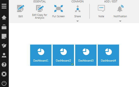
Tile navigation is a built-in component that can be easily added to any dashboard in Dundas BI in order to provide an experience similar to tab-based navigation that many users are familiar with from existing tools, such as Excel. The tile navigation component will essentially display a clickable tile for each dashboard/report within a certain folder or project. This will allow standard users to easily navigate to their desired view from within an existing view.

Pros
With this format of navigation, standard users are not required to open Dundas BI’s built-in navigation menu in order to access other views and can do so within an existing view. The user experience is also likely familiar and is customizable to include thumbnails of the views. In addition to this, the list of possible views standard users can navigate to is dynamic, so the creator of the original dashboard (or template) that contains the tile navigation, is not required to modify the navigation system every time a new view is added. This is opposed to building a custom tab navigation (i.e. with buttons and navigation interactions) that would be static and would require manual adjustments were new views to require additional tabs.
Cons
While simplifying the standard user's experience through familiarity, the tiles often consume space on the view that is sometimes better used for data display rather than navigation elements.
Main Menu & Recently Viewed Panel
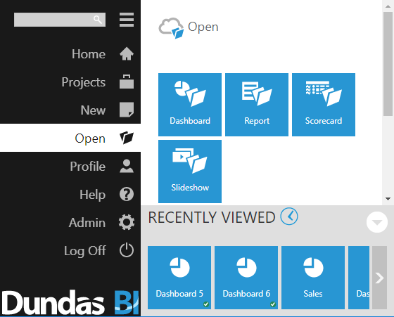
Dundas BI contains the main menu that allows standard users the option to either search for or open, existing content within the system. The menu is easily accessible by clicking on the hamburger menu in the top left. In addition, the “Recently Viewed Panel” can also be accessed from the default home screen, or with a clicking on the main menu, with single-click access to recent views.
Main expandable menu recently viewed panel

Pros
Within the main menu, content is logically organized using a tree structure that aligns to a specific set of projects and folders users may recognize when a myriad of content is available. The recently viewed items panel bolsters the main menu with a quick shortcut for content that is often visited.
Cons
With this navigation format, content is organized by view type: dashboard, report, scorecard or slideshow. Occasionally, standard users may be unaware of the view type that applies to the content they’re searching for. The main menu also contains additional options that standard users may refrain from using, hence leading them to avoid them all together. Some standard users even abstain from using the hamburger menu entirely (these users likely require a predefined custom navigation created on the views directly, like a tile navigation).
Home Screen Customization
This navigation format is similar to that of tile navigation, but rather than having it placed within a view, it serves as the user’s default home screen in Dundas BI, allowing each individual user to decide what view they can access directly from their home screen.

Pros
By customizing the home screen, each standard user can create a library of key views that can be directly from the home screen. These views can be easily customized and changed as often as needed.
Cons
Home screen customization is a manual effort and is the responsibility of the standard user, meaning they must take action and customize their home screen, rather than use the defaults they often settle for.
--
Dundas BI offers multiple different, yet easy to set up, options to tailor the standard user’s experience, especially when it comes to navigation. Each organization’s solution would likely warrant a different approach, which often is a combination of the aforementioned options. We strongly recommend thinking about the user experience you want your standard users to have prior to rolling out your solution, in order to ensure your standard users can easily reach more data that is relevant to them, faster.
Try Dundas BI today, and let us help you create a navigation experience unlike any other.


Follow Us
Support