In the age of Big Data, the value of data visualizations – and data visualization software, for that matter – has exploded tenfold. The volume of data available at this exact moment is simply staggering and data visualization tools and technologies are essential to analyzing, understanding and making sense of trends and patterns in it.
We’ve talked at length about the value of data visualizations, so I’ll spare you my CN Tower long elevator pitch this time, but if you’re interested in learning more about how they can be used to drive instant decision-making and why Dundas’ data visualizations are so unique, I highly recommend taking a look at the following content:
- How Data Visualizations Effectively Enhance Your Analytics
- The Benefits of Visualizing Data
- The Importance of Stunning Data Visualizations
- 10 Advanced Data Visualizations
Now, back to the matter at hand! Data visualizations are – and I think you’ve gotten the point by now – terribly important, and buyers who are seriously evaluating data analytics and business intelligence platforms should consider narrowing their lists to include those with integrated data visualization functionality. That said, there are a wide range of data analytics platforms available on the market today, with varying breadths and depths of data visualization capabilities. Effective data visualization is an art, and not all platforms are capable of transforming data into stunning visualizations that combine exceptional storytelling with robust analysis.
When evaluating data analytics platforms based on their data visualization capabilities, it’s important you consider top-performers. Anyone can add style to a chart; not everyone can add substance.
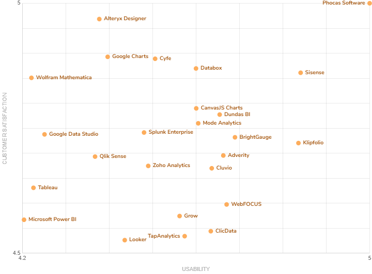
Dundas BI – Dundas Data Visualization’s browser-based data analytics and reporting platform – has been ranked as a 2020 FrontRunner for Data Visualization Software, which uses real reviews from real software users to highlight top software products
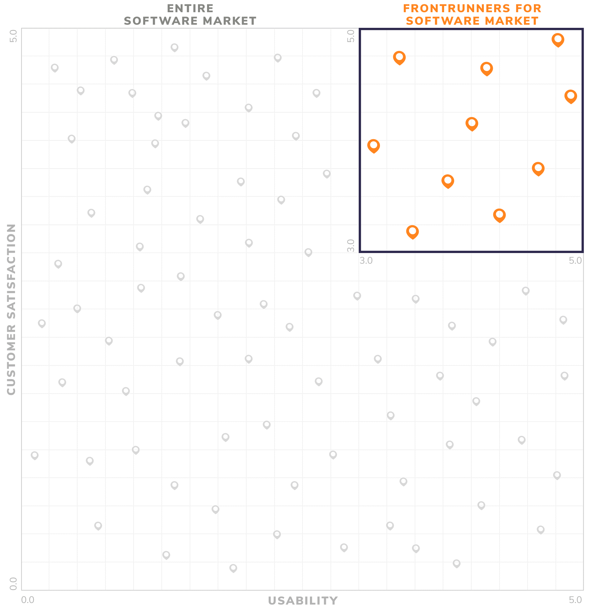
The FrontRunners quadrant, powered by Gartner Methodology, provides a data-driven assessment of products in a particular software category to determine which ones offer the best capability and value for small businesses. This quadrant is completely data-driven with no analyst interpretation and is heavily influenced by user reviews. Only the top-scoring products appear in FrontRunners graphics.

FrontRunners – which is published on Software Advice, the leading online service for businesses navigating the software selection process – plots a given market’s top 20-30 products in a quadrant format that displays the Capability and Value of a product relative to their peers.
According to real users, Dundas BI – which is making its second straight appearance as a FrontRunner for Data Visualization Software – has a Usability score of 4.35 out of 5 and a Customer Satisfaction score of 4.38 out of 5, firmly cementing it as a top ranked software.

As American mathematician and developer of the Box Plot, John Tukey, once said, “the greatest value of a picture is when it forces us to notice what we never expected to see”. Data analytics and reporting platforms are integral tools for analyzing information, but data visualizations are the key to presenting and conveying those results, and helping users understand their data in more insightful ways.
By making data visualizations a key component in your analytics stack, you’ll be able to better consume data and discover insights you’d likely never expect to see. To take our data visualizations out for a spin, download this interactive eBook, or start your free evaluation of Dundas BI today!
FrontRunners constitute the subjective opinions of individual end-user reviews, ratings, and data applied against a documented methodology; they neither represent the views of, nor constitute an endorsement by, Software Advice or its affiliates


Follow Us
Support