We are back with another installment of Innovation Never Rests! For those of you who are new to this series, Innovation Never Rests is a compilation of both short and detailed articles, each of which dives into the complexities of Dundas BI to shine a light on some of the cutting-edge capabilities our platform is renowned for and has received critical acclaim for in the business intelligence (BI) industry. It’s also a little bit of an unwritten motto here. The innovation truly never rests at Dundas and we’re constantly pushing the boundaries of what’s possible in a business intelligence and data analytics software.
While this series isn’t exhaustive – we actually release upwards of 200 new features every single year! – we’re using it as an opportunity to emphasize and highlight the newest and most exciting features and enhancements within Dundas BI that are designed to help you better handle your data analytics. In this installment, we’ll be arming you with everything you need to know about Data Aggregation in Dundas BI, but first, to quickly get you up to speed, I’ve listed the first eight articles in the series for you to read:
New Features: Overview
Episode 1: Ragged Hierarchies
Episode 2: Small Multiples
Episode 3: Hierarchy Attributes
Episode 4: Automatically Detect Tables Within Excel
Episode 5: Delivery API
Episode 6: Radar Chart
Episode 7: Map Animation
Episode 8: Recycle Bin
A Crash Course in Data Aggregation
If you’re familiar with business intelligence in general, then it’s very likely you’ve encountered the concept of data aggregation in some way, shape or form at some point in your career. In fact, I’d wager that every data analytics software uses some idea of aggregation when expressing data in visualizations, so if you’ve ever tested the wares of some BI vendor you’ve definitely come face-to-face with it. And while this concept may be considered more or less commonplace, it’s something you need to have a solid understanding of in order to really leverage and take advantage of. Plus, some BI platforms do it better or describe it differently than others and it’s important you understand why that is and what that looks like.
And that’s exactly what we’re going to tackle in this blog! I’m going to give you a crash course in data aggregation and will use Dundas BI – our fully programmable, end-to-end business intelligence platform – to explain it and share a few examples. So, let’s get down to business. What is data aggregation in Dundas BI, why is it so important, and what are some practical use cases?
In Dundas BI, understanding data aggregation is key to understanding how to work with data in general. To be able to drink from the proverbial water-hose of information, you need to first corral it and transform it into bite-sized forms that regular folk like us can understand. In other words, you need to aggregate it. But before you do that, you should first understand how data flows through Dundas BI and at what stages data aggregation can occur. Take a look at the following diagram showing at a high-level the main elements of the Dundas BI data model.
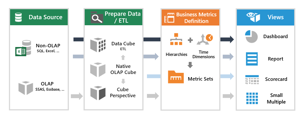
While this is a highly simplified view, what we want to focus on, are the two sections in the middle we’ve titled Prepare Data / ETL and Business Metrics Definition.
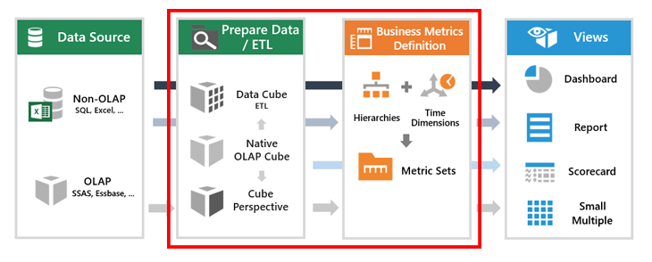
It’s at these stages that data aggregation can occur in Dundas BI. While often (and mistakenly) used as a catch-all phrase, data aggregation is simply one component of a much larger process known as Extract, Transform, Load (ETL) – which is built directly into Dundas BI via our data cube layer (the left-most section within our red rectangle in the image above).
ETL is a process whereby data is gathered and presented in a summarized format. In business intelligence, that usually means gathering data from multiple data sources (be it from RDBMS, OLAP, flat files such as Excel, or elsewhere), and combining them together (think of it as a summary) to perform data cleansing or join tables for advanced data analysis. It’s during the ETL – and more specifically, when dealing with Metric Sets** – that data aggregation can occur in Dundas BI. It’s here where we’ll spend the rest of the blog; examining how data aggregation can be performed when building metric sets in Dundas BI.
**A Metric Set is something that’s specific to Dundas BI. It’s a group of measures and dimensions that can be created and later used to power data visualizations. You can think of it as a view (like a dashboard or report), but of the source data. With Metric Sets, it’s very easy to explore and analyze data because we’re able to select data and choose how it should be sorted, filtered, visualized and aggregated.
Ready, Set, Aggregate!
Now that you have an understanding of when data aggregation can be performed in Dundas BI, let’s look at an example of it in action! Here’s when you’ll begin to understand the value of data aggregation and why you’ll want to take advantage of it. Here we have a simple data set in Dundas BI containing raw data. Zero aggregation or manipulation has been applied here. We’ve opted to keep this sample nice and small so that we can really highlight exactly what we’re doing.
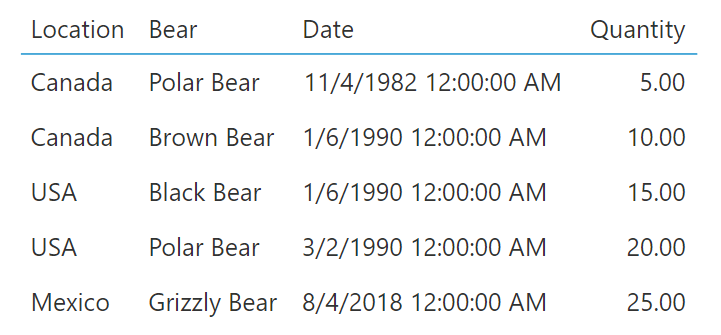
You can see that if we open the Metric set for the raw data that we’re using, all the fields that our raw data table has are included (Location, Bear Type, Date, and Quantity).
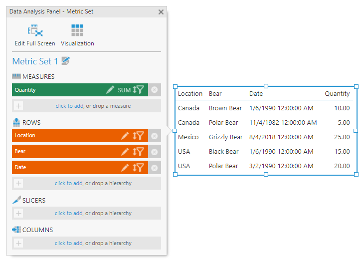
Let’s take a closer look now at each column in our source data and see how we can aggregate or simplify them to make them more readable. Beginning with the Location column, we can think about the different ways we might want to combine the data within it to simplify it. The data is categorical in nature, meaning we are limited in how we can aggregate it, so let’s go ahead and group the values based on similarity. Grouping is a method of aggregation in Dundas BI that allows us to see more clearly the information from the source data. In this example, we’ve now grouped our data and have 3 data points as opposed to five.

It’s also possible to have multiple groupings in Dundas BI, meaning you aren’t limited to aggregating your data solely by one category such as Location or Bear Type. If your data set is comprised of more than two categories like ours is, you can actually let Dundas BI know you’d like to first group by one category and then by the other, ultimately nesting the two of them together. Keep in mind, the order by which you group does in fact matter!

Now, the Date category is a little unique in that there’s a lot more you can do with it when aggregating beyond simply combining duplicate data points. This is because Dates themselves are comprised of multiple components such as Time, Day, Month, and Year. Were you so inclined, you could further group your data by one of those components to continue simplifying the view. In more complex scenarios, you might even want to group your data by the Minimum or Maximum Date. You’ve a lot more aggregation options when discussing Dates.
This finally brings us to the Quantity (or Number) column of our sample. If, for example, you had to represent the numbers in our data set as one single value, there’s many ways in which you could do so. For example, the majority of people would likely add up each of the values to determine the SUM.
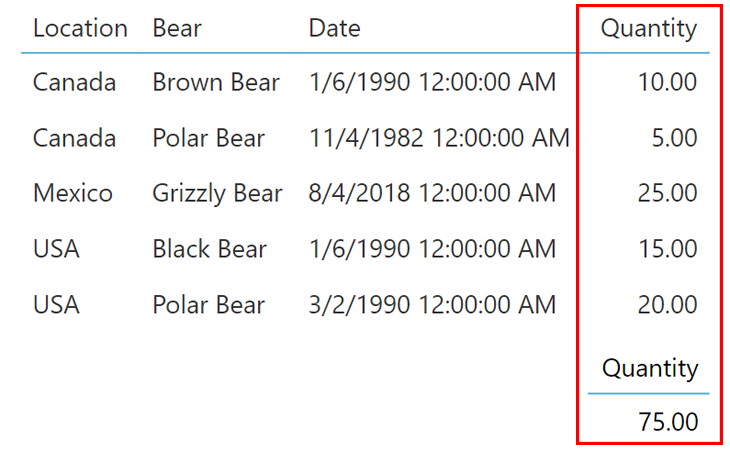
Now, this isn’t incorrect in the slightest; it’s actually what many business intelligence tools do by default. But that’s what’s so unique about Dundas BI. When it comes to aggregating numbers, there are a ton of options readily available out-of-the-box. Our platform actually provides math functions that we can use to aggregate our numbers with as little as one click.
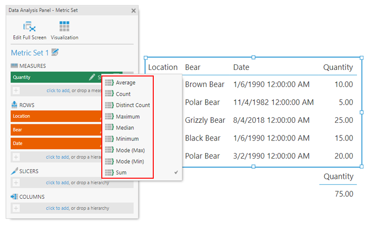
As you can see, there are some really useful aggregations already at your disposal. You can leverage the Mode (Min) and Mode (Max) aggregations if you’re looking for a quick understanding of the range of your values (if, for example, you were interested in creating a gauge). Or you can aggregate by Average, Median and Mode, depending on which type of distribution you need to better understand. These are incredibly useful aggregation options to have, especially considering how difficult they’d be to calculate if they weren’t already provided out-of-the-box.
For a more visual explanation of how each of these aggregations is achieved in Dundas BI, take a look at our video, Here’s Everything You Need to Know About Aggregators.
A Tidy Summary
As you can see, having an understanding of data aggregation is vital when using a business intelligence and data analytics tool for data analysis, as it’s one of the building blocks of knowledge that gives insight into what the application is doing and why, as you decide which data you’d like to show. If you are interested in furthering your data analysis capabilities with Dundas BI, I recommend taking a look at some of our detailed videos on formulas – such as, Introduction to Formulas in Dundas BI. The use of formulas will allow you to take the aggregations you’ve already performed and apply even more on top of them.


Follow Us
Support