3D charts are frowned upon in the data visualization world, especially when it comes to 3D Pie and Bar Charts. Those 3D visualizations usually go against data visualization best practices as they don’t provide any additional information that cannot be achieved using their 2D counterparts.
Furthermore, studies show that people make more errors when reading 3D visualizations and so the best practice is to stick with 2D. Yes, some would think that 3D is more “sexy” than 2D, but as much as one wants to make their visualizations appealing, the first factor to take into consideration is how accurately we can read the data that can then be used for important decision making. That begs the question – are there any valuable 3D visualizations?
Perform Multivariate Analysis Using 3D Scatter Plots
Scatter Plots are a great way to visualize correlations between paired sets across different variables and determine if there are any patterns/clusters within the data.
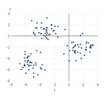
Usually Scatter Plots are used for bivariate analysis with pairs of numerical data plotted on each axis in order to look for a relationship between them. The points fall along a line or curve, or form a cluster if there is a correlation between variables. This helps in analyzing how the data is dispersed and/or if there are any outliers present.

Figure 1: Scatter plot example
But sometimes, there may be hidden clusters and patterns in the data that are not visible with just two dimensions. Adding a third dimension might reveal additional clusters and reveal hidden insights in the data. This is called a multi-variate analysis and a 3D Scatter Plot could be a good way to uncover these patterns and visualize them by plotting the variables along three axes in a xyz coordinate system instead of just two axes.
As mentioned above, 3D visualizations are usually against data visualization best practices, however, for multi-variate analysis specifically, the 3D visual coupled with interactivity allows you to see clusters that cannot be seen in 2D visual analysis and uncover additional insights. For example, you can rotate the scatter plot in a 3D space to see the clusters and patterns that were not previously visible (because they were hidden under other angles) and explore the relationships more thoroughly. We have seen a few examples of our customers in the engineering field using this type of visual to help them spot potential root causes for defects in their manufacturing process. Check out this animation to see this interactivity in action.
This animation was created using the Plotly JavaScript library. The Plotly library offers the ability to create different 3D interactive plots, and this blog will demonstrate how to use it in Dundas BI. The script used in this blog is based on the 3D point clustering example provided by Plotly: https://plot.ly/javascript/3d-point-clustering/
Inserting a 3D Scatter Plot in Dundas BI
The steps below are based on our detailed documentation on how to insert third party content into Dundas BI and thus the below just includes the specifics that apply to this sample (note this does require some JavaScript knowledge):
https://www.dundas.com/support/developer/samples/integration/insert-scripted-third-party-web-content
For other visualization examples inserted into Dundas BI using external JavaScript libraries you can also look at the D3.js library sample: https://www.dundas.com/support/developer/script-library/controls/insert-scripted-third-party-web-content-sample
The first step is to load the data into Dundas BI. For this example, we’ll use the sample dataset found here: https://raw.githubusercontent.com/plotly/datasets/master/alpha_shape.csv
This is the same dataset used to create the scatter plot mentioned above in Figure 1. We’ll see how by adding the third variable, we are able to see more clusters in this dataset.
To load the data, create a new Metric Set from the main menu, and drag and drop the file. Note the order of the columns, and the metric set ID shown after clicking Edit in the Data Analysis Panel.
On the dashboard, add an HTML label:

Figure 3: Add an HTML Label
Change the HTML label text to this:
<script src="https://cdn.plot.ly/plotly-latest.min.js"></script>
<div></div>
In the ready actions of dashboard, add the following script that draws the Scatter Plot from the three columns in the dataset:
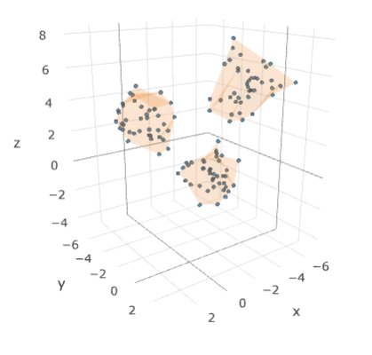
You can now use the Sandbox view or go to view and reload the page in order for the script to take effect. You should be able to see the Scatter Plot on the dashboard. The mesh enhances the view as it helps make the clusters more defined.

Figure 4: 3-D Scatter Plot
You can now interact with the plot by zooming, panning, rotating, etc., to see the clusters more clearly.
Is it Worth it?
As you can see from the above example, by plotting the three variables in a 3D Scatter Plot, we were able to see more well-defined clusters and groupings that were not easily visible when the data was plotted over two dimensions. This does require using the chart’s interactivity and some time spent looking at the shape under different angles and zoom levels, but it may help you catch clusters you couldn’t see before. After all, there may be a case for useful 3D visualizations.


Follow Us
Support