Are your metrics impacted by the weather? Have you ever considered using historical weather data to contextualize your data visualizations? If you had weather forecasts, could you more accurately predict decisions and results? The possibilities when working with weather data are near endless and today I’m going to explore how we might incorporate it into our dashboards.
Dundas BI will easily allow you to use weather data alongside the data you’re already visualizing and have in your current data sources. Getting the weather data to augment your existing data is typically the biggest issue, but luckily there are many providers out there today that can give you the data to display on your dashboard. One of these providers are our friends over at AerisWeather.com. AerisWeather provides historical and forecast information for just about anything you could want on a dashboard from Air Quality to Forecasts and Alerts.
As an example, let’s explore how we can use the AerisWeather API to create a custom widget to show location-based weather data right on our dashboard.
The Setup
The first thing we need to do is create an account at https://www.aerisweather.com. An account is needed because every request to the AerisWeather server requires a client_id and client_secret code to use their API.
Once you have these keys, you can create a call to the weather API that will look something like this:
https://api.aerisapi.com/forecasts/toronto,canada?&format=json&filter=day&limit=7&client_id=[YOUR CLIENT ID HERE]&client_secret=[YOUR SECRET CODE HERE]
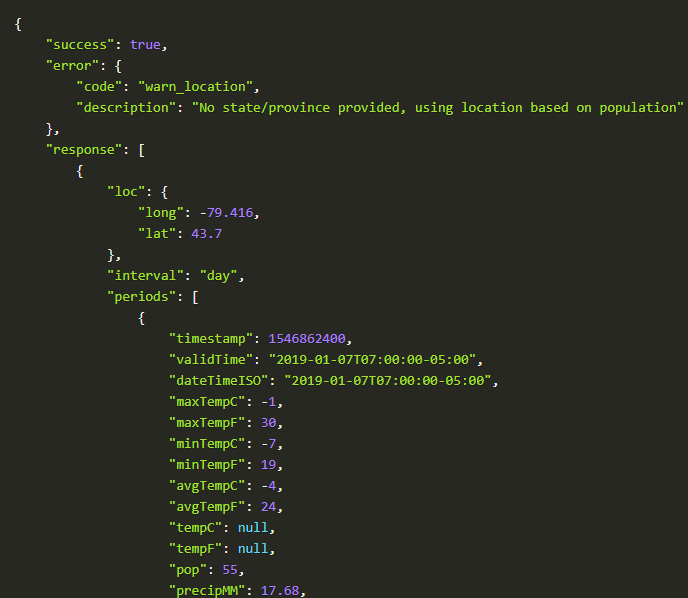
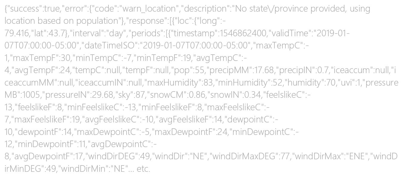
Once you open this URL you’ll see that it returns more information than you could ever need based on the URL and the options that you provide it. You might also want to look at the AerisWeather wizard as it will help you construct a request URL.
Using AerisWeather Data in Dundas BI
Since the weather data comes back as a big block of JSON data, we need a way to easily consume and work with this data in Dundas BI.
To process this data into a consumable format, we use Python, and more specifically, a module called PANDAS. You can do this in Dundas BI using a Data Cube that starts the data flow with a Python Data Generation transform that triggers a Python script to call out to the AerisWeather API to make a request.

You can see from the above image that after the Python Data Generation, I used a data conversion and a calculated element to extend and modify the data a little bit. These additional transformations are not necessary (i.e., I could have done those in the Python script) but were an easy way to provide some nice formatting.
Making a data connection to the AerisWeather API using the Python Data Generation transform is very straightforward and I was able to do this with a simple script.
import json
importurllib.request as ur
importpandas as pd
importflatten_json asflatten
lat = $lat$
long= $long$
s = ur.urlopen("https://api.aerisapi.com/observations/"+lat+","+long+"?&format=json&filter=allstations&limit=1&client_id=[YOUR KEY]&client_secret=[YOUR KEY]");
sl = json.load(s)
frompandas.io.json importjson_normalize
flat = flatten.flatten_json(sl)
result = json_normalize(flat);
returnresult
Notice also that the inputs for $lat$/$long$ (latitude/longitude) are done using a placeholder. This is so we can have our weather widget automatically load the weather based on the browser location information. I’m not entirely sure if you’d use this in production, but I thought that it was a good exercise nonetheless. We will hook into these placeholders on the dashboard later, but in the Data Cube, they have been defaulted to coordinates of Las Vegas for testing.
Why Las Vegas? Because it’s the first city that came to my mind and it’s too cold in Canada right now!
Once you have your Python script running, you’ll see that the Flatten and Panda libraries make this weather data easily consumable in a large table structure.

Building the Widget
One very powerful and often underused feature of Dundas BI is the ability to have dashboards embedded within other dashboards. Using this technique, we’ll create a small dashboard that we can later add to another dashboard to be our ‘widget’. This technique allows you to pretty much build reusable designs of multiple visualizations and/or components.
To get started on this dashboard, I’m first going to shrink the dashboard to our desired size.

Then we’ll add an image to the background of the dashboard for effect.

I’ll then use Data Labels to add our weather information like “Weather”, “Place_State”, “Place_Country”, “TempC”, “WindChillC”, “Sunrise”, and “Sunset”.
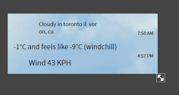
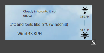
Next, we can add some images to represent the sunrise and the sunset as well as a joining line to show the connection.
One very neat thing that AerisWeather provides, is a full icon set to represent the various conditions from clear to sunny to a blizzard.
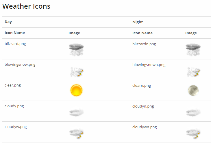
And there are many more…
Using the Data Image visualization, you can dynamically have an image on your dashboard link to one of these icons as the data requires, all without any code.
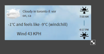
Finally, wind is displayed with a tiny Gauge, whereby the scale is disabled but set from 0 -> 360 to represent degrees. The pointer can be modified to look more like the arrow of a compass, and a small label with the letter “N” is used to provide that compass feel without the mess of too many labels.
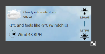
As you can see, we’re simply using the many controls that Dundas BI provides to build a miniature dashboard completely to our own style and specifications.
Geolocation
Now that the visualization and data is done, all we need to do is make sure that the widget can recognize the location of the user and can properly feed that location into the data request that we make.
Recall that the data request we used takes lat/long as an input:
https://api.aerisapi.com/forecasts/48.25,-152.58?&format...
And when we did our Python query in the Data Cube, we created placeholders that feed this lat/long information into the query:
lat = $lat$
long= $long$
s = ur.urlopen("https://api.aerisapi.com/observations/"+lat+","+long+"?&format=json&filter=allstations&limit=1&client_id=[YOUR KEY]&client_secret=[YOUR KEY]");
All we need to do now is add parameters to the dashboard and hook into these lat/long placeholder variables.
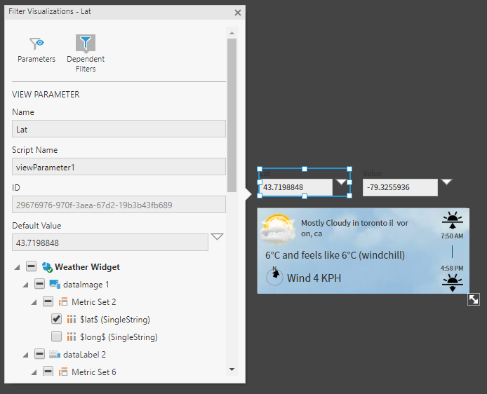
Note that the view parameters can be easily created using the filter menu and don’t require a parameter control on the dashboard. The parameter controls can be deleted from the dashboard as long as you keep the view parameters. The screen shot above has those controls off the dashboard canvas, which can help for debugging purposes.
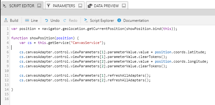
We’ll then add a simple script to the loading event of the dashboard (widget), which will query the lat/long from the browser and set the parameters. Once these parameters are set, the widget will automatically show weather based on the user’s location.
The Result
Now that our weather widget is complete, it can be dropped on any dashboard with no additional configuration required.
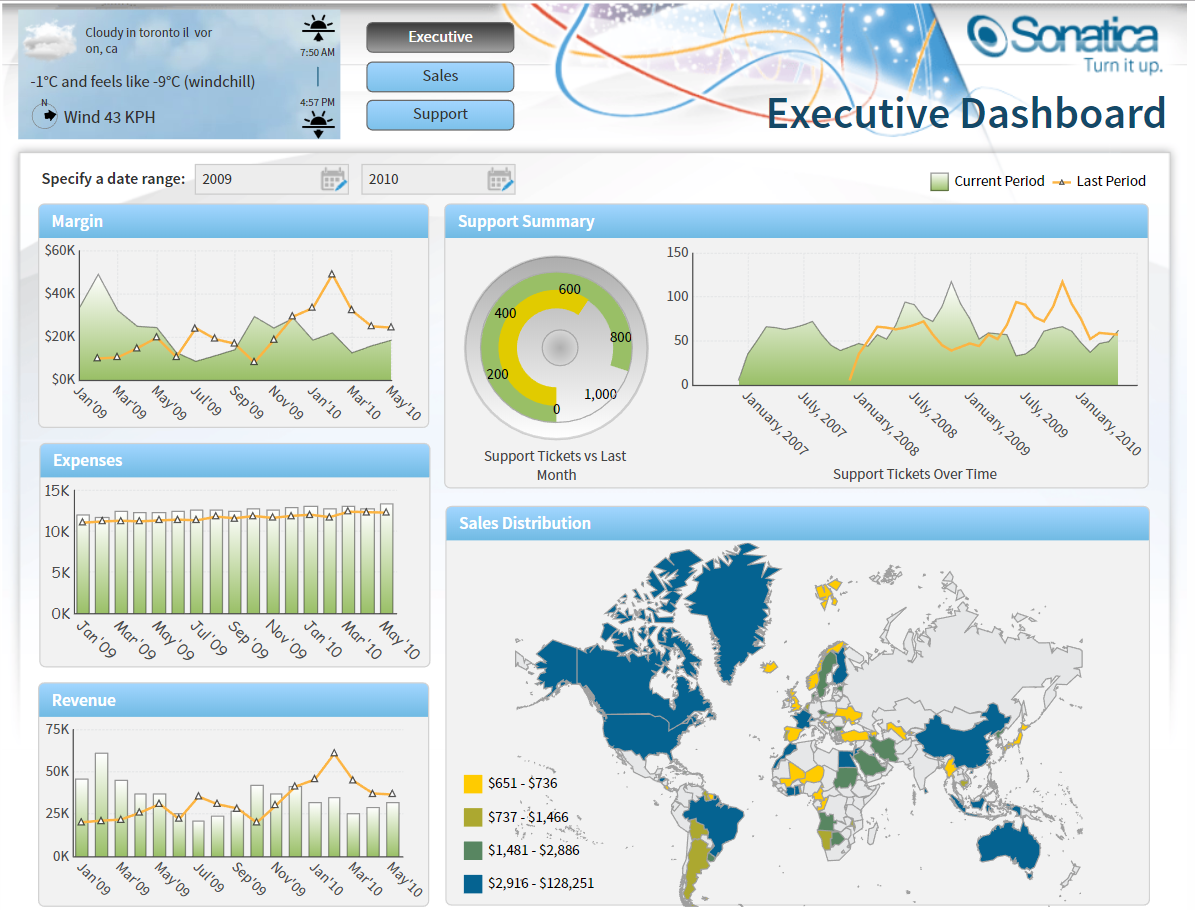
While your goal with weather data may not exactly be to create a “weather widget” per say, this should give you a detailed understanding of how you can generally bring in and augment your current data with weather data for your own analytical needs.
About the Author

Jeff Hainsworth is a Senior Solutions Architect at Dundas Data Visualization with over a decade and a half of experience in Business Intelligence. He has a passion for building, coding and everything visual – you know, shiny things! Check out "Off the Charts... with Jeff", his platform for great content on all things analytics, data visualizations, dashboards, and business intelligence. There’s something for everyone!
More Content by Jeff Hainsworth


Follow Us
Support