As the world continues to combat the COVID-19 outbreak, more and more businesses are uniting to prevent the spread of the novel coronavirus and subsequently flatten the curve. And while Canada appears to have weathered the worst of the pandemic, the respiratory disease has far from reached its conclusion. The measures Canadians have taken to limit the rate of infection have had a tremendous impact in slowing its spread, but without a vaccine, the expectation is that it will continue to circulate for a year or longer.
In times of great uncertainty – such as these – it’s imperative businesses and individuals leverage data and use it as the driving force behind their decision-making. Unfortunately, with data changing as rapidly as the state of affairs, it can be difficult to stay abreast of the situation. The team at Dundas has created a real-time, interactive COVID-19 dashboard to help our fellow Canadian businesses and communities better explore the data, stay informed and safe, and take action.
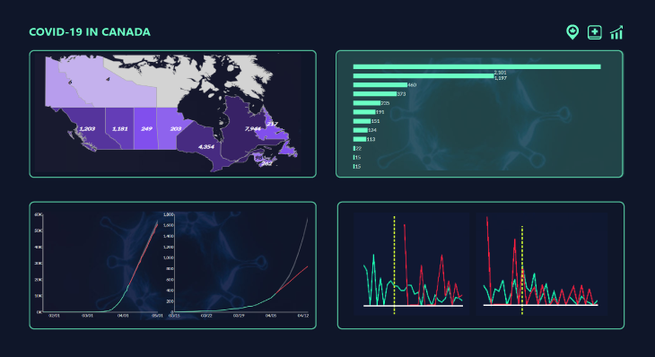
Figure 1 – Graphic interpretation of Dundas’ coronavirus (COVID-19) dashboard. Select the image to interact with the live dashboard
What insights can we get from this COVID-19 dashboard?
If memory serves me right, there is no recent event whereby accurate, up-to-date data and information has held more significance. Nor has there been such demand for it by the general public. As a result, access to data and information regarding the pandemic is becoming more accessible by the day, and government agencies, businesses and individuals alike are conducting their own analyses to help shed light on this health and economic crisis.
However, while there are myriad resources at your disposal, we’ve often found it difficult to analyze, digest, and ultimately make sense of them all in a timely fashion. It’s become increasingly clear the importance of analytics in situations like this – and for making real-time, fact-based decisions.
It’s come to our attention, that we are in a unique position to help Canadian businesses and people operate more effectively and make the critical decisions they need to get them through these difficult times. The real-time, interactive, public-facing dashboard we’ve created takes the massive volumes of data available from various sources and consolidates it into bite-sized, digestible insights that address some of the more common concerns the general public is asking.
Using this dashboard, Canadians, and those who are interested in the situation here in Canada, can stay up-to-date on the status of the coronavirus and make better decisions by exploring critical cases and resources by geography and performing their own social distancing what-if analysis. They are able to interact with and explore current case and death trends at the provincial level, resource capacities based on the number of critical cases, hospital beds and ventilators, and forecast the impact of social distancing on future case and death trends.
Current Provincial Data
Observing changes in data over time allows us to gain insights on past behavior and make decisions based on them. And with the help of animations – which help to highlight patterns and showcase how data is evolving – it’s even easier to see insights we otherwise may never have seen and begin to tell a story. Using Dundas’ Play Axis Filter, we’ve built a daily tracker at the forefront of the dashboard to help you to understand, at-a-glance, the speed by which the virus is spreading across the country.
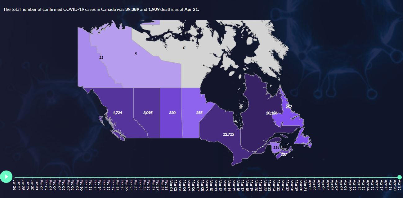
Figure 2 – Animated map using Dundas’ Play Axis Filter displaying how the volume of confirmed cases of COVID-19 has evolved over time
By combining valuable data from John Hopkins University (updated daily), Statistics Canada and the Ontario Health Coalition – amongst other sources – we’re able to present answers to the questions that matter most to you. At both the provincial and national levels, you’re able to easily identify the total number of confirmed cases of COVID-19, along with the total number of deaths attributable to the disease.

Figure 3 – Data labels displaying confirmed cases and total deaths of COVID-19
You’re also able to see how each of these metrics is trending on a daily basis to understand how rapidly the virus is spreading – or flattening – over time. In this section of the dashboard, we’ve opted to include Small Multiples that call out the specific date each province declared a state of emergency. This gives us a visual benchmark for understanding when government restrictions were implemented, and the subsequent impact each provinces’ preventative measures have had day-by-day.
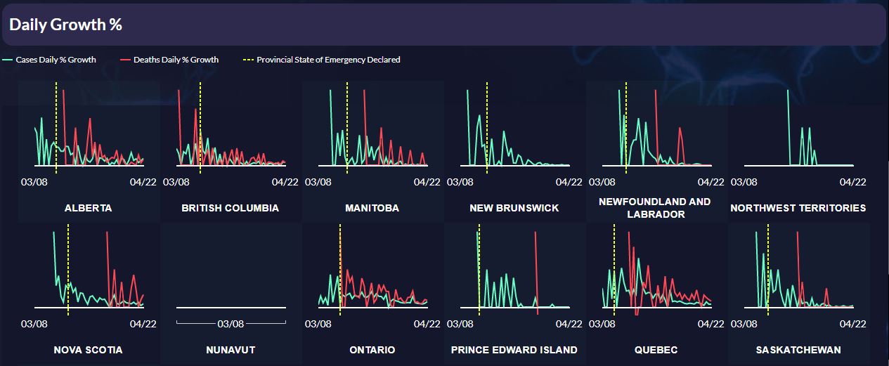
Figure 4 – Small Multiples displaying daily growth percentages of COVID-19 confirmed cases and deaths
Current Hospital Resources
The healthcare industry – and hospitals in particular – has been pushed to its limits by this pandemic. Critical resources – such as hospital beds, medical masks, and ventilators – are key components of a hospital’s ability to effectively treat patients who’ve contracted the virus – as well as those who’ve not. As the number of confirmed cases balloons across the country, the concern is that fewer – or worse, no – resources will be available, which threatens the quality of care and the general safety of all patients and front-line healthcare workers.
Using our dashboard, users can filter down to the provincial and regional levels, to better grasp the severity of the issue and understand which provinces and hospitals have the capacity to operate most effectively.
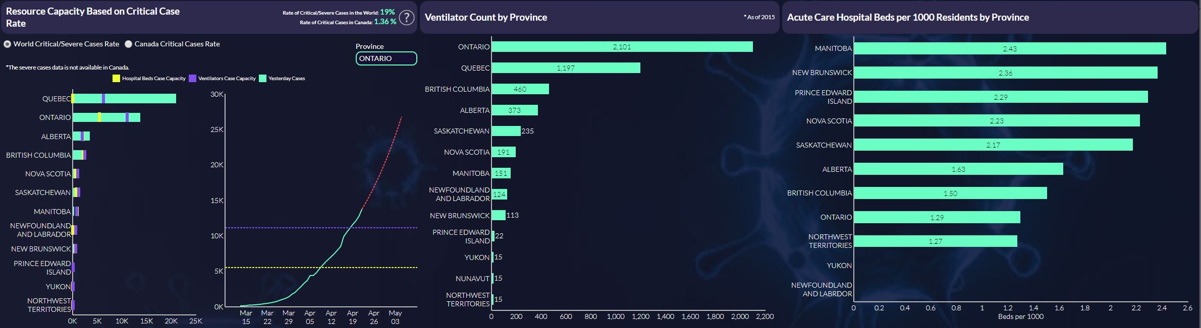
Figure 5 – Hospital resource counts by province
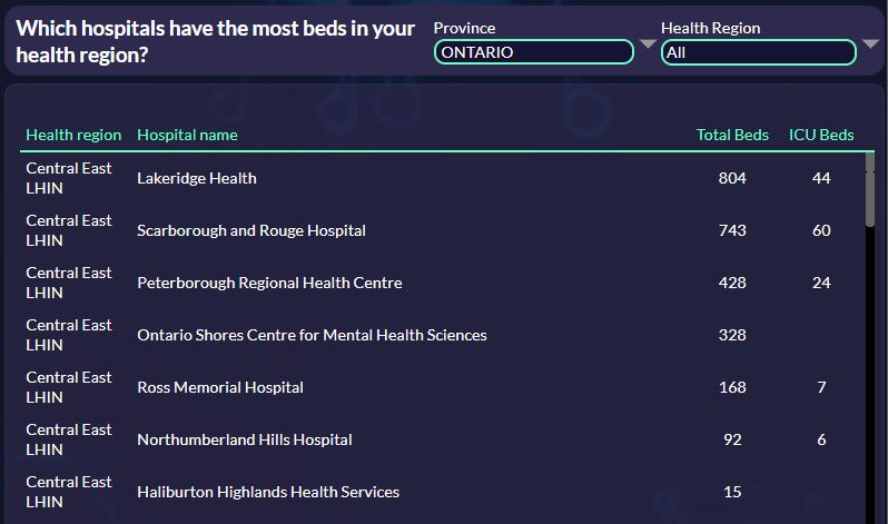
Figure 6 – Hospital bed counts by province and region
Future Projections – The Impact of Social Distancing
Social – or physical – distancing has proven to be one of the most effective ways to reduce the spread of illness during an outbreak. By limiting physical contact, avoiding crowded places and gatherings, and keeping a distance of at least 6 feet from others (amongst other tactics), we’re able to slow the spread of COVID-19. But by how much? And how quickly? We know our efforts are working, but to what extent, and what repercussions are there for breaking protocol – even if slightly?
With the dashboard we’ve created, users are able to perform their own ‘what-if-analysis’ and visualize the effects of social distancing to better understand the impact their actions are having. Take for example the following two images. In the first scenario, the degree of social distancing is presumed to be – roughly – 50%. In the second scenario, the degree of social distancing is presumed to be 100%.
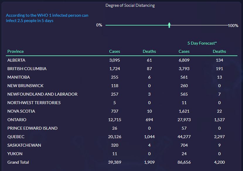
Figure 7 - Analysis of the effects of 50% degree of social distancing
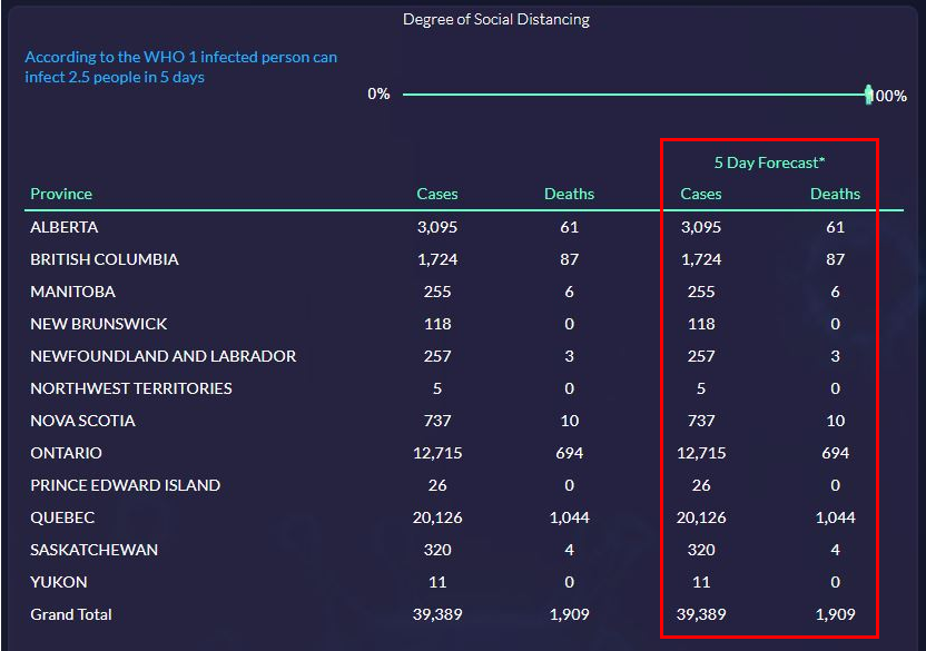
Figure 8 - Analysis of the effects of 100% degree of social distancing
As you can see, the values contained within the 5 Day Forecast are markedly lower when a higher degree of social distancing is implemented.
Furthermore, using Dundas’ forecasting formula – which captures the evolving trend and/or seasonality of data to predict future outcomes – users are able to identify with reasonable confidence the date by which the number of cases and deaths will flatten in individual provinces.
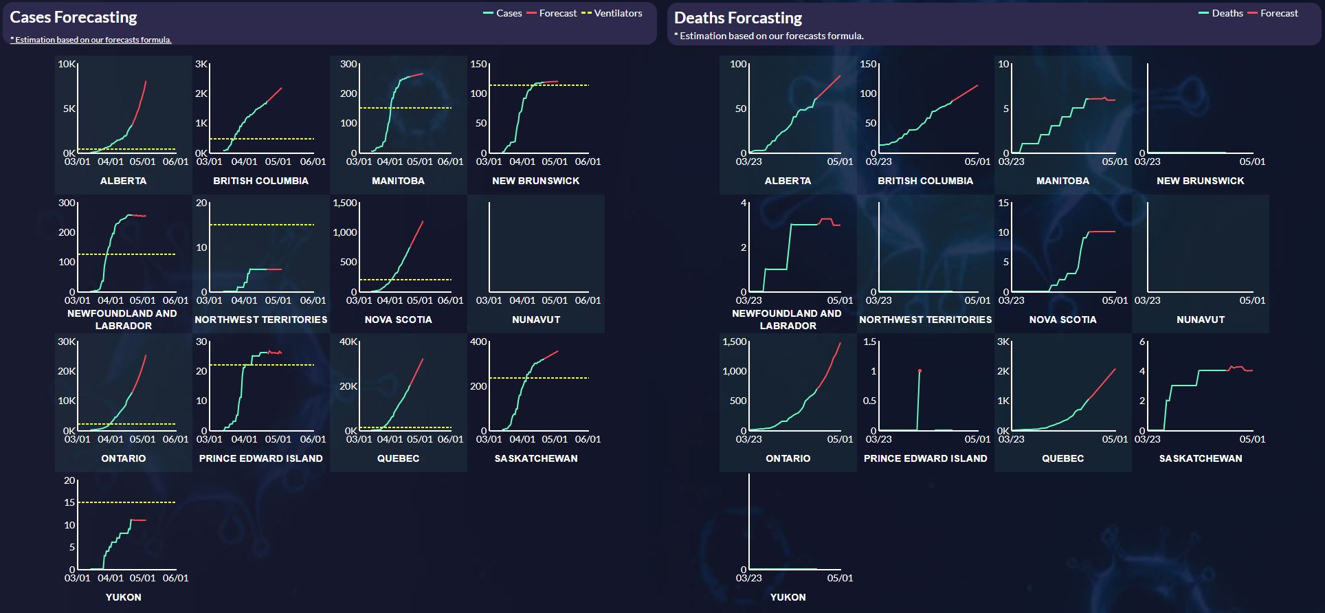
This goes without saying, but we are in the midst of an unprecedented crisis, driven by a disease we’ve fairly little knowledge about. While our forecasting model assumes some semblance of consistency over time, in reality, there are innumerable changing variables to account for, many of which we, unfortunately, cannot at this time. Our forecasting functions are designed for the types of data the vast majority of our customers use: predictable data, with trends and seasonality. As we’re still in the early stages of understanding this disease, many factors will continue to impact the trajectories of our forecasts.
Conclusion
As you continue to lean on data to make critical decisions confidently and quickly, while keeping those dearest to you safe, we wanted to assure you that all of us at Dundas will continue to be here to support you. We have an obligation to our community – of which you’re a massive part of – and you can rely on us to serve your business to our fullest extent regardless of what is happening around us.
Use this dashboard to stay informed and aware of the situation at hand, but most importantly, prioritize your wellbeing and health, and stay safe.
The provincial data over time and Canada level data in Dundas Data Visualization’s dashboard is drawn from this API, which sources its numbers from John Hopkins University. Government statistics, hospital occupancy rates, ventilator counts, COVID-19 rates, and populations are drawn from the following sources:
- Canadian Hospital Bed Occupancy Rates >
- Canadian Hospital Bed Occupancy Rates >
- World Severe and Critical COVID-19 Rates >
- Province Populations >
Follow Us
Support