3D charts are frowned upon in the data visualization world, especially when it comes to 3D...

3D charts are frowned upon in the data visualization world, especially when it comes to 3D...
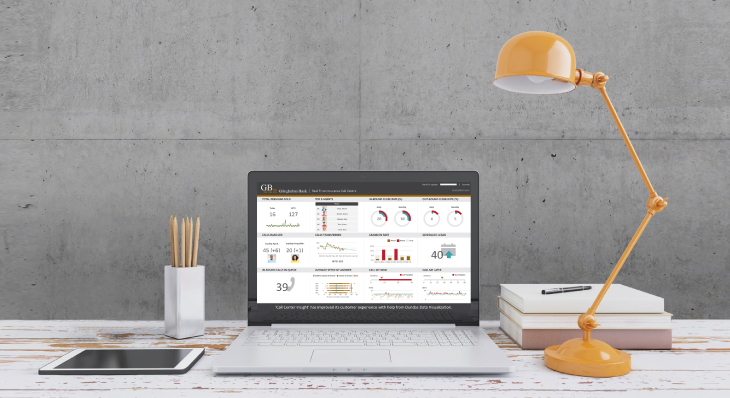
Dashboards are a great way to visually represent your data to track, analyze and display K...

The ability to group data on-the-fly is incredibly powerful. It's helpful when correcting ...

With Dundas BI 5, we’ve added two new visualizations to the relationship category. Dundas ...

With Dundas BI 5, we’ve taken our existing Map Visualization and set its functionalities a...
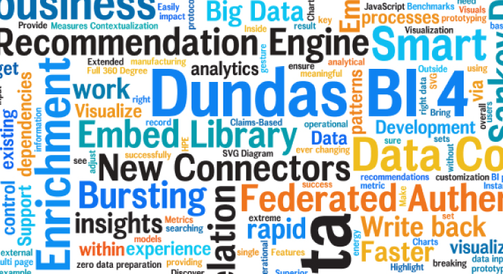
Word Clouds (or Tag Clouds) are excellent options to help visually interpret text and are ...

A Slope Graph is a line chart variation that is typically used to emphasize change in time...

Cohort Analysis enables you to easily compare how different groups or cohorts of people be...

The Parallel Coordinates Chart is a uniquely valuable visualization in the sense that it a...

Everybody has their own baggage when they start using new software – specifically for BI a...

With Dundas BI, you're able to calculate the distance between two locations using a built-...

For analytics projects to transform the way people manage their decisions, speed is often ...
Follow Us
Support