How many Sales meetings or scrums have you been privy to, where some of the Sales reps are unfocused, unsure of how to prioritize their leads, unable to articulate which key accounts are receiving the attention they require – or which have the potential to generate the highest revenue – and are unaware of how their performances stack up against the metrics – or their colleagues, for that matter.
This is a grim reality for many Sales departments. Despite the best efforts of Sales leaders, it can be difficult to keep Sales teams in sync, and keep things moving as efficiently as possible. This isn’t a knock on Sales reps either. They’re often inundated with and juggling high volumes of daily tasks, and simply prioritizing those can be a mammoth accomplishment in and of itself.
What Sales reps need to boost their productivity and achieve their targets is transparency and unprecedented insight into those oh-so-important daily tasks. Daily check-ins and weekly stand-ups aren’t getting the job done. The best way to encourage Sales reps to achieve peak performance is to light a competitive fire beneath them and hold them accountable. You have to build and facilitate a Sales culture – one that rewards hard work and recognizes tangible successes – and the best way to do so, is by visualizing the status of all Sales activities using real-time dashboards.
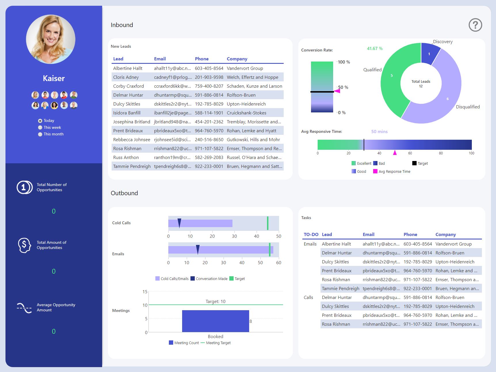
We’ve developed an Individual Sales Performance Dashboard using Dundas BI that accomplishes just that. (This dashboard was optimized for desktop monitors).
Click here or on the image to interact with the dashboard.
While this dashboard was purely designed to spark your inspiration – we are using fabricated data – in practice, it’s a highly effective tool for keeping Sales reps and organizational goals aligned, organized, and frequently updated. By tracking specific metrics that are critical to individual performance, Sales reps are more likely to achieve the goals set for them and adjust their processes accordingly.
So what, exactly, are we tracking on this dashboard? Glad you asked! Let’s take a closer look at each section and discuss what information is being shared and how Sales reps can use these insights to make better decisions and stay on top of their activities.
Sales Rep Selection
The first thing you’ll notice when accessing our Individual Sales Performance Dashboard is that you have the option to select which Sales rep you’d like performance metrics on. You’re also given the ability to select a time-frame, which will impact what data is shown on the dashboard. Now, depending on whether or not you’ve opted to build user-dependent filtering or row-level security into the dashboard, the Sales rep selection panel will vary in appearance for different users.

For example, you may decide it’s vital that Sales managers have access to performance metrics for all Sales reps, but the individual Sales reps should only have access to data associated with their accounts. In our example, we’ve opened the filters so you can get a feel for how easy it is to see and change the current view as you interact with the dashboard.
Inbound Sales Activities
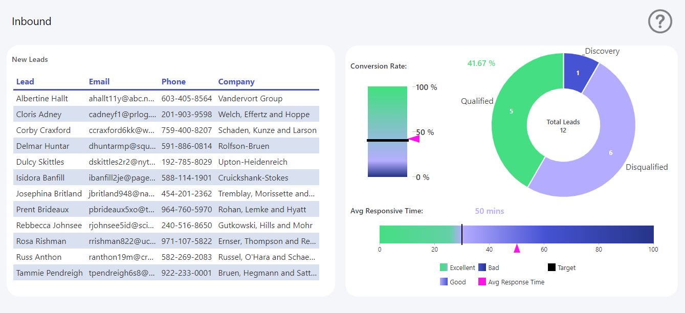
In our dashboard example, the efforts of this Sales team are rooted in a mix of Inbound and Outbound activities, we felt it necessary to divide our Individual Sales Performance Dashboard into sections, so that Sales reps are able to visualize metrics pertaining to both activities. Here’s what information we’ve opted to highlight within the Inbound activities section of the dashboard:
New Leads
In our fictitious scenario, each Sales rep gets, on average, 10-15 new Inbound leads every single day. Now, at the daily level, that might not seem like a lot, but trust me… once they start compounding, the Sales reps will be clamoring for a way to manage the non-stop onslaught of workable leads.
This is why we’ve included a table visualization in our dashboard. This data visualization – also known as a data grid or data table – has been designed with familiarity in mind – note the resemblance to an Excel spreadsheet – so that Sales reps are more easily able to understand what it’s trying to tell them. By populating this table visualization with a constantly updating stream of new leads, Sales reps are able to quickly see contact details – in whichever order they’d prefer (most recent, alphabetically, priority-level, etc.) – of each lead they’ve been assigned, and take action accordingly. No longer will Sales reps miss following up with their Inbound leads. If it’s in the table, they know there’s an action to take.
Conversion Rate and Average Response Time
On the right side of the Inbound leads section is a Pie Chart and two Linear Gauges. With the Pie Chart, we’re able to visualize the results of our Inbound activities and express them as a ‘part-to-whole’ relationship, where all of the pieces combined represent the status of all Inbound leads – which, by the way, we’ve opted to include in the hollowed out hole in its center. Using this simple, compact data visualization – and for the purpose of this project – Sales reps can, at-a-glance, identify the volume of leads they’ve qualified, disqualified, or have remaining at discovery.
To ensure Sales reps are connecting with and qualifying leads as effectively and efficiently as possible, we’ve supplemented the Pie Chart with two Linear Gauges: one displaying the lead conversion rate against a target, and the other displaying the average response time against a target. Each of these gauges illuminates where the Sales reps sit in relation to target for both metrics and whether or not their performances are considered bad, good or excellent – along a gradated scale. While other factors are in play, in this particular use case, we found there to be a correlation between response time and lead conversation rate, and these gauges provide useful information in this regard.
Outbound Sales Activities
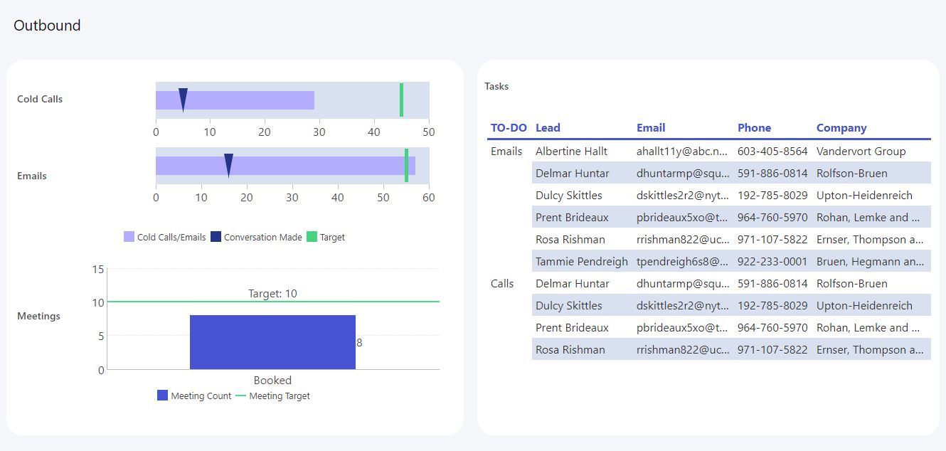
To quantify the performance of Outbound activities, we felt it necessary to track metrics relating to three key indicators – Cold Calls, Emails, and Meetings. And, similar to Inbound activities, we wanted to include a table visualization as a way for Sales reps to prioritize their follow up of Outbound leads. When dealing with 100+ Outbound activities a day, it’s easy for things to fall through the cracks. We wanted a way to seal these cracks entirely, and this table is our solution.
Cold Calls & Emails
Up first, we’ve two more Linear Gauges – each of these tracking Sales rep performance of the two most common ‘cold outreach’ activities: calls and emails. Each of these gauges displays the number of outreaches a Sales rep has made per channel – against a target – along with the numbers of conversations borne from each. Outbound Sales is traditionally more difficult than Inbound Sales, so rather than measuring the two using the same metrics – i.e., using qualified, disqualified, and discovery – we felt it made more sense to measure the number of conversations had.
Meetings
Now, based on the number of conversations a Sales rep is able to have from their cold outreach activities, we are expecting to see in return, a specific number of meetings booked. We’ve included a Bar Chart data visualization to represent this conversion, and what’s unique about this chart, is that its target is never static – it’s constantly fluctuating based on how many conversations the Sales rep had. For example, a Sales rep with 20 conversations will be expected to book more meetings than a Sales rep with only 5 conversations.
What a moving target does, is reward Sales reps on their ability to further the conversations they’ve already had. There’s less emphasis on the quantity of meetings booked, and more emphasis on pushing those leads they’ve already connected with, further through the funnel. It also shines a light on where processes might need to be fixed or where more training is required.
Opportunities
The final section of our Individual Sales Performance Dashboard focuses solely on the opportunities driven by Inbound and Outbound activities. It’s here where Sales reps can visualize the fruits of their labor and better understand and make tangible their contributions.
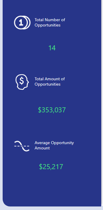
Sales reps can easily conclude the number of opportunities they’ve opened over the selected time frame, the total monetary value of those opportunities, and the average opportunity value. While the other sections of the dashboard provide insight into whether or not a Sales rep is on target to achieve their goals and offer concrete paths for improvement, this section highlights whether or not they have actually achieved those goals. This concept of Key Performance Indicators vs. Key Results Indicators is discussed in more detail in this video, KPI 101 – The Basics.
Conclusion
With the right tools in place to increase transparency and insight into important daily Sales activities, your sales team will be able to boost their productivity and work on those activities that will produce results and generate revenue. Don’t let your Sales reps get overwhelmed. Give them a dashboard that rewards their hard work and keeps their eyes securely on the prize.
For more dashboard inspirations, take a look at our Samples Gallery – all of these dashboards are built using Dundas BI.


Follow Us
Support